Posted by John Zoeller – Developer Relations Engineer, and Caroline Vander Wilt – Group Product Manager

New Wear OS features enable ‘standalone’ watches for kids, unlocking new possibilities for Wear OS app developers
In collaboration with Samsung, Wear OS is introducing Galaxy Watch for Kids, a new kids experience enabling kids to explore while staying connected with their families from their smartwatch, no phone necessary. This launch unlocks new opportunities for Wear OS developers to reach younger audiences.
Galaxy Watch for Kids is rolling out to Galaxy Watch7 LTE models , with features including:
- No phone ownership required: This experience enables the watch and its associated apps to operate on a fully standalone basis using LTE, and when available, Wifi connectivity. This includes calling, texting, games, and more.
- Selection of kid-friendly apps: From gaming to health, kids can browse and request installs of Teacher Approved apps and watch faces onGoogle Play. In addition to approving and blocking apps, parents can also monitor app usage from Google Family Link.
- Stay in touch with parent-managed contacts: Parents can ensure safer communications by limiting text and calling to approved contacts.
- Location sharing: Offers peace of mind with location sharing and geofencing notifications when kids leave or arrive at designated areas.
- School time: Limits watch functionality during scheduled hours of the day, so kids can focus while in school or studying.
Building kids experiences with standalone functionality enables you to reach both standalone and tethered watches for kids. Apps like Math Tango have already created great Wear OS experiences for kids. Check out the video below to learn how they built a rich and engaging Wear OS app.
Our new kids-focused design and content principles and developer guidance are also available today. Check out some of the highlights in the next section.
New principles and guidelines for development
We've created new design principles and guidelines to help developers take advantage of this opportunity to build and improve apps and watch faces for kids.
Design principle: Active and fun
Build engaging healthy experiences for children by including activity-based features.
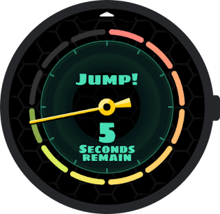
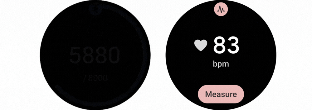
A great example of this is the Odd Squad Time Unit app from PBS KIDS that encourages children to get up and be physically active. By using the on-device sensors and power-efficient platform APIs, the app is able to provide a fun experience all day and still maintain battery life of the watch from wakeup to bed time.
Note that while experiences should be catered to kids, they must also follow the Wear OS quality requirements related to the visual experience of your app, especially when crafting touch targets and font sizes.
Content principle: Thoughtfully crafted
Consider adjusting your content to make it not only appropriate, but also consumable and intuitive for younger kids (including those as young as 6). This includes both audio and visual app components.
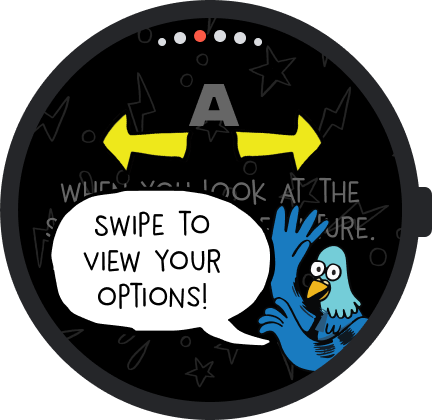
Tinkercast’s Two Whats?! And a Wow! app uses age-appropriate vocabulary and fun characters to aid in their teaching. It’s a great example of how a developer should account for reading comprehension.
Development guidelines
New Wear OS kids apps must adhere to the Wear OS app quality guidelines, the guidelines for standalone apps, and the new Kids development guide.
Minimize impact on device battery
Minimize events that affect battery life over the course of one session. Kids use watches that provide important safety features for their parents or guardians, which depend on the device having enough battery life. Below are best practices for reducing battery impact.
✅ DO design for offline use cases so that kids can play without incurring network-related battery costs
✅ DO minimize tasks that require an internet or GPS connection
✅ DO use power efficient APIs for all day activity tracking as well as tracking exercises
🚫 DO NOT use direct sensor tracking as this will significantly reduce the battery life
🚫 DO NOT include long-running animations
Choose a development environment
To develop kid-friendly apps and games you can use Compose for Wear OS, our recommended approach for building UI for Wear OS, as well as Unity for Android.
We recommend Unity for developing games on Wear OS if you’re familiar and comfortable with its workflows and capabilities. However, for games with only a few animations, Compose Animation should be sufficient and is better supported within the Android environment.
Be sure to consider that some Wear OS quality requirements may require custom Unity implementations, such as support for Rotary Input.
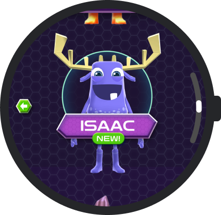
Originator’s MathTango showcases the flexibility and richness of developing with Unity:
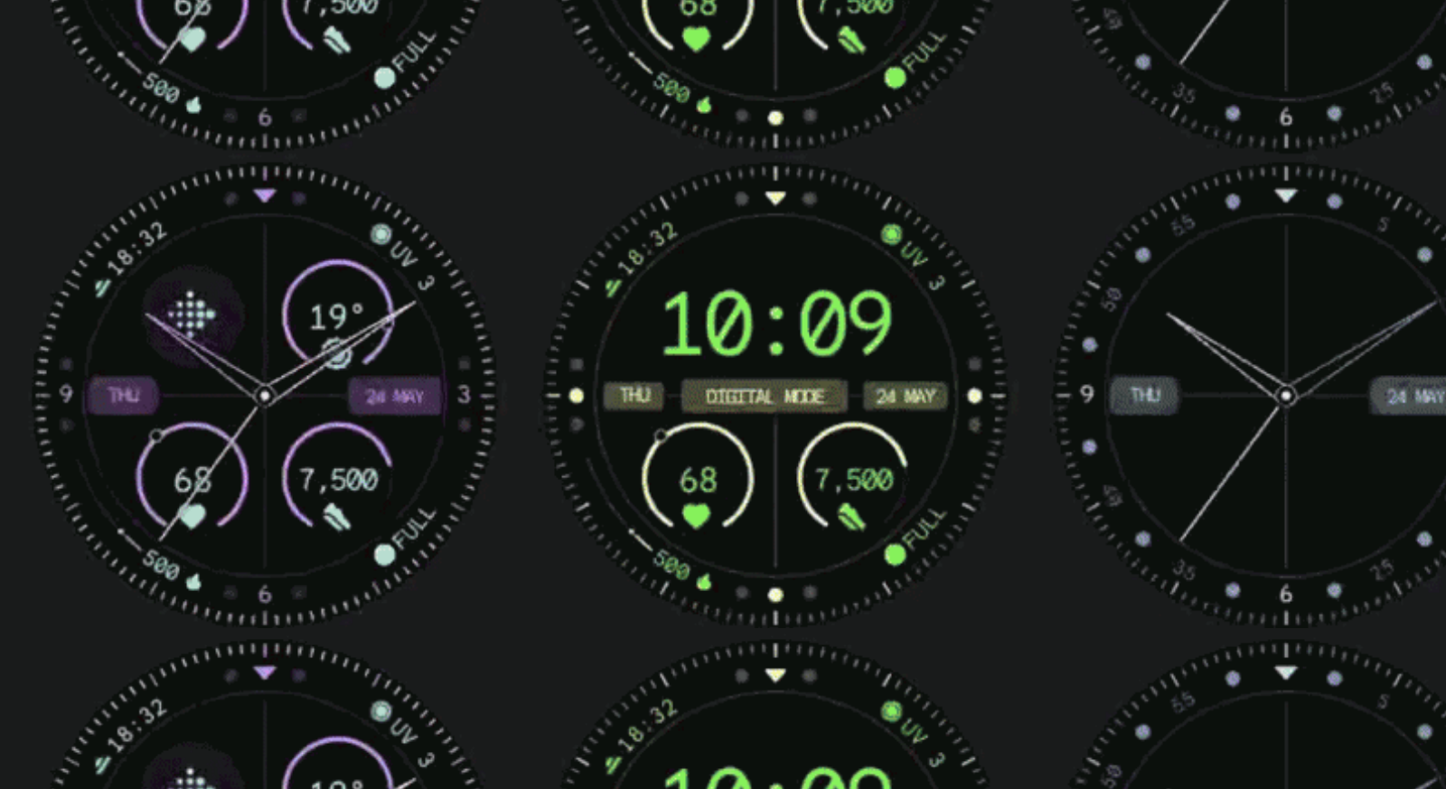
Creating Watch Faces
Developing watch faces for kids requires the use of Watch Face Format. Watch faces should adhere to our content and design principles mentioned above, as well as our quality standards, including our ambient mode requirement.
The following examples demonstrate our Content Principle: Appealing. The content is relevant, engaging, and fun for kids, sparking their interest and imagination.
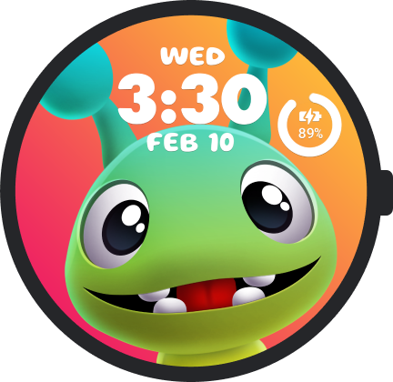
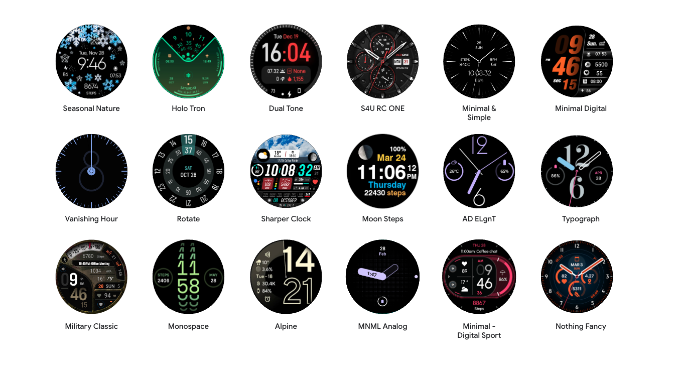
The Crayola Pets Watch Face comes with a great variety of customization options, and demonstrates an informative and pleasant watch face:
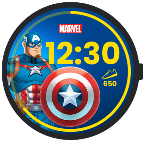
The Marvel Watch Faces (Captain America shown) provide a fun and useful step tracking feature:
Kids experience publishing requirements
Developers looking to get started on a new kids experience will need to keep a few things in mind when publishing on the Play Store.
- Age and Content Rating: Kids apps should be configured in the Play Store to meet the age and content requirements appropriate to their functionality
- Standalone Functionality: Apps must have 'standalone' defined in their manifest and meet all associated requirements, which will apply when the watch is set up with a child account
- Using Watch Face Format: Only watch faces which are built with Watch Face Format will be made available for kids
Expand your reach with Wear OS
Get ready to reach a new generation of Wear OS users! We've created all-new guidelines to help you build engaging experiences for kids. Here’s a quick recap:
- Continue to use the baseline set of Wear OS development resources, including Get started with Wear OS and Wear OS app quality
- Focus on enrichment and age-tailoring
- Make sure it works with Standalone, and keep an eye on the battery
With the Wear for Kids experience, developers can reach an entirely new audience of users and be part of the next generation of learning and enrichment on Wear OS.
Check out all of the new experiences on the Play Store!
 Posted by Maru Ahues Bouza, Product Management Director, Android Developer


 Kseniia Shumelchyk, Android Developer Relations Engineer, and Garan Jenkin, Android Developer Relations Engineer


 Posted by Anna Bernbaum – Product Manager, and Garan Jenkin – Developer Relations Engineer


 Posted by Fahd Imtiaz, Product Manager, Android Developer


 Posted by

 Posted by
 Posted by