Posted by Jolanda Verhoef, Android Developer Relations Engineer

We launched Jetpack Compose over a year ago, and have been busy improving it ever since. We’ve added new features and invented powerful tools to make your experience developing Android UI as productive, intuitive and fun as possible. So, if you're starting a new app, it's time to write it with Compose! With Material Design 3 support, new Bill Of Materials, Compose WearOS Stable and Android TV (alpha), Compose Camp, and many other pieces of news… It's an exciting release!
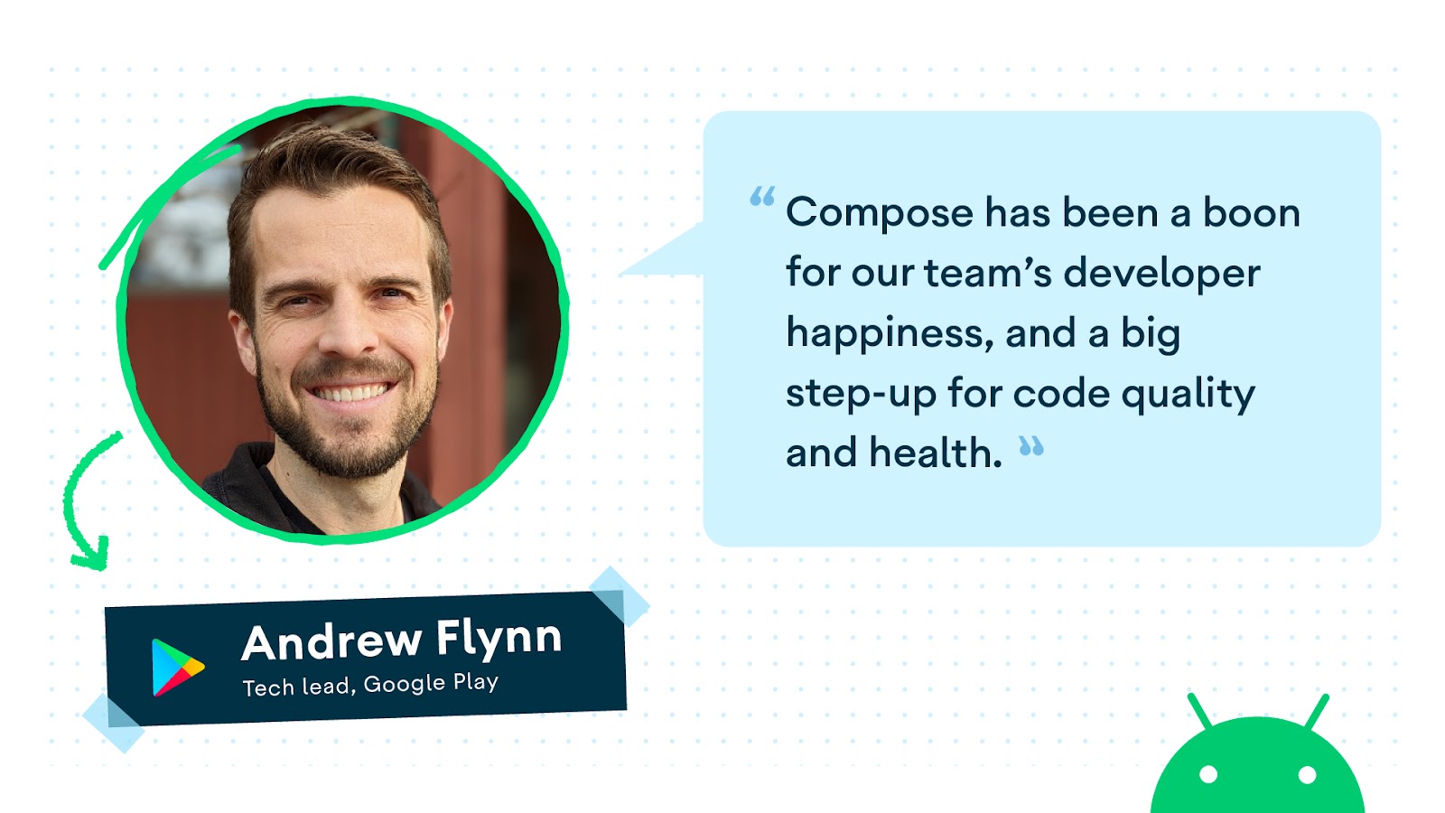
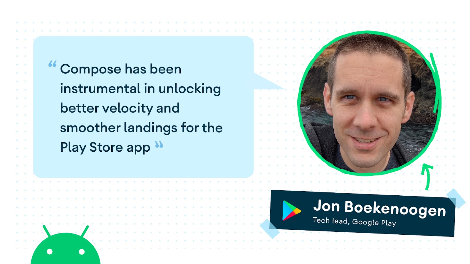
Compose in the Community
Compose, October ‘22 release
Today we’re releasing a new stable version of Compose, with some exciting features and news.
First of all, we’ve heard from you how it can be daunting to track versions across different artifacts that might go on different release schedules, so we’re now publishing, together with every Stable release of any of the Compose artifacts, a Bill of Materials, or BOM, to make your life easier.
Our first BOM release, Compose October ‘22, brings support for Staggered Grids, drawing Text directly to Canvas, Pull to Refresh, as well as performance improvements and bug fixes.
Compose Bill of Materials
A BOM is a Maven module that declares a set of libraries with their versions. It will greatly simplify the way you define Compose library versions in your Gradle dependencies block, especially now that we moved the various Jetpack Compose libraries to independent versioning schemes. Instead of defining each version separately, which can become cumbersome and prone to errors when library versions start to differ, you now only need to define one BOM version and all Compose library versions will be extracted from that. We will publish a new version of the BOM every time a Compose artifact has a new stable release, so moving from stable release to stable release is going to be much simpler.
Modifiers on overdrive
Behind the scenes, we’re always working on improving Compose performance. The October ‘22 release includes a major refactor of how Modifiers work under the hood. While you will not notice anything changing in the APIs, this refactor paves the way for greatly improving Modifier performance. Learn more about the rationale behind the changes, and what’s planned for the near future in the ADS talk Compose Modifiers deep dive.
Popup & Dialog elevation change
Accessibility is always a first-class citizen for Compose, and this release contains a behavior change that helps fix an Accessibility bug with Popups and Dialogs: their maximum elevation is decreased from 30dp to 8dp. Your app will be impacted only if it uses a custom dialog or popup implementation with an elevation higher than 8dp. The release notes contain more information about the change, including a way to override the new behavior as an interim solution (keep in mind that we always recommend using 8dp maximum when customizing popups or dialogs).
New features
We added a lot of new functionality to Compose. Here are some highlights:
-
Implement staggered grids using the new
LazyHorizontalStaggeredGridandLazyVerticalStaggeredGrid - Draw text directly to Canvas using
DrawScope.drawText - You can add a variable font to your app and change its properties using the
FontVariationobject. - Add a UrlAnnotation to your annotated string to improve Accessibility services interacting with the text.
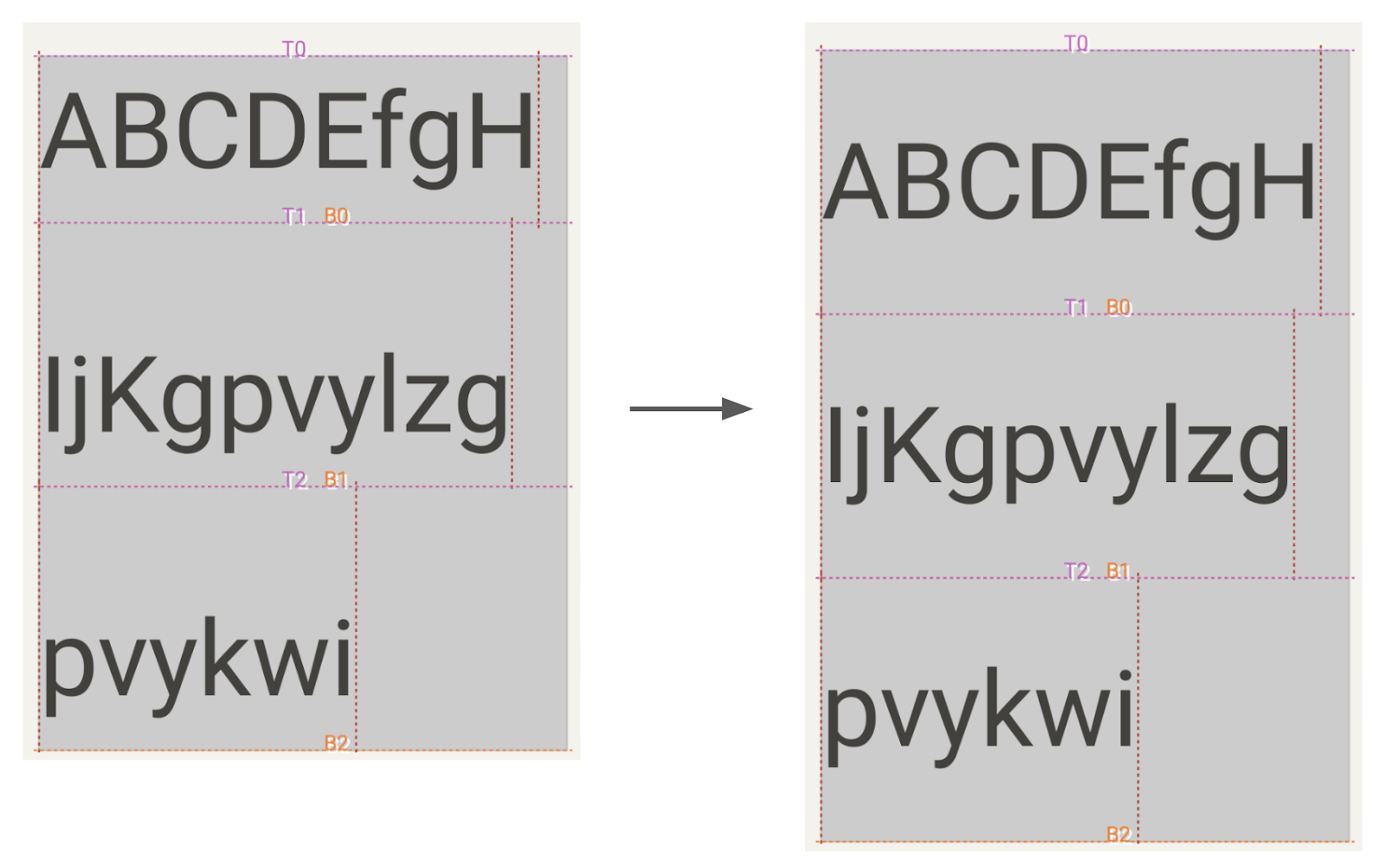
- Add hyphenation to your text using the new LineBreak API.
- Swipe to refresh with the new
pullRefreshmodifier. - Add snapping behavior to your lazy lists using SnapFlingBehavior.
LookAheadLayoutis a new type of layout that provides information about final measurement and placement of its children so you can decide on intermediate layouts.
Compose Material 3 stable

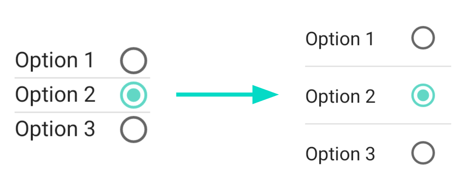
Today we also announce the first stable release of the Compose Material 3 library! You can build an app using Compose and theme it according to Material Design 3, our latest iteration of Material Design. Use Material Design 3 to further customize your app’s colors, typography and shapes to make your brand stand out! The library contains fresh and updated versions of many UI components, such as buttons, cards, checkboxes, switches, navigation bars, drawers, and many more, with support for others on its way. See a list of all the supported components in the documentation and learn more in this blog post.
To help you adopt Material 3 check out our new migration guide with clear guidance on how Material 2 concepts translate to Material 3. The default template in Android Studio Flamingo now uses Material 3, to get you up and running in no time. We’ve also updated many of our sample apps, tutorials, templates, and codelabs to use Material 3 so you can learn as you go!
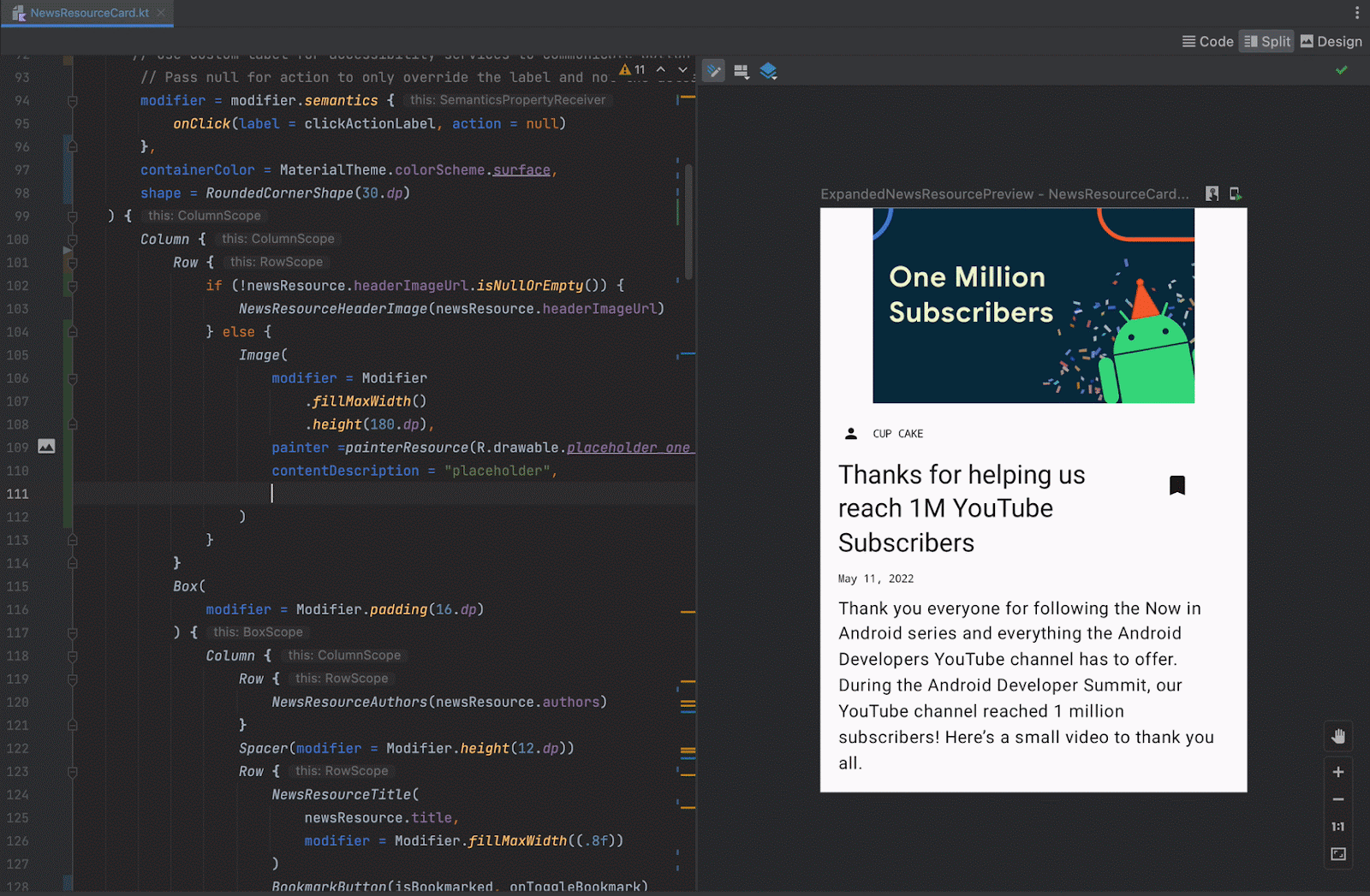
New tools
Developing your app using Jetpack Compose is much easier with the new and improved tools around it. We’ve added tons of new features to Android Studio to improve your workflow and efficiency:
Android Studio Dolphin is the latest stable release, bringing you:
- Animation Coordination
- Multipreview annotations
- Recomposition counts in Layout Inspector
Android Studio Electric Eel contains beta features, like:
- Live Edit (experimental)
- Composition rendering highlighting
- Configuring Preview devices
- Live updates in Previews
Android Studio Flamingo contains canary features such as:
- New project templates use Compose and Material 3 by default
- Live Edit turned on by default
- Improved composition tracing to help you better inspect performance issues.
Relay
Today we also launch the first alpha version of Relay, a design-to-code solution for improving designer-developer collaboration. Designers create UI components using the Figma plugin, and developers use the Android Studio plugin to automatically use these components in their apps. The generated components are composable functions and can be integrated directly into your Compose app. Learn more about Relay in the documentation.
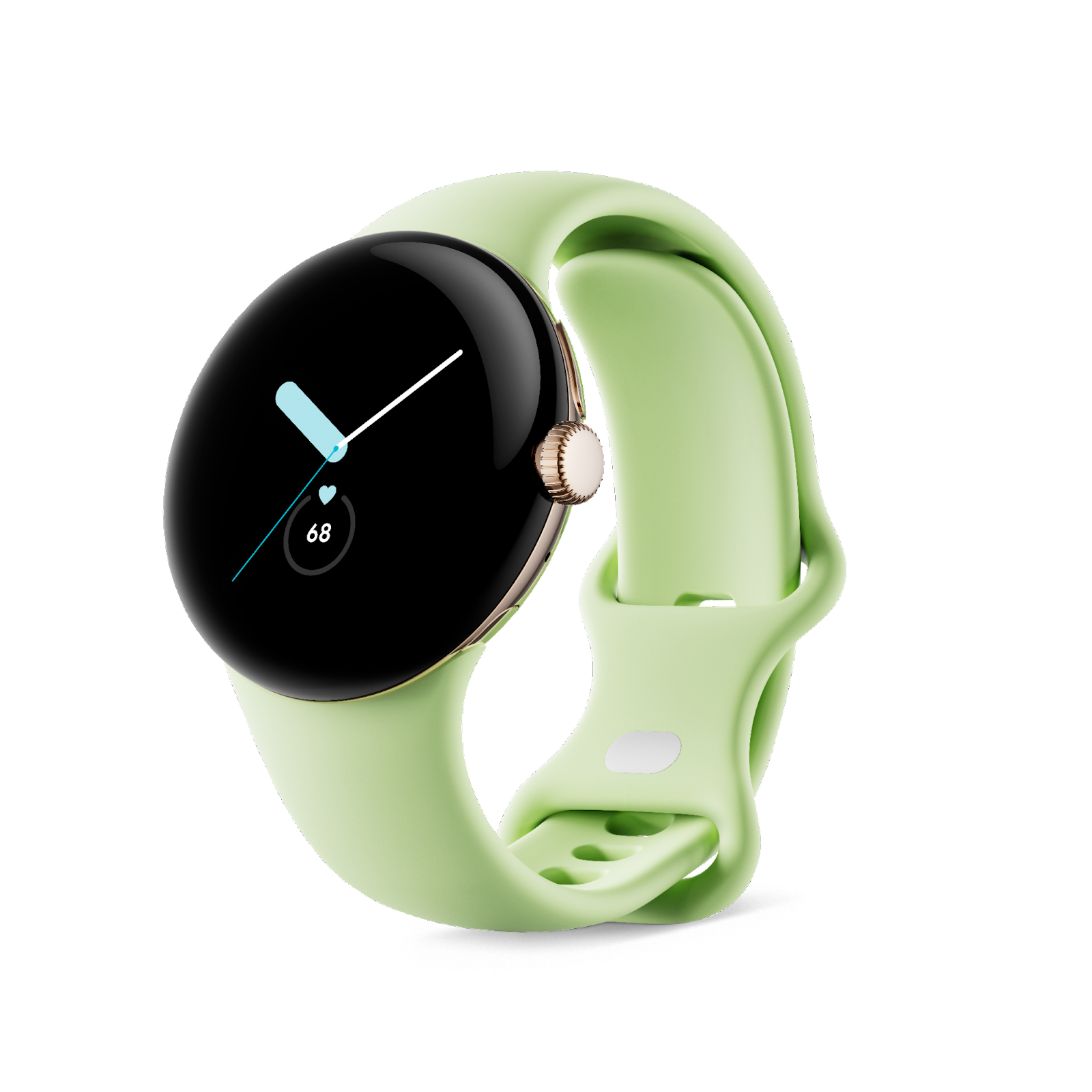
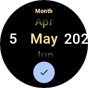
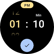
Compose on WearOS, Large Screens and TV
In July we released the first Stable version of Wear Compose, ready to build production apps. Compose for Wear OS is our recommended approach for building UIs for Wear OS apps. We’ve included over twenty Compose UI components that were designed specifically for Wearables, like TimeText, PositionIndicator, and ScalingLazyColumn.
We’re also continuing to make it easier to design, develop, and test apps for large screens such as foldables, tablets, and Chrome OS. The material3-window-size-class library graduated to Stable, giving you a set of opinionated viewport breakpoints to work with. Large screen designs often contain staggered grids, and the addition of LazyHorizontalStaggeredGrid and LazyVerticalStaggeredGrid will help implement these.
Feedback from the Android community always moves us forward. With your input we have updated our roadmap, focusing on areas that will help you implement Compose successfully. We’re now focusing on supporting more advanced use cases, covering more Material 3 components, improving platform support, tooling and performance.
New and updated guidance
No matter where you are in your learning journey, we’ve got you covered! We added and revamped a lot of the guidance on Compose:
- For hands-on work, head on to the revamped Compose for Android Developers course. It covers a wide range of topics, from basics to advanced.
- If you prefer watching videos, check out the MAD Skills: Compose Basics series and of course, all the Compose talks at the Android Dev Summit
- Read the expanded documentation on Images and Graphics.
- Wondering what animation to use? The new animation cheat sheet has the answer!
- Learn how to find and fix performance issues with the new debugging recomposition screencast and blog post.
- If you’re considering adopting Compose to your existing app, read the expanded Adopting Compose in your app guide.
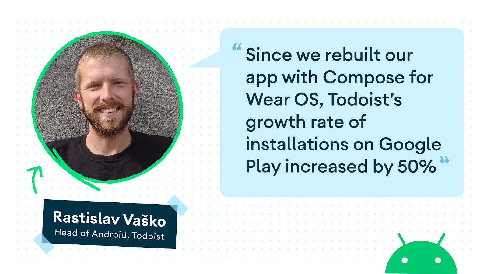
Compose Camp

Running from September through December is a world-wide community-organized event series called Compose Camp! With both a beginner and an experienced track, developers of all levels can join Compose Camp to learn together with others. We already see lots of traction, with many videos being posted by GDGs and GDSCs all over the globe, and many events hosted on our Community platform.
Happy Composing!
We hope that you’re as excited by these developments as we are! If you haven't started yet, it's time to learn Jetpack Compose and see how your team and development process can benefit from it. Get ready for improved velocity and developer productivity. Happy Composing!
