Tag Archives: Jetpack Compose

Meet the Android Studio Team: A Conversation with Staff Developer Programs Engineer, Trevor Johns

Posted by Ashley Tschudin – Social Media Specialist, MTP at Google

Android Studio isn't just code and algorithms – it's built by real people with fascinating stories. Our "Meet the Android Studio Team" series gives you a glimpse into the lives and passions of the talented individuals who craft the tools you use every day. Tune in each month to meet new team members and discover their unique journey.


Trevor Johns: Building Android Studio for You

Trevor Johns, Staff Developer Programs Engineer

Meet Trevor Johns, a seasoned Staff Developer Programs Engineer at Google.

Reflecting on his journey, Trevor sheds light on the most impactful advancements in the Android ecosystem and offers a glimpse into his vision for the future where AI plays a pivotal role in streamlining development workflows.

Trevor discusses the Android Studio team's dedication to enhancing developer productivity through AI, highlighting their focus on understanding and addressing developer needs, and reflects on the dynamic journey of Android development while sharing valuable insights.


Can you tell us about your journey to becoming a part of the Android Studio team? What sparked your interest in Android development?

I've been at Google in various roles since Google since 2007, and transferred to Android team in 2009 shortly after the launch of the HTC G1 — the first publicly available Android phone. Even in those early days it was clear that mobile computing was a unique opportunity to reimagine many of the limitations of desktop computers and how users interact with the digital world.

Among my first projects were helping developers optimize their apps for the MyTouch 3G and Motorola Droid, as well as creating developer resources for Android's 1.6 Donut release.

Over the years, I've worked on various parts of the Android OS including our first tablet devices, Android Wear, helping develop the original Android support libraries (which later became Jetpack), and the migration to Kotlin.

Recently I joined the Android Studio team to help improve developer productivity, using AI to streamline common developer tasks and help developers have more time to focus on creativity.

How does the Android Studio team ensure that products or features meet the ever-changing needs of developers?

Like the rest of Android, we approach development of new features by listening to our developer community. We hold regular listening sessions with publishers, work with our UX research team to conduct case studies, and participate in online discussions to get a sense for where developers face the most friction — and then try to find ways to reduce that friction.

For example, we developed Gemini in Android Studio's integration with Play Vitals and Firebase Crashlytics based on feedback from members of the developer community who commented to let us know where they would find AI most useful across their developer workflow.

Speaking of, if you'd like to provide us with feedback, you can always file a bug or feature request on the Android Studio issue tracker.

How does the Studio team contribute to Google's broader vision for the Android platform?

In addition to listening to the Android community, we also keep an eye on what's being developed across the rest of the Android team and make sure that Android Studio has the right tools to help developers quickly migrate between Android versions and adopt those new platform features.

Beyond that, the Studio team provides leading edge editing tools to make sure that Android remains one of the easiest computing platforms to develop for — unlocking this unique computing platform for millions of developers.

In your opinion, what is the most impactful feature or improvement the Android team has introduced in recent years, and why?

For developers, my answer would have to be the migration to Kotlin. This language has modernized the Android developer experience — letting developers write apps with less code and fewer errors. It's also the foundation for Jetpack Compose, which is the future of Android UI development.

If you could wave a magic wand and add one dream feature to the Android universe, what would it be and why?

I'd love to see Gemini be able to not just autocomplete code for me, but generate scaffolds for new projects. That way I can focus on building features rather than worrying about basic structure when starting a new project.

Develop Android Apps with Kotlin

Follow Trevor's lead and embrace the power of Kotlin for modern Android development. Enhance your skills and write better Android apps faster with Kotlin.

Stay tuned!

Get ready for another inspiring story! The "Meet the Android Studio Team" series continues next week with a new team member in the spotlight. Don't miss their unique insights and journey.

Find Trevor Johns on LinkedIn, X, Bluesky, and Medium.

What’s new in CameraX 1.4.0 and a sneak peek of Jetpack Compose support

Posted by Scott Nien – Software Engineer (scottnien@)

Get ready to level up your Android camera apps! CameraX 1.4.0 just dropped with a load of awesome new features and improvements. We're talking expanded HDR capabilities, preview stabilization and the versatile effect framework, and a whole lot of cool stuff to explore. We will also explore how to seamlessly integrate CameraX with Jetpack Compose! Let's dive in and see how these enhancements can take your camera app to the next level.

HDR preview and Ultra HDR

A split-screen image compares Standard Dynamic Range (SDR) and High Dynamic Range (HDR) image quality side-by-side using a singular image of a detailed landscape. The HDR side is more vivid and vibrant.

High Dynamic Range (HDR) is a game-changer for photography, capturing a wider range of light and detail to create stunningly realistic images. With CameraX 1.3.0, we brought you HDR video recording capabilities, and now in 1.4.0, we're taking it even further! Get ready for HDR Preview and Ultra HDR. These exciting additions empower you to deliver an even richer visual experience to your users.

HDR Preview

This new feature allows you to enable HDR on Preview without needing to bind a VideoCapture use case. This is especially useful for apps that use a single preview stream for both showing preview on display and video recording with an OpenGL pipeline.

To fully enable the HDR, you need to ensure your OpenGL pipeline is capable of processing the specific dynamic range format and then check the camera capability.

See following code snippet as an example to enable HLG10 which is the baseline HDR standard that device makers must support on cameras with 10-bit output.

// Declare your OpenGL pipeline supported dynamic range format. 
val openGLPipelineSupportedDynamicRange = setOf(
     DynamicRange.SDR, 
     DynamicRange.HLG_10_BIT
)
// Check camera dynamic range capabilities. 
val isHlg10Supported =  
     cameraProvider.getCameraInfo(cameraSelector)
           .querySupportedDynamicRanges(openGLPipelineSupportedDynamicRange)
           .contains(DynamicRange.HLG_10_BIT)

val preview = Preview.Builder().apply {
     if (isHlg10Supported) {
        setDynamicRange(DynamicRange.HLG_10_BIT)
     }
}

Ultra HDR

Introducing Ultra HDR, a new format in Android 14 that lets users capture stunningly realistic photos with incredible dynamic range. And the best part? CameraX 1.4.0 makes it incredibly easy to add Ultra HDR capture to your app with just a few lines of code:

val cameraSelector = CameraSelector.DEFAULT_BACK_CAMERA
val cameraInfo = cameraProvider.getCameraInfo(cameraSelector)
val isUltraHdrSupported = 
      ImageCapture.getImageCaptureCapabilities(cameraInfo)
                  .supportedOutputFormats
                  .contains(ImageCapture.OUTPUT_FORMAT_JPEG_ULTRA_HDR)

val imageCapture = ImageCapture.Builder().apply {
    if (isUltraHdrSupported) {
        setOutputFormat(ImageCapture.OUTPUT_FORMAT_JPEG_ULTRA_HDR)
    }
}.build()

Jetpack Compose support

While this post focuses on 1.4.0, we're excited to announce the Jetpack Compose support in CameraX 1.5.0 alpha. We’re adding support for a Composable Viewfinder built on top of AndroidExternalSurface and AndroidEmbeddedExternalSurface. The CameraXViewfinder Composable hooks up a display surface to a CameraX Preview use case, handling the complexities of rotation, scaling and Surface lifecycle so you don’t need to.

// in build.gradle 
implementation ("androidx.camera:camera-compose:1.5.0-alpha03")


class PreviewViewModel : ViewModel() {
    private val _surfaceRequests = MutableStateFlow<SurfaceRequest?>(null)

    val surfaceRequests: StateFlow<SurfaceRequest?>
        get() = _surfaceRequests.asStateFlow()

    private fun produceSurfaceRequests(previewUseCase: Preview) {
        // Always publish new SurfaceRequests from Preview
        previewUseCase.setSurfaceProvider { newSurfaceRequest ->
            _surfaceRequests.value = newSurfaceRequest
        }
    }

    // ...
}

@Composable
fun MyCameraViewfinder(
    viewModel: PreviewViewModel,
    modifier: Modifier = Modifier
) {
    val currentSurfaceRequest: SurfaceRequest? by
        viewModel.surfaceRequests.collectAsState()

    currentSurfaceRequest?.let { surfaceRequest ->
        CameraXViewfinder(
            surfaceRequest = surfaceRequest,
            implementationMode = ImplementationMode.EXTERNAL, // Or EMBEDDED
            modifier = modifier        
        )
    }
}

Kotlin-friendly APIs

CameraX is getting even more Kotlin-friendly! In 1.4.0, we've introduced two new suspend functions to streamline camera initialization and image capture.

// CameraX initialization 
val cameraProvider = ProcessCameraProvider.awaitInstance()

val imageProxy = imageCapture.takePicture() 
// Processing imageProxy
imageProxy.close()

Preview Stabilization and Mirror mode

Preview Stabilization

Preview stabilization mode was added in Android 13 to enable the stabilization on all non-RAW streams, including previews and MediaCodec input surfaces. Compared to the previous video stabilization mode, which may have inconsistent FoV (Field of View) between the preview and recorded video, this new preview stabilization mode ensures consistency and thus provides a better user experience. For apps that record the preview directly for video recording, this mode is also the only way to enable stabilization.

Follow the code below to enable preview stabilization. Please note that once preview stabilization is turned on, it is not only applied to the Preview but also to the VideoCapture if it is bound as well.

val isPreviewStabilizationSupported =  
    Preview.getPreviewCapabilities(cameraProvider.getCameraInfo(cameraSelector))
        .isStabilizationSupported
val preview = Preview.Builder().apply {
    if (isPreviewStabilizationSupported) {
      setPreviewStabilizationEnabled(true)
    }
}.build()

MirrorMode

While CameraX 1.3.0 introduced mirror mode for VideoCapture, we've now brought this handy feature to Preview in 1.4.0. This is especially useful for devices with outer displays, allowing you to create a more natural selfie experience when using the rear camera.

To enable the mirror mode, simply call Preview.Builder.setMirrorMode APIs. This feature is supported for Android 13 and above.

Real-time Effect

CameraX 1.3.0 introduced the CameraEffect framework, giving you the power to customize your camera output with OpenGL. Now, in 1.4.0, we're taking it a step further. In addition to applying your own custom effects, you can now leverage a set of pre-built effects provided by CameraX and Media3, making it easier than ever to enhance your app's camera features.

Overlay Effect

The new camera-effects artifact aims to provide ready-to-use effect implementations, starting with the OverlayEffect. This effect lets you draw overlays on top of camera frames using the familiar Canvas API.

The following sample code shows how to detect the QR code and draw the shape of the QR code once it is detected.

By default, drawing is performed in surface frame coordinates. But what if you need to use camera sensor coordinates? No problem! OverlayEffect provides the Frame#getSensorToBufferTransform function, allowing you to apply the necessary transformation matrix to your overlayCanvas.

In this example, we use CameraX's MLKit Vision APIs (MlKitAnalyzer) and specify COORDINATE_SYSTEM_SENSOR to obtain QR code corner points in sensor coordinates. This ensures accurate overlay placement regardless of device orientation or screen aspect ratio.

// in build.gradle 
implementation ("androidx.camera:camera-effects:1.4.1}")      
implementation ("androidx.camera:camera-mlkit-vision:1.4.1")

var qrcodePoints: Array<Point>? = null
val qrcodeBoxEffect 
    = OverlayEffect(
        PREVIEW /* applied on the preview only */,
        0, /* queueDepth */, 
        Handler(Looper.getMainLooper()), {}
      )

fun initCamera() {
    qrcodeBoxEffect.setOnDrawListener { frame ->
        frame.overlayCanvas.drawColor(Color.TRANSPARENT, PorterDuff.Mode.CLEAR)
        qrcodePoints?.let {
            // Using sensor coordinates to draw.
            frame.overlayCanvas.setMatrix(frame.sensorToBufferTransform)
            val path = android.graphics.Path().apply {
                it.forEachIndexed { index, point ->
                    if (index == 0) {
                        moveTo(point.x.toFloat(), point.y.toFloat())
                    } else {
                        lineTo(point.x.toFloat(), point.y.toFloat())
                    }
                 }
                 lineTo(it[0].x.toFloat(), it[0].y.toFloat())
            }
            frame.overlayCanvas.drawPath(path, paint)
        }
        true
    }

    val imageAnalysis = ImageAnalysis.Builder()
        .build()
        .apply {
            setAnalyzer(executor,
                MlKitAnalyzer(
                    listOf(barcodeScanner!!),
                    COORDINATE_SYSTEM_SENSOR,
                    executor
                ) { result ->
                    val barcodes = result.getValue(barcodeScanner!!)
                    qrcodePoints = 
                        barcodes?.takeIf { it.size > 0}?.get(0)?.cornerPoints
                }
            )
        }

    val useCaseGroup = UseCaseGroup.Builder()
          .addUseCase(preview)
          .addUseCase(imageAnalysis)
          .addEffect(qrcodeBoxEffect)
          .build()

    cameraProvider.bindToLifecycle(
        lifecycleOwner, cameraSelector, usecaseGroup)
  }

Media3 Effect

Want to add stunning camera effects to your CameraX app? Now you can tap into the power of Media3's rich effects framework! This exciting integration allows you to apply Media3 effects to your CameraX output, including Preview, VideoCapture, and ImageCapture.

This means you can easily enhance your app with a wide range of professional-grade effects, from blurs and color filters to transitions and more. To get started, simply use the new androidx.camera:media3:media3-effect artifact.

Here's a quick example of how to apply a Gaussian blur to your camera output:

// in build.gradle 
implementation ("androidx.camera.media3:media3-effect:1.0.0-alpha01")
implementation ("androidx.media3:media3-effect:1.5.0")

import androidx.camera.media3.effect.Media3Effect
val media3Effect =
            Media3Effect(
                requireContext(),  PREVIEW or VIDEO_CAPTURE or IMAGE_CAPTURE,
                mainThreadExecutor(), {}
            )
// use grayscale effect
media3Effect.setEffects(listOf(RgbFilter.createGrayscaleFilter()) 
cameraController.setEffects(setOf(media3Effect)) // or using UseCaseGroup API

Here is what the effect looks like:

A black and white view from inside a coffee shop looking out at a city street.  The bottom of the photo shows the edge of a table with a laptop and two buttons labeled 'BACK' and 'RECORD'

Screen Flash

Taking selfies in low light just got easier with CameraX 1.4.0! This release introduces a powerful new feature: screen flash. Instead of relying on a traditional LED flash which most selfie cameras don’t have, screen flash cleverly utilizes your phone's display. By momentarily turning the screen bright white, it provides a burst of illumination that helps capture clear and vibrant selfies even in challenging lighting conditions.

Integrating screen flash into your CameraX app is flexible and straightforward. You have two main options:

      1. Implement the ScreenFlash interface: This gives you full control over the screen flash behavior. You can customize the color, intensity, duration, and any other aspect of the flash. This is ideal if you need a highly tailored solution.

      2. Use the built-in implementation: For a quick and easy solution, leverage the pre-built screen flash functionality in ScreenFlashView or PreviewView. This implementation handles all the heavy lifting for you.

If you're already using PreviewView in your app, enabling screen flash is incredibly simple. Just enable it directly on the PreviewView instance. If you need more control or aren't using PreviewView, you can use ScreenFlashView directly.

Here's a code example demonstrating how to enable screen flash:

// case 1: PreviewView + CameraX core API.
previewView.setScreenFlashWindow(activity.getWindow());
imageCapture.screenFlash = previewView.screenFlash
imageCapture.setFlashMode(ImageCapture.FLASH_MODE_SCREEN)

// case 2: PreviewView + CameraController
previewView.setScreenFlashWindow(activity.getWindow());
cameraController.setImageCaptureFlashMode(ImageCapture.FLASH_MODE_SCREEN);

// case 3 : use ScreenFlashView 
screenFlashView.setScreenFlashWindow(activity.getWindow());
imageCapture.setScreenFlash(screenFlashView.getScreenFlash());
imageCapture.setFlashMode(ImageCapture.FLASH_MODE_SCREEN);

Camera Extensions new features

Camera Extensions APIs aim to help apps to access the cutting-edge capabilities previously available only on built-in camera apps. And the ecosystem is growing rapidly! In 2024, we've seen major players like Pixel, Samsung, Xiaomi, Oppo, OnePlus, Vivo, and Honor all embrace Camera Extensions, particularly for Night Mode and Bokeh Mode. CameraX 1.4.0 takes this even further by adding support for brand-new Android 15 Camera Extensions features, including:

    • Postview: Provides a preview of the captured image almost instantly before the long-exposure shots are completed
    • Capture Process Progress: Displays a progress indicator so users know how long capturing and processing will take, improving the experience for features like Night Mode
    • Extensions Strength: Allows users to fine-tune the intensity of the applied effect

Below is an example of the improved UX that uses postview and capture process progress features on Samsung S24 Ultra.

moving image capturing process progress features on Samsung S24 Ultra

Interested to know how this can be implemented? See the sample code below:

val extensionsCameraSelector =  
    extensionsManager
        .getExtensionEnabledCameraSelector(DEFAULT_BACK_CAMERA, extensionMode)
val isPostviewSupported = ImageCapture.getImageCaptureCapabilities(                   
    cameraProvider.getCameraInfo(extensionsCameraSelector)
).isPostviewSupported
val imageCapture = ImageCapture.Builder().apply {
    setPostviewEnabled(isPostviewSupported)
}.build()

imageCapture.takePicture(outputfileOptions, executor,  
    object : OnImageSavedCallback {
        override fun onImageSaved(outputFileResults: OutputFileResults) {
            // final image saved. 
        }
        override fun onPostviewBitmapAvailable(bitmap: Bitmap) {
            // Postview bitmap is available.
        }
        override fun onCaptureProcessProgressed(progress: Int) {
            // capture process progress update 
        }
}
Important: If your app ran into the CameraX Extensions issue on Pixel 9 series devices, please use CameraX 1.4.1 instead. This release fixes a critical issue that prevented Night Mode from working correctly with takePicture.

What's Next

We hope you enjoy this new release. Our mission is to make camera development a joy, removing the friction and pain points so you can focus on innovation. With CameraX, you can easily harness the power of Android's camera capabilities and build truly amazing app experiences.

Have questions or want to connect with the CameraX team? Join the CameraX developer discussion group or file a bug report:

We can’t wait to see what you create!

Reddit improved app startup speed by over 50% using Baseline Profiles and R8

Posted by Ben Weiss – Developer Relations Engineer, and Lauren Darcey – Senior Engineering Manager, Reddit

Reddit is one of the world’s largest internet forums, bringing together countless communities looking for entertainment, answers to everyday questions, and so much more.

Recently, the team optimized its Android app to reduce startup speed and improve rendering performance using Baseline Profiles. But the team didn’t stop there. Reddit app developers also enabled Android’s R8 compiler in full mode to maximize bytecode optimization and used Jetpack Compose to rewrite legacy UI, improving both the user and developer experience.

Maximizing optimization using Baseline Profiles and R8 full mode

The Reddit Android app has undergone countless performance upgrades over the years. Reddit developers have long since cleared the list of quick and easy tasks for optimization, but the team still wants to improve the app, bringing its performance to the next level and ensuring it runs well on every Android device.

“Reddit is looking for any strategic improvement to its app performance so we can make the app experience better for new and existing users,” said Rob McWhinnie, a staff engineer at Reddit. “Baseline Profiles fit this use case well since they are based on critical user journeys.”

Reddit’s platform engineering team used screen-specific performance metrics and observability to help its feature teams improve key metrics like time to interactive and scroll performance. Baseline Profiles were a natural fit to help improve these metrics and the user experience behind them, so the team integrated them to make tracking and optimizing easier, using insights from geodata and device classes.

The team built Baseline Profiles for five critical user journeys so far, like scrolling the home feed, logging in, launching the full-screen video player, navigating between subreddits and scrolling their feeds, and using the chat feature.

Simplifying Baseline Profile management in their continuous integration processes, enabled Reddit to remove the need for manual maintenance and streamlining optimization. Now, Baseline Profiles are automatically regenerated for each release.

Enabling Android’s R8 optimization compiler in full mode was another area Reddit engineers worked on. The team had already used R8 in compatibility mode, but some of Reddit’s legacy code would’ve made implementing R8’s more aggressive features difficult. The team worked through the app’s existing technical debt first, making it easier to integrate R8's full mode capabilities and maximize Android app optimization.

Quote card with image of Catherine Chi, Senior Engineer at Reddit that reads: 'It’s now trivial to work with a team to instrument Baseline Profiles for their critical user journeys. We turn them around in a couple of hours and see results in production a week later.

Improvements with Baseline Profiles and R8 full mode

Reddit's Baseline Profiles and R8 full mode optimization led to multiple performance improvements across the app, with early benchmarks of the first Baseline Profile for feeds showing a 51% median startup time improvement. While responses from Redditors initially confirmed large startup improvements, Baseline Profile optimizations for less frequent journeys, like logging in, saw fewer user reports.

Baseline Profiles for the home feed had a 36% reduction in frozen frames' 95th percentile. Baseline Profiles for the community feed also delivered strong screen load and scroll performance improvements. At the 90th percentile, screen Time To Interactive improved by 12% and time to first draw decreased by 22%. Reddit’s scrolling performance also saw a 12% reduction in P90 slow frames.

The upgrade to R8 full mode led to an increase in Google Play average ratings. The proportion of global positive ratings (fours and fives) increased by four percent, with a notable decrease in negative reports. R8 full mode also reduced total application-not-responding errors by almost 30%.

Overall, the app saw cold start improvements of 20%, scroll performance improvements of 15%, and widespread enhancements in lower-end devices and emerging markets. Google Play vitals saw improvements in slow cold starts, a 10% reduction in excessive frozen frames, and a 30% reduction in excessive slow frames. Nearly 75% of screens, refactored using Jetpack Compose, experienced performance gains.

Quote card with image of Lauren Darcey, Senior Engineering Manager at Reddit that reads: 'When you find a feature that users love and engage with, taking the time to refine and optimize it can be the difference between a good and a great experience for your users.

Further optimizations using Jetpack Compose

Reddit adopted Jetpack Compose years ago and has since rebuilt much of its UI with the toolkit, benefitting both the app and its design system. According to the Reddit team, Google’s ongoing support for Compose’s stability and performance made it a strong fit as Reddit scaled its app, allowing for more efficient feature development and better performance.

One major example is Reddit’s feed rewrite using Compose, which resulted in more maintainable code and an improved developer experience. Compose enabled teams to focus on future work instead of being bogged down by legacy code, allowing them to fix bugs quickly and improve overall app stability.

“The R8 and Compose upgrades were important to deploy in relative isolation and stabilize,” said Drew Heavner, a staff engineer at Reddit. “We feel like we got great outcomes from this work for all teams adopting our modern tech stack and Compose.”

After upgrading to the September 2024 release of Compose, the latest iteration, Reddit saw significant performance gains across the board. Cold start times improved by 13%, excessive slow frames decreased by 25%, and frozen frames dropped by 10%. Low- and mid-tier devices saw even greater improvements where app start times improved by up to 40%, especially in markets with lower-performing devices.

Screens using Reddit’s modern Compose-powered design stack showed substantial improvements in both slow and frozen frame rates. For example, the home feed saw a 23% reduction in frozen frames, and scrolling performance visibly improved according to internal reviews. These updates were well received among users and reflected a 17% increase in the app’s Google Play average rating.

Quote card with image of the Android Bot peeking in from the right side that reads: Compose continues to deliver great new features for a more responsive user experience. It also provides stability and performance improvements we get to take advantage of.” — Eric Kuck, a Principal Engineer at Reddit

Up-leveling UX through optimization

Adding value to an app isn’t just about introducing new features—it's about refining and optimizing the ones users already love. Investing in performance improvements made Reddit’s key features faster and more reliable, enhancing the overall user experience. These optimizations not only improved app startup and runtime performance but also simplified development workflows, increasing both developer satisfaction and app stability.

The focus on high-traffic features, such as feeds, has demonstrated the power of performance tuning, with substantial gains in user engagement and satisfaction. As the app has become more efficient, both users and developers have benefitted from a cleaner codebase and faster performance.

Looking ahead, Reddit plans to extend the usage of Baseline Profiles to other critical user journeys, including Reddit’s post and comment experiences, ensuring even more users benefit from these ongoing performance improvements.

Reddit’s platform engineers also want to continue collaborating with feature teams to integrate performance improvements across the app. These efforts will ensure that as the app evolves, it remains a smooth, fast, and engaging experience for all Redditors.

“Adding new features isn’t the only way to add value to an experience for users,” said Lauren Darcey, a senior engineering manager at Reddit. “When you find a feature that users love and engage with, taking the time to refine and optimize it can be the difference between a good and a great experience for your users.”

Get started

Improve your app performance using Baseline Profiles, R8 full mode, and Jetpack Compose.

Introducing Android XR SDK Developer Preview

Posted by Matthew McCullough – VP of Product Management, Android Developer

Today, we're launching the developer preview of the Android XR SDK - a comprehensive development kit for Android XR. It's the newest platform in the Android family built for extended reality (XR) headsets (and glasses in the future!). You’ll have endless opportunities to create and develop experiences that blend digital and physical worlds, using familiar Android APIs, tools and open standards created for XR. All of this means: if you build for Android, you're already building for XR! Read on to get started with development for headsets.

With the Android XR SDK you can:

    • Break free of traditional screens by spatializing your app with rich 3D elements, spatial panels, and spatial audio that bring a natural sense of depth, scale, and tangible realism
    • Transport your users to a fantastical virtual space, or engage with them in their own homes or workplaces
    • Take advantage of natural, multimodal interaction capabilities such as hands and eyes
"We believe Android XR is a game-changer for storytelling. It allows us to merge narrative depth with advanced interactive features, creating an immersive world where audiences can engage with characters and stories like never before." 
- Jed Weintrob, Partner at 30 Ninjas

Your apps on Android XR

The Android XR SDK is built on the existing foundations of Android app development. We're also bringing the Play Store to Android XR, where most Android apps will automatically be made available without any additional development effort. Users will be able to discover and use your existing apps in a whole new dimension. To differentiate your existing Compose app, you may opt-in, to automatically spatialize Material Design (M3) components and Compose for adaptive layouts in XR.

Moving image showing sizing capabilities in Android XR
Apps optimized for large screens take advantage of sizing capabilities in Android XR

The Android XR SDK has something for every developer:

Building with Kotlin and Android Studio? You'll feel right at home with the Jetpack XR SDK, a suite of familiar libraries and tools to simplify development and accelerate productivity.

    • Using Unity’s real-time 3D engine? The Android XR Extensions for Unity provides the packages you need to build or port powerful, immersive experiences.
    • Developing on the web? Use WebXR to add immersive experiences supported on Chrome.
    • Working with native languages like C/C++? Android XR supports the OpenXR 1.1 standard.

Creating with Jetpack XR SDK

The Jetpack XR SDK includes new Jetpack libraries purpose-built for XR. The highlights include:

    • Jetpack Compose for XR - enables you to declaratively create spatial UI layouts and spatialize your existing 2D UI built with Compose or Views
    • ARCore for Jetpack XR - brings powerful perception capabilities for your app to understand the real world
“With Android XR, we can bring Calm directly into your world, capturing the senses and allowing you to experience it in a deeper and more transformative way. By collaborating closely with the Android XR team on this cutting-edge technology, we’ve reimagined how to create a sense of depth and space, resulting in a level of immersion that instantly helps you feel more present, focused, and relaxed.” 
- Dan Szeto, Vice President at Calm Studios

Kickstart your Jetpack XR SDK journey with the Hello XR Sample, a straightforward introduction to the essential features of Jetpack Compose for XR.

Learn more about developing with the Jetpack XR SDK.

Moving image of the JetNews sample app adapted for Android XR
The JetNews sample app is an Android large-screen app adapted for Android XR

We're also introducing new tools and capabilities to the latest preview of Android Studio Meerkat to boost productivity and simplify your creation process for Android XR.

    • Use the new Android XR Emulator to create a virtualized XR device for deploying and testing apps built with the Jetpack XR SDK. The emulator includes XR-specific controls for using a keyboard and mouse to navigate an emulated virtual space.
    • Use the Android XR template to get a jump-start on creating an app with Jetpack Compose for XR.
    • Use the updated Layout Inspector to inspect and debug spatialized UI components created with Jetpack Compose for XR.

Learn more about the XR enabled tools in Android Studio and the Android XR Emulator.

Moving image of the The Android XR Emulator in Android Studio
The Android XR Emulator in Android Studio has new controls to explore 3D space within the emulator

Creating with Unity

We've partnered with Unity to natively integrate their real-time 3D engine with Android XR starting with Unity 6. Unity is introducing the Unity OpenXR: Android XR package for bringing your multi-platform XR experiences to Android XR.

Unity is adding Android XR support to these popular XR packages:

We're also rolling out the Android XR Extensions for Unity with samples and innovative features such as mouse interaction profile, environment blend mode, personalized hand mesh, object tracking, and more.

"Having already brought Demeo to most commercially available platforms, it's safe to say we were impressed with the process of adapting the game to run on Android XR." 
– Johan Gastrin, CTO at Resolution Games

Check out our getting started guide for unity and Unity’s blog post to learn more.

Moving image of the The Vacation Simulator
Vacation Simulator has been updated to Unity 6 and supports Android XR

Creating for the Web

Chrome on Android XR supports the WebXR standard. If you're building for the web, you can enhance existing sites with 3D content or build new immersive experiences. You can also use full-featured frameworks like three.js, A-Frame, or PlayCanvas to create virtual worlds, or you can use a simpler API like model-viewer so your users can visualize products in an e-commerce site. And because WebXR is an open standard, the same experiences you build for mobile AR devices or dedicated VR hardware seamlessly work on Android XR.

Learn more about developing with WebXR.

Moving image demonstrating virtual objects interacting with real world surfaces in Chrome on Android XR
Chrome on Android XR supports WebXR features including depth maps allowing virtual objects to interact with real world surfaces

Built on Open Standards

We’re continuing the Android tradition of building with open standards. At the heart of the Android perception stack is OpenXR - a high-performance, cross-platform API focused on portability. Android XR is compliant with OpenXR 1.1, and we’re also expanding the Open XR standards with leading-edge vendor extensions to introduce powerful world-sensing capabilities such as:

    • AI-powered hand mesh, designed to adapt to the shape and size of hands to better represent the diversity of your users
    • Sophisticated light estimation, for lighting your digital content to match real-world lighting conditions
    • New trackables that let you bring real world objects like laptops, phones, keyboards, and mice into a virtual environment

The Android XR SDK also supports open standard formats such as glTF 2.0 for 3D models and OpenEXR for high-dynamic-range environments.

Building the future together

We couldn't be more proud or excited to be announcing the Developer Preview of the Android XR SDK. We’re releasing this developer preview, because we want to build the future of XR together with you. We welcome your feedback and can’t wait to work with you and build your ideas and suggestions into the platform. Your passion, expertise, and bold ideas are absolutely essential as we continue to build Android XR.

We look forward to interacting with your apps, reimagined to take advantage of the unique spatial capabilities of Android XR, using familiar tools like Android Studio and Jetpack Compose. We’re eager to visit the amazing 3D worlds you build using powerful tools and open standards like Unity and OpenXR. Most of all, we can’t wait to go on this journey with all of you that make up the amazing community of Android and Unity developers.

To get started creating and developing for Android XR, check out developer.android.com/develop/xr where you will find all of the tools, libraries and resources you need to create with the Android XR SDK! If you are interested in getting access to prerelease hardware and collaborating with the Android XR team, express your interest to participate in an Android XR Developer Bootcamp in 2025 by filling out this form.

Creating a responsive dashboard layout for JetLagged with Jetpack Compose

Posted by Rebecca Franks - Developer Relations Engineer

This blog post is part of our series: Adaptive Spotlight Week where we provide resources—blog posts, videos, sample code, and more—all designed to help you adapt your apps to phones, foldables, tablets, ChromeOS and even cars. You can read more in the overview of the Adaptive Spotlight Week, which will be updated throughout the week.


We’ve heard the news, creating adaptive layouts in Jetpack Compose is easier than ever. As a declarative UI toolkit, Jetpack Compose is well suited for designing and implementing layouts that adjust themselves to render content differently across a variety of sizes. By using logic coupled with Window Size Classes, Flow layouts, movableContentOf and LookaheadScope, we can ensure fluid responsive layouts in Jetpack Compose.

Following the release of the JetLagged sample at Google I/O 2023, we decided to add more examples to it. Specifically, we wanted to demonstrate how Compose can be used to create a beautiful dashboard-like layout. This article shows how we’ve achieved this.

Moving image demonstrating responsive design in Jetlagged where items animate positions automatically
Responsive design in Jetlagged where items animate positions automatically

Use FlowRow and FlowColumn to build layouts that respond to different screen sizes

Using Flow layouts ( FlowRow and FlowColumn ) make it much easier to implement responsive, reflowing layouts that respond to screen sizes and automatically flow content to a new line when the available space in a row or column is full.

In the JetLagged example, we use a FlowRow, with a maxItemsInEachRow set to 3. This ensures we maximize the space available for the dashboard, and place each individual card in a row or column where space is used wisely, and on mobile devices, we mostly have 1 card per row, only if the items are smaller are there two visible per row.

Some cards leverage Modifiers that don’t specify an exact size, therefore allowing the cards to grow to fill the available width, for instance using Modifier.widthIn(max = 400.dp), or set a certain size, like Modifier.width(200.dp).

FlowRow(
    modifier = Modifier.fillMaxSize(),
    horizontalArrangement = Arrangement.Center,
    verticalArrangement = Arrangement.Center,
    maxItemsInEachRow = 3
) {
    Box(modifier = Modifier.widthIn(max = 400.dp))
    Box(modifier = Modifier.width(200.dp))
    Box(modifier = Modifier.size(200.dp))
    // etc 
}

We could also leverage the weight modifier to divide up the remaining area of a row or column, check out the documentation on item weights for more information.


Use WindowSizeClasses to differentiate between devices

WindowSizeClasses are useful for building up breakpoints in our UI for when elements should display differently. In JetLagged, we use the classes to know whether we should include cards in Columns or keep them flowing one after the other.

For example, if WindowWidthSizeClass.COMPACT, we keep items in the same FlowRow, where as if the layout it larger than compact, they are placed in a FlowColumn, nested inside a FlowRow:

            FlowRow(
                modifier = Modifier.fillMaxSize(),
                horizontalArrangement = Arrangement.Center,
                verticalArrangement = Arrangement.Center,
                maxItemsInEachRow = 3
            ) {
                JetLaggedSleepGraphCard(uiState.value.sleepGraphData)
                if (windowSizeClass == WindowWidthSizeClass.COMPACT) {
                    AverageTimeInBedCard()
                    AverageTimeAsleepCard()
                } else {
                    FlowColumn {
                        AverageTimeInBedCard()
                        AverageTimeAsleepCard()
                    }
                }
                if (windowSizeClass == WindowWidthSizeClass.COMPACT) {
                    WellnessCard(uiState.value.wellnessData)
                    HeartRateCard(uiState.value.heartRateData)
                } else {
                    FlowColumn {
                        WellnessCard(uiState.value.wellnessData)
                        HeartRateCard(uiState.value.heartRateData)
                    }
                }
            }

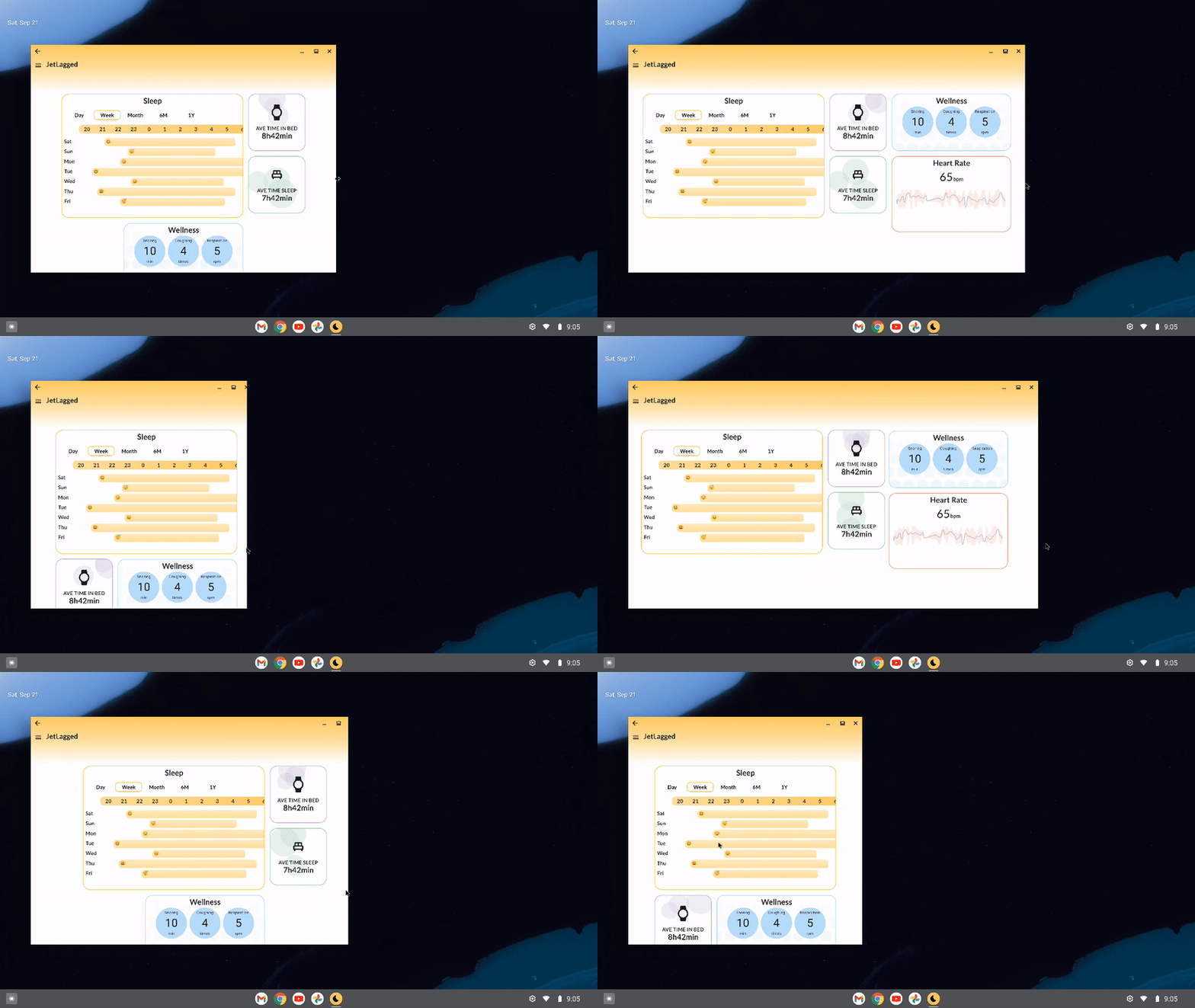
From the above logic, the UI will appear in the following ways on different device sizes:

Side by side comparisons of the differeces in UI on three different sized devices
Different UI on different sized devices

Use movableContentOf to maintain bits of UI state across screen resizes

Movable content allows you to save the contents of a Composable to move it around your layout hierarchy without losing state. It should be used for content that is perceived to be the same - just in a different location on screen.

Imagine this, you are moving house to a different city, and you pack a box with a clock inside of it. Opening the box in the new home, you’d see that the time would still be ticking from where it left off. It might not be the correct time of your new timezone, but it will definitely have ticked on from where you left it. The contents inside the box don’t reset their internal state when the box is moved around.

What if you could use the same concept in Compose to move items on screen without losing their internal state?

Take the following scenario into account: Define different Tile composables that display an infinitely animating value between 0 and 100 over 5000ms.


@Composable
fun Tile1() {
    val repeatingAnimation = rememberInfiniteTransition()

    val float = repeatingAnimation.animateFloat(
        initialValue = 0f,
        targetValue = 100f,
        animationSpec = infiniteRepeatable(repeatMode = RepeatMode.Reverse,
            animation = tween(5000))
    )
    Box(modifier = Modifier
        .size(100.dp)
        .background(purple, RoundedCornerShape(8.dp))){
        Text("Tile 1 ${float.value.roundToInt()}",
            modifier = Modifier.align(Alignment.Center))
    }
}

We then display them on screen using a Column Layout - showing the infinite animations as they go:

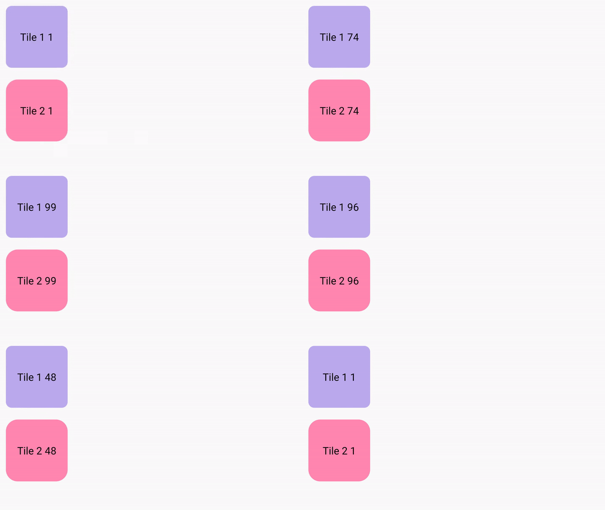
A purple tile stacked in a column above a pink tile. Both tiles show a counter, counting up from 0 to 100 and back down to 0

But what If we wanted to lay the tiles differently, based on if the phone is in a different orientation (or different screen size), and we don’t want the animation values to stop running? Something like the following:

@Composable
fun WithoutMovableContentDemo() {
    val mode = remember {
        mutableStateOf(Mode.Portrait)
    }
    if (mode.value == Mode.Landscape) {
        Row {
           Tile1()
           Tile2()
        }
    } else {
        Column {
           Tile1()
           Tile2()
        }
    }
}

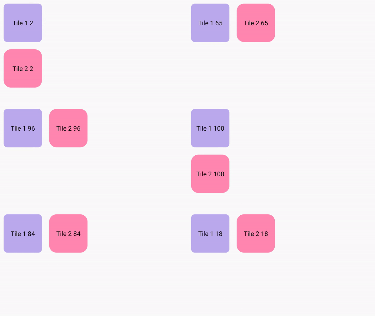
This looks pretty standard, but running this on device - we can see that switching between the two layouts causes our animations to restart.

A purple tile stacked in a column above a pink tile. Both tiles show a counter, counting upward from 0. The column changes to a row and back to a column, and the counter restarts everytime the layout changes

This is the perfect case for movable content - it is the same Composables on screen, they are just in a different location. So how do we use it? We can just define our tiles in a movableContentOf block, using remember to ensure its saved across compositions:

val tiles = remember {
        movableContentOf {
            Tile1()
            Tile2()
        }
 }

Now instead of calling our composables again inside the Column and Row respectively, we call tiles() instead.

@Composable
fun MovableContentDemo() {
    val mode = remember {
        mutableStateOf(Mode.Portrait)
    }
    val tiles = remember {
        movableContentOf {
            Tile1()
            Tile2()
        }
    }
    Box(modifier = Modifier.fillMaxSize()) {
        if (mode.value == Mode.Landscape) {
            Row {
                tiles()
            }
        } else {
            Column {
                tiles()
            }
        }

        Button(onClick = {
            if (mode.value == Mode.Portrait) {
                mode.value = Mode.Landscape
            } else {
                mode.value = Mode.Portrait
            }
        }, modifier = Modifier.align(Alignment.BottomCenter)) {
            Text("Change layout")
        }
    }
}

This will then remember the nodes generated by those Composables and preserve the internal state that these composables currently have.

A purple tile stacked in a column above a pink tile. Both tiles show a counter, counting upward from 0 to 100. The column changes to a row and back to a column, and the counter continues seamlessly when the layout changes

We can now see that our animation state is remembered across the different compositions. Our clock in the box will now keep state when it's moved around the world.

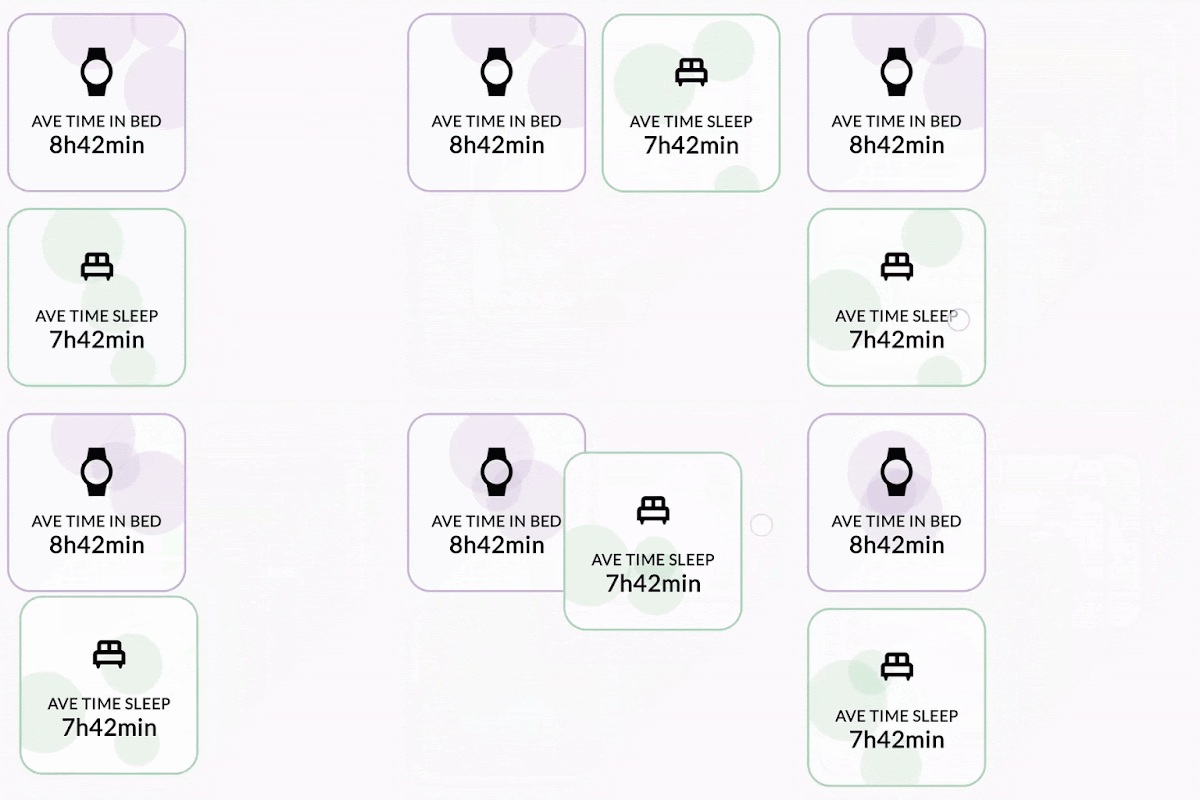
Using this concept, we can keep the animating bubble state of our cards, by placing the cards in movableContentOf:

Language
val timeSleepSummaryCards = remember { movableContentOf { AverageTimeInBedCard() AverageTimeAsleepCard() } } LookaheadScope { FlowRow( modifier = Modifier.fillMaxSize(), horizontalArrangement = Arrangement.Center, verticalArrangement = Arrangement.Center, maxItemsInEachRow = 3 ) { //.. if (windowSizeClass == WindowWidthSizeClass.Compact) { timeSleepSummaryCards() } else { FlowColumn { timeSleepSummaryCards() } } // } }

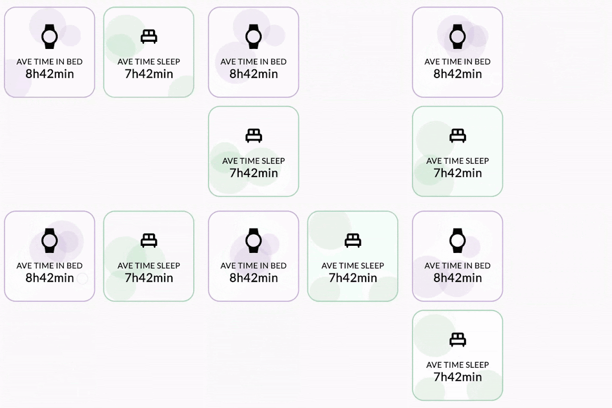
This allows the cards state to be remembered and the cards won't be recomposed. This is evident when observing the bubbles in the background of the cards, on resizing the screen the bubble animation continues without restarting the animation.

A purple tile showing Average time in bed stacked in a column above a green tile showing average time sleep. Both tiles show moving bubbles. The column changes to a row and back to a column, and the bubbles continue to move across the tiles as the layout changes

Use Modifier.animateBounds() to have fluid animations between different window sizes

From the above example, we can see that state is maintained between changes in layout size (or layout itself), but the difference between the two layouts is a bit jarring. We’d like this to animate between the two states without issue.

In the latest compose-bom-alpha (2024.09.03), there is a new experimental custom Modifier, Modifier.animateBounds(). The animateBounds modifier requires a LookaheadScope.

LookaheadScope enables Compose to perform intermediate measurement passes of layout changes, notifying composables of the intermediate states between them. LookaheadScope is also used for the new shared element APIs, that you may have seen recently.

To use Modifier.animateBounds(), we wrap the top-level FlowRow in a LookaheadScope, and then apply the animateBounds modifier to each card. We can also customize how the animation runs, by specifying the boundsTransform parameter to a custom spring spec:

val boundsTransform = { _ : Rect, _: Rect ->
   spring(
       dampingRatio = Spring.DampingRatioNoBouncy,
       stiffness = Spring.StiffnessMedium,
       visibilityThreshold = Rect.VisibilityThreshold
   )
}


LookaheadScope {
   val animateBoundsModifier = Modifier.animateBounds(
       lookaheadScope = this@LookaheadScope,
       boundsTransform = boundsTransform)
   val timeSleepSummaryCards = remember {
       movableContentOf {
           AverageTimeInBedCard(animateBoundsModifier)
           AverageTimeAsleepCard(animateBoundsModifier)
       }
   }
   FlowRow(
       modifier = Modifier
           .fillMaxSize()
           .windowInsetsPadding(insets),
       horizontalArrangement = Arrangement.Center,
       verticalArrangement = Arrangement.Center,
       maxItemsInEachRow = 3
   ) {
       JetLaggedSleepGraphCard(uiState.value.sleepGraphData, animateBoundsModifier.widthIn(max = 600.dp))
       if (windowSizeClass == WindowWidthSizeClass.Compact) {
           timeSleepSummaryCards()
       } else {
           FlowColumn {
               timeSleepSummaryCards()
           }
       }


       FlowColumn {
           WellnessCard(
               wellnessData = uiState.value.wellnessData,
               modifier = animateBoundsModifier
                   .widthIn(max = 400.dp)
                   .heightIn(min = 200.dp)
           )
           HeartRateCard(
               modifier = animateBoundsModifier
                   .widthIn(max = 400.dp, min = 200.dp),
               uiState.value.heartRateData
           )
       }
   }
}

Applying this to our layout, we can see the transition between the two states is more seamless without jarring interruptions.

A purple tile showing Average time in bed stacked in a column above a green tile showing average time sleep. Both tiles show moving bubbles. The column changes to a row and back to a column, and the bubbles continue to move across the tiles as the layout changes

Applying this logic to our whole dashboard, when resizing our layout, you will see that we now have a fluid UI interaction throughout the whole screen.

Moving image demonstrating responsive design in Jetlagged where items animate positions automatically

Summary

As you can see from this article, using Compose has enabled us to build a responsive dashboard-like layout by leveraging flow layouts, WindowSizeClasses, movable content and LookaheadScope. These concepts can also be used for your own layouts that may have items moving around in them too.

For more information on these different topics, be sure to check out the official documentation, for the detailed changes to JetLagged, take a look at this pull request.

SAP integrated NavigationSuiteScaffold in just 5 minutes to create adaptive navigation UI

Posted by Alex Vanyo – Developer Relations Engineer

SAP Mobile Start is an app that centralizes access to SAP's mobile business suite, a hub for users to keep track of their companies’ processes and data so they can efficiently manage their daily to-dos while on the move.

Recently, SAP Mobile Start developers prioritized building an adaptive app that looks great across devices, including tablets and foldables, to create a more seamless user experience. Using Jetpack Compose and Material 3 design, the team efficiently implemented intuitive, user-friendly features to increase accessibility across its users’ preferred devices.


Adaptive design across devices

With over 300 million daily active users on foldables, tablets, and Chromebooks today, building apps that adapt to varied screen sizes is important for providing an optimal user experience. But simply stretching the UI to fit different screen sizes can drastically alter it from its original form, obscuring the interface and impairing the user experience.

“We focused on situations where we could make better use of available space on large screens,” said Laura Bergmann, UX designer for SAP. “We wanted to get rid of screens that are stretched from edge to edge, full-screen drill-downs or dialogs, and use space more efficiently.”

Now, after optimizing for different devices, SAP Mobile Start dynamically adjusts its layouts by swapping components and showing or hiding content based on the available window size instead of stretching UI elements to match a device's screen.

The SAP team also implemented canonical layouts, common UI designs that split a screen into panes according to its size. By separating content into panes, SAP’s users can manage their business workflows more productively. Depending on the window size class, the supporting pane adjusts the UI without additional custom logic. For example, compact windows typically utilize one pane, while larger windows can utilize multiple.

“Adopting the new canonical layouts from Google helped us focus more on designing unique app capabilities for SAP’s business scenarios,” said Laura. “With the available navigational elements and patterns, we can now channel our efforts into creating a more engaging user experience without reinventing the wheel.”

SAP developers started by implementing supporting panes to create multi-pane layouts that efficiently utilize on-screen space. The first place developers added supporting panes was on the app’s “To-Do” details page. To-dos used to be managed in a single pane, making it difficult to review the comments and tickets simultaneously. Now, tickets and comments are reviewed in primary and secondary panes on the same screen using SupportingPaneScaffold.

We focused on making better use of the available space in large screens. We wanted to move away from UIs that are stretched to adaptive layouts that enhance productivity.”  — Laura Bergmann, UX designer at SAP

Fast implementation using Compose Material 3 Adaptive library

SAP Mobile Start is built entirely with Jetpack Compose, Android’s modern declarative toolkit for building native UI. Compose helped SAP developers build new UI faster and easier than ever before thanks to composables, reusable code blocks for building common UI components. The team also used Compose Navigation to integrate seamless navigation between composables, optimizing travel between new UI on all screens.

It took developers only five minutes to integrate the NavigationSuiteScaffold from the new Compose Material 3 adaptive library, rapidly adapting the app’s navigation UI to different window sizes, switching between a bottom navigation bar and a vertical navigation rail. It also eliminated the need for custom logic, which previously determined the navigation component based on various window size classes. The NavigationSuiteScaffold also reduced the custom navigation UI logic code by 59%, from 379 lines to 156.

“Jetpack Compose simplified UI development,” said Aditya Arora, lead Android developer. “Its declarative nature, coupled with built-in support for Material Design and dark theme, significantly increased our development efficiency. By simply describing the desired UI, we've reduced code complexity and improved maintainability.”

SAP developers used live edit and layout inspector in Android Studio to test and optimize the app for large screens. These features were “total game changers” for the SAP team because they helped iterate and inspect layout issues faster when optimizing for new screens.

With its @PreviewScreenSizes annotation and device streaming powered by Firebase, Jetpack Compose also made testing the app's UI across various screen sizes easier. SAP developers look forward to Compose Screenshot Testing being completed, which will further streamline UI testing and ensure greater visual consistency within the app.

Using Jetpack Compose, SAP developers also quickly and easily implemented new Material 3 design concepts from the Compose M3 Adaptive library. Material 3 design emphasizes personalizing the app experience, improving interactions with modern visual aesthetics.

Compose's flexibility made replacing the standard Material Theme with their own custom Fiori Horizon Theme simple, ensuring a consistent visual appearance across SAP apps. “As early adopters of the Compose M3 Adaptive library, we collaborated with Google to refine the API,” said Aditya. “Since our app is completely Compose-based, leveraging the new Compose Material 3 Adaptive library was a piece of cake.”

A list layout adapting to and from a list detail layout depending on the window size

As large-screen devices like tablets, foldables, and Chromebooks become more popular, building layouts that adapt to varied screen sizes becomes increasingly crucial. For SAP Mobile Start developers, reimagining their app across devices using Jetpack Compose and Material 3 design guidelines was simple. Using Android’s collection of tools and resources, creating adaptive UIs for all the new form factors hitting the market today is faster and easier than ever.

“Optimizing for large screens is crucial. The market for tablets, foldables, and Chromebooks is booming. Don't miss out on this opportunity to improve your user experience and expand your app's reach,” said Aditya.

Get started

Learn how to improve your UX by optimizing for large screens and foldables using Jetpack Compose and Material 3 design.

Max implemented UI changes 30% faster using Jetpack Compose

Posted by Tomáš Mlynarič, Developer Relations Engineer
Max®, which launched in the US on May 23, 2023, is an enhanced streaming platform from Warner Bros. Discovery, delivering unparalleled quality content for everyone in the household. Max developers want to provide the best UX possible, and they’re always searching for new ways to do that. That’s why Max developers built the app using Jetpack Compose, Android’s modern declarative toolkit for creating native UI. Building Max’s UI with Compose set the app up for long-term success, enabling developers to build new experiences in a faster and easier way.

Compose streamlines development

Max is the latest app from Warner Bros. Discovery and builds on the company’s prior learnings from HBO Max and discovery+. When Max development began in late 2022, developers had already used Compose to build the content discovery feature on discovery+—one of its core UI features.

“It was natural to continue our adoption of Compose to the Max platform,” said Boris D’Amato, Sr. Staff Software Engineer at Max.

Given the team’s previous experience using Compose on discovery+, they knew it would streamline development and improve the app’s maintainability. In the end, building Max with Compose reduced the app’s boilerplate code, increased the re-usability of its UI elements, and boosted developer productivity overall.

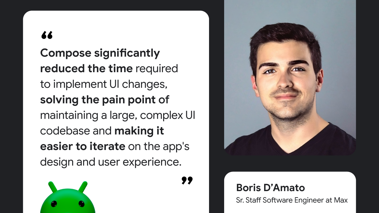
“Compose significantly reduced the time required to implement UI changes, solving the pain point of maintaining a large, complex UI codebase and making it easier to iterate on the app's design and user experience,” said Boris.

Today, Max’s UI is built almost entirely with Compose, and developers estimate that adopting Compose allowed them to implement UI changes 30% faster than with Views. Thanks to the toolkit’s modular nature, developers could build highly reusable components and adapt or combine them to form new UI elements, creating a more cohesive app design.

Compose significantly reduced the time required to implement UI changes, solving the pain point of maintaining a large, complex UI codebase and making it easier to iterate on the app's design and user experience,” — Boris D’Amato, Sr. Staff Software Engineer at Max

More improvements with Compose

Today, Compose is so integral to Max's design that the app's entire UI architecture is designed specifically to support Compose. For example, developers built a system to dynamically render server-driven, editorially curated content and user-personalized recommendations without having to ship a new version of the app. To support this system, developers relied on the best practices when architecting Compose apps, leveraging Compose's smart recompositioning and skipability for the smoothest experience possible.

Much like the discovery+ platform, Compose is also used for Max’s content discovery feature. This feature helps Max serve tailored content to each user based on how they use the app. Thanks to Compose, it was easy for developers to ensure this feature worked as intended because it allowed them to test each part in manageable segments.

“One of the features most impacted by using Compose was our content discovery system. Compose enabled us to create a highly dynamic and interactive interface that adapts in real-time to user context and preferences,” said Boris.

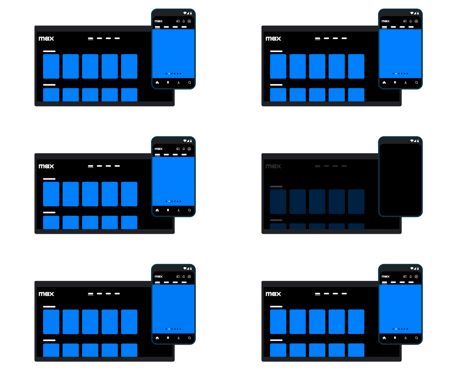
Adapting to users’ unique needs is another reason Compose has impressed Max developers. Compose makes it easy to support the many different screens and form factors available on the market today. With the Window size classes API, Max can scale its UI in real time to accommodate screen size and shape variations for tablets and foldables.

Examples of UX on large and small screens

The future with Compose

Since adopting Compose, the Max team has noticed increased interest from prospective job candidates excited about working with the latest Android technologies.

“Whenever we mention that Max is built using Compose, the excitement in the candidates is palpable. It indicates that we’re investing in keeping our tech stack updated and our focus on the developer experience,” said Boris.

Looking ahead, the Max team plans to lean further into its Compose codebase and make even more use of the toolkit’s features, like animation APIs, predictive gestures, and widgets.

“I absolutely recommend Jetpack Compose. Compose's declarative approach to UI development allows for a more intuitive and efficient design process, making implementing complex UIs and animations easy. Once you try Compose, there’s no going back,” said Boris.

Get started

Optimize your UI development with Jetpack Compose.

Developers for adidas CONFIRMED build features 30% faster using Jetpack Compose

Posted by Nick Butcher – Product Manager for Jetpack Compose, and Florina Muntenescu – Developer Relations Engineer

adidas CONFIRMED is an app for the brand’s most loyal fans who want its latest, curated collections that aren’t found anywhere else. The digital storefront gives streetwear, fashion, and style enthusiasts access to adidas' most exclusive drops and crossovers so they can shop them as soon as they go live. The adidas CONFIRMED team wants to provide users a premium experience, and it’s always exploring new ways to elevate the app’s UX. Today, its developers are more equipped than ever to improve the in-app experience using Jetpack Compose, Android’s modern declarative toolkit for building UI.

Improving the UX with Jetpack Compose

adidas CONFIRMED designers conduct quarterly consumer surveys for feedback from users regarding new app flows and UI enhancements. Their surveys revealed that 80% of the app’s users prefer animated visuals because animations encourage them to explore and interact with the app more. adidas CONFIRMED developers wanted to implement new design elements and animations across the app’s interface to strengthen engagement, but the app’s previous View-based system limited their ability to create engaging UX in a scalable way.

“We decided to build dynamic elements and animations across many of our screens and user journeys,” said Rodrigo Represa, an Android engineer at adidas. “We had an ambitious list of UI updates we wanted to make and started looking for solutions to help us achieve them.”

Switching to Compose allowed adidas CONFIRMED developers to create features faster than ever. The improvement in engineering efficiency has been noticeable, with the team estimating that Compose enables them to create new features roughly 30% faster than with Views. Today, more than 80% of the app’s UI has been migrated to Compose.

“I can build the same feature with Compose about 30% faster than with Views.” — Rodrigo Represa, Android engineer at adidas

Innovating the in-app experience

As part of the app’s new interface update, adidas CONFIRMED developers created an exciting, animated experience called Shoes Tournament. This competition positions different brand-collaborator sneakers head to head in a digital tournament where users vote for their favorite shoe. It took two developers only three months to build this feature from the ground up using Compose. And users loved it — it increased the app’s weekly active users by 8%.

UX screen of shoe tournament. Top shoe is clicked. Text reads: It took adidas' Android devs only 3 months to build this feature from the ground up using Compose.

Before transitioning to Compose, it was hard for the team to customize the adidas CONFIRMED app to incorporate branding from its collaborators. With Compose, it’s easy. For instance, the app’s developers can now create a dynamic design system using CompositionLocals. This functionality helps developers update the app's appearance during collab launches, providing a more appealing user experience while maintaining a consistent and clean design.

One of the most exciting animations adidas CONFIRMED developers added utilized device sensors. Users can view and interact with the products they’re looking at on product display pages by simply moving their devices, just as if they were holding the product in real life. Developers used Compose to create realistic lighting effects for the animation to make the viewing experience more engaging.

An easier way to build UI

Using composables allowed adidas CONFIRMED developers to reuse existing components. As both the flagship adidas app and the adidas CONFIRMED app are part of the same monorepo, engineers could reuse composables across both apps, like forms and lists, enabling them to implement new features quickly and easily.

“The accelerated development with Compose provided our team of seven with more time, enabling us to strike a healthy balance between delivering new functionalities and ensuring the long-term health and sustainability of our app,” said Rodrigo.

Compose also helped to improve app stability and performance for the team. They noticed a significant reduction in app-related crashes, and have seen virtually no UI-related crashes, since migrating the app to Compose. The team is proud to provide a 99.9% crash-free user experience.

Compose’s efficiency not only accelerated development, but also helped us achieve our business goals.” — Rodrigo Represa, Android engineer at adidas

A better app built with the future in mind

Compose opened doors to implementing new features faster than ever. With Compose’s clean and concise usage of Kotlin, it was easy for developers to create the ambitious and engaging interface adidas CONFIRMED users wanted. And the team doesn’t plan to stop there.

The adidas CONFIRMED team wants to lean further into its new codebase and fully adopt Compose moving forward. They also want to bring the app to new screens using more of the Compose suite and are currently developing an app widget using Jetpack Glance. This new experience will provide users with a streamlined feed of new product information for an even more efficient user experience.

“I recommend Compose because it simplifies development and is a more intuitive and powerful approach to building UI,” said Rodrigo.

Get started

Optimize your UI development with Jetpack Compose.

Top 3 Updates with Compose across Form Factors at Google I/O ’24

Posted by Chris Arriola – Developer Relations Engineer

Google I/O 2024 was filled with lots of updates and announcements around helping you be more productive as a developer. Here are the top 3 announcements around Jetpack Compose and Form Factors from Google I/O 2024:

#1 New updates in Jetpack Compose

The June 2024 release of Jetpack Compose is packed with new features and improvements such as shared element transitions, lazy list item animations, and performance improvements across the board.

With shared element transitions, you can create delightful continuity between screens in your app. This feature works together with Navigation Compose and predictive back so that transitions can happen as users navigate your app. Another highly requested feature—lazy list item animations—is also now supported for lazy lists giving it the ability to animate inserts, deletions, and reordering of items.

Jetpack Compose also continues to improve runtime performance with every release. Our benchmarks show a faster time to first pixel of 17% in our Jetsnack Compose sample. Additionally, strong skipping mode graduated from experimental to production-ready status further improving the performance of Compose apps. Simply update your app to take advantage of these benefits.

Read What’s new in Jetpack Compose at I/O ‘24 for more information.


#2 Scaling across screens with new Compose APIs and Tools

During Google I/O, we announced new tools and APIs to make it easier to build across screens with Compose. The new Material 3 adaptive library introduces new APIs that allow you to implement common adaptive scenarios such as list-detail, and supporting pane. These APIs allow your app to display one or two panes depending on the available size for your app.

Watch Building UI with the Material 3 adaptive library and Building adaptive Android apps to learn more. If you prefer to read, you can check out About adaptive layouts in our documentation.

We also announced that Compose for TV 1.0.0 is now available in beta. The latest updates to Compose for TV include better performance, input support, and a whole range of improved components that look great out of the box. New in this release, we’ve added lists, navigation, chips, and settings screens. We’ve also added a new TV Material Catalog app and updated the developer tools in Android Studio to include a new project wizard to get a running start with Compose for TV.

Finally, Compose for Wear OS has added features such as SwipeToReveal, an expandableItem, and a range of WearPreview supporting annotations. During Google I/O 2024, Compose for Wear OS graduated visual improvements and fixes from beta to stable. Learn more about all the updates to Wear OS by checking out the technical session.

Check out case studies from SoundCloud and Adidas to see how apps are leveraging Compose to build their apps and learn more about all the updates for Compose across screens by reading more here!


#3 Glance 1.1

Jetpack Glance is Android’s modern recommended framework for building widgets. The latest version, Glance 1.1, is now stable. Glance is built on top of Jetpack Compose allowing you to use the same declarative syntax that you’re used to when building widgets.

This release brings a new unit test library, Error UIs, and new components. Additionally, we’ve released new Canonical Widget Layouts on GitHub to allow you to get started faster with a set of layouts that align with best practices and we’ve published new design guidance published on the UI design hub — check it out!

To learn more about using Glance, check out Build beautiful Android widgets with Jetpack Glance. Or if you want something more hands-on, check out the codelab Create a widget with Glance.


You can learn more about the latest updates to Compose and Form Factors by checking out the Compose Across Screens and the What’s new in Jetpack Compose at I/O ‘24 blog posts or watching the spotlight playlist!

SoundCloud supported more screens using 45% less code with Jetpack Compose

Posted by Chris Arriola, Developer Relations Engineer and Nick Butcher, Product Manager for Jetpack Compose

As one of the largest audio streaming platforms in the world, SoundCloud supports a network of creators who use its service to upload and promote their music. SoundCloud’s developers are always exploring ways to improve its user experience, which means going beyond simply building the best mobile app. The team also wants to make SoundCloud available on as many form factors as possible so users can easily access and listen to SoundCloud in any situation and on the devices that work best for them.

That’s why the SoundCloud team adopted Jetpack Compose, Android’s modern declarative toolkit for building native UI. Compose enabled SoundCloud engineers to not only expand the app to more form factors, but also streamline new feature development—in some cases reducing nearly half the code.

Compose helped us reach new users and markets, ultimately increasing our global reach” — Vitus Ortner, Android engineer at SoundCloud


Simplified UI development with Compose

Before migrating to Compose, building UI was much slower for SoundCloud developers because they had to constantly switch context between Kotlin and XML. This also made managing and maintaining its design system much more difficult. The team’s engineers wanted to find a simpler way to write code, and they knew Compose would help them get there.

“We started adopting Compose to quickly build dynamic layouts using Kotlin, the language we love,” said Vitus Ortner, an Android engineer at SoundCloud. “We wanted to empower our engineers to effectively create rich UIs through Compose.”

SoundCloud engineers overhauled the app’s design system with Compose and can now build new features using 45% less code on average. Compose’s concise Kotlin syntax and its ability to create reusable UI made design and maintenance much easier for the team. Prototyping new features was also simpler thanks to Compose’s declarative approach, as well as its live edit and UI preview features.

“We implemented a new content discovery feature with an interactive vertical feed layout. We used Compose to prototype, and it enabled us to iterate fast even when we changed our design ideas daily,” said Vitus. “That wouldn’t have been possible with Views.”

Compose’s interoperability with Views made it easier for developers to migrate SoundCloud’s design system to the new toolkit because they could do it gradually. Because SoundCloud uses a model–view–viewModel architecture, developers could reuse the app’s old view models in the new Compose framework. This meant they only needed to migrate the app’s View-based layouts to Compose, rather than rewrite the entire UI layer.

“Compose helped us reach new users and markets, ultimately increasing our global reach” — Vitus Ortner, Android engineer at SoundCloud

Optimizing for more form factors with Compose

Switching to Compose enabled developers to do more than streamline the app’s codebase. It also made supporting multiple form factors easier. With Compose, SoundCloud engineers were able to more easily bring the app to tablets, TVs, cars, and wearables.

“We’re using Compose across all form factors in the Android ecosystem,” said Vitus. “We implemented our Wear OS and TV apps from the ground up with Compose, which allowed us to rapidly iterate and ship new products in a fraction of the time it would have taken before.”

To adapt the mobile experience to a variety of screen sizes while maintaining interoperability with existing code, SoundCloud developers provide different XML layouts to combine existing View code with newer Compose components. Easy-to-implement features like this helped the team quickly build experiences across different devices, including optimizing SoundCloud for cars and tablets.

With these improvements, SoundCloud engineers built their Wear OS app and TV app from the ground up in just four months using Compose. According to Vitus, this “would’ve been unthinkable” using their previous system.

“Our mobile Compose skills transferred directly to Compose for other form factors,” said Vitus. “The concepts and most APIs are the same across form factors. We still needed to learn some form factor-specific APIs, like ScalingLazyColumn for Wear OS and TvLazyColumn for TVs.”

UI example

Future investment in Compose

By migrating its Android app to Compose, SoundCloud developers improved productivity, simplified the app’s code, and established smoother development processes for new features and experiences. Switching to Compose also helped SoundCloud expand to more form factors, creating new ways for users to access the platform.

“Compose helped us reach new users and markets, ultimately increasing our global reach,” said Vitus. “We're fully committed to Compose and plan to use it for all projects in the future.”


Get started

Optimize your UI development with Jetpack Compose.