Tag Archives: Jetpack

SoundCloud uses Jetpack Glance to build Liked Tracks widget in just 2 weeks

Posted by Summers Pittman – Developer Relations Engineer

To make it even easier for users to listen on Android, developers at SoundCloud — an artist-first music platform — turned to Jetpack Glance to create a Liked Tracks widget for their highly-rated app, which boasts 4.6 stars and over 100 million downloads. With a catalog of over 400 million tracks from more than 40 million creators, SoundCloud is dedicated to connecting artists and fans through music, and this latest update to its Android app offers listeners an even more convenient way to enjoy their favorite tracks. Propelled by Glance, the team was able to complete the project in just two weeks, saving precious development time and boosting engagement.

Maximize visibility with user-friendly touchpoints

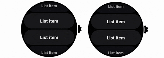
By showcasing the artwork of their recently liked tracks, the new Liked Tracks widget allows users to to jump directly to a specific song or access their full track list right from their home screen. This keeps SoundCloud front and center for listeners, acting as a shortcut to their personal libraries and encouraging them to tune back in.

Liked Tracks isn’t SoundCloud’s first widget. Over a decade ago, SoundCloud developers used RemoteViews to create a Player widget that let users easily control playback and like tracks. After recently updating the Player widget based on design feedback, developers made sure to prioritize a personalized interface for Liked Tracks. The new widget features both light and dark modes, resizes freely to accommodate user preferences, and dynamically adapts its theme to complement the user's wallpaper. Backed by Glance, these design choices ensured the widget isn’t just seamless to use but also serves as an appealing and tailored gateway into the SoundCloud app.

A foldable smartphone is open, displaying various apps and widgets, including music controls and 'Liked tracks'
SoundCloud’s Liked Tracks widget in action.

Accelerate development cycles with Glance

Glance also played a crucial role in streamlining the development of Liked Tracks. For developers already proficient in Compose, Glance’s intuitive design felt familiar, minimizing the learning curve and accelerating the team's onboarding. The platform’s collection of code samples provided a useful starting point, too, helping developers quickly grasp its capabilities and best practices. “Using sample app repositories is a great way to learn. I can check out an entire repository and inspect how the code operates,” said Sigute Kateivaite, lead SoundCloud engineer on the Android team. “It sped up our widget development by a lot.”

Quote card reads: “Using sample app repositories is a great way to learn. It sped up our widget development.” — Sigute Kateivaite, Android Engineer at SoundCloud

The declarative nature of Glance’s UI was especially beneficial to developers. Because they didn’t have to use additional XML files when building, developers could create cleaner, more readable code with less boilerplate. Glance also allowed them to work with modules separately, meaning components could be written and integrated one at a time and reused for later iterations. By isolating components, developers could quickly test modules, identify and resolve issues, and build for different states without duplication, leading to more efficient workflows.

Glance’s design also improved the overall code quality. The ability to make changes using Android Studio’s support for Glance’s real-time preview enabled developers to build components in isolation without needing to integrate the UI component into the widget or deploy the full widget on the phone. They could represent various states, view all relevant cases, and review changes to components without having to compile the full app. Put simply, Glance made developers more productive because it allowed them to iterate faster, refining the widget for a more polished final product.

Elevate app widgets with the power of Glance

With effective new workflows and no major development issues, the SoundCloud team applauds Glance for streamlining a successful production. “With the new Liked Tracks widget, rollout has been really stable,” Sigute said. “Development and the testing process went really smoothly.” Early data also shows promising results — active users now interact with the widget to access the app multiple times a day on average.

Stat card reads:'2X average daily active user interaction with widget feature.'
2X average daily active user interaction with widget feature.

Looking ahead, the SoundCloud team is eager to employ more of Glance to improve existing widgets, like adopting canonical layouts, and even develop new ones. While the current Liked Tracks widget focuses primarily on image display, the team is interested in including other types of content to further enrich user experience. Developers also hope to migrate the Player widget over to Glance to access the framework’s robust theming options, simplify resizing processes, and address some long-standing bugs.

Beyond the Liked Tracks and Player features, the team is excited about the potential of using Glance to build a wider range of widgets. The modular, component-based architecture of the Liked Tracks widget, with reusable elements like UserAvatar and Logo, offers a solid foundation for future development, promising to simplify processes from the start.

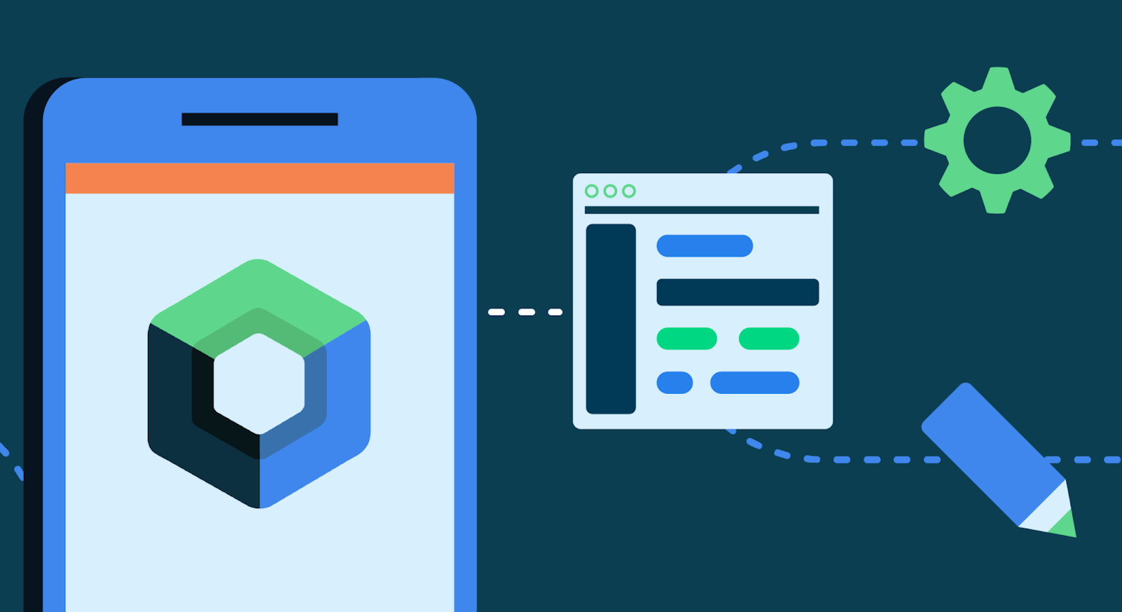
Get started building custom app widgets with Jetpack Glance

Rapidly develop and deploy widgets that keep your app visible and engaging with Glance.


This blog post is part of our series: Spotlight Week on Widgets, where we provide resources—blog posts, videos, sample code, and more—all designed to help you design and create widgets. You can read more in the overview of Spotlight Week: Widgets, which will be updated throughout the week.

Meet the Android Studio Team: A Conversation with Staff Developer Programs Engineer, Trevor Johns

Posted by Ashley Tschudin – Social Media Specialist, MTP at Google

Android Studio isn't just code and algorithms – it's built by real people with fascinating stories. Our "Meet the Android Studio Team" series gives you a glimpse into the lives and passions of the talented individuals who craft the tools you use every day. Tune in each month to meet new team members and discover their unique journey.


Trevor Johns: Building Android Studio for You

Trevor Johns, Staff Developer Programs Engineer

Meet Trevor Johns, a seasoned Staff Developer Programs Engineer at Google.

Reflecting on his journey, Trevor sheds light on the most impactful advancements in the Android ecosystem and offers a glimpse into his vision for the future where AI plays a pivotal role in streamlining development workflows.

Trevor discusses the Android Studio team's dedication to enhancing developer productivity through AI, highlighting their focus on understanding and addressing developer needs, and reflects on the dynamic journey of Android development while sharing valuable insights.


Can you tell us about your journey to becoming a part of the Android Studio team? What sparked your interest in Android development?

I've been at Google in various roles since Google since 2007, and transferred to Android team in 2009 shortly after the launch of the HTC G1 — the first publicly available Android phone. Even in those early days it was clear that mobile computing was a unique opportunity to reimagine many of the limitations of desktop computers and how users interact with the digital world.

Among my first projects were helping developers optimize their apps for the MyTouch 3G and Motorola Droid, as well as creating developer resources for Android's 1.6 Donut release.

Over the years, I've worked on various parts of the Android OS including our first tablet devices, Android Wear, helping develop the original Android support libraries (which later became Jetpack), and the migration to Kotlin.

Recently I joined the Android Studio team to help improve developer productivity, using AI to streamline common developer tasks and help developers have more time to focus on creativity.

How does the Android Studio team ensure that products or features meet the ever-changing needs of developers?

Like the rest of Android, we approach development of new features by listening to our developer community. We hold regular listening sessions with publishers, work with our UX research team to conduct case studies, and participate in online discussions to get a sense for where developers face the most friction — and then try to find ways to reduce that friction.

For example, we developed Gemini in Android Studio's integration with Play Vitals and Firebase Crashlytics based on feedback from members of the developer community who commented to let us know where they would find AI most useful across their developer workflow.

Speaking of, if you'd like to provide us with feedback, you can always file a bug or feature request on the Android Studio issue tracker.

How does the Studio team contribute to Google's broader vision for the Android platform?

In addition to listening to the Android community, we also keep an eye on what's being developed across the rest of the Android team and make sure that Android Studio has the right tools to help developers quickly migrate between Android versions and adopt those new platform features.

Beyond that, the Studio team provides leading edge editing tools to make sure that Android remains one of the easiest computing platforms to develop for — unlocking this unique computing platform for millions of developers.

In your opinion, what is the most impactful feature or improvement the Android team has introduced in recent years, and why?

For developers, my answer would have to be the migration to Kotlin. This language has modernized the Android developer experience — letting developers write apps with less code and fewer errors. It's also the foundation for Jetpack Compose, which is the future of Android UI development.

If you could wave a magic wand and add one dream feature to the Android universe, what would it be and why?

I'd love to see Gemini be able to not just autocomplete code for me, but generate scaffolds for new projects. That way I can focus on building features rather than worrying about basic structure when starting a new project.

Develop Android Apps with Kotlin

Follow Trevor's lead and embrace the power of Kotlin for modern Android development. Enhance your skills and write better Android apps faster with Kotlin.

Stay tuned!

Get ready for another inspiring story! The "Meet the Android Studio Team" series continues next week with a new team member in the spotlight. Don't miss their unique insights and journey.

Find Trevor Johns on LinkedIn, X, Bluesky, and Medium.

Apps adopt Transformer to support more reliable and performant media editing use cases

Posted by Caren Chang – Developer Relations Engineer

The Jetpack Media3 library enables Android apps to build high quality media apps. As part of the Media3 library, the Transformer module aims to provide easy to use, reliable, and performant APIs for transcoding and editing media.

For example, apps can use Transformer to apply editing operations such as trimming a long piece of media file, or applying effects to video tracks. Transformer can also be used to convert media files from one format to another, such as adjusting the resolution or encoding of the media file.

Developing Transformer APIs

As part of the process to introduce new APIs, our engineering team works closely with Google apps such as Google Photos to test and experiment the new APIs. Experimental flags are first introduced to enable performance improvements. Once the results are successful and conclusive, these experimental features are then built into the default API implementations or promoted to public APIs for all apps to use. This approach allows Transformer APIs to be tested on a wide variety of devices.

Transformer Adoption in apps

Apps that have been using Transformer in production observed in-app performance improvements, less code to maintain, and better developer experience. Let’s take a closer look at how Transformer has helped apps for their media-editing use cases.

One of users’ favorite features in Google Photos is memory sharing, where snippets of your life story that are curated and presented as Google Photos memories can now be shared as videos to social media and chat apps. However, the process of combining media items to create a video on device is resource intensive and subject to significant latency, especially on low-end devices. To reduce this latency and enable the feature on a wider range of devices, Photos adopted Transformer in their media creation pipeline. Along with other improvements made, the team found that Transformer played a part in reducing the median user latency for creating memory videos by 41% on high-end devices and 27% on mid-range devices.

The Photos app also enables users to perform media edits such as trimming or rotating a video. By adopting Transformer APIs for rotating videos, median save latency was reduced by 79% for applicable videos. The app also adopted Transformer’s API for optimizing video trimming, and observed video save latency decrease by 64%.

1 Second Everyday is a personal video journal that helps you create captivating montages and timelapses. One of the app’s main user journeys is sequentially combining short videos to create a meaningful movie. After adopting Transformer for this use case, the app observed that video encoding performance was up to 5x faster, allowing them to explore enabling 4k and HDR support. The Transformer adoption also helped decrease relevant code by 30%, making it easier for the developers to maintain the code base.

BandLab is the next-generation music creation platform used by millions around the world to make and share their music. The app originally used MediaCodecs for their video creation use cases, but found that the low level implementation resulted in native crashes that were difficult to debug. After researching more on Transformer, the team made the decision to migrate from MediaCodecs to Transformer. Overall, it only took the team 12 working days for the migration, and this resulted in a simpler codebase and more maintainable pipeline for their media creation use cases. In addition, the app observed that all previously observed native crashes were no longer occurring anymore.

What’s next for Transformers?

We’re excited to see Transformer’s adoption in the developer community, and will continue adding new features to support more media-editing use cases for the Android ecosystem including:

    • Better support for previewing media edits
    • Improving the performance and developer experience for video frame extraction
    • Easier integration with AI effects
    • and much more

Keep an eye out on what we’re working on in the Media3 Github, and file feature requests to help shape the future of Transformer!

CameraX update makes dual concurrent camera even easier

Posted by Donovan McMurray – Developer Relations Engineer

CameraX, Android's Jetpack camera library, is getting an exciting update to its Dual Concurrent Camera feature, making it even easier to integrate this feature into your app. This feature allows you to stream from 2 different cameras at the same time. The original version of Dual Concurrent Camera was released in CameraX 1.3.0, and it was already a huge leap in making this feature easier to implement.

Starting with 1.5.0-alpha01, CameraX will now handle the composition of the 2 camera streams as well. This update is additional functionality, and it doesn’t remove any prior functionality nor is it a breaking change to your existing Dual Concurrent Camera code. To tell CameraX to handle the composition, simply use the new SingleCameraConfig constructor which has a new parameter for a CompositionSettings object. Since you’ll be creating 2 SingleCameraConfigs, you should be consistent with what constructor you use.

Nothing has changed in the way you check for concurrent camera support from the prior version of this feature. As a reminder, here is what that code looks like.

// Set up primary and secondary camera selectors if supported on device.
var primaryCameraSelector: CameraSelector? = null
var secondaryCameraSelector: CameraSelector? = null

for (cameraInfos in cameraProvider.availableConcurrentCameraInfos) {
    primaryCameraSelector = cameraInfos.first {
        it.lensFacing == CameraSelector.LENS_FACING_FRONT
    }.cameraSelector
    secondaryCameraSelector = cameraInfos.first {
        it.lensFacing == CameraSelector.LENS_FACING_BACK
    }.cameraSelector

    if (primaryCameraSelector == null || secondaryCameraSelector == null) {
        // If either a primary or secondary selector wasn't found, reset both
        // to move on to the next list of CameraInfos.
        primaryCameraSelector = null
        secondaryCameraSelector = null
    } else {
        // If both primary and secondary camera selectors were found, we can
        // conclude the search.
        break
    }
}

if (primaryCameraSelector == null || secondaryCameraSelector == null) {
    // Front and back concurrent camera not available. Handle accordingly.
}

Here’s the updated code snippet showing how to implement picture-in-picture, with the front camera stream scaled down to fit into the lower right corner. In this example, CameraX handles the composition of the camera streams.

// If 2 concurrent camera selectors were found, create 2 SingleCameraConfigs
// and compose them in a picture-in-picture layout.
val primary = SingleCameraConfig(
    cameraSelectorPrimary,
    useCaseGroup,
    CompositionSettings.Builder()
        .setAlpha(1.0f)
        .setOffset(0.0f, 0.0f)
        .setScale(1.0f, 1.0f)
        .build(),
    lifecycleOwner);
val secondary = SingleCameraConfig(
    cameraSelectorSecondary,
    useCaseGroup,
    CompositionSettings.Builder()
        .setAlpha(1.0f)
        .setOffset(2 / 3f - 0.1f, -2 / 3f + 0.1f)
        .setScale(1 / 3f, 1 / 3f)
        .build()
    lifecycleOwner);

// Bind to lifecycle
ConcurrentCamera concurrentCamera =
    cameraProvider.bindToLifecycle(listOf(primary, secondary));

You are not constrained to a picture-in-picture layout. For instance, you could define a side-by-side layout by setting the offsets and scaling factors accordingly. You want to keep both dimensions scaled by the same amount to avoid a stretched preview. Here’s how that might look.

// If 2 concurrent camera selectors were found, create 2 SingleCameraConfigs
// and compose them in a picture-in-picture layout.
val primary = SingleCameraConfig(
    cameraSelectorPrimary,
    useCaseGroup,
    CompositionSettings.Builder()
        .setAlpha(1.0f)
        .setOffset(0.0f, 0.25f)
        .setScale(0.5f, 0.5f)
        .build(),
    lifecycleOwner);
val secondary = SingleCameraConfig(
    cameraSelectorSecondary,
    useCaseGroup,
    CompositionSettings.Builder()
        .setAlpha(1.0f)
        .setOffset(0.5f, 0.25f)
        .setScale(0.5f, 0.5f)
        .build()
    lifecycleOwner);

// Bind to lifecycle
ConcurrentCamera concurrentCamera =
    cameraProvider.bindToLifecycle(listOf(primary, secondary));

We’re excited to offer this improvement to an already developer-friendly feature. Truly the CameraX way! CompositionSettings in Dual Concurrent Camera is currently in alpha, so if you have feature requests to improve upon it before the API is locked in, please give us feedback in the CameraX Discussion Group. And check out the full CameraX 1.5.0-alpha01 release notes to see what else is new in CameraX.

Introducing Ink API, a new Jetpack library for stylus apps

Posted by Chris Assigbe – Developer Relations Engineer and Tom Buckley – Product Manager

With stylus input, Android apps on phones, foldables, tablets, and Chromebooks become even more powerful tools for productivity and creativity. While there's already a lot to think about when designing for large screens – see our full guidance and inspiration gallery – styluses are especially impactful, transforming these devices into a digital notebook or sketchbook. Users expect stylus experiences to feel as fluid and natural as writing on paper, which is why Android previously added APIs to reduce inking latency to as low as 4ms; virtually imperceptible. However, latency is just one aspect of an inking experience – developers currently need to generate stroke shapes from stylus input, render those strokes quickly, and efficiently run geometric queries over strokes for tools like selection and eraser. These capabilities can require significant investment in geometry and graphics just to get started.

Today, we're excited to share Ink API, an alpha Jetpack library that makes it easy to create, render, and manipulate beautiful ink strokes, enabling developers to build amazing features on top of these APIs. Ink API builds upon the Android framework's foundation of low latency and prediction, providing you with a powerful and intuitive toolkit for integrating rich inking features into your apps.

moving image of a stylus writing with Ink API on a Samsung Tab S8, 4ms showing end-to-end latency
Writing with Ink API on a Samsung Tab S8, 4ms end-to-end latency

What is Ink API?

Ink API is a comprehensive stylus input library that empowers you to quickly create innovative and expressive inking experiences. It offers a modular architecture rather than a one-size-fits-all canvas, so you can tailor Ink API to your app's stack and needs. The modules encompass key functionalities like:

    • Strokes module: Represents the ink input and its visual representation.
    • Geometry module: Supports manipulating and analyzing strokes, facilitating features like erasing, and selecting strokes.
    • Brush module: Provides a declarative way to define the visual style of strokes, including color, size, and the type of tool to draw with.
    • Rendering module: Efficiently displays ink strokes on the screen, allowing them to be combined with Jetpack Compose or Android Views.
    • Live Authoring module: Handles real-time inking input to create smooth strokes with the lowest latency a device can provide.

Ink API is compatible with devices running Android 5.0 (API level 21) or later, and offers benefits on all of these devices. It can also take advantage of latency improvements in Android 10 (API 29) and improved rendering effects and performance in Android 14 (API 34).

Why choose Ink API?

Ink API provides an out-of-the-box implementation for basic inking tasks so you can create a unique drawing experience for your own app. Ink API offers several advantages over a fully custom implementation:

    • Ease of Use: Ink API abstracts away the complexities of graphics and geometry, allowing you to focus on your app's unique inking features.
    • Performance: Built-in low latency support and optimized rendering ensure a smooth and responsive inking experience.
    • Flexibility: The modular design allows you to pick and choose the components you need, tailoring the library to your specific requirements.

Ink API has already been adopted across many Google apps because of these advantages, including for markup in Docs and Circle-to-Search; and the underlying technology also powers markup in Photos, Drive, Meet, Keep, and Classroom. For Circle to Search, the Ink API modular design empowered the team to utilize only the components they needed. They leveraged the live authoring and brush capabilities of Ink API to render a beautiful stroke as users circle (to search). The team also built custom geometry tools tailored to their ML models. That’s modularity at its finest.

moving image of a stylus writing with Ink API on a Samsung Tab S8, 4ms showing end-to-end latency

“Ink API was our first choice for Circle-to-Search (CtS). Utilizing their extensive documentation, integrating the Ink API was a breeze, allowing us to reach our first working prototype w/in just one week. Ink's custom brush texture and animation support allowed us to quickly iterate on the stroke design.” 

- Jordan Komoda, Software Engineer, Google

We have also designed Ink API with our Android app partners' feedback in mind to make sure it fits with their existing app architectures and requirements.

With Ink API, building a natural and fluid inking experience on Android is simpler than ever. Ink API lets you focus on what differentiates your experience rather than on the details of paths, meshes, and shaders. Whether you are exploring inking for note-taking, photo or document markup, interactive learning, or something completely different, we hope you’ll give Ink API a try!

Get started with Ink API

Ready to dive into the well of Ink API? Check out the official developer guide and explore the API reference to start building your next-generation inking app. We're eager to see the innovative experiences you create!

Note: This alpha release is just the beginning for Ink API. We're committed to continuously improving the library, adding new features and functionalities based on your feedback. Stay tuned for updates and join us in shaping the future of inking on Android!

15 Things to know for Android developers at Google I/O

Posted by Matthew McCullough, Vice President, Product Management, Android Developer  

AI is unlocking experiences that were not even possible a few years ago, and we’ve been hard at work reimaging Android with AI at the core, to help enable you to build a whole new class of apps. At this year’s Google I/O, we’re covering how new tools like Gemini can power building the next generations of apps on Android. Plus, we showcased a range of updates to our tools and services grounded in productivity, helping you make it faster and easier to build excellent experiences across form factors. Let’s dive in!

Powering the next generation of Apps with AI

#1: AI in your tools, with Gemini in Android Studio

Gemini in Android Studio (formerly Studio Bot) is your coding companion for Android development, and thanks to your feedback since its preview at last year’s Google I/O, we’ve evolved our models, expanded to over 200 countries and territories, and brought it into the Gemini family of products. Earlier today, we previewed a number of new features coming soon, like Code suggestions, App Quality Insights that leverage Gemini, and a preview of the multi-modal inputs that are coming using Gemini 1.5 Pro. You can read more about the updates here, and make sure to check out What’s new in Android development tools.

#2: Building with Generative AI

Android provides the solution you need to build Generative AI apps. You can use our most capable models over the Cloud with the Gemini API in Google AI or Vertex AI for Firebase directly in your Android apps. For on-device, Gemini Nano is our most efficient model. We’re working closely with a few early adopters such as Patreon, Grammarly, and Adobe to ensure we’re creating the best APIs that unlock the most innovative experiences. For example, Adobe is experimenting with Gemini Nano to enhance the on-device experience of Acrobat AI Assistant, a tool that allows their users to summarize and interact with documents. Be sure to check out the Build your own generative AI powered Android app, Android on-device gen AI under the hood, and the What’s New in Android sessions to learn more!

Moving image of Gemini Nano operating in Adobe

Excellent apps, across devices

#3: Think adaptive: apps on phones, foldables, tablets and more

Build and design apps that adapt beyond the phone, with the new Compose adaptive layout libraries built with Material guidance in beta. Add rich stylus and keyboard support to increase user productivity. Check out three of our key Android adaptive sessions at Google I/O: Designing adaptive apps, Building adaptive Android apps, and Increase user productivity with large screens and accessories.

Moving image of Gemini Nano operating in Adobe

#4: Enhance homescreens with Widgets and Jetpack Glance

Jetpack Glance 1.1 is now available in release candidate and lets you build high quality widgets using your Compose skills. Check out our new canonical layouts, design guidance and figma updates to the Android UI kit. To learn more check out our Improve the user experience of your Android app workshop and Build Android widgets with Jetpack Glance technical session.

#5-9: come back here tomorrow and Thursday!

We’ll continue to share more updates for Android Developers throughout Google I/O, so check back here tomorrow!

Developer Productivity

#10: Use Kotlin Multiplatform for sharing business logic

Kotlin Multiplatform (KMP) enables sharing Kotlin code across different platforms and several of our Jetpack libraries, like DataStore and Room, have already been migrated to take advantage of KMP. We use Kotlin Multiplatform within Google and recommend using KMP for sharing business logic between platforms. Learn more about it here.

#11: Compose: Shared Elements, performance improvements and more

The upcoming Compose June ‘24 release is packed with the features you’ve been asking for! Shared element transitions, lazy list item reordering animations, strong skipping mode, performance improvements, a new lazy flow layout and more. Read more about it in our blog.

#12: Android Studio: the latest preview, with Gemini and more

Android Studio Koala 🐨Feature Drop (2024.1.2) available today in the canary channel, builds on top of IntelliJ 2024.1 and adds new innovative features unlocked by Gemini, such as insights for crashes in App Quality Insights, code transformations and a Gemini API starter template to get you quickly started with Gemini. Additionally, new features such as USB speed detection, shortcut UI to control device settings, a new way to sign into Google services, updated and speedier UI for profilers with a new task centric approach and a deep integration with the Google Play SDK index are intended to make the development process extremely productive. Read more here.

And the latest from the world of Mobile

#13: Grow your business with the latest Google Play updates

Discover new ways to attract and engage users with enhanced custom store listings. Optimize revenue with expanded payment options. Reinforce trust through secure, high-quality experiences made easier with our latest SDK Console improvements. Learn about these updates and more, including our new vertical approach, in our blog.

#14: Simplify app compliance with Checks

Streamline your app's privacy compliance with Checks, Google's AI-powered compliance solution! Checks empowers developers to swiftly identify, address, resolve privacy issues, and enables you to launch apps faster and with confidence. Harness the power of automation with Checks' intelligent reports, saving you valuable time and resources. Get started now at checks.google.com.

#15: And of course, Android 15

…but for that, you’ll have to stay tuned tomorrow, when we’ve got a bit more up our sleeve!

AndroidX moving to minSdkVersion 19

Posted by Aurimas Liutikas, Software Engineer on AndroidX

AndroidX libraries are moving to a default minimum supported Android API level 19 (previously 14) starting with releases in October, 2023. According to Play Store check-in data, nearly all Android users have devices on API 19 or newer, so it’s no longer necessary to support legacy versions. This change will help AndroidX libraries maximize the potential number of users for app developers and aligns with Google Play Services and Android NDK.

If you are currently supporting a lower minSdkVersion, we recommend increasing that value to 19 and cleaning up any code to support prior versions or if you are unable to do so for business reasons you should stay on the previous versions of AndroidX.

What’s new in the Jetpack Compose August ’23 release

Posted by Ben Trengrove, Android Developer Relations Engineer

Today, as part of the Compose August ‘23 Bill of Materials, we’re releasing version 1.5 of Jetpack Compose, Android's modern, native UI toolkit that is used by apps such as Play Store, Dropbox, and Airbnb. This release largely focuses on performance improvements, as major parts of our modifier refactor we began in the October ‘22 release are now merged.

Performance

When we first released Compose 1.0 in 2021, we were focused on getting the API surface right to provide a solid foundation to build on. We wanted a powerful and expressive API that was easy to use and stable so that developers could confidently use it in production. As we continue to improve the API, performance is our top priority, and in the August ‘23 release, we have landed many performance improvements.

Modifier performance

Modifiers see large performance improvements, up to 80% improvement to composition time, in this release. The best part is that, thanks to our work getting the API surface right in the first release, most apps will see these benefits just by upgrading to the August ‘23 release.

We have a suite of benchmarks that are used to monitor for regressions and to inform our investments in improving performance. After the initial 1.0 release of Compose, we began focusing on where we could make improvements. The benchmarks showed that we were spending more time than anticipated materializing modifiers. Modifiers make up the vast majority of a composition tree and, as such, were the largest contributor to initial composition time in Compose. Refactoring modifiers to a more efficient design began under the hood in the October ‘22 release.

The October ‘22 release included new APIs and performance improvements in our lowest level module, Compose UI. Modifiers build on top of each other so we started migrating our low level modifiers in Compose Foundation in the next release, March ‘23. This included graphicsLayer, low level focus modifiers, padding, and offset. These low level modifiers are used by other highly utilized modifiers such as Clickable, and are also utilized by many framework Composables such as Text. Migrating modifiers in the March ‘23 release brought performance improvements to those components, but the real gains would come when we could migrate the higher level modifiers and composables themselves to the new modifier system.

In the August ‘23 release, we have begun migrating the Clickable modifier to the new modifier system, bringing substantial improvements to composition time, in some cases up to 80%. This is especially relevant in lazy lists that contain clickable elements such as buttons. Modifier.indication, used by Clickable, is still in the process of being migrated, so we anticipate further gains to come in future releases.

As part of this work, we identified a use case for composed modifiers that wasn’t covered in the original refactor and added a new API to create Modifier.Node elements that consume CompositionLocal instances.

We are now working on documentation to guide you through migrating your own modifiers to the new Modifier.Node API. To get started right away, you can reference the samples in our repository.

Learn more about the rationale behind the changes in the Compose Modifiers deep dive talk from Android Dev Summit ‘22.

Memory

This release includes a number of improvements in memory usage. We have taken a hard look at allocations happening across different Compose APIs and have reduced the total allocations in a number of areas, especially in the graphics stack and vector resource loading. This not only reduces the memory footprint of Compose, but also directly improves performance, as we spend less time allocating memory and reduce garbage collection.

In addition, we fixed a memory leak when using ComposeView, which will benefit all apps but especially those that use multi-activity architecture or large amounts of View/Compose interop.

Text

BasicText has moved to a new rendering system backed by the modifier work, which has brought an average of gain of 22% to initial composition time and up to a 70% gain in one benchmark of complex layouts involving text.

A number of Text APIs have also been stabilized, including:

Improvements and fixes for core features

We have also shipped new features and improvements in our core APIs as well as stabilizing some APIs:

  • LazyStaggeredGrid is now stable.
  • Added asComposePaint API to replace toComposePaint as the returned object wraps the original android.graphics.Paint.
  • Added IntermediateMeasurePolicy to support lookahead in SubcomposeLayout.
  • Added onInterceptKeyBeforeSoftKeyboard modifier to intercept key events before the soft keyboard.

Get started!

We’re grateful for all of the bug reports and feature requests submitted to our issue tracker — they help us to improve Compose and build the APIs you need. Continue providing your feedback, and help us make Compose better!

Wondering what’s next? Check out our roadmap to see the features we’re currently thinking about and working on. We can’t wait to see what you build next!

Happy composing!

Compose for Wear OS and Tiles 1.2 libraries are now stable: check out new features!

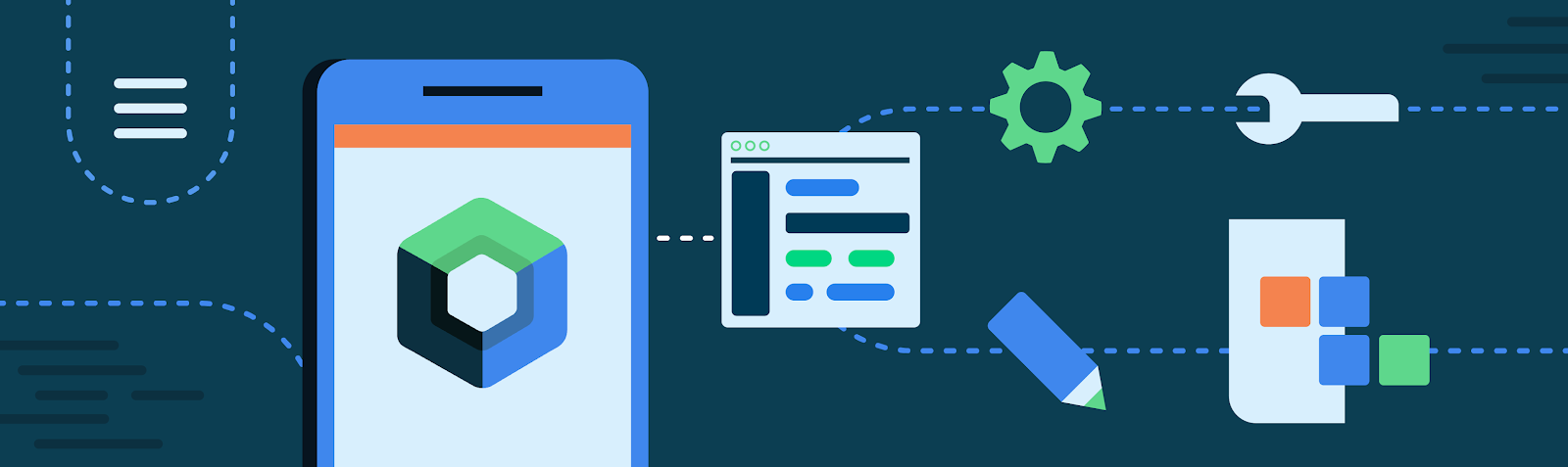
Posted by Anna Bernbaum, Product Manager and Kseniia Shumelchyk, Android Developer Relations Engineer

We’re excited to announce that version 1.2 of Compose for Wear OS and Wear Tiles libraries have reached the stable milestone. This makes it easier than ever to use these modern APIs to build beautiful and engaging apps for Wear OS.

We continue to evolve Android Jetpack libraries for Wear OS with new features and improvements to streamline development, including support for the latest Wear OS 4 release.

Many developers are already leveraging the powerful tools and intuitive APIs to create exceptional experiences for Wear OS. Partners like Peloton and Deezer were able to quickly build a watch experience and are seeing the impact on their feature-adoption and user engagement.

"The Wear OS app was our first usage of Compose in production, we really enjoyed how much more productive it made us.” 

– Stefan Haacker, a senior Android engineer at Peloton.

Compose for Wear OS and Wear Tiles complement one another. Use Wear Tiles to define the experience in your app’s tiles, and use Compose for Wear OS to build UIs across the more detailed screens in your app. Both sets of APIs offer material components and layouts that ensure your app experience on Wear OS is coherent and follows our best practices.

Now, let’s look into key features of version 1.2 of Jetpack libraries for Wear OS.

Compose for Wear OS 1.2 release

Compose for Wear OS version 1.2 contains new components and brings improvements to tooling, as well as the usability and accessibility of existing components:

Expandable Items

The new expandableItem, expandableItems and expandableButton components provide a simple way to fold and unfold content on demand. Use these components to hide detailed information on long pages or expanded sections by default. This design pattern allows users to focus on essential content and choose when to view the more detailed information.

This pattern enables apps to include high-density content while preserving the key principles of wearables – compactness and glanceability.


Moving images of expanding list and expanding text using the new component
Example of expanding list and expanding text using the new component

The component can be used for expanding lists within ScalingLazyColumn, so expandableButton collapses after the content in expandableItems is revealed in one smooth option. Another use case is expanding the content of a single item, such as Text, that would otherwise contain too many lines to show all at once when the screen first loads.

Swipe to Reveal

A new experimental API has been added to support the SwipeToReveal pattern, as a way to add up to 2 secondary actions when the composable is swiped to the left. It also provides support for users to undo the secondary actions that they take. This component is intended for use cases where the existing ‘long press’ pattern is not ideal.


Moving images showing SwipeToReveal implementation with two actions (left) and single action with undo (right)
SwipeToReveal implementation with two actions (left) and single action with undo (right)

Note that this feature is distinct from swipe-to-dismiss, which is used to navigate back to the previous screen.

Compose Previews for Wear OS

In version 1.2 we’ve added device configurations to the set of Compose Preview annotations that you use when evaluating how a design looks and behaves on a variety of devices.

We added a number of custom Wear Preview annotations for different watch shapes and sizes: WearPreviewSmallRound, WearPreviewLargeRound, WearPreviewSquare. We’ve also added the WearPreviewDevices, WearPreviewFontScales annotations to check your app against multiple device configurations and types at once. Use these new annotations to instantly verify how your app’s layout behaves on a variety of Wear OS devices.

Image showing WearPreviewDevices and WearPreviewFontScales annotations used for Horologist VolumeScreen preview
WearPreviewDevices and WearPreviewFontScales annotations used for Horologist VolumeScreen preview

Wear Compose tooling is available within a separate dependency androidx.wear.compose.ui.tooling.preview that you’ll need to include in addition to general Compose dependencies.

UX and accessibility improvements

The 1.2 release also introduced numerous improvements for user experience and accessibility:

  • Reduce-motion setting is now supported. When setting switched on it will disable scaling and fading animations in ScalingLazyColumn, and turn off the shimmering effect and wipe-off motion on placeholders.
  • HierarchicalFocusCoordinator - new experimental composable that enables marking sub-trees of the composition as focus enabled or focus disabled. Use this to control which element receives rotary scroll events, such as multiple ScalingLazyColumns in a HorizontalPage
  • PickerGroup - a new composable designed to combine multiple pickers together. It handles focus between the pickers using the HierarchicalFocusCoordinator API and enables auto-centering of Picker items. It’s already integrated in prebuilt Date and Time pickers from Horologist: check out some examples.
  • Picker has a new userScrollEnabled parameter, which determines if picker should be scrollable and disables scrolling when not focused.
  • The shimmer and wipe-off animations for placeholder now apply the wipe-off effect immediately when the content is ready.
  • Stepper has an additional parameter, enableRangeSemantics, that allows customization of semantics, such as disabling default range semantics when required.

Other changes

ScalingLazyColumn and associated classes have migrated from the material package to the foundation.lazy package, as a preparation for a new Material3 library. You can use this migration script to update your code seamlessly.

The Horologist library enhances the implementation of snap behavior to a ScalingLazyColumn, TimePicker and DatePicker when the user interacts with a rotary crown. The rotaryWithFling modifier was deprecated in favor of rotaryWithScroll which includes fling behavior by default. Check out rotaryWithScroll and rotaryWithSnap reference documentation for details.


Moving image of Snap and fling behavior for scrolling list
Snap and fling behavior for scrolling list

Tiles 1.2 release

Tiles are designed to give users fast, predictable access to the information and actions they rely on most. Version 1.2 of the Jetpack Tiles Library introduces support for platform data bindings and animations so you can provide even more responsive experiences to your users.

Moving image of Tiles carousel on Wear Os
Tiles carousel on Wear OS

Platform data bindings

Version 1.2 introduces support dynamic expressions that link elements of your tile to platform data sources. If your tile uses platform data sources such as heart rate, or, step count, or time, your tile can be updated up to once per second.

Moving image of a tile using data binding
Examples of a tile using data binding

Animations

The new version of tiles also adds support for animations. You can use tween animations to create smooth transitions when part of your layout changes, and use transition animations to animate new or disappearing elements from the tile.

Moving images of animated tiles
Examples of animated tiles

Partial tile updates

We have also now enabled partial tile updates, meaning that we will only update the part of your tile that has been updated, not the entire layout. This allows you to update part of your tile, while an animation is playing in another part, without disrupting that animation.

Learn more

Get started with hands-on experience trying our codelab to create your first Tile and Compose for Wear OS codelab.

We’ve already updated our samples and Horologist libraries to work with the latest version of Jetpack libraries for Wear OS. Also make sure to check out the documentation for Tiles and Compose for Wear OS to learn more about best practices when building apps for wearables.

Provide feedback

We continue to evolve our APIs with the features you’ve been asking for. Please do continue providing us feedback on the issue tracker , and join the Kotlin Slack #compose-wear channel to connect with the Google team and developer community.

Start building for Wear OS now

Discover even more by taking a look at our developer site and reading the latest Wear OS announcements from Google I/O!

Introducing Jetpack Emoji Picker: A New Way to Add Emojis to Your Android App

Posted by Lin Guo, Software Engineer

The use of emojis in communication has become increasingly popular in recent years. These small icons can be used to express a wide range of emotions and can add a personal touch to messages. However, adding emojis to your Android app can be a bit of a challenge. That's where the Emoji picker library comes in. You can simply add a few lines of code to your app, and you'll be able to start using emojis right away. It's the easiest way to get started with emojis, and it will make your app more fun and expressive.

Moving image of using EmojiPicker on Google Pixel 6 Pro
Figure 1. Emoji Picker

Some useful features provided by the library

Up-to-date emojis without tofu (☐)

Every year, new emoji versions are published, and we will regularly update the library to provide these new emojis. Higher-end phones will be able to render these newer emojis without any problem. For lower-end phones, newer emoji may be displayed as a small square box called tofu (☐). The library guarantees to detect and remove them. This ensures the library is compatible across multiple Android versions/devices.

Smooth UI

The library has several optimizations that attempt to reduce startup latency and speed up scrolling experience, such as caching renderable emojis, drawing emojis asynchronously and RecyclerView optimizations.

Personalized inclusive experience

User selections are persistent in the library. Emojis that are newly chosen will be shown at the top row, making it simpler for users to find and share them. The library also offers a variety of emojis that represent different people and cultures in the variant panels. If the user chooses an emoji from one of the variation panels (Figure 2), the choice is retained and set as the default in the main panel.

Image showijng diversity of characters to choose from in EmojiPicker
Figure 2. Emoji variants

Integrate emoji picker into your app in 3 steps

Step 1: Import the library in build.gradle 
dependencies { implementation "androidx.emoji2:emojipicker:$version" }

Step 2: Inflate the EmojiPickerView

Optionally set emojiGridColumns and emojiGridRows based on the desired size of each emoji cell

An example that uses EmojiPickerView in XML
<androidx.emoji2.emojipicker.EmojiPickerView app:emojiGridColumns="9" />

A very simple emoji picker should now be presented on your app! For the next step, we assume you would like to do something to the picked emoji.


Step 3: Provide listener to the picked emoji
// a listener example emojiPickerView.setOnEmojiPickedListener { findViewById<EditText>(R.id.edit_text).append(it.emoji) }

Now you have a basic functioning emoji picker. To customize it further (e.g, override some styles or provide a different behavior to the recent emoji row), please refer to our api and sample app.

Feel free to file Bug Report or Feature Request to help us improve the library!