Liza Goldberg has a big-picture view of climate change — and it all started with satellite imagery. In high school she started an internship at NASA, where she built a program that used satellite imagery and Google Earth Engine, a platform for geospatial analysis, to monitor the loss of mangrove forests. This gave her a whole new perspective of planetary changes.
“I was seeing the world through a different lens,” Liza says. “Without images, it’s hard to visualize what things like urbanization, deforestation, wildfires and rise in temperatures mean to our planet — just using statistics and data doesn’t get the message across. I wanted to bring a new perspective to others.” Liza is now a freshman at Stanford University and runs Cloud to Classroom, a program that uses satellite imagery to help teach students around the world about climate change.
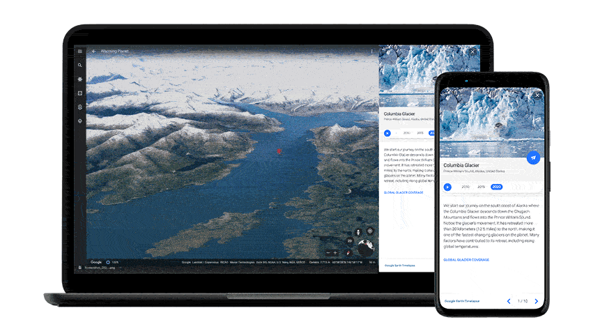
Today, that birds-eye view of the planet is available to even more people with the launch of Timelapse in Google Earth. For the first time, 24 million satellite photos from the past 37 years have been embedded directly into Google Earth, creating an explorable view of our planet over time. Now anyone can watch time across the globe. And that perspective can be enough to inspire anyone to take action — just like it inspired Liza.
“If we want to solve climate challenges, the bottom line is we need to take this information out of scientific papers and put it into the hands of the public so they can make positive change in their local areas,” Liza adds.
As someone who has spent a lot of time looking at satellite imagery of the Earth, Liza has a few pointers for how to explore the planet with Timelapse and put these changes into context. She shares some of her tips here:
Zoom in on your community
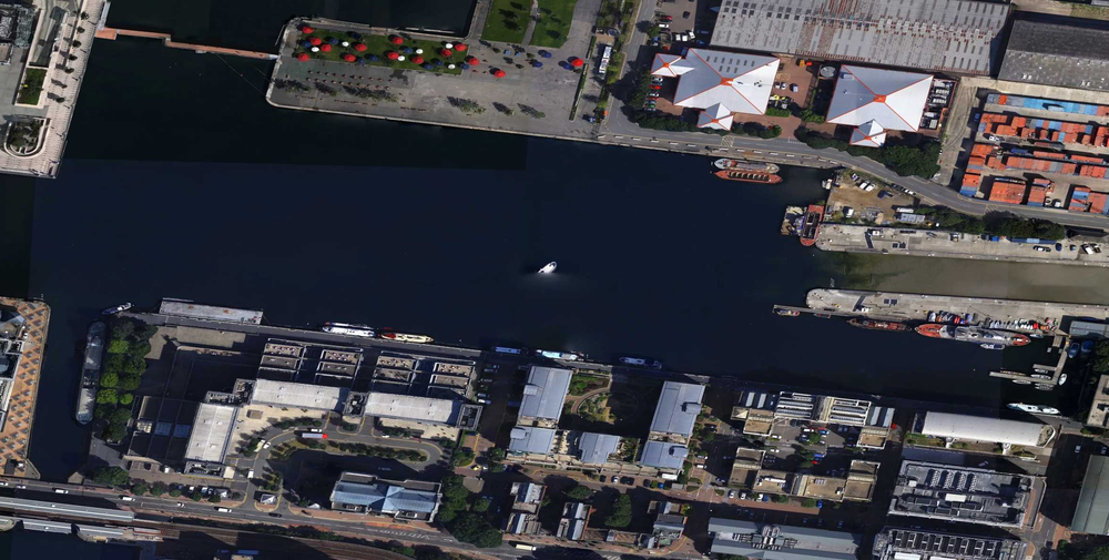
If you're a teacher, reporter, student or just someone exploring Timelapse, start looking at the places you care about. Use the search bar function to zero in on a region you know really well — whether it’s the city you grew up in, the place your grandparents are from or where you spent your summers growing up. Seeing the changes at a more personal level contextualizes what global environmental change actually means right now and what it could mean in the future of your local community.
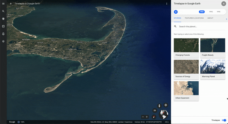
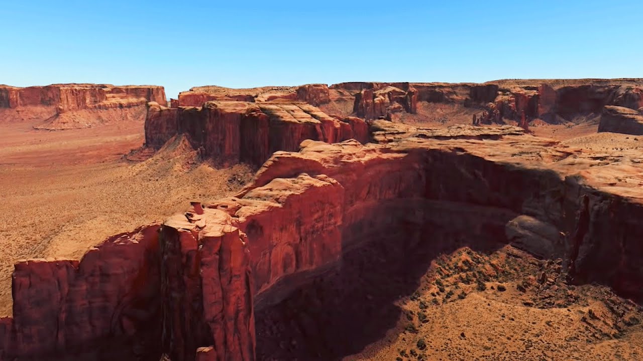
Take a look at how Cape Cod, Massachusetts has changed from above.
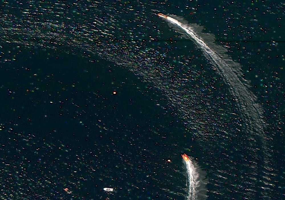
Look for the patterns
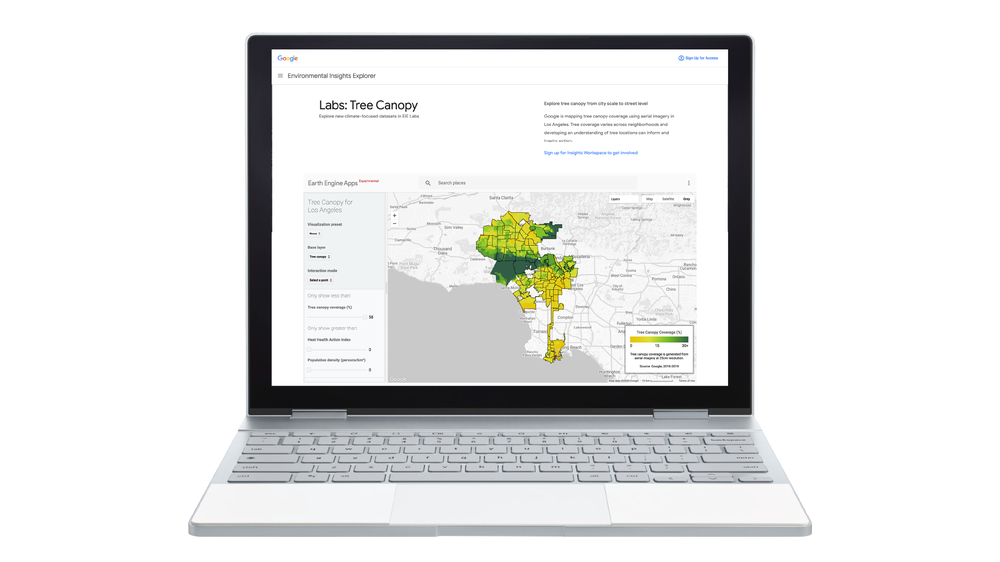
The patterns are everywhere. You can see how the same trends — like rapid changes from wildfires — are taking place on the West Coast of the U.S. and across the world in Australia. Start with the curated videos from Google that show the story of change related to forest change, urban growth, warming temperatures and more. Then start to look for other trends you see happening across the world. It can be an exercise in unity to see what communities are experiencing here and elsewhere, and see how these changes transcend communities and ecosystems.
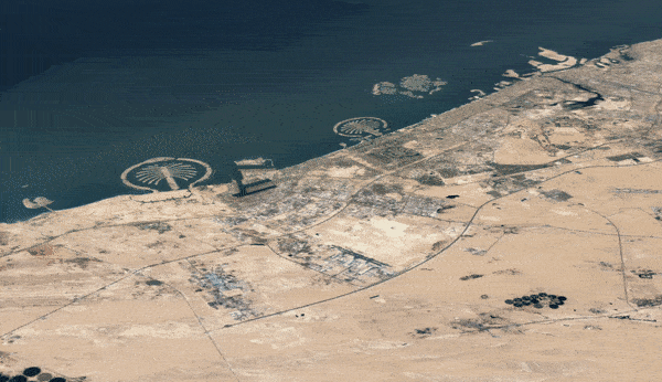
See how urbanization changes the landscape.
Soak up the fragile beauty of it all
The Timelapse videos are like vignettes of art — enjoy them. Take a step back and remember that this is our planet and it's worth protecting. For me, videos like the meandering rivers are captivating. The ability to watch the planet change over time is now in the hands of everyone, and that makes me optimistic.
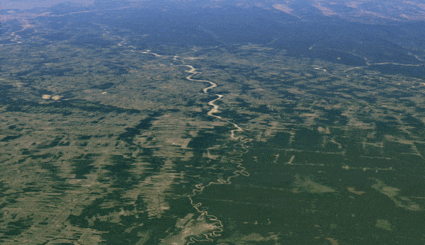
A Google Earth Timelapse of a meandering river over time.
From Liza’s perspective, technology like this can help affect change. In fact, she’s even started to focus more on studying computer science and plans to use those skills to tackle the big issues she cares most about, like climate change.