Recent advances in machine learning (ML) have shown impressive results, with applications ranging from image recognition, language translation, medical diagnosis and more. With the widespread adoption of ML systems, it is increasingly important for research scientists to be able to explore how the data is being interpreted by the models. However, one of the main challenges in exploring this data is that it often has hundreds or even thousands of dimensions, requiring special tools to investigate the space.
To enable a more intuitive exploration process, we are open-sourcing the Embedding Projector, a web application for interactive visualization and analysis of high-dimensional data recently shown as an A.I. Experiment, as part of TensorFlow. We are also releasing a standalone version at projector.tensorflow.org, where users can visualize their high-dimensional data without the need to install and run TensorFlow.
Exploring Embeddings
The data needed to train machine learning systems comes in a form that computers don't immediately understand. To translate the things we understand naturally (e.g. words, sounds, or videos) to a form that the algorithms can process, we use embeddings, a mathematical vector representation that captures different facets (dimensions) of the data. For example, in this language embedding, similar words are mapped to points that are close to each other.
With the Embedding Projector, you can navigate through views of data in either a 2D or a 3D mode, zooming, rotating, and panning using natural click-and-drag gestures. Below is a figure showing the nearest points to the embedding for the word “important” after training a TensorFlow model using the word2vec tutorial. Clicking on any point (which represents the learned embedding for a given word) in this visualization, brings up a list of nearest points and distances, which shows which words the algorithm has learned to be semantically related. This type of interaction represents an important way in which one can explore how an algorithm is performing.
Methods of Dimensionality Reduction
The Embedding Projector offers three commonly used methods of data dimensionality reduction, which allow easier visualization of complex data: PCA, t-SNE and custom linear projections. PCA is often effective at exploring the internal structure of the embeddings, revealing the most influential dimensions in the data. t-SNE, on the other hand, is useful for exploring local neighborhoods and finding clusters, allowing developers to make sure that an embedding preserves the meaning in the data (e.g. in the MNIST dataset, seeing that the same digits are clustered together). Finally, custom linear projections can help discover meaningful "directions" in data sets - such as the distinction between a formal and casual tone in a language generation model - which would allow the design of more adaptable ML systems.
A custom linear projection of the 100 nearest points of "See attachments." onto the "yes" - "yeah" vector (“yes” is right, “yeah” is left) of a corpus of 35k frequently used phrases in emails
The Embedding Projector website includes a few datasets to play with. We’ve also made it easy for users to publish and share their embeddings with others (just click on the “Publish” button on the left pane). It is our hope that the Embedding Projector will be a useful tool to help the research community explore and refine their ML applications, as well as enable anyone to better understand how ML algorithms interpret data. If you'd like to get the full details on the Embedding Projector, you can read the paper here. Have fun exploring the world of embeddings!
Posted by Daniel Smilkov and the Big Picture group
Recent advances in Machine Learning (ML) have shown impressive results, with applications ranging from image recognition, language translation, medical diagnosis and more. With the widespread adoption of ML systems, it is increasingly important for research scientists to be able to explore how the data is being interpreted by the models. However, one of the main challenges in exploring this data is that it often has hundreds or even thousands of dimensions, requiring special tools to investigate the space.
To enable a more intuitive exploration process, we are open-sourcing the Embedding Projector, a web application for interactive visualization and analysis of high-dimensional data recently shown as an A.I. Experiment, as part of TensorFlow. We are also releasing a standalone version at projector.tensorflow.org, where users can visualize their high-dimensional data without the need to install and run TensorFlow.
Exploring Embeddings
The data needed to train machine learning systems comes in a form that computers don't immediately understand. To translate the things we understand naturally (e.g. words, sounds, or videos) to a form that the algorithms can process, we use embeddings, a mathematical vector representation that captures different facets (dimensions) of the data. For example, in this language embedding, similar words are mapped to points that are close to each other.
With the Embedding Projector, you can navigate through views of data in either a 2D or a 3D mode, zooming, rotating, and panning using natural click-and-drag gestures. Below is a figure showing the nearest points to the embedding for the word “important” after training a TensorFlow model using the word2vec tutorial. Clicking on any point (which represents the learned embedding for a given word) in this visualization, brings up a list of nearest points and distances, which shows which words the algorithm has learned to be semantically related. This type of interaction represents an important way in which one can explore how an algorithm is performing.
Methods of Dimensionality Reduction
The Embedding Projector offers three commonly used methods of data dimensionality reduction, which allow easier visualization of complex data: PCA, t-SNE and custom linear projections. PCA is often effective at exploring the internal structure of the embeddings, revealing the most influential dimensions in the data. t-SNE, on the other hand, is useful for exploring local neighborhoods and finding clusters, allowing developers to make sure that an embedding preserves the meaning in the data (e.g. in the MNIST dataset, seeing that the same digits are clustered together). Finally, custom linear projections can help discover meaningful "directions" in data sets - such as the distinction between a formal and casual tone in a language generation model - which would allow the design of more adaptable ML systems.
A custom linear projection of the 100 nearest points of "See attachments." onto the "yes" - "yeah" vector (“yes” is right, “yeah” is left) of a corpus of 35k frequently used phrases in emails
The Embedding Projector website includes a few datasets to play with. We’ve also made it easy for users to publish and share their embeddings with others (just click on the “Publish” button on the left pane). It is our hope that the Embedding Projector will be a useful tool to help the research community explore and refine their ML applications, as well as enable anyone to better understand how ML algorithms interpret data. Have fun exploring the world of embeddings!
Posted by Lily Peng MD PhD, Product Manager and Varun Gulshan PhD, Research Engineer
Diabetic retinopathy (DR) is the fastest growing cause of blindness, with nearly 415 million diabetic patients at risk worldwide. If caught early, the disease can be treated; if not, it can lead to irreversible blindness. Unfortunately, medical specialists capable of detecting the disease are not available in many parts of the world where diabetes is prevalent. We believe that Machine Learning can help doctors identify patients in need, particularly among underserved populations.
A few years ago, several of us began wondering if there was a way Google technologies could improve the DR screening process, specifically by taking advantage of recent advances in Machine Learning and Computer Vision. In "Development and Validation of a Deep Learning Algorithm for Detection of Diabetic Retinopathy in Retinal Fundus Photographs", published today in JAMA, we present a deep learning algorithm capable of interpreting signs of DR in retinal photographs, potentially helping doctors screen more patients in settings with limited resources.
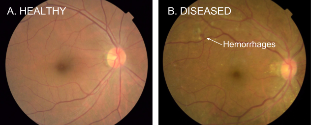
One of the most common ways to detect diabetic eye disease is to have a specialist examine pictures of the back of the eye (Figure 1) and rate them for disease presence and severity. Severity is determined by the type of lesions present (e.g. microaneurysms, hemorrhages, hard exudates, etc), which are indicative of bleeding and fluid leakage in the eye. Interpreting these photographs requires specialized training, and in many regions of the world there aren’t enough qualified graders to screen everyone who is at risk.
Figure 1. Examples of retinal fundus photographs that are taken to screen for DR. The image on the left is of a healthy retina (A), whereas the image on the right is a retina with referable diabetic retinopathy (B) due a number of hemorrhages (red spots) present.
Working closely with doctors both in India and the US, we created a development dataset of 128,000 images which were each evaluated by 3-7 ophthalmologists from a panel of 54 ophthalmologists. This dataset was used to train a deep neural network to detect referable diabetic retinopathy. We then tested the algorithm’s performance on two separate clinical validation sets totalling ~12,000 images, with the majority decision of a panel 7 or 8 U.S. board-certified ophthalmologists serving as the reference standard. The ophthalmologists selected for the validation sets were the ones that showed high consistency from the original group of 54 doctors.
Performance of both the algorithm and the ophthalmologists on a 9,963-image validation set are shown in Figure 2.
Figure 2. Performance of the algorithm (black curve) and eight ophthalmologists (colored dots) for the presence of referable diabetic retinopathy (moderate or worse diabetic retinopathy or referable diabetic macular edema) on a validation set consisting of 9963 images. The black diamonds on the graph correspond to the sensitivity and specificity of the algorithm at the high sensitivity and high specificity operating points.
The results show that our algorithm’s performance is on-par with that of ophthalmologists. For example, on the validation set described in Figure 2, the algorithm has a F-score (combined sensitivity and specificity metric, with max=1) of 0.95, which is slightly better than the median F-score of the 8 ophthalmologists we consulted (measured at 0.91).
These are exciting results, but there is still a lot of work to do. First, while the conventional quality measures we used to assess our algorithm are encouraging, we are working with retinal specialists to define even more robust reference standards that can be used to quantify performance. Furthermore, interpretation of a 2D fundus photograph, which we demonstrate in this paper, is only one part in a multi-step process that leads to a diagnosis for diabetic eye disease. In some cases, doctors use a 3D imaging technology, Optical Coherence Tomography (OCT), to examine various layers of a retina in detail. Applying machine learning to this 3D imaging modality is already underway, led by our colleagues at DeepMind. In the future, these two complementary methods might be used together to assist doctors in the diagnosis of a wide spectrum of eye diseases.
Automated DR screening methods with high accuracy have the strong potential to assist doctors in evaluating more patients and quickly routing those who need help to a specialist. We are working with doctors and researchers to study the entire process of screening in settings around the world, in the hopes that we can integrate our methods into clinical workflow in a manner that is maximally beneficial. Finally, we are working with the FDA and other regulatory agencies to further evaluate these technologies in clinical studies.
Given the many recent advances in deep learning, we hope our study will be just one of many compelling examples to come demonstrating the ability of machine learning to help solve important problems in medical imaging in healthcare more broadly.
Posted by Mike Schuster (Google Brain Team), Melvin Johnson (Google Translate) and Nikhil Thorat (Google Brain Team)
In the last 10 years, Google Translate has grown from supporting just a few languages to 103, translating over 140 billion words every day. To make this possible, we needed to build and maintain many different systems in order to translate between any two languages, incurring significant computational cost. With neural networks reforming many fields, we were convinced we could raise the translation quality further, but doing so would mean rethinking the technology behind Google Translate.
In September, we announced that Google Translate is switching to a new system called Google Neural Machine Translation (GNMT), an end-to-end learning framework that learns from millions of examples, and provided significant improvements in translation quality. However, while switching to GNMT improved the quality for the languages we tested it on, scaling up to all the 103 supported languages presented a significant challenge.
In “Google’s Multilingual Neural Machine Translation System: Enabling Zero-Shot Translation”, we address this challenge by extending our previous GNMT system, allowing for a single system to translate between multiple languages. Our proposed architecture requires no change in the base GNMT system, but instead uses an additional “token” at the beginning of the input sentence to specify the required target language to translate to. In addition to improving translation quality, our method also enables “Zero-Shot Translation” — translation between language pairs never seen explicitly by the system.
Here’s how it works. Let’s say we train a multilingual system with Japanese⇄English and Korean⇄English examples, shown by the solid blue lines in the animation. Our multilingual system, with the same size as a single GNMT system, shares its parameters to translate between these four different language pairs. This sharing enables the system to transfer the “translation knowledge” from one language pair to the others. This transfer learning and the need to translate between multiple languages forces the system to better use its modeling power.
This inspired us to ask the following question: Can we translate between a language pair which the system has never seen before? An example of this would be translations between Korean and Japanese where Korean⇄Japanese examples were not shown to the system. Impressively, the answer is yes — it can generate reasonable Korean⇄Japanese translations, even though it has never been taught to do so. We call this “zero-shot” translation, shown by the yellow dotted lines in the animation. To the best of our knowledge, this is the first time this type of transfer learning has worked in Machine Translation.
The success of the zero-shot translation raises another important question: Is the system learning a common representation in which sentences with the same meaning are represented in similar ways regardless of language — i.e. an “interlingua”? Using a 3-dimensional representation of internal network data, we were able to take a peek into the system as it translates a set of sentences between all possible pairs of the Japanese, Korean, and English languages.
Part (a) from the figure above shows an overall geometry of these translations. The points in this view are colored by the meaning; a sentence translated from English to Korean with the same meaning as a sentence translated from Japanese to English share the same color. From this view we can see distinct groupings of points, each with their own color. Part (b) zooms in to one of the groups, and part (c) colors by the source language. Within a single group, we see a sentence with the same meaning but from three different languages. This means the network must be encoding something about the semantics of the sentence rather than simply memorizing phrase-to-phrase translations. We interpret this as a sign of existence of an interlingua in the network.
We show many more results and analyses in our paper, and hope that its findings are not only interesting for machine learning or machine translation researchers but also to linguists and others who are interested in how multiple languages can be processed by machines using a single system.
Finally, the described Multilingual Google Neural Machine Translation system is running in production today for all Google Translate users. Multilingual systems are currently used to serve 10 of the recently launched 16 language pairs, resulting in improved quality and a simplified production architecture.
Posted by Jimbo Wilson, Software Engineer, Google Big Picture Team and Brendan Meade, Professor, Harvard Department of Earth and Planetary Sciences
The Earth’s surface is moving, ever so slightly, all the time. This slow, small, but persistent movement of the Earth's crust is responsible for the formation of mountain ranges, sudden earthquakes, and even the positions of the continents. Scientists around the world measure these almost imperceptible movements using arrays of Global Navigation Satellite System (GNSS) receivers to better understand all phases of an earthquake cycle—both how the surface responds after an earthquake, and the storage of strain energy between earthquakes.
To help researchers explore this data and better understand the Earthquake cycle, we are releasing a new, interactive data visualization which draws geodetic velocity lines on top of a relief map by amplifying position estimates relative to their true positions. Unlike existing approaches, which focus on small time slices or individual stations, our visualization can show all the data for a whole array of stations at once. Open sourced under an Apache 2 license, and available on GitHub, this visualization technique is a collaboration between Harvard’s Department of Earth and Planetary Sciences and Google's Machine Perception and Big Picture teams.
Our approach helps scientists quickly assess deformations across all phases of the earthquake cycle—both during earthquakes (coseismic) and the time between (interseismic). For example, we can see azimuth (direction) reversals of stations as they relate to topographic structures and active faults. Digging into these movements will help scientists vet their models and their data, both of which are crucial for developing accurate computer representations that may help predict future earthquakes.
Classical approaches to visualizing these data have fallen into two general categories: 1) a map view of velocity/displacement vectors over a fixed time interval and 2) time versus position plots of each GNSS component (longitude, latitude and altitude).
Examples of classical approaches. On the left is a map view showing average velocity vectors over the period from 1997 to 2001[1]. On the right you can see a time versus eastward (longitudinal) position plot for a single station.
Each of these approaches have proved to be informative ways to understand the spatial distribution of crustal movements and the time evolution of solid earth deformation. However, because geodetic shifts happen in almost imperceptible distances (mm) and over long timescales, both approaches can only show a small subset of the data at any time—a condensed average velocity per station, or a detailed view of a single station, respectively. Our visualization enables a scientist to see all the data at once, then interactively drill down to a specific subset of interest.
Our visualization approach is straightforward; by magnifying the daily longitude and latitude position changes, we show tracks of the evolution of the position of each station. These magnified position tracks are shown as trails on top of a shaded relief topography to provide a sense of position evolution in geographic context.
To see how it works in practice, let’s step through an an example. Consider this tiny set of longitude/latitude pairs for a single GNSS station, with the differing digits shown in bold:
Day Index
Longitude
Latitude
0
139.06990407
34.949757897
1
139.06990400
34.949757882
2
139.06990413
34.949757941
3
139.06990409
34.949757921
4
139.06990413
34.949757904
If we were to draw line segments between these points directly on a map, they’d be much too small to see at any reasonable scale. So we take these minute differences and multiply them by a user-controlled scaling factor. By default this factor is 105.5 (about 316,000x).
To help the user identify which end is the start of the line, we give the start and end points different colors and interpolate between them. Blue and red are the default colors, but they’re user-configurable. Although day-to-day movement of stations may seem erratic, by using this method, one can make out a general trend in the relative motion of a station.
Close-up of a single station’s movement during the three year period from 2003 to 2006.
However, static renderings of this sort suffer from the same problem that velocity vector images do; in regions with a high density of GNSS stations, tracks overlap significantly with one another, obscuring details. To solve this problem, our visualization lets the user interactively control the time range of interest, the amount of amplification and other settings. In addition, by animating the lines from start to finish, the user gets a real sense of motion that’s difficult to achieve in a static image.
We’ve applied our new visualization to the ~20 years of data from the GEONET array in Japan. Through it, we can see small but coherent changes in direction before and after the great 2011 Tohoku earthquake.
GPS data sets (in .json format) for both the GEONET data in Japan and the Plate Boundary Observatory (PBO) data in the western US are available at earthquake.rc.fas.harvard.edu.
This short animation shows many of the visualization’s interactive features. In order:
Modifying the multiplier adjusts how significantly the movements are magnified.
We can adjust the time slider nubs to select a particular time range of interest.
Using the map controls provided by the Google Maps JavaScript API, we can zoom into a tiny region of the map.
By enabling map markers, we can see information about individual GNSS stations.
By focusing on a stations of interest, we can even see curvature changes in the time periods before and after the event.
Station designated 960601 of Japan’s GEONET array is located on the island of Mikura-jima. Here we see the period from 2006 to 2012, with movement magnified 105.1 times (126,000x).
To achieve fast rendering of the line segments, we created a custom overlay using THREE.js to render the lines in WebGL. Data for the GNSS stations is passed to the GPU in a data texture, which allows our vertex shader to position each point on-screen dynamically based on user settings and animation.
We’re excited to continue this productive collaboration between Harvard and Google as we explore opportunities for groundbreaking, new earthquake visualizations. If you’d like to try out the visualization yourself, follow the instructions at earthquake.rc.fas.harvard.edu. It will walk you through the setup steps, including how to download the available data sets. If you’d like to report issues, great! Please submit them through the GitHub project page.
Acknowledgments
We wish to thank Bill Freeman, a researcher on Machine Perception, who hatched the idea and developed the initial prototypes, and Fernanda Viégas and Martin Wattenberg of the Big Picture Team for their visualization design guidance.
It has been an eventful year since the Google Brain Teamopen-sourced TensorFlow to accelerate machine learning research and make technology work better for everyone. There has been an amazing amount of activity around the project: more than 480 people have contributed directly to TensorFlow, including Googlers, external researchers, independent programmers, students, and senior developers at other large companies. TensorFlow is now the most popular machine learning project on GitHub.
We’re especially excited to see how people all over the world are using TensorFlow. For example:
Australian marine biologists are using TensorFlow to find sea cows in tens of thousands of hi-res photos to better understand their populations, which are under threat of extinction.
An enterprising Japanese cucumber farmer trained a model with TensorFlow to sort cucumbers by size, shape, and other characteristics.
Data scientists in the Bay Area have rigged up TensorFlow and the Raspberry Pi to keep track of the Caltrain.
We’re committed to making sure TensorFlow scales all the way from research to production and from the tiniest Raspberry Pi all the way up to server farms filled with GPUs or TPUs. But TensorFlow is more than a single open-source project – we’re doing our best to foster an open-source ecosystem of related software and machine learning models around it:
The TensorFlow Serving project simplifies the process of serving TensorFlow models in production.
TensorFlow “Wide and Deep” models combine the strengths of traditional linear models and modern deep neural networks.
For those who are interested in working with TensorFlow in the cloud, Google Cloud Platform recently launched Cloud Machine Learning, which offers TensorFlow as a managed service.
Thanks very much to all of you who have already adopted TensorFlow in your cutting-edge products, your ambitious research, your fast-growing startups, and your school projects; special thanks to everyone who has contributed directly to the codebase. In collaboration with the global machine learning community, we look forward to making TensorFlow even better in the years to come!
Posted by Zak Stone, Product Manager for TensorFlow, on behalf of the TensorFlow team
It has been an eventful year since the Google Brain Teamopen-sourced TensorFlow to accelerate machine learning research and make technology work better for everyone. There has been an amazing amount of activity around the project: more than 480 people have contributed directly to TensorFlow, including Googlers, external researchers, independent programmers, students, and senior developers at other large companies. TensorFlow is now the most popular machine learning project on GitHub.
We’re especially excited to see how people all over the world are using TensorFlow. For example:
Australian marine biologists are using TensorFlow to find sea cows in tens of thousands of hi-res photos to better understand their populations, which are under threat of extinction.
An enterprising Japanese cucumber farmer trained a model with TensorFlow to sort cucumbers by size, shape, and other characteristics.
Data scientists in the Bay Area have rigged up TensorFlow and the Raspberry Pi to keep track of the Caltrain.
We’re committed to making sure TensorFlow scales all the way from research to production and from the tiniest Raspberry Pi all the way up to server farms filled with GPUs or TPUs. But TensorFlow is more than a single open-source project – we’re doing our best to foster an open-source ecosystem of related software and machine learning models around it:
The TensorFlow Serving project simplifies the process of serving TensorFlow models in production.
TensorFlow “Wide and Deep” models combine the strengths of traditional linear models and modern deep neural networks.
For those who are interested in working with TensorFlow in the cloud, Google Cloud Platform recently launched Cloud Machine Learning, which offers TensorFlow as a managed service.
Thanks very much to all of you who have already adopted TensorFlow in your cutting-edge products, your ambitious research, your fast-growing startups, and your school projects; special thanks to everyone who has contributed directly to the codebase. In collaboration with the global machine learning community, we look forward to making TensorFlow even better in the years to come!
Posted by Vincent Dumoulin*, Jonathon Shlens and Manjunath Kudlur, Google Brain Team
Pastiche. A French word, it designates a work of art that imitates the style of another one (not to be confused with its more humorous Greek cousin, parody). Although it has been used for a long time in visual art, music and literature, pastiche has been getting mass attention lately with online forums dedicated to images that have been modified to be in the style of famous paintings. Using a technique known as style transfer, these images are generated by phone or web apps that allow a user to render their favorite picture in the style of a well known work of art.
Although users have already produced gorgeous pastiches using the current technology, we feel that it could be made even more engaging. Right now, each painting is its own island, so to speak: the user provides a content image, selects an artistic style and gets a pastiche back. But what if one could combine many different styles, exploring unique mixtures of well known artists to create an entirely unique pastiche?
Learning a representation for artistic style
In our recent paper titled “A Learned Representation for Artistic Style”, we introduce a simple method to allow a single deep convolutional style transfer network to learn multiple styles at the same time. The network, having learned multiple styles, is able to do style interpolation, where the pastiche varies smoothly from one style to another. Our method enables style interpolation in real-time as well, allowing this to be applied not only to static images, but also videos.
Credit: awesome dog role played by Google Brain team office dog Picabo.
In the video above, multiple styles are combined in real-time and the resulting style is applied using a single style transfer network. The user is provided with a set of 13 different painting styles and adjusts their relative strengths in the final style via sliders. In this demonstration, the user is an active participant in producing the pastiche.
A Quick History of Style Transfer
While transferring the style of one image to another has existed for nearly 15 years [1] [2], leveraging neural networks to accomplish it is both very recent and very fascinating. In “A Neural Algorithm of Artistic Style” [3], researchers Gatys, Ecker & Bethge introduced a method that uses deep convolutional neural network (CNN) classifiers. The pastiche image is found via optimization: the algorithm looks for an image which elicits the same kind of activations in the CNN’s lower layers - which capture the overall rough aesthetic of the style input (broad brushstrokes, cubist patterns, etc.) - yet produces activations in the higher layers - which capture the things that make the subject recognizable - that are close to those produced by the content image. From some starting point (e.g. random noise, or the content image itself), the pastiche image is progressively refined until these requirements are met.
This work is considered a breakthrough in the field of deep learning research because it provided the first proof of concept for neural network-based style transfer. Unfortunately this method for stylizing an individual image is computationally demanding. For instance, in the first demos available on the web, one would upload a photo to a server, and then still have plenty of time to go grab a cup of coffee before a result was available.
This process was sped up significantly by subsequent research [4, 5] that recognized that this optimization problem may be recast as an image transformation problem, where one wishes to apply a single, fixed painting style to an arbitrary content image (e.g. a photograph). The problem can then be solved by teaching a feed-forward, deep convolutional neural network to alter a corpus of content images to match the style of a painting. The goal of the trained network is two-fold: maintain the content of the original image while matching the visual style of the painting.
The end result of this was that what once took a few minutes for a single static image, could now be run real time (e.g. applying style transfer to a live video). However, the increase in speed that allowed real-time style transfer came with a cost - a given style transfer network is tied to the style of a single painting, losing some flexibility of the original algorithm, which was not tied to any one style. This means that to build a style transfer system capable of modeling 100 paintings, one has to train and store 100 separate style transfer networks.
Our Contribution: Learning and Combining Multiple Styles
We started from the observation that many artists from the impressionist period employ similar brush stroke techniques and color palettes. Furthermore, painting by say, Monet, are even more visually similar.
We leveraged this observation in our training of a machine learning system. That is, we trained a single system that is able to capture and generalize across many Monet paintings or even a diverse array of artists across genres. The pastiches produced are qualitatively comparable to those produced in previous work, while originating from the same style transfer network.
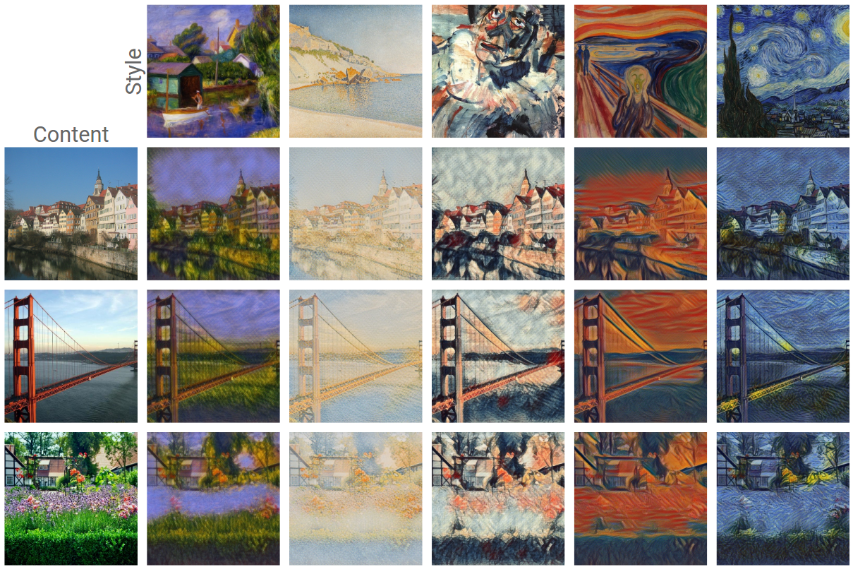
The technique we developed is simple to implement and is not memory intensive. Furthermore, our network, trained on several artistic styles, permits arbitrary combining multiple painting styles in real-time, as shown in the video above. Here are four styles being combined in different proportions on a photograph of Tübingen:
Unlike previous approaches to fast style transfer, we feel that this method of modeling multiple styles at the same time opens the door to exciting new ways for users to interact with style transfer algorithms, not only allowing the freedom to create new styles based on the mixture of several others, but to do it in real-time. Stay tuned for a future post on the Magenta blog, in which we will describe the algorithm in more detail and release the TensorFlow source code to run this model and demo yourself. We also recommend that you check out Nat & Lo’s fantastic video explanation on the subject of style transfer.
Posted by Moritz Hardt, Research Scientist, Google Brain Team
As machine learning technology progresses rapidly, there is much interest in understanding its societal impact. A particularly successful branch of machine learning is supervised learning. With enough past data and computational resources, learning algorithms often produce surprisingly effective predictors of future events. To take one hypothetical example: an algorithm could, for example, be used to predict with high accuracy who will pay back their loan. Lenders might then use such a predictor as an aid in deciding who should receive a loan in the first place. Decisions based on machine learning can be both incredibly useful and have a profound impact on our lives.
Even the best predictors make mistakes. Although machine learning aims to minimize the chance of a mistake, how do we prevent certain groups from experiencing a disproportionate share of these mistakes? Consider the case of a group that we have relatively little data on and whose characteristics differ from those of the general population in ways that are relevant to the prediction task. As prediction accuracy is generally correlated with the amount of data available for training, it is likely that incorrect predictions will be more common in this group. A predictor might, for example, end up flagging too many individuals in this group as ‘high risk of default’ even though they pay back their loan. When group membership coincides with a sensitive attribute, such as race, gender, disability, or religion, this situation can lead to unjust or prejudicial outcomes.
Despite the need, a vetted methodology in machine learning for preventing this kind of discrimination based on sensitive attributes has been lacking. A naive approach might require a set of sensitive attributes to be removed from the data before doing anything else with it. This idea of “fairness through unawareness,” however, fails due to the existence of “redundant encodings.” Even if a particular attribute is not present in the data, combinations of other attributes can act as a proxy.
Another common approach, called demographic parity, asks that the prediction must be uncorrelated with the sensitive attribute. This might sound intuitively desirable, but the outcome itself is often correlated with the sensitive attribute. For example, the incidence of heart failure is substantially more common in men than in women. When predicting such a medical condition, it is therefore neither realistic nor desirable to prevent all correlation between the predicted outcome and group membership.
Equal Opportunity Taking these conceptual difficulties into account, we’ve proposed a methodology for measuring and preventing discrimination based on a set of sensitive attributes. Our framework not only helps to scrutinize predictors to discover possible concerns. We also show how to adjust a given predictor so as to strike a better tradeoff between classification accuracy and non-discrimination if need be.
At the heart of our approach is the idea that individuals who qualify for a desirable outcome should have an equal chance of being correctly classified for this outcome. In our fictional loan example, it means the rate of ‘low risk’ predictions among people who actually pay back their loan should not depend on a sensitive attribute like race or gender. We call this principle equality of opportunity in supervised learning.
When implemented, our framework also improves incentives by shifting the cost of poor predictions from the individual to the decision maker, who can respond by investing in improved prediction accuracy. Perfect predictors always satisfy our notion, showing that the central goal of building more accurate predictors is well aligned with the goal of avoiding discrimination.
Learn more
To explore the ideas in this blog post on your own, our Big Picture team created a beautiful interactive visualization of the different concepts and tradeoffs. So, head on over to their page to learn more.
Once you’ve walked through the demo, please check out the full version of our paper, a joint work with Eric Price (UT Austin) and Nati Srebro (TTI Chicago). We’ll present the paper at this year’s Conference on Neural Information Processing Systems (NIPS) in Barcelona. So, if you’re around, be sure to stop by and chat with one of us.
Our paper is by no means the final word on this important and complex topic. It joins an ongoing conversation with a multidisciplinary focus of research. We hope to inspire future research that will sharpen the discussion of the different achievable tradeoffs surrounding discrimination and machine learning, as well as the development of tools that will help practitioners address these challenges.
The ability to learn from experience will likely be a key in enabling robots to help with complex real-world tasks, from assisting the elderly with chores and daily activities, to helping us in offices and hospitals, to performing jobs that are too dangerous or unpleasant for people. However, if each robot must learn its full repertoire of skills for these tasks only from its own experience, it could take far too long to acquire a rich enough range of behaviors to be useful. Could we bridge this gap by making it possible for robots to collectively learn from each other’s experiences?
While machine learning algorithms have made great strides in natural language understanding and speech recognition, the kind of symbolic high-level reasoning that allows people to communicate complex concepts in words remains out of reach for machines. However, robots can instantaneously transmit their experience to other robots over the network - sometimes known as "cloud robotics" - and it is this ability that can let them learn from each other.
This is true even for seemingly simple low-level skills. Humans and animals excel at adaptive motor control that integrates their senses, reflexes, and muscles in a closely coordinated feedback loop. Robots still struggle with these basic skills in the real world, where the variability and complexity of the environment demands well-honed behaviors that are not easily fooled by distractors. If we enable robots to transmit their experiences to each other, could they learn to perform motion skills in close coordination with sensing in realistic environments?
We previously wrote about how multiple robots could pool their experiences to learn a grasping task. Here, we will discuss new experiments that we conducted to investigate three possible approaches for general-purpose skill learning across multiple robots: learning motion skills directly from experience, learning internal models of physics, and learning skills with human assistance. In all three cases, multiple robots shared their experiences to build a common model of the skill. The skills learned by the robots are still relatively simple -- pushing objects and opening doors -- but by learning such skills more quickly and efficiently through collective learning, robots might in the future acquire richer behavioral repertoires that could eventually make it possible for them to assist us in our daily lives.
Learning from raw experience with model-free reinforcement learning. Perhaps one of the simplest ways for robots to teach each other is to pool information about their successes and failures in the world. Humans and animals acquire many skills by direct trial-and-error learning. During this kind of ‘model-free’ learning -- so called because there is no explicit model of the environment formed -- they explore variations on their existing behavior and then reinforce and exploit the variations that give bigger rewards. In combination with deep neural networks, model-free algorithms have recently proved to be surprisingly effective and have been key to successes with the Atari video game system and playing Go. Having multiple robots allows us to experiment with sharing experiences to speed up this kind of direct learning in the real world.
In these experiments we tasked robots with trying to move their arms to goal locations, or reaching to and opening a door. Each robot has a copy of a neural network that allows it to estimate the value of taking a given action in a given state. By querying this network, the robot can quickly decide what actions might be worth taking in the world. When a robot acts, we add noise to the actions it selects, so the resulting behavior is sometimes a bit better than previously observed, and sometimes a bit worse. This allows each robot to explore different ways of approaching a task. Records of the actions taken by the robots, their behaviors, and the final outcomes are sent back to a central server. The server collects the experiences from all of the robots and uses them to iteratively improve the neural network that estimates value for different states and actions. The model-free algorithms we employed look across both good and bad experiences and distill these into a new network that is better at understanding how action and success are related. Then, at regular intervals, each robot takes a copy of the updated network from the server and begins to act using the information in its new network. Given that this updated network is a bit better at estimating the true value of actions in the world, the robots will produce better behavior. This cycle can then be repeated to continue improving on the task. In the video below, a robot explores the door opening task. With a few hours of practice, robots sharing their raw experience learn to make reaches to targets, and to open a door by making contact with the handle and pulling. In the case of door opening, the robots learn to deal with the complex physics of the contacts between the hook and the door handle without building an explicit model of the world, as can be seen in the example below: Learning how the world works by interacting with objects. Direct trial-and-error reinforcement learning is a great way to learn individual skills. However, humans and animals don’t learn exclusively by trial and error. We also build mental models about our environment and imagine how the world might change in response to our actions.
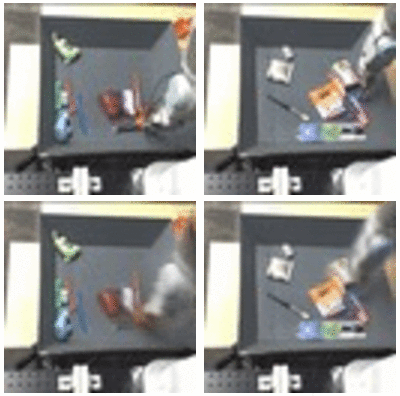
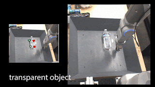
We can start with the simplest of physical interactions, and have our robots learn the basics of cause and effect from reflecting on their own experiences. In this experiment, we had the robots play with a wide variety of common household objects by randomly prodding and pushing them inside a tabletop bin. The robots again shared their experiences with each other and together built a single predictive model that attempted to forecast what the world might look like in response to their actions. This predictive model can make simple, if slightly blurry, forecasts about future camera images when provided with the current image and a possible sequence of actions that the robot might execute:
Top row: robotic arms interacting with common household items. Bottom row: Predicted future camera images given an initial image and a sequence of actions.
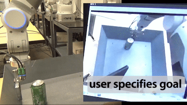
Once this model is trained, the robots can use it to perform purposeful manipulations, for example based on user commands. In our prototype, a user can command the robot to move a particular object simply by clicking on that object, and then clicking on the point where the object should go:
The robots in this experiment were not told anything about objects or physics: they only see that the command requires a particular pixel to be moved to a particular place. However, because they have seen so many object interactions in their shared past experiences, they can forecast how particular actions will affect particular pixels. In order for such an implicit understanding of physics to emerge, the robots must be provided with a sufficient breadth of experience. This requires either a lot of time, or sharing the combined experiences of many robots. An extended video on this project may be found here.
Learning with the help of humans. So far, we discussed how robots can learn entirely on their own. However, human guidance is important, not just for telling the robot what to do, but also for helping the robots along. We have a lot of intuition about how various manipulation skills can be performed, and it only seems natural that transferring this intuition to robots can help them learn these skills a lot faster. In the next experiment, we provided each robot with a different door, and guided each of them by hand to show how these doors can be opened. These demonstrations are encoded into a single combined strategy for all robots, called a policy. The policy is a deep neural network which converts camera images to robot actions, and is maintained on a central server. The following video shows the instructor demonstrating the door-opening skill to a robot: Next, the robots collectively improve this policy through a trial-and-error learning process. Each robot attempts to open its own door using the latest available policy, with some added noise for exploration. These attempts allow each robot to plan a better strategy for opening the door the next time around, and improve the policy accordingly: Not surprisingly, we find that robots learn more effectively if they are trained on a curriculum of tasks that are gradually increasing in difficulty. In our experiment, each robot starts off by practicing the door-opening skill on a specific position and orientation of the door that the instructor had previously shown it. As it gets better at performing the task, the instructor starts to alter the position and orientation of the door to be just a bit beyond the current capabilities of the policy, but not so difficult that it fails entirely. This allows the robots to gradually increase their skill level over time, and expands the range of situations they can handle. The combination of human-guidance with trial-and-error learning allowed the robots to collectively learn the skill of door-opening in just a couple of hours. Since the robots were trained on doors that look different from each other, the final policy succeeds on a door with a handle that none of the robots had seen before: In all three of the experiments described above, the ability to communicate and exchange their experiences allows the robots to learn more quickly and effectively. This becomes particularly important when we combine robotic learning with deep learning, as is the case in all of the experiments discussed above. We’ve seen before that deep learning works best when provided with ample training data. For example, the popular ImageNet benchmark uses over 1.5 million labeled examples. While such a quantity of data is not impossible for a single robot to gather over a few years, it is much more efficient to gather the same volume of experience from multiple robots over the course of a few weeks. Besides faster learning times, this approach might benefit from the greater diversity of experience: a real-world deployment might involve multiple robots in different places and different settings, sharing heterogeneous, varied experiences to build a single highly generalizable representation.
Of course, the kinds of behaviors that robots today can learn are still quite limited. Even basic motion skills, such as picking up objects and opening doors, remain in the realm of cutting edge research. In all of these experiments, a human engineer is still needed to tell the robots what they should learn to do by specifying a detailed objective function. However, as algorithms improve and robots are deployed more widely, their ability to share and pool their experiences could be instrumental for enabling them to assist us in our daily lives.
The experiments on learning by trial-and-error were conducted by Shixiang (Shane) Gu and Ethan Holly from the Google Brain team, and Timothy Lillicrap from DeepMind. Work on learning predictive models was conducted by Chelsea Finn from the Google Brain team, and the research on learning from demonstration was conducted by Yevgen Chebotar, Ali Yahya, Adrian Li, and Mrinal Kalakrishnan from X. We would also like to acknowledge contributions by Peter Pastor, Gabriel Dulac-Arnold, and Jon Scholz. Articles about each of the experiments discussed in this blog post can be found below:


