The following was originally posted on the Google Developers Blog. Autotrack is a JavaScript library built for use with
analytics.jsthat provides developers with a wide range of plugins to track the most common user interactions relevant to today's modern web.
The first version of autotrack for analytics.js was
released on Github earlier this year, and since then the response and adoption from developers has been amazing. The project has been starred over a thousand times, and sites using autotrack are sending millions of hits to Google Analytics every single day.
Today I'm happy to announce that we've released
autotrack version 1.0, which includes several new plugins, improvements to the existing plugins, and tons of new ways to customize autotrack to meet your needs.
Note: autotrack is not an official Google Analytics product and does not qualify for Google Analytics 360 support. It is maintained by members of the Google Analytics developer platform team and is primarily intended for a developer audience. New plugins
Based on the feedback and numerous feature requests we received from developers over the past few months, we've added the following new autotrack plugins:
Impression Tracker
The
impression tracker plugin allows you to track when an element is visible within the browser viewport. This lets you much more reliably determine whether a particular advertisement or call-to-action button was seen by the user.
Impression tracking has been historically tricky to implement on the web, particularly in a way that doesn't degrade the performance of your site. This plugin leverages
new browser APIs that are specifically designed to track these kinds of interactions in a highly performant way.
Clean URL Tracker
If your analytics implementation sends pageviews to Google Analytics without modifying the URL, then you've probably experienced the problem of seeing multiple different page paths in your reports that all point to the same place. Here's an example:
/contact /contact//contact?hl=en/contact/index.html
The
clean URL tracker plugin avoids this problem by letting you set your preferred URL format (e.g. strip trailing slashes, remove index.html filenames, remove query parameters, etc.), and the plugin automatically updates all page URLs based on your preference before sending them to Google Analytics.
Note: setting up View Filters in your Google Analytics view settings is another way to modify the URLs sent to Google Analytics. Page Visibility Tracker
It's becoming increasingly common for users to visit sites on the web and then leave them open in an inactive browser tab for hours or even days. And when users return to your site, they often won't reload the page, especially if your site fetches new content in the background.
If your site implements just the
default javascript tracking snippet, these types of interactions will never be captured.
The
page visibility tracker plugin takes a more modern approach to what should constitute a pageview. In addition to tracking when a page gets loaded, it also tracks when the visibility state of the page changes (i.e. when the tab goes into or comes out of the background). These additional interaction events give you more insight into how users behave on your site.
Updates and improvements
In addition to the new plugins added to autotrack, the existing plugins have undergone some significant improvements, most notably in the ability to customize them to your needs.
All plugins that send data to Google Analytics now give you 100% control over precisely what
fieldsget sent, allowing you to set, modify, or remove anything you want. This gives advanced users the ability to set their own custom dimensions on hits or change the interaction setting to better reflect how they choose to measure bounce rate.
Users upgrading from previous versions of autotrack should refer to the
upgrade guide for a complete list of changes (note: some of the changes are incompatible with previous versions).
Who should use autotrack
Perhaps the most common question we received after the initial release of autotrack is who should use it. This was especially true of
Google Tag Managerusers who wanted to take advantage of some of the more advanced autotrack features.
Autotrack is a developer project intended to demonstrate and streamline some advanced tracking techniques with Google Analytics, and it's primarily intended for a developer audience. Autotrack will be a good fit for small to medium sized developer teams who already have analytics.js on their website or who prefer to manage their tracking implementation in code.
Large teams and organizations, those with more complex collaboration and testing needs, and those with tagging needs beyond just Google Analytics should instead consider using
Google Tag Manager. While Google Tag Manager does not currently support custom analytics.js plugins like those that are part of autotrack, many of the same tracking techniques are easy to achieve with Tag Manager’s built-in
triggers, and others may be achieved by pushing
data layer events based on custom code on your site or in Custom HTML tags in Google Tag Manager. Read
Google Analytics Events in the Google Tag Manager help center to learn more about automatic event tracking based on clicks and form submissions.
Next steps
If you're not already using autotrack but would like to, check out the
installation and usage section of the documentation. If you already use autotrack and want to upgrade to the latest version, be sure to read the
upgrade guide first.
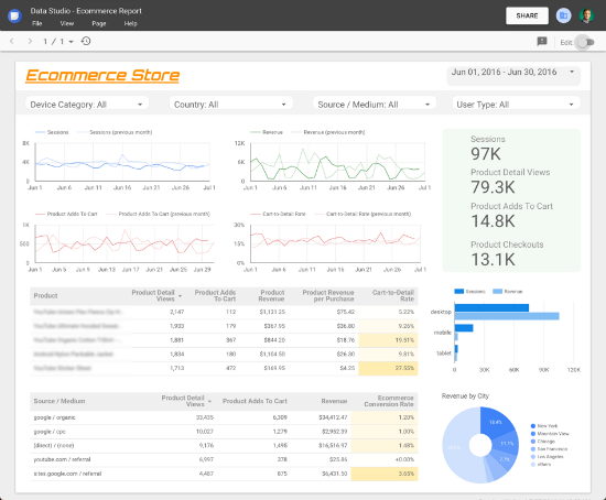
To get a sense of what the data captured by autotrack looks like, the
Google Analytics Demos & Tools site includes several reports displaying its own autotrack usage data. If you want to go deeper, the autotrack library is open source and can be a great learning resource. Have a read through the
plugin source code to get a better understanding of how some of the advanced analytics.js features work.
Lastly, if you have feedback or suggestions, please let us know. You can report bugs or submit any issues
on Github.
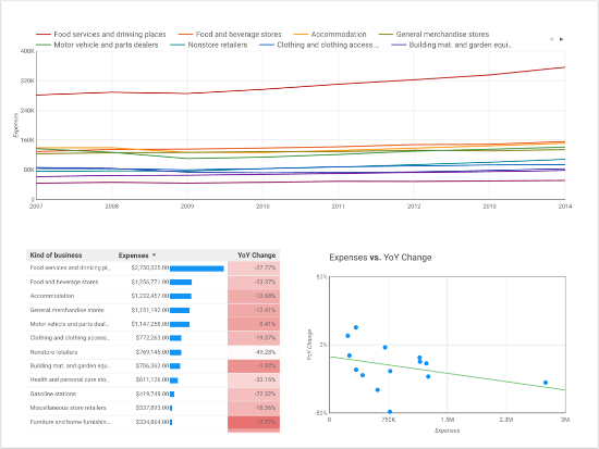
Posted by Philip Walton, Developer Programs Engineer 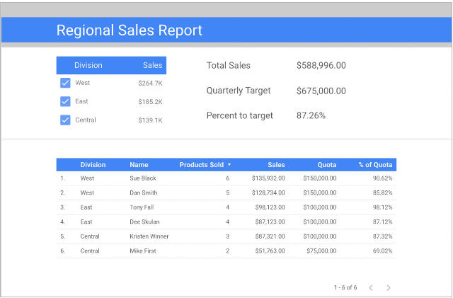 Example report accessing sales data by sales person from MySQL database
 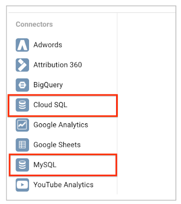 List of connectors now includes Cloud SQL and MySQL
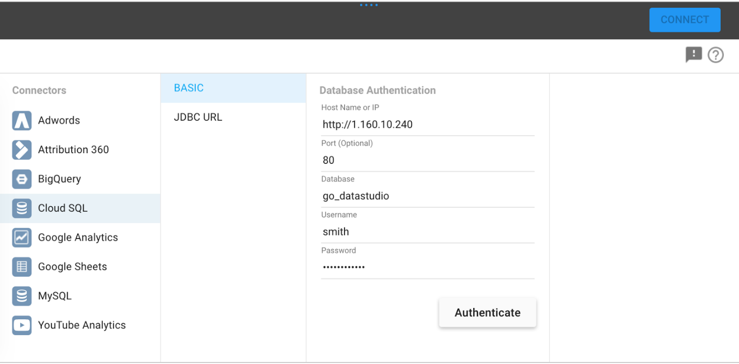
 Configuration screen to access your SQL database