Tag Archives: form factors

U-NEXT sees 1.5X increase in tablet installations after boosting support for large screens

Posted by the Android team

As the largest domestic streaming and digital content service in Japan, U-NEXT is always looking for new ways to connect its users to their favorite content. With just a single application, the platform hosts an extensive library of over 840,000 titles, ranging from movies, anime, and live streams to manga, magazines, and e-books.

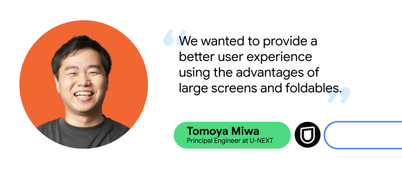
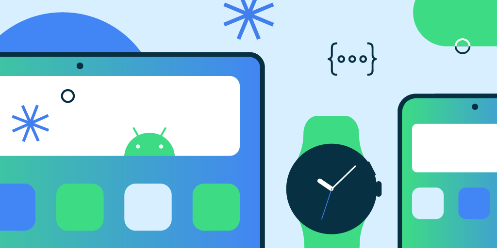
Always looking for ways to improve its UX for its expanding user base, U-NEXT recently turned to the growing market of large screens and foldables, which includes devices like tablets and Chromebooks. Here, U-NEXT engineers saw an opportunity to create a better way to view content by focusing on what makes these devices special. For example, better multi-window support on larger screens could offer a more visually rich UX, while an improved foldable UX might better mimic the experience readers get with a traditional paperback.

But some users bumped into bugs while using the U-NEXT app with these larger and foldable viewing formats. For instance, the app would often hide important buttons when users opened U-NEXT on larger screens, forcing them to search the page for those navigation tools.

To optimize a UX overhaul to support these formats, the U-NEXT team tackled the project in two phases: remove any existing bugs, then add the features that its large-screen users would benefit from the most.

Headshot of Tomoya Miwa, Principal engineer at U-NEXT, smiling, with text quote 'We wanted to provide a better user experience using the advantages of large screens and foldables'

Clearing out the bugs

To fix the visibility issue for important in-app navigation buttons, U-NEXT engineers used a ConstraintLayout to set constraint barriers. These barriers prevented UI elements from being pushed off-screen while ensuring they’re always oriented correctly, no matter the screen size.

What’s more, U-NEXT’s application didn’t always display properly on larger screens. For example, pages displaying browsable video lists typically consist of a header and a curated list of content. These lists are supposed to occupy most of the space on the page. But on larger screens, the headers occupied the most on-screen real estate, making video content harder to navigate. The U-NEXT team resolved this issue by restricting the width of the header image on larger screens, giving the list more space and making browsing easier for large-screen users.

When users view books on the U-NEXT application, they can tap the screen to reveal a horizontal, scrollable wheel that lets them quickly and easily navigate their place in the text. But when users tried to access this navigation tool on Chromebooks, it wouldn’t appear on the page.

“Originally, we used SystemUiVisibility to determine whether a Chromebook was full-screen when a user tapped it,” said Tomoya Miwa, principal engineer at U-NEXT. “If SystemUiVisibility detected it wasn’t full screen, it’s supposed to display the controller. However, this listener isn’t called on when SystemUiVisibility is changed on Chromebooks, so the controller couldn’t be displayed.”

This meant U-NEXT had to change how they manage the visibility of the controller when SystemUiVisibility changes on Chromebooks. After this bug fix, the application would hide and display the controller at the same time when the screen is tapped on a Chromebook, resolving the issue for these users.

The last bug U-NEXT devs tackled was one that temporarily disrupted video when users folded their device during viewing. Switching device orientation while viewing content is supposed to be seamless, but the automatic deletion and recreation of the Activity during orientation changes caused videos to momentarily cut out.

Instead of letting Android handle these configuration changes automatically, U-NEXT developers changed the app to handle them manually. Using onConfigurationChanged(), the team overrode the change and prevented the UI elements from automatically being deleted and recreated, letting the app preserve them and prevent any viewing interruptions.

Making the most with more form factors

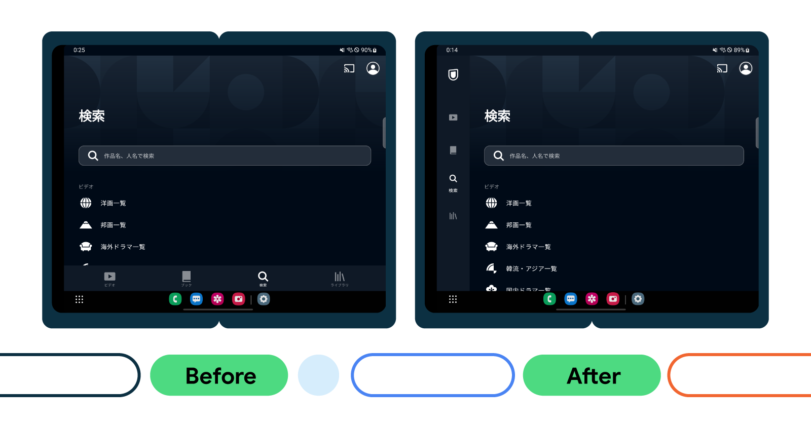
As part of its feature overhaul, U-NEXT replaced the traditional navigation bar with a navigation rail, which U-NEXT engineers anticipated would significantly improve the user experience. U-NEXT made this change in line with Android’s Do’s and Don't for Large Screens presentation from its recent Android Developer Summit, which provided best practices for developers optimizing for large screens.

“Reachability is an important factor when it comes to curating comfortable user experiences,” said Tomoya. “With a traditional, horizontal navigation bar, it makes it difficult to reach the buttons in the middle. With a navigation rail, it becomes much easier to reach these buttons.”

Image showing side by side rendering of UI before the implementation of the navigation rail on the left and after on the right

Next, the team enhanced support for two-page spreads when users viewed any e-books content on large screens. Apps typically display a single page when devices are oriented vertically on large screens and foldables. But because most large screens and foldables offer plenty of room for a double-page view, U-NEXT developers wanted to ensure users would always see a double-page spread whether in portrait or landscape orientation—even when the device was slightly folded.

The U-NEXT team also included some smaller, quality-of-life updates to make the user experience for large screens and foldables even better. These included enhancing the app’s compatibility with Compose by ensuring the Navigation component was consistent on every screen size, adding better support for Google Play in-app billing on large screens, and optimizing picture-in-picture viewing.

'The number of installations on tablets increased by more than 1.5x following the update for large screen devices.' — Tomoya Miwa, principal engineer at U-NEXT

Android support makes optimization easy

The U-NEXT team was surprised by how easy it was to optimize its app for large screens and foldable devices. Thanks to Android’s developer resources, U-NEXT was able to improve content viewing on its app, across devices, while also minimizing time and effort.

“It’s not that difficult,” said Tomoya. “Introducing the navigation was relatively easy, and foldable support in general is not hard as long as your app is compatible with basic screen rotation.”

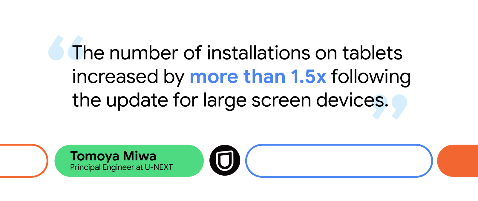
Since updating the U-NEXT app to better support large screens, tablet installations have increased by 1.5X. Additionally, the watch time from users on large screen devices jumped by more than 10%.

Looking forward, the U-NEXT team plans to keep expanding its app’s large screen capabilities by enhancing mouse and keyboard compatibility, introducing list detail view to improve search functionality, adding greater support for tabletop mode, and implementing drag-and-drop features to make content sharing easier.

U-NEXT is excited to see Android add more resources to its large and expanding list of documentation, including the recently updated Material 3 library, which will further help support the growing number of users with large screen and foldable devices.

Start optimizing for large screens today

More people are using large screens, foldables, and other up-and-coming form factors. Learn how you can better support your users on these devices with examples from Android’s Large Screen Gallery.

Kakaonavi increased foldable adoption by 24.5% after optimizing its app for large screens

Posted by the Android team

Kakaonavi prides itself on providing fast, accurate routes while offering several other helpful features, including directions to the nearest EV charging stations, car wash order services, navigation data, maintenance reminders, and more. As Korea’s top ranking driving assistant, Kakaonavi wants to make the daily driving experience as easy as possible for its users. Recently, that meant making its services consistent across devices.

With an increasing number of people using large screen and foldable Android devices, Kakaonavi saw a need to evolve its application to optimize the driving experience across all screen shapes and sizes. To do this, the Kakaonavi team focused on establishing a high-quality user experience for large screens by using Android’s latest software features.

Meeting the growing demand for large screens and foldables

Before updating its app, Kakaonavi’s user experience wasn’t tailored for large screens and foldables. The different sizes of devices caused the UI to be displayed improperly on them, which affected the user experience because screen ratio and resolution have a significant impact on usability.

Kakaonavi also recognized that many of its users preferred foldables because they’re easier to position in vehicles, allowing drivers to prop their device on a dashboard or center console. “The reason we decided to focus on foldables is due to the flexible display options provided by them,” said Jaesun Lee, Android developer at Kakaonavi. “Drivers can view the map however they prefer depending on how they fold or unfold the device inside their vehicle.”
ALT TEXT
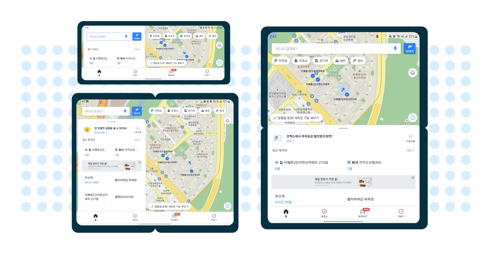
Additionally, some drivers, including professionals like truck drivers and taxi drivers, use Kakaonavi with three to four other apps simultaneously through Android OS’s split-screen mode. At the time, the Kakaonavi team had only established this type of multi-window supportfor devices with standard resolutions, leading to some of its users experiencing UI issues when trying to run multiple applications at once.

Cohesive experiences across form factors

Developers at Kakaonavi addressed these issues by creating a common UI for large screen and foldable devices. They needed to ensure the UI was consistent whether the device was folded or unfolded, or in portrait or landscape mode. The UI also had to work efficiently while users ran multiple apps on their device’s main display. Because the ability to display map and location information on a larger screen is one of the benefits of these devices, creating consistency across layouts was essential to Kakaonavi’s success.

Using ConstraintLayout, which lets developers create large, complex layouts with a flatter app structure, the Kakaonavi team displayed a uniform, responsive UI regardless of the screen size or ratio. To handle configuration changes that are common on these devices, such as resizing windows or orientation changes, Kakaonavi's developers overrode onConfigurationChanged().

Overriding onConfigurationChanged() ensured the app ran smoothly on all screen sizes and during view mode changes by preventing the system from recreating UI elements triggered by folding and unfolding a device or opening multiple windows. Manually configuring these changes to preserve UI elements, rather than automatically deleting and recreating them, drastically improved the app’s UI performance for these new form factors.

“Since the map and UI state are updated frequently by GPS, we decided that the app would perform better by responding only to changes in screen orientation and screen size with onConfigurationChanged(), rather than restoring the previous state by restarting the Activity,” said Jaesun.

The Kakaonavi team also used multi-resume to enhance the app’s multi-window support for large screens and foldables. Multi-resume lets its users keep multiple applications in an active state while on screen, making multitasking more convenient and reliable.

ALT TEXT

Positive results and expanding opportunities

The number of people using large screen and foldable devices has grown significantly and will continue to grow as more of these devices become available. Currently, there are more than 270 million large screen Android devices in use, including tablets, foldables, and Chrome OS devices.

Kakaonavi has seen this same trend in devices used by its consumers. Since the brand began optimizing its application for large screens in January 2022, its number of monthly active users who use the app on foldables has increased by 24.5%, and the company has received positive feedback from drivers using tablets and foldables as their main source of navigation. As of today, Kakaonavi is optimized for all available tablets and foldables.

The Kakaonavi team is excited by the opportunities these new form factors will bring by giving its users more ways to interact with the app. Looking ahead, the brand plans to further optimize its UI with Jetpack Compose and is already considering how to further tailor its multi-window support to large screens and foldables.

“There will be more devices with various screen sizes and ratios in the future,” said Jaesun. “That’s why we believe it’s important to always provide an optimized UI and meet the needs of consumers’ frequently changing screens.”

Optimize your app for all form factors

Learn how you can optimize your application for large screens and upcoming form factors.

Form Factors at Android Developer Summit ‘22

Posted by Alex Vanyo, Developer Relations EngineerThe Android Developer Summit is live with the second stop on our world tour - and we are thrilled to give you the latest updates on Android form factors! Discover the latest tools, APIs and guidance that make it easier to build apps that look great on large screens, wearables, and TVs. Here are the three things you need to know about form factors at ADS, and check out the full YouTube playlist here:

#1: Android developers are finding BIG success when optimizing their apps for large screens

The large screen category is growing, with over 270 million active large screen Android devices and an expanding portfolio of tablets, desktops, and foldables to choose from. That’s why there has never been a better time to be sure your app looks great across all screen sizes and postures. To learn practical tips for optimizing your app for large screens, check out the Do’s and Don’ts: Mindset for optimizing apps for larger screens session. Throughout the session, the Android team highlights design guidance, app quality, and additional tips for large screens on everything from reachability to canonical layouts. New Android Studio tools like emulators and reference devices make it easier to build and test.In-depth guides help you improve your app by optimizing layouts, avoiding camera issues, and enhancing support for peripherals like mouse, keyboard and stylus.

Large screens enable users to see more, do more, and experience more. With large screen sizes, there are ever-expanding opportunities to excite and delight your users with differentiated app experiences. That’s why we launched our new large screens gallery page during the Android Dev Summit kickoff, with general design tips and verticalized use cases, and implementation ideas.

#2: It’s easier than ever to develop for Wear OS

Compose for Wear OS is stable, bringing the modern UI toolkit to the wrist and making it simpler than ever to build exceptional Wear OS apps. This toolkit is designed to help you get your app up and running faster than before; Outdooractive adopted Compose for Wear OS and enhanced their wearable experience with 30% fewer development hours. Equally important as development time is the user experience you are able to provide. Todoist rebuilt their app using Compose for Wear OS, saw their growth rate on Google Play increase by 50%, and heard positive feedback internally and on their social media channels. To begin developing with Compose for Wear OS, get started on our curated learning pathway for a step-by-step learning journey. Where you can find documentation including a quick start guide and get hands on experience with the Compose for Wear OS codelab!

Outdooractive cut development time by an estimated 30% with Compose for Wear OS
The Android Developer Summit technical sessions dive deep into the content you need to build Wear OS apps, with guidance on app architecture, testing, handling rotary input and verticalized sessions for media and fitness. We have seen the impact that Health Services has had on developing health and fitness apps for the wrist, and how powerful this can be when extended with Health Connect on mobile. Using Google APIs and tools, Strava improved their user engagement and retention - with 30% more active days from Wear OS users on Strava than users without a wearable device. For more information on how to start building apps for Wear OS check out the developer site.

#3: Find tips and tricks for developing a great Android TV app

Finally, for Android TV we have collected tips for building amazing living room user experiences, including some new platform features in Android 12 and 13. TV is an important part of the Android ecosystem; of US households watch 25+ hours of content each week. Plus, there are now over 110 million monthly active AndroidTV OS devices. There is a ton to learn about how you can tap into this audience in our Improving the TV User Experience technical session including an update on Compose, seeing how App Bundles relate to TV, and guidance and best practices around energy savings and user preferences.

Those were the top three announcements about Form Factors at Android Developer Summit. Want to learn more? Check out the full form factors playlist on YouTube!

What’s next for Android Dev Summit’ 22? The Platform track, on November 14

This was the second stop on the Android Dev Summit ‘22 tour. Last month, we kicked things off with the keynote as well as our first track on Modern Android Development. After today’s second track on Form Factors, there’s more to come in our third and final track on the Platform, which will be broadcast live on YouTube next week on November 14. We can’t wait to see you again next week!

Coming up next for Android Dev Summit ‘22: The Form Factors track, on November 9!

Posted by Diana Wong, Product ManagerLast month, we kicked off the first part of Android Dev Summit, and later this week comes the second session track: Form Factors! In this track, we’ll bring you through all things Android form factors, including the API, tooling, and design guidance needed to help make your app look great on Android watches, tablets, TVs and more. We dropped information on the livestream agenda, technical talks, and speakers — so start planning your schedule!

Form Factors Track @ Android Dev Summit November 9, 2022 
Sessions: Deep Dive into Wear OS App Architecture, Build Better Uls Across Form Factors with Android Studio, Designing for Large Screens: Canonical Layouts and Visual Hierarchy Compose: Implementing Responsive UI for Large Screens, Creating Helpful Fitness Experiences with Health Services and Health Connect, The Key to Keyboard and Mouse Support across Tablets and ChromeOS Your Camera App on Different Form Factors,  Building Media Apps on Wear OS,  Why and How to Optimize Your App for ChromeOS. 
Broadcast live on d.android.com/dev-summit & YouTube.

Here’s what to expect on November 9th:

Get ready for all things form factors! We’re kicking the livestream off at 1:00 PM GMT on November 9th on YouTube and developer.android.com, where you’ll be able to watch over 20 sessions and check out the latest announcements on building for different form factors, with talks such as:

  • Build Better UIs Across Form Factors with Android Studio
  • Deep Dive into Wear OS App Architecture
  • Do's and Don'ts: Mindset for Optimizing Apps for Large Screens

And to wrap the livestream up, at 4:20 PM GMT, we’ll be hosting a live Q&A – #AskAndroid - so you can get your burning form factors questions answered live by the team who built Android. Post your questions to Twitter or comment in the YouTube livestream using #AskAndroid, for a chance to have your questions answered on the livestream.


There’s more to come!

There is even more to get excited for as the Android Dev Summit continues later this month with the Platform track. On November 14, we’re broadcasting our Platform technical talks where you’ll learn about the latest innovations and updates to the Android platform. You’ll be able to watch talks such as Android 13: Migrate your apps, Presenting a high-quality media experience for all users, and Migrating to Billing Library 5 and more flexible subscriptions on Google Play. Get a sneak peak at all the Platform talks here.

Missed the kick off event? Watch the keynote on YouTube and check out the keynote recap so you don’t miss a beat! Plus, get up to speed on all things Modern Android Development with a recap video, blog, and the full MAD playlist where you can find case studies and technical sessions.

We’re so excited for all the great content yet to come from Android Dev Summit, and we’re looking forward to connecting with you!

3 things to know about Form Factors at Google I/O’22

Three different form factors- a phone, watch, and tablet 

With close to half a billion cars, TVs, watches and laptops running on Android, it is more important than ever for apps to work seamlessly across every device. This year at I/O, we renewed our focus on form factors and announced major updates for Wear OS and Large Screens. To help you get to the bottom of what’s new, here are the three things you need to know about Form Factors at Google I/O:


#1: Building Wear OS and fitness apps is simpler than ever

Compose for Wear OS GIF 

At I/O we announced the Beta release of Compose for Wear OS, our modern declarative UI toolkit designed to help developers build exceptional user experiences for Wear OS. Compose for Wear OS shares the foundation and principles of Jetpack Compose, helping to simplify and accelerate UI development. Additionally, Compose for Wear OS offers the Material catalog with components that are optimized for the watch experience.

We’ve been developing Compose for Wear OS with open source community feedback and participation. Since the Developer Preview, we’ve added and improved a number of components such as navigation, scaling lazy lists, input and gesture support and many more. Compose for Wear OS is now feature complete for the 1.0 release coming soon and the API is stable - so you can begin building beautiful, production-ready apps.

Health Services Logo

Health Services—the power efficient and easy-to-use library for collecting real-time sensor data on smartwatches—will soon be available in beta and ready for production use. Health Services enables apps to take advantage of modern smartwatch architecture, thus helping conserve battery while still delivering high frequency data. Since the alpha release last year, we have been working hard to increase performance and improve the developer experience. We have also made some improvements to the API in response to your feedback.

If you have an existing health and fitness app for Wear OS you want to update, or have a completely new app in mind, we suggest you look at Health Service to provide the best experience for Wear 3 users and prepare your app for additional devices and sensors in the future. For example, this library will power all the Google- and Fitbit-branded health and fitness experiences on the recently announced Google Pixel Watch.

Health Conect Logo

And, last but not least, we just launched Health Connect. With Health Connect, users will be able to securely store health and fitness data on their phone and connect and share that data with some of their favorite health and fitness apps. Samsung Health, Google Fit and Fitbit are integrating with Health Connect, along with many popular health and fitness apps. Health Connect is a common set of APIs for storing & sharing health data on Android phones. Developers can read from & write data to an on-device data store and we’ve standardized the schema and API behavior, making it easy for you to use the data. We know how important the privacy of each user’s health data is, so we centralized permissions and privacy controls - making it clear and simple for your users to manage and control this data.


#2: Google is all-in on tablets

Google is going big on large screens with innovations in hardware, optimizations in the operating system and a major investment in our app ecosystem. In the first quarter of this year, we saw active large screen users approaching 270 million, making it a great time to optimize for tablets, foldables and Chrome OS.

Since last I/O we launched Android 12L, a feature drop that makes Android 12 even better on large screens. With Android 13, we are including all of these improvements and more. Android 12L and 13 have a huge number of optimizations for large screens, including the task bar, multi-tasking, keyboard and mouse support, and a compatibility mode for applications. We also have exciting updates to guidance, testing and tools. To take the guesswork out of optimizing and testing your app for large screens, we created a set of Large Screen Quality guidelines and a number of Material Design Canonical Layouts. Our guidance is implemented in our Jetpack libraries, which bake in many of the most common tasks for Large Screen development, such as drag and drop.


Quote from Developer at Meta 

Hardware innovation is a cornerstone of Google’s investment in large screens - this year and beyond. At I/O, we announced the Google Pixel tablet, coming in 2023. Plus, our partners are creating some amazing devices with tablets, Chromebooks, and foldables coming from companies like Samsung, Lenovo, and OPPO.

With the incredible hardware and operating system innovations, more apps than ever are optimizing for large screens. Apps like Facebook, TikTok, HBO Max and Zoom look great on large screens. Here at Google, we recognize the opportunity with large screens. Apps like YouTube, Google Maps, Google Photos, Chrome, and many of our most popular apps are rolling out large screen optimizations, with more to come.

These apps - and more - are available on the Play Store, where we have made some of our most impactful updates to date. We are committed to helping users find the best large-screen optimized apps in the Play Store with new large screens focused editorial content and separate reviews and ratings for large-screen applications. Plus, we are updating Google Play to look awesome on a tablet, Chromebook or foldable device.


#3: We’re here to support you!

To make your apps even better on large screens and Wear OS, we’ve created in-depth content for making your app work better across different types of inputs, screen sizes and devices.

In Android Studio Dolphin Beta and Electric Eel Canary we’ve added new features for Wear OS and Large screens to help you be more productive when developing and testing for different form factors. Read more


Looking to get started? Here’s all the amazing I/O content to help you on your way:

Sharing Tiles with your smartwatch users:

Posted by Jeremy Walker, Engineer

Tiles provide quick access to information and actions with a simple swipe from the watch face home screen. This gives smartwatch users more control over what information and actions they want to see, and it’s no surprise that Tiles have become one of the most helpful and useful features for smartwatches that run on Wear OS.

Today we’re announcing Tiles can be shared with your smartwatch users. You can start creating your custom Tile by downloading the latest Alpha release of the Jetpack Tiles API. Once you upload your experience to Google Play, your users will be able to download your Tile and start using it. Let your users know they can try out the new experience. You can also upload a screenshot of your Tile to your Play Store preview assets within Google Play Console.

Apps such as Calm and Sleep Cycle have already started building custom Tiles.


Tiles blog


"Using the new Tiles API, we were able to easily expose our Wear app features to be just a swipe away from your watch face." -Samo Kralj, Android Staff Software Engineer at Calm.

Tiles blog


The API was easy to understand and the documentation was quite clear, enabling us to have our first tile running with real data within hours. It feels like a very modern API that is easy to get started with.” -Viktor Åkerskog, Technical Lead at Sleep Cycle


We've appreciated all your feedback on the alpha library, and have included many of the requests and performance improvements into the APIs. You can add any additional feedback here to help us prioritize API improvements for future releases.

If you haven't had a chance to try out the API, check out the guide, or if you prefer a walkthrough, explore the Tiles codelab.

Happy coding!

What’s new in foldables, tablets, and large screens

Posted by Oscar Wahltinez, Developer Relations Engineer, Google

Users are seeing more value in larger screens, and the benefits of doing more with a single device. Apps designed for large screen devices increase those benefits even further.

The ability to fold a screen offers better ergonomics for large devices. When folded, you can fit a tablet-sized screen in your pocket — unlocking utility that was previously unavailable on a portable device. Thinking about our app ecosystem, we’re excited because this is a hardware shift that is driving new expectations around what you can do from a handheld device. We see the demand for larger screens extending to tablets too, which have greatly increased in popularity, given the similar app experience.

Technological breakthroughs and our understanding of ergonomics have played a role in device form factors.

Technological breakthroughs and our understanding of ergonomics have played a role in device form factors.

In this blog post, we'll explain what you should do to prepare your apps for large screens, and how recent updates have made developing your app easier. But first, let’s talk about what we're seeing with large screens — and why you should optimize your app.

Why large screens

There are many ways to use foldable devices, including a number of postures
  illustrated here.

There are many ways to use foldable devices, including a number of postures illustrated here.

Over the past year, we’ve seen device makers release exciting new foldable and tablet devices. Demand has increased as users are doing more than ever from these devices. Altogether, developers can reach more than 250 million active foldables, tablets, and Chromebooks by building for Android large screen devices today. Sales of tablet devices grew 16% in 2020 with analysts expecting more than 400 million Android tablets by 2023, and foldables are redefining what’s possible on premium devices. Android apps can also run on ChromeOS, which is now the second most popular desktop OS.

Large screen ready

Larger screens are changing how users interact with their device. These devices allow you to edit slide decks while looking at notes, look up restaurant recommendations while planning a night out, or watch a video while chatting with friends. Let’s talk about base-level support — features an app must support to be “large screen ready”. There are three main areas of focus when it comes to large screen readiness:

  1. Designing for large screens
  2. Multitasking
  3. Input modes

They’re summarized below, but make sure to check out our large screen app quality guidelines for the full details.

Design for large screens

The first step is to ensure that your app is designed for large screens. To make this easier, we’ve defined specific window size breakpoints and device classes for you to optimize for. Add tablet layouts for displays where the shortest dimension is >600dp, and ensure your apps go edge-to-edge. Developers should also plan for their app to be used in both portrait and landscape modes, since larger screens are more likely to be used in landscape. We’ve got material adaptive components that we’ll be talking about to help developers make better use of the increased space.

Since foldable and large screen devices have a variable window size, adaptive
  layouts work better than splitting experiences based on screen size.

Since foldable and large screen devices have a variable window size, adaptive layouts work better than splitting experiences based on screen size.

Multitasking

Going into split screen (or multi-window mode) and gestures like drag and drop are starting to become natural interactions that users expect to work seamlessly in their large screen devices. Your apps should handle multitasking seamlessly by being resizable. Handling folding and unfolding events and planning for your app to be in multi-window mode prevents your app from becoming letterboxed.

Drag and drop can be a natural interaction in large screen layouts, even within the same
  app.

Drag and drop can be a natural interaction in large screen layouts, even within the same app.

By enabling multiple instance support, users can run multiple copies of your
  app side-by-side. The let’s users compare two products, reference notes
  while writing a document or maybe keeping your calendar in view as you are
  planning an event.

By enabling multiple instance support, users can run multiple copies of your app side-by-side. The let’s users compare two products, reference notes while writing a document or maybe keeping your calendar in view as you are planning an event.

Input modes

Since many people use larger screens for productivity, tablets should support basic keyboard, mouse and stylus usage.

Users of Android apps on ChromeOS devices often have a keyboard; apps should ensure that standard keyboard navigation and shortcuts are available to provide improved accessibility.

Users of Android apps on ChromeOS devices often have a keyboard; apps should ensure that standard keyboard navigation and shortcuts are available to provide improved accessibility.

Component updates

Several UI components across Jetpack and Material Design libraries have been updated to help you build a flexible user experience to scale your phone's UI to a larger screen.

SlidingPaneLayout

One of the most common adaptive layouts to optimize your app for large screens is implementing a list-detail UI. For example, a messaging app that lists messages on one side with the message detail on the other.

SlidingPaneLayout automatically adapts to configuration changes to provide a good user experience across different layout sizes.

SlidingPaneLayout automatically adapts to configuration changes to provide a good user experience across different layout sizes.

UIs that would be one top of each other on a smaller screen can now easily lay out side-by-side. For this, you can use the updated version of the SlidingPaneLayout library — updated to support a two-pane style layout, SlidingPaneLayout uses the width of the two panes to determine how to lay out the UI. It does that by automatically determining if it can lay out side-by-side based on the content width and available space. For example, if the list pane is measured to have a minimum width of 200dp and the detail pane needs 400dp, then the SlidingPaneLayout automatically shows the two panes side by side if it has at least 600dp of width available.

SlidingPaneLayout is used in our sample application IOSched.

SlidingPaneLayout is used in our sample application IOSched.

We have updated the library to recognize and adapt to folds and hinges . For example, if you are on a device with hinges that blocks part of the screen, it will automatically place your content on either side.

We have also introduced lock modes,which allow control over the swipe behavior when panes overlap (programmatically switching is also supported). For example, to prevent users from swiping to an empty pane you may want them to have to click on a list item to load information about that pane, but allow them to swipe back to the list. On a foldable device or tablet that has room to show both views side by side, the lock modes are ignored.

NavRail

A vertical Navigation Rail is functionally equivalent to Bottom navigation, and provides a more ergonomic navigation experience on larger screens. As you scale your UI, NavRail supports better reachability, since larger screens tend to be held by the side, whereas on the phone users are probably holding the device from the bottom.

NavRail automatically changes the location of the navigation menu depending
	on configuration changes.

NavRail automatically changes the location of the navigation menu depending on configuration changes.

For example, NavRail can help if vertical scrolling is key to your app. In those cases, a bottom navigation bar decreases the amount of content that’s visible, especially when tablet devices are being used in landscape orientation.

Other Components

We've also made updates across multiple other components. One of the biggest pitfalls when apps move to a larger screen is when UIs are stretched edge-to-edge across the whole screen. To help prevent this, we’ve added default Max Width values to certain Material Components where this commonly happens, for example:

  • Buttons
  • TextFields
  • Sheets

We will add more components to this list in the future. These changes provide opinionated defaults to help your apps adapt and look better out of the box on large screen devices. Find more information about using size constraints with components in the Material Design guidelines.

Most foreground UI elements should have a maximum width value.

Most foreground UI elements should have a maximum width value.

WindowManager Jetpack library

Beyond component updates to help you scale your UI, we also have the WindowManager Jetpack library to help you build better experiences on these devices. This library is now available in alpha and it provides a common API surface for supporting different device types, starting with foldables and tablets.

You can use WindowManager to detect display features such as folds or hinges. It also gives information about how the display feature affects your app, so you can create an optimal experience. For example, reacting to the foldable device state changes when the device is folded into tabletop mode while the user is watching a video.

Applications should seamlessly adapt to a growing number of device configurations.

Applications should seamlessly adapt to a growing number of device configurations.

WindowManager also provides a couple of convenience methods to retrieve the current and maximum WindowMetrics information in a backward compatible way, starting from API level 14.

Platform changes

Display API deprecations

Your app needs to determine the screen or display size in order to render content appropriately for each device. With the introduction of the WindowMetrics API, a number of methods related to display size have been deprecated. For a backwards-compatible replacement, you should use the Window Manager Jetpack library.

Exclusive resources

Android 10 introduced the possibility to have multiple resumed apps running at the same time, with a single “top resumed” application. Most applications benefit from this change without the need of updates. The most notable exception is if your application uses an exclusive resource like the microphone or the camera. See our previous blog post for more details.

Case studies

Optimizing your app for large screens can improve the experience for your users, as well as deliver on business results. We’re seeing an increased number of apps take advantage of the opportunities with large screens on Google Play. As an example, Google Duo implemented tablet and foldable support to enhance their user experience, and saw an increase in app ratings and user engagement.

Google Duo's optimized experience for foldable devices

Google Duo's optimized experience for foldable devices, such as the Samsung Galaxy Z Fold2

In addition to Google Duo's enhanced user experience, we've modernized many additional apps to use adaptive layouts so they can take advantage of large screens and foldable devices:

  • Chrome added improved tab navigation for larger screens
  • YouTube redesigned its UI to improve usability in foldable devices
  • Google Photos displays more UI elements, like a search bar, in larger screens
  • Google Calendar provides a more ergonomic UI in larger screens


Learn more

To learn more about foldables and large screen devices, see the following resources:

Android 10 on Android TV

Posted by Paul Lammertsma, Developer Advocate

Technology has changed the way media and entertainment is accessed and consumed in the home. While the living room experience is evolving with the addition of smart devices, TVs still remain the largest and most frequently used screen for watching content.

When Android TV was first introduced in 2014, we set out to bring the best of Android into the connected home on the TV. We worked closely with the developer community to grow our content and app ecosystem and bring users the content they want. Since then, we’ve seen tremendous momentum with OEM and operator partners as well as consumer adoption worldwide.

Today, we are bringing Android API level 29 with the recent performance and security updates made with Android 10 to Android TV. We’re excited to provide faster updates through Project Treble and more secure storage with encrypted user data. TLS 1.3 by default also brings better performance benefits and is up to date with the TLS standard. In addition, Android 10 includes hardening for several security-critical areas of the platform.

ADT-3

To make sure developers have the ability to build and test Android TV app implementations on Android 10 prior to rollout, we’re introducing a new, developer-focused streaming media device called ADT-3.

With a quad-core A53, 2GB of DDR3 memory and 4Kp60 HDR HDMI 2.1 output, we’ve designed this pre-certified TV dongle with updates and security patches to help developers design for the next generation of Android TV devices. By providing a way to test on physical and up to date hardware, developers can better validate their Android TV app’s compatibility.

Android TV box and remote

ADT-3 will be made available to developers in the coming months for purchase online through an OEM partner.