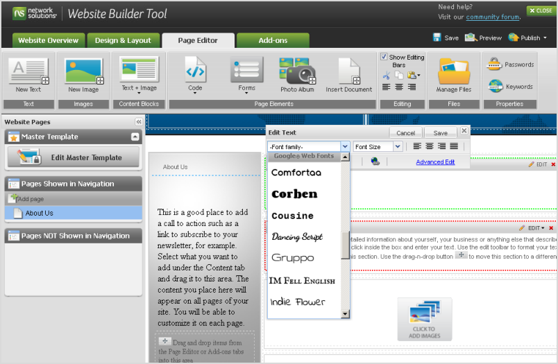
 Ania Kruk is a type designer from Poznan, Poland. She currently lives and works in Barcelona and Google Web Fonts is proud to include her first published typeface, Cookie.Q: What is your background as a designer, and how did you become interested in type design?
Actually, I'm still a beginner in the world of type design: I have drawn letters for only 2 years. I've recently graduated from the University of Arts in Poznan, Poland. Originally, I studied product design, but after 3 years I found myself more interested in graphics than in furniture.
So I took a one year break and moved to Barcelona, Spain, where I worked as an intern in Estudio Mariscal (which was quite an experience, as they were working on the 'Chico y Rita' movie at that time), and did a one-year Masters in Typography and Editorial Design at Eina, Escola de Disseny i Art.
When I came back to Poland for my last year of studies, I was 100% sure that I wanted to focus on type design.
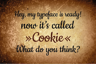
And here I am now, 3 months after my graduation, with my first typeface to be published:
Cookie :)
Q: What is your favourite part of the type design process, and why?Generally, I'm interested in complex, narrative projects that require creating a whole from various elements (meaning: editorial design, information design, typography). Type Design is not about designing one letter, it's about creating a system: the alphabet.
I like the moment when you can start writing words and sentences with your letters, because then you can actually work on the flow and on the balance between the characters. For example, to make some of them more 'normal', transparent, in order to make others more distinctive or decorative.
Q: Designing a new typeface is a long journey. What inspires you to keep motivated throughout all the different stages?For sure, Type Design is all about details, that an average user won't even notice, so you need to be patient to do this kind of work. I'd say I'm quite competitive, so when I see other peoples projects and I think 'Wow, that's so cool!', it get's me motivated ;) I spend an awful amount of time digging through the internet, checking out blogs, personal websites, etc.
 Q: Can you recommend how other type designers can learn the skills involved in making type?
It's hard to say, because I'm still learning myself. But I'd say that calligraphy and drawing are essential to understanding the construction of the letters.
Q: What do you think could be improved about the type design process?For me the hard part is hinting ;)
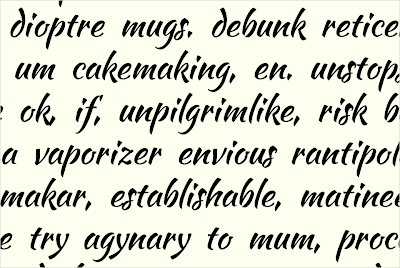
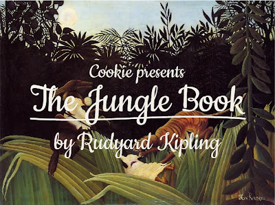
Q: What inspired you to create Cookie?Cookie is a script typeface, based on brush calligraphy. It has a little bit of the 1950s look, that makes you think about all the beautiful ads and pin-ups from this time. It's sweet and friendly - but not too decorative. I tried to keep it simple and legible.
Q: Did you try to accomplish something specific with this typeface design, and did you succeed?It's my first script typeface, so the whole design process was like discovering a new way of working. I wanted to create a typeface with a nice flow between the letters, and I wanted the letters to join in a natural way - that's the tough part, if you think about all the possible combinations between 26 lowercase characters. I hope it works ok...!
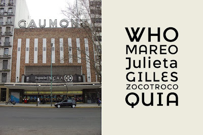
Q: What kinds of uses are most appropriate for this font?Its clearly a display typeface, suitable more for titles than main texts. But it can be used for short texts, if you're aiming for a hand-written look. It will look good on an invitation, menu, recipe... poster, flyer or as a header of your blog :)
Q: What are your favourite fonts, and why?Well, I don't really have any favourites. It all depends on the context and what you want to communicate: a typeface can be perfect for one kind of a job, but look horrible when misused.
There are some surprises: I've always considered Mistral by Roger Excoffon as very kitsch and ugly, until I've seen it in on the opening credits for the movie 'Drive'. It looked just great, combined with the music and pictures.
Posted by Dave Crossland, Font Consultant, Google Web Fonts