Android devices do a lot, whether it is taking pictures, getting directions or making phone calls. With all of this functionality comes a large amount of very sensitive user data including contacts, calendar appointments, current location, and more. This sensitive information is protected by permissions, which each app must have before being able to access the data. Android 6.0 Marshmallow introduces one of the largest changes to the permissions model with the addition of runtime permissions, a new permission model that replaces the existing install time permissions model when you target API 23 and the app is running on an Android 6.0+ device.
Runtime permissions give your app the ability to control when and with what context you’ll ask for permissions. This means that users installing your app from Google Play will not be required to accept a list of permissions before installing your app, making it easy for users to get directly into your app. It also means that if your app adds new permissions, app updates will not be blocked until the user accepts the new permissions. Instead, your app can ask for the newly added runtime permissions as needed.
Finding the right time to ask for runtime permissions has an important impact on your app’s user experience. We’ve gathered a number of design patterns in our new Permission design guidelines including best practices around when to request permissions, how to explain why permissions are needed, and how to handle permissions being denied.
Ask up front for permissions that are obvious
In many cases, you can avoid permissions altogether by using the existing intents system to utilize other existing specialized apps rather than building a full experience within your app. An example of this is using ACTION_IMAGE_CAPTURE to start an existing camera app the user is familiar with rather than building your own camera experience. Learn more about permissions versus intents.
However, if you do need a runtime permission, there’s a number of tools to help you. Checking for whether your app has a permission is possible with ContextCompat.checkSelfPermission() (available as part of revision 23 of the support-v4 library for backward compatibility) and requesting permissions can be done with requestPermissions(), bringing up the system controlled permissions dialog to allow the user to grant you the requested permission(s) if you don’t already have them. Keep in mind that users can revoke permissions at any time through the system settings so you should always check permissions every time.
A special note should be made around shouldShowRequestPermissionRationale(). This method returns true if the user has denied your permission request at least once yet have not selected the ‘Don’t ask again’ option (which appears the second or later time the permission dialog appears). This gives you an opportunity to provide additional education around the feature and why you need the given permission. Learn more about explaining why the app needs permissions.
Read through the design guidelines and our developer guide for all of the details in getting your app ready for Android 6.0 and runtime permissions. Making it easy to install your app and providing context around accessing user’s sensitive data are key changes you can make to build better apps.
Posted by Roman Nurik, Design Advocate, and Richard The, Google Creative Lab
Android was created as an open and flexible platform, giving people more ways to come together to imagine and create. This spirit of invention has allowed developers to push the boundaries of mobile development and has helped make Android the go-to platform for creative projects in more places—from phones, to tablets, to watches, and beyond. We set out to find a way to celebrate the creative, experimental Android work of developers everywhere and inspire more developers to get creative with technology and code.
Today, we’re excited to launch Android Experiments: a showcase of inspiring projects on Android and an open invitation for all developers to submit their own experiments to the gallery.
The 20 initial experiments show a broad range of creative work–from camera experiments to innovative Android Wear apps to hardware hacks to cutting edge OpenGL demos. All are built using platforms such as the Android SDK and NDK, Android Wear, the IOIO board, Cinder, Processing, OpenFrameworks and Unity. Each project creatively examines in small and big ways how we think of the devices we interact with every day.
Today is just the beginning as we’re opening up experiment submissions to creators everywhere. Whether you’re a student just starting out, or you’ve been at it for a while, and no matter the framework it uses or the device it runs on, Android Experiments is open to everybody.
Check out Android Experiments to view the completed projects, or to submit one of your own. While we can’t post every submission, we’d love to see what you’ve created.
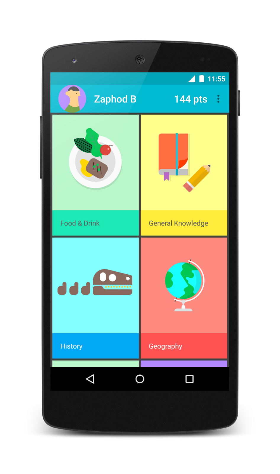
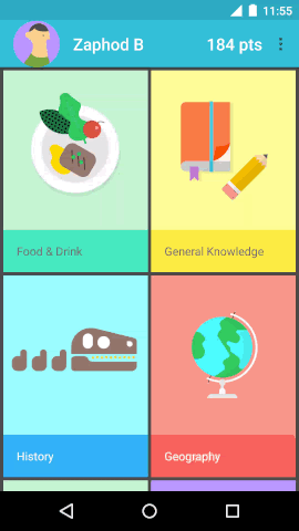
Material design is a new system for visual, interaction and motion design. We originally launched the Topeka web app as an Open Source example of material design on the web.
Today, we’re publishing a new material design example: The Android version of Topeka. It demonstrates that the same branding and material design principles can be used to create a consistent experience across platforms.
Grab the code today on GitHub.
The juicy bits
While the project demonstrates a lot of different aspects of material design, let’s take a quick look at some of the most interesting bits.
Transitions
Topeka for Android features several possibilities for transition implementation. For starters the Transitions API within ActivityOptions provides an easy, yet effective way to make great transitions between Activities.
To achieve this, we register the shared string in a resources file like this:
For multiple transition participants with ActivityOptions you can take a look at the CategorySelectionFragment.
Animations
When it comes to more complex animations you can orchestrate your own animations as we did for scoring.
To get this right it is important to make sure all elements are carefully choreographed.
The AbsQuizView class performs a handful of carefully crafted animations when a question has been answered:
The animation starts with a color change for the floating action button, depending on the provided answer. After this has finished, the button shrinks out of view with a scale animation. The view holding the question itself also moves offscreen. We scale this view to a small green square before sliding it up behind the app bar. During the scaling the foreground of the view changes color to match the color of the fab that just disappeared. This establishes continuity across the various quiz question states.
All this takes place in less than a second’s time. We introduced a number of minor pauses (start delays) to keep the animation from being too overwhelming, while ensuring it’s still fast.
The code responsible for this exists within AbsQuizView’s performScoreAnimation method.
FAB placement
The recently announced Floating Action Buttons are great for executing promoted actions. In the case of Topeka, we use it to submit an answer. The FAB also straddles two surfaces with variable heights; like this:
To achieve this we query the height of the top view (R.id.question_view) and then set padding on the FloatingActionButton once the view hierarchy has been laid out:
private void addFloatingActionButton() {
    final int fabSize = getResources().getDimensionPixelSize(R.dimen.fab_size);
    int bottomOfQuestionView = findViewById(R.id.question_view).getBottom();
    final LayoutParams fabLayoutParams = new LayoutParams(fabSize, fabSize,
            Gravity.END | Gravity.TOP);
    final int fabPadding = getResources().getDimensionPixelSize(R.dimen.padding_fab);
    final int halfAFab = fabSize / 2;
    fabLayoutParams.setMargins(0, // left
        bottomOfQuestionView - halfAFab, //top
        0, // right
        fabPadding); // bottom
    addView(mSubmitAnswer, fabLayoutParams);
}
To make sure that this only happens after the initial layout, we use an OnLayoutChangeListener in the AbsQuizView’s constructor:
addOnLayoutChangeListener(new OnLayoutChangeListener() {
    @Override
    public void onLayoutChange(View v, int l, int t, int r, int b,
            int oldLeft, int oldTop, int oldRight, int oldBottom) {
        removeOnLayoutChangeListener(this);
        addFloatingActionButton();
    }
});
Round OutlineProvider
Creating circular masks on API 21 onward is now really simple. Just extend the ViewOutlineProvider class and override the getOutline() method like this:
@Override
public final void getOutline(View view, Outline outline) {
    final int size = view.getResources().
        getDimensionPixelSize(R.id.view_size);
    outline.setOval(0, 0, size, size);
}
and setClipToOutline(true) on the target view in order to get the right shadow shape.
We use vector drawables to display icons in several places throughout the app. You might be aware of our collection of Material Design Icons on GitHub which contains about 750 icons for you to use. The best thing for Android developers: As of Lollipop you can use these VectorDrawables within your apps so they will look crisp no matter what density the device’s screen. For example, the back arrow ic_arrow_back from the icons repository has been adapted to Android’s vector drawable format.
The vector drawable only has to be stored once within the res/drawable folder. This means less disk space is being used for drawable assets.
Property Animations
Did you know that you can easily animate any property of a View beyond the standard transformations offered by the ViewPropertyAnimator class (and it’s handy View#animate syntax)? For example in AbsQuizView we define a property for animating the view’s foreground color.
// Property for animating the foreground
public static final Property FOREGROUND_COLOR =
        new IntProperty("foregroundColor") {

            @Override
            public void setValue(FrameLayout layout, int value) {
                if (layout.getForeground() instanceof ColorDrawable) {
                    ((ColorDrawable) layout.getForeground()).setColor(value);
                } else {
                    layout.setForeground(new ColorDrawable(value));
                }
            }

            @Override
            public Integer get(FrameLayout layout) {
                return ((ColorDrawable) layout.getForeground()).getColor();
            }
        };
This can later be used to animate changes to said foreground color from one value to another like this:
final ObjectAnimator foregroundAnimator = ObjectAnimator
        .ofArgb(this, FOREGROUND_COLOR, Color.WHITE, backgroundColor);
This is not particularly new, as it has been added with API 12, but still can come in quite handy when you want to animate color changes in an easy fashion.
Tests
In addition to exemplifying material design components, Topeka for Android also features a set of unit and instrumentation tests that utilize the new testing APIs, namely “Gradle Unit Test Support” and the “Android Testing Support Library.” The implemented tests make the app resilient against changes to the data model. This catches breakages early, gives you more confidence in your code and allows for easy refactoring. Take a look at the androidTest and test folders for more details on how these tests are implemented within Topeka. For a deeper dive into Testing on Android, start reading about the Testing Tools.
What’s next?
With Topeka for Android, you can see how material design lets you create a more consistent experience across Android and the web. The project also highlights some of the best material design features of the Android 5.0 SDK and the new Android Design Library.
While the project currently only supports API 21+, there’s already a feature request open to support earlier versions, using tools like AppCompat and the new Android Design Support Library.
Have a look at the project and let us know in the project issue tracker if you’d like to contribute, or on Google+ or Twitter if you have questions.
Trello is a visual collaboration tool that gives teams a shared perspective on projects. It’s built around the concept of a traditional office whiteboard. Simplicity and flexibility are core to the product, so the Trello team recently redesigned their Android app using the material design guidelines to double down on that effort.
According to Fyza Hashim, Designer at Trello, material design had an immediate impact on streamlining app-design and -development at the company. She added that, “Because the guidelines are so thorough and well thought out, you don’t have to go back and forth with developers.”
Sharing is a key component of Trello, so material design helped continue the same cohesive design and intuitive experience on both web and mobile. This makes sharing even easier. As a result, Trello has also seen double digit growth in user engagement with more and more sessions added per week.
Watch the video where we caught up with Michael Pryor, CEO; Hamid Palo, Mobile Lead; and Fyza at the Trello offices in New York to learn more.
Material design — learn more about material design and how it helps you create beautiful, engaging apps.
Posted by Peter Lubbers, Senior Program Manager, Google Developer Training
We know how important it is for you to efficiently develop the skills to build better Android apps and be successful in your jobs. To meet your training needs, we’ve partnered with Udacity to create Android training courses, ranging from beginner to more advanced content.
Last week at Google I/O we announced the Android Nanodegree, an education credential that is designed for busy people to learn new skills and advance their careers in a short amount of time from anywhere at any time. The nanodegree ties together our Android courses, and provides you with a certificate that may help you be a more marketable Android developer.
Training courses
All training courses are developed and taught by expert Google instructors from the Developer Platform team. In addition to updating our popular Developing Android Apps course and releasing Advanced Android App Development, we now have courses for everyone from beginning programmers to advanced developers who want to configure their Gradle build settings. And then there's all the fun stuff in between—designing great-looking, high performance apps, making your apps run on watches, TVs, and in cars, and using Google services like Maps, Ads, Analytics, and Fit.
Each course is available individually, without charge, at udacity.com/google. Our instructors are waiting for you:
Android Nanodegree
You can also enroll in the new Android Nanodegree for a monthly subscription fee, which gives you access to coaches who will review your code, provide guidance on your project, answer questions about the class, and help keep you on track when you need it.
More importantly, you will learn by doing, focusing only on where you need to grow. Since the Nanodegree is based on your skills and the projects in your portfolio, you do not need to complete the courses that address the skills you already have. You can focus on writing the code and building the projects that meet the requirements for the Nanodegree credential.
We’ll also be inviting 50 Android Nanodegree graduates to Google's headquarters in Mountain View, California, for a three day intensive Android Career Summit in November. Participants will have the opportunity to experience Google’s company culture and attend workshops focused on developing their personal career paths. Participants will then leverage the skills learned from Udacity’s Android Nanodegree during a two-day hackathon.
To help you learn more about this program and and courses within it, Google and Udacity are partnering up for an "Ask the Experts" live streamed series. In the first episode on Wednesday, June 3rd at 2pm PDT, Join Sebastian Thrun, Peter Lubbers and Jocelyn Becker who will be answering your questions on the Nanodegree. RSVP here and ask and vote for questions here.
Android training in Arabic
We also believe that everyone has the right to learn how to develop Android apps. Today, there is a great need for developers in countries outside of the United States as software powers every industry from food and transportation to healthcare and retail. As a first step in getting the Android Nanodegree localized and targeted for individual countries, we have worked with the Government of Egypt and Udacity to create end-to-end translations of our top Android courses into Arabic (including fully dubbed video). Google will offer 2,000 scholarships to students to get a certificate for completing the Arabic version of the Android Fundamentals course. Google will also host job fairs and sessions for students with local employers and the Egyptian Government. For more information, see www.udacity.com/egypt.
Complete Android course catalog
Here are the currently-planned courses in the Android Nanodegree:
Android 5.0 Lollipop was one of the most significant Android releases ever, in no small part due to the introduction of material design, a new design language that refreshed the entire Android experience. Our detailed spec is a great place to start to adopt material design, but we understand that it can be a challenge for developers, particularly ones concerned with backward compatibility. With a little help from the new Android Design Support Library, we’re bringing a number of important material design components to all developers and to all Android 2.1 or higher devices. You’ll find a navigation drawer view, floating labels for editing text, a floating action button, snackbar, tabs, and a motion and scroll framework to tie them together.
Navigation View
The navigation drawer can be an important focal point for identity and navigation within your app and consistency in the design here can make a considerable difference in how easy your app is to navigate, particularly for first time users. NavigationView makes this easier by providing the framework you need for the navigation drawer as well as the ability to inflate your navigation items through a menu resource.
You use NavigationView as DrawerLayout’s drawer content view with a layout such as:
You’ll note two attributes for NavigationView: app:headerLayout controls the (optional) layout used for the header. app:menu is the menu resource inflated for the navigation items (which can also be updated at runtime). NavigationView takes care of the scrim protection of the status bar for you, ensuring that your NavigationView interacts with the status bar appropriately on API21+ devices.
The simplest drawer menus will be a collection of checkable menu items:
You’ll get callbacks on selected items by setting a OnNavigationItemSelectedListener using setNavigationItemSelectedListener(). This provides you with the MenuItem that was clicked, allowing you to handle selection events, changed the checked status, load new content, programmatically close the drawer, or any other actions you may want.
Floating labels for editing text
Even the humble EditText has room to improve in material design. While an EditText alone will hide the hint text after the first character is typed, you can now wrap it in a TextInputLayout, causing the hint text to become a floating label above the EditText, ensuring that users never lose context in what they are entering.
In addition to showing hints, you can also display an error message below the EditText by calling setError().
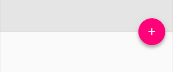
Floating Action Button
A floating action button is a round button denoting a primary action on your interface. The Design library’s FloatingActionButton gives you a single consistent implementation, by default colored using the colorAccent from your theme.
In addition to the normal size floating action button, it also supports the mini size (fabSize="mini") when visual continuity with other elements is critical. As FloatingActionButton extends ImageView, you’ll use android:src or any of the methods such as setImageDrawable() to control the icon shown within the FloatingActionButton.
Snackbar
Providing lightweight, quick feedback about an operation is a perfect opportunity to use a snackbar. Snackbars are shown on the bottom of the screen and contain text with an optional single action. They automatically time out after the given time length by animating off the screen. In addition, users can swipe them away before the timeout.
By including the ability to interact with the Snackbar through swiping it away or actions, these are considerably more powerful than toasts, another lightweight feedback mechanism. However, you’ll find the API very familiar:
You’ll note the use of a View as the first parameter to make() - Snackbar will attempt to find an appropriate parent of the Snackbar’s view to ensure that it is anchored to the bottom.
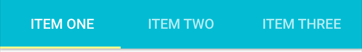
Tabs
Switching between different views in your app via tabs is not a new concept to material design and they are equally at home as a top level navigation pattern or for organizing different groupings of content within your app (say, different genres of music).
The Design library’s TabLayout implements both fixed tabs, where the view’s width is divided equally between all of the tabs, as well as scrollable tabs, where the tabs are not a uniform size and can scroll horizontally. Tabs can be added programmatically:
However, if you are using a ViewPager for horizontal paging between tabs, you can create tabs directly from your PagerAdapter’s getPageTitle() and then connect the two together using setupWithViewPager(). This ensures that tab selection events update the ViewPager and page changes update the selected tab.
CoordinatorLayout, motion, and scrolling
Distinctive visuals are only one part of material design: motion is also an important part of making a great material designed app. While there are a lot of parts of motion in material design including touch ripples and meaningful transitions, the Design library introduces CoordinatorLayout, a layout which provides an additional level of control over touch events between child views, something which many of the components in the Design library take advantage of.
CoordinatorLayout and floating action buttons
A great example of this is when you add a FloatingActionButton as a child of your CoordinatorLayout and then pass that CoordinatorLayout to your Snackbar.make() call - instead of the snackbar displaying over the floating action button, the FloatingActionButton takes advantage of additional callbacks provided by CoordinatorLayout to automatically move upward as the snackbar animates in and returns to its position when the snackbar animates out on Android 3.0 and higher devices - no extra code required.
CoordinatorLayout also provides an layout_anchor attribute which, along with layout_anchorGravity, can be used to place floating views, such as the FloatingActionButton, relative to other views.
CoordinatorLayout and the app bar
The other main use case for the CoordinatorLayout concerns the app bar (formerly action bar) and scrolling techniques. You may already be using a Toolbar in your layout, allowing you to more easily customize the look and integration of that iconic part of an app with the rest of your layout. The Design library takes this to the next level: using an AppBarLayout allows your Toolbar and other views (such as tabs provided by TabLayout) to react to scroll events in a sibling view marked with a ScrollingViewBehavior. Therefore you can create a layout such as:
Now, as the user scrolls the RecyclerView, the AppBarLayout can respond to those events by using the children’s scroll flags to control how they enter (scroll on screen) and exit (scroll off screen). Flags include:
scroll: this flag should be set for all views that want to scroll off the screen - for views that do not use this flag, they’ll remain pinned to the top of the screen
enterAlways: this flag ensures that any downward scroll will cause this view to become visible, enabling the ‘quick return’ pattern
enterAlwaysCollapsed: When your view has declared a minHeight and you use this flag, your View will only enter at its minimum height (i.e., ‘collapsed’), only re-expanding to its full height when the scrolling view has reached it’s top.
exitUntilCollapsed: this flag causes the view to scroll off until it is ‘collapsed’ (its minHeight) before exiting
One note: all views using the scroll flag must be declared before views that do not use the flag. This ensures that all views exit from the top, leaving the fixed elements behind.
Collapsing Toolbars
Adding a Toolbar directly to an AppBarLayout gives you access to the enterAlwaysCollapsed and exitUntilCollapsed scroll flags, but not the detailed control on how different elements react to collapsing. For that, you can use CollapsingToolbarLayout:
This setup uses CollapsingToolbarLayout’s app:layout_collapseMode="pin" to ensure that the Toolbar itself remains pinned to the top of the screen while the view collapses. Even better, when you use CollapsingToolbarLayout and Toolbar together, the title will automatically appear larger when the layout is fully visible, then transition to its default size as it is collapsed. Note that in those cases, you should call setTitle() on the CollapsingToolbarLayout, rather than on the Toolbar itself.
In addition to pinning a view, you can use app:layout_collapseMode="parallax" (and optionally app:layout_collapseParallaxMultiplier="0.7" to set the parallax multiplier) to implement parallax scrolling (say of a sibling ImageView within the CollapsingToolbarLayout). This use case pairs nicely with the app:contentScrim="?attr/colorPrimary" attribute for CollapsingToolbarLayout, adding a full bleed scrim when the view is collapsed.
CoordinatorLayout and custom views
One thing that is important to note is that CoordinatorLayout doesn’t have any innate understanding of a FloatingActionButton or AppBarLayout work - it just provides an additional API in the form of a Coordinator.Behavior, which allows child views to better control touch events and gestures as well as declare dependencies between each other and receive callbacks via onDependentViewChanged().
Views can declare a default Behavior by using the CoordinatorLayout.DefaultBehavior(YourView.Behavior.class) annotation,or set it in your layout files by with the app:layout_behavior="com.example.app.YourView$Behavior" attribute. This framework makes it possible for any view to integrate with CoordinatorLayout.
Available now!
The Design library is available now, so make sure to update the Android Support Repository in the SDK Manager. You can then start using the Design library with a single new dependency:
compile 'com.android.support:design:22.2.0'
Note that as the Design library depends on the Support v4 and AppCompat Support Libraries, those will be included automatically when you add the Design library dependency. We also took care that these new widgets are usable in the Android Studio Layout Editor’s Design view (find them under CustomView), giving you an easier way to preview some of these new components.
The Design library, AppCompat, and all of the Android Support Library are important tools in providing the building blocks needed to build a modern, great looking Android app without building everything from scratch.
When we first announced material design in June 2014, we shared an aspirational highlights reel that demonstrated key material principles for motion, interaction, and visual design across a range of hypothetical apps. “Hypothetical” being the key word here—back then, material design was just an idea. Sure, designers and engineers at Google were already working hard on applying material to Google’s Android, iOS, and web apps, but the notion of a single design system that can work across platforms and brands was just an idea.
Fast-forward to today, and thousands of Android apps are adopting material design using the Android 5.0 SDK and AppCompat, while designers and developers begin to experiment with material design on iOS and the web as well. These apps are starting to realize that aspirational vision we set out with that sizzle reel.
Today, we’re celebrating the amazing design work from Google Play developers and announcing the Material Design Showcase and Material Design Awards.
Of those 18 apps, we’re recognizing 6 with a special award, which we handed out during Google I/O today and announced at the Material Now session hosted by Matias Duarte.
These 6 winners of our first ever Material Design Awards represent best-in-class applications of specific aspects of material design:
B&H Photo Video Audio Pro for Immersive Imagery
New York Times for Elegant Typography
Pocket for Adaptive Layouts
Pocket Casts for Seamless Browsing
Tumblr for Delightful Animation
Weather Timeline for Crafted Simplicity
So today, we have a new highlights reel, featuring these six wonderful and very real apps:
The individuals, teams, and companies behind these apps have made the promise of material design that much more of a reality.
What’s next
But remember, this is only the beginning. We’ll continue to recognize excellent material design in the future, evolving the awards as we evolve material design itself—together as a community.
If you’re a designer or developer just starting out with material design, make sure to check out these 18 apps in the Material Design Showcase. They’re a great source of inspiration, in addition to the awesome content on community sites like Dribbble. And if you’re wondering how to start implementing some of these ideas, get started today with the Creating Apps with Material Design training docs. When you publish your next great app with material design, be sure to let us know on Google+ and Twitter!
Android 5.0 brings in material design as the new design system for the platform and system apps. Consumers will soon start getting Android 5.0 and they’re already seeing glimpses of material design with apps like Google Play Newsstand, Inbox by Gmail and Tumblr. Meanwhile, developers now have the Android 5.0 SDK, along with AppCompat for backward compatibility. And designers now have access to Photoshop, Illustrator and Sketch templates. All this means that now—yes now!—is the time to start implementing material design in your Android apps. Today, let’s talk about what implementing material design really boils down to.
Below, you’ll find a material design checklist that you can use to mark progress as you implement the new design system. The checklist is divided into 4 key sections based on the 4 key aspects of material design.
If you include a good chunk of the items in the checklist below, especially the ones indicated as signature elements, and follow traditional Android design best practices (i.e. these, these, and things we discussed on ADiA), you’ll be well on your way to material design awesomeness!
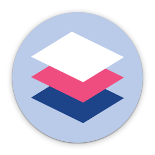
Tangible Surfaces
UIs consist of surfaces (pieces of “digital paper”) arranged at varying elevations, casting shadows on surfaces behind them.
Figure 1. Surfaces and layering.
Signature element: Shadows are used to communicate which surfaces are in front of others, helping focus attention and establish hierarchy. Read more on depth and layering in UIs.
In code: This is the android:elevation and android:translationZ attribute in Android 5.0. On earlier versions, shadows are normally provided as PNG assets.
Shadows and surfaces are used in a consistent and structured way. Each shadow indicates a new surface. Surfaces are created thoughtfully and carefully.
There are generally between 2 and 10 surfaces on the screen at once; avoid too much layering/nesting of surfaces.
Scrollable content either scrolls to the edges of the screen or behind another surface that casts a shadow over the content’s surface. Never clip an element against an invisible edge—elements don’t just scroll off into nowhere. Put another way, you rarely scroll the ink on a surface; you scroll the surface itself.
In code: android:clipToPadding=false often helps with this when using ListView and ScrollView.
Surfaces have simple, single-color backgrounds.
A Bold, Print-Like Aesthetic
The “digital ink” you draw on those pieces of digital paper is informed by classic print design, with an emphasis on bold use of color and type, contextual imagery, and structured whitespace.
Figure 2. Primary and accent colors. Figure 3. Keylines.
Signature element: Apps use a primary color and an accent color (Figure 2) to color surface backgrounds and key UI widgets such as text fields and checkboxes. The accent color contrasts very well with the primary color (for example an app can use a dark blue primary color and a neon pink accent color). The accent color is high-contrast and is used to call attention to key UI elements, like a circular floating action button, selected tab strips, or form fields.
In code: Set the android:colorPrimary and android:colorAccent attributes in your theme (drop the android prefix if using AppCompat). AppCompat automatically colors text fields, checkboxes, and more on pre-L devices.
Signature element: On Android 5.0, the status bar is colored to match the app’s primary color, or the current screen’s content. For full-bleed imagery, the status bar can be translucent.
In code: Set the android:colorPrimaryDark or android:statusBarColor attribute in your theme (drop the android prefix if using AppCompat) or call Window.setStatusBarColor.
Icons, photos/images, text, and other foreground elements are colored “ink” on their surfaces. They don’t have shadows and don’t use gradients.
Colors extracted from images can be used to color adjacent UI elements or surfaces.
In code: This can be done using the Palette support library.
In code: The new Toolbar widget (and its AppCompat equivalent) can be transparent and placed directly in your layout. For the status bar, check this Stack Overflow post.
Signature element: Where appropriate, elements like body text, thumbnails, app bar titles, etc. are aligned to 3 keylines (Figure 3). On phones, those keylines are 16dp and 72dp from the left edge and 16dp from the right edge of the screen. On tablets those values are 24dp and 80dp.
UI elements are aligned to and sized according to an 8dp baseline grid. For example, app bars are 56dp tall on phones and 64dp tall on tablets. Padding and margins can take on values like 8dp, 16dp, 24dp, etc. More precise text positioning uses a 4dp grid.
Authentic Motion
Motion helps communicate what’s happening in the UI, providing visual continuity across app contexts and states. Motion also adds delight using smaller-scale transitions. Motion isn’t employed simply for motion’s sake.
Figure 4. "Hero" transitions.
In general, UI and content elements don’t just appear or disappear—they animate into place, either together as a unit, or individually.
Signature element: When touching an item to see its details, there’s a “hero” transition (Figure 4) that moves and scales the item between its position in the browsing screen and its position in the detail screen.
In code: These are called “shared element transitions” in the SDK. The support version of FragmentTransaction also includes some shared element support.
Signature element: Ripple effects originating from where you touched the screen are used to show touch feedback on an item.
In code: The default android:selectableItemBackground and android:selectableItemBackgroundBorderless have this, or you can use RippleDrawable (<ripple>) to customize the effect. On pre-5.0 devices, ripples aren’t an expected feature, so defer to the default android:selectableItemBackground behavior.
Signature element: UI elements can appear using a circular “reveal” animation.
In code: See this doc or the ViewAnimationUtils class for more.
Signature element: Animations are used in more subtle, delightful ways, such as to convey the transition between icon states or text states. For example, a “+” icon can morph into an “x” symbol, or an outlined heart icon can be filled using a paint-bucket fill effect.
In code: Icon transitions can be implemented using AnimatedStateListDrawable and its XML counterpart. An example can be found in the Google I/O app source. There’s also support for animated vector icons.
Animations and transitions are fast—generally under 300ms.
Crossfades are often replaced by translate/slide transitions: vertical slides for descendant navigation and horizontal slides for lateral navigation. For slide transitions, prefer quick acceleration and gentle ease-in deceleration over simple linear moves. See the material design spec on motion for more.
Adaptive Design (and UI Patterns)
Tangible surfaces, bold graphic design, and meaningful motion work together to bring a consistent experience across any screen, be it phones, tablets, laptops, desktops, TVs, wearables, or even cars. Additionally, the key UI patterns below help establish a consistent character for the app across devices.
In material design, detail screens are often presented as popups that appear using “hero” transitions (see above).
In multi-pane layouts, the app can use multiple toolbars to place actions contextually next to their related content.
Signature element: Where appropriate, the app promotes the key action on a screen using a circular floating action button (FAB). The FAB (Figure 5) is a circular surface, so it casts a shadow. It is colored with a bright, accent color (see above). It performs a primary action such as send, compose, create, add, or search. It floats in front of other surfaces, and is normally at an 8dp elevation. It frequently appears at the bottom right of the screen, or centered on an edge where two surfaces meet (a seam or a step).
App bar
Signature element: The app uses a standard Android app bar. The app bar doesn’t have an app icon. Color and typography are used for branding instead. The app bar casts a shadow (or has a shadow cast on it by a surface below and behind it). The app bar normally has a 4dp elevation.
In code: Use the new Toolbar widget in Android 5.0 that is placed directly into the activity’s view hierarchy. AppCompat also provides android.support.v7.widget.Toolbar, which supports all modern platform versions.
The app bar might be for example 2 or 3 times taller than the standard height; on scroll, the app bar can smoothly collapse into its normal height.
App bar titles align to the 2nd keyline (see more info on keylines above)
In code: when using the Toolbar widget, use the android:contentInsetStart attribute.
Where appropriate, upon scrolling down, the app bar can scroll off the screen, leaving more vertical space for content. Upon scrolling back up, the app bar should be shown again.
Tabs
Figure 6. Tabs with material design.
Signature element: Tabs follow the newer material design interactions and styling (Figure 6). There are no vertical separators between tabs. If the app uses top-level tabs, tabs are visually a part of the app bar; tabs are a part of the app bar’s surface.
Tabs should support a swipe gesture for moving between them.
In code: All tabs should be swipeable using the ViewPager widget, which is available in the support library.
Selected tabs are indicated by a foreground color change and/or a small strip below the tab text (or icon) colored with an accent color. The tab strip should smoothly slide as you swipe between tabs.
Navigation drawer
Figure 7. Navigation drawers with material design.
Signature element: If the app uses a navigation drawer, it follows the newer material design interactions and styling (Figure 7). The drawer appears in front of the app bar. It also appears semitransparent behind the status bar.
In code: Implement drawers using the DrawerLayout widget from the support library, along with the new Toolbar widget discussed above. See this Stack Overflow post for more.
Signature element: The leftmost icon in the app bar is a navigation drawer indicator; the app icon is not visible in the app bar. Optionally, on earlier versions of the platform, if the app has a drawer, the top-left icon can remain the app icon and narrower drawer indicator, as in Android 4.0.
The drawer is a standard width: No wider than 320dp on phones and 400dp on tablets, but no narrower than the screen width minus the standard toolbar height (360dp - 56dp = 304dp on the Nexus 5)
Item heights in the drawer follow the baseline grid: 48dp tall rows, 8dp above list sections and 8dp above and below dividers.
Text and icons should follow the keylines discussed above.
More and more apps from Google and across the Google Play ecosystem will be updating with material design soon, so expect Winter 2014 to be a big quarter for design on Android. For more designer resources on material design, check out the DesignBytes series. For additional developer resources, check the Creating Apps with Material Design docs!
Android Wear is designed for serving up useful information at just the right time and in the right place. A neat example of this is Allthecooks Recipes. It gives you the right recipe, right when you need it.
Allthecooks also shows what developers can do by combining both the power of the mobile device and the convenience of Android Wear.
Pick the best tool for the job
One particularly well-designed aspect of Allthecooks is their approach to the multi-device experience. Allthecooks lets the user search and browse the different recipes on their Android phone or tablet. When the user is ready, there is a clearly labelled blue action link to send the recipe to the watch.
The integration is natural. Using the on-screen keyboard and the larger screen real estate, Allthecooks is using the best screen to browse through the recipes. On the wearables side, the recipe is synchronised by using the DataApi and is launched automatically, fulfilling one of the key creative visions for Android Wear.
The end result? The mobile / Wear integration is seamless.
Thoughtful navigation
Once the recipe has been sent to the Android Wear device, Allthecooks splits the steps into easily glanceable pages. At the end of that list of steps, it allows the user to jump back to the beginning with a clearly marked button.
This means if you would like to browse through the steps before starting to cook, you can effortlessly get to the beginning again without swiping through all the pages. This is a great example of two other points in the vision: glanceable and zero or low interaction.
A great (cooking) assistant
One of the key ingredients of great cooking is timing, and Allthecooks is always on hand to do all the inputs for you when you are ready to start the clock. A simple tap on the blue “1” and Allthecooks will automatically set the timer to one hour. It is a gentle suggestion that Allthecooks can set the timer for you if you want.
Alternatively, if you want to use your egg timer, why not? It is a small detail but it really demonstrates the last and final element of Android Wear’s vision of suggest and demand. It is an ever ready assistant when the user wants it. At the same time, it is respectful and does not force the user to go down a route that the user does not want.
It’s about the details
Great design is about being user-centric and paying attention to details. Allthecooks could have just shrunk their mobile app for wear. Instead the Allthecooks team put a lot of thoughts into the design and leveraged all four points of the Android Wear creative vision. The end result is that the user can get the best experience out of both their Android mobile device and their Android Wear device. So developers, what will you be cooking next on Android Wear?
It’s that time again! Last summer, we published the first Beautiful Design collection on Google Play, and updated it in the winter with a fresh set of beautifully crafted apps.
Since then, developers have been hard at work updating their existing apps with new design ideas, and many new apps targeted to phones and tablets have launched on Google Play sporting exquisite detail in their UIs. Some apps are even starting to incorporate elements from material design, which is great to see. We’re on the lookout for even more material design concepts applied across the Google Play ecosystem!
Today, we're refreshing the Beautiful Design collection with our latest favorite specimens of delightful design from Google Play. As a reminder, the goal of this collection is to highlight beautiful apps with masterfully crafted design details such as beautiful presentation of photos, crisp and meaningful layout and typography, and delightful yet intuitive gestures and transitions.
The newly updated Beautiful Design Summer 2014 collection includes:
Flight Track 5, whose gorgeously detailed flight info, full of maps and interactive charts, stylishly keeps you in the know.
Oyster, a book-reading app whose clean, focused reading experience and delightful discovery makes it a joy to take your library with you, wherever you go.
Gogobot, an app whose bright colors and big images make exploring your next city delightful and fun.
Airbnb, a veteran of the collection from this past winter, remains as they continue to finesse their app.
If you’re an Android designer or developer, make sure to play with some of these apps to get a sense for the types of design details that can separate good apps from great ones. And remember to review the material design spec for ideas on how to design your next beautiful Android app!.


 UIs consist of surfaces (pieces of “digital paper”) arranged at varying elevations, casting shadows on surfaces behind them.

 The “digital ink” you draw on those pieces of digital paper is informed by classic print design, with an emphasis on bold use of color and type, contextual imagery, and structured whitespace.


 Motion helps communicate what’s happening in the UI, providing visual continuity across app contexts and states. Motion also adds delight using smaller-scale transitions. Motion isn’t employed simply for motion’s sake.
 Tangible surfaces, bold graphic design, and meaningful motion work together to bring a consistent experience across any screen, be it phones, tablets, laptops, desktops, TVs, wearables, or even cars. Additionally, the key UI patterns below help establish a consistent character for the app across devices.


