Tag Archives: Design

Cryptography Changes in Android P

Posted by Adam Vartanian, Software Engineer

We hope you're enjoying the first developer preview of Android P. We wanted to specifically call out some backward-incompatible changes we plan to make to the cryptographic capabilities in Android P, which you can see in the developer preview.

Changes to providers

Starting in Android P, we plan to deprecate some functionality from the BC provider that's duplicated by the AndroidOpenSSL (also known as Conscrypt) provider. This will only affect applications that specify the BC provider explicitly when calling getInstance() methods. To be clear, we aren't doing this because we are concerned about the security of the implementations from the BC provider, rather because having duplicated functionality imposes additional costs and risks while not providing much benefit.

If you don't specify a provider in your getInstance() calls, no changes are required.

If you specify the provider by name or by instance—for example, Cipher.getInstance("AES/CBC/PKCS7PADDING", "BC") or Cipher.getInstance("AES/CBC/PKCS7PADDING", Security.getProvider("BC"))—the behavior you get in Android P will depend on what API level your application targets. For apps targeting an API level before P, the call will return the BC implementation and log a warning in the application log. For apps targeting Android P or later, the call will throw NoSuchAlgorithmException.

To resolve this, you should stop specifying a provider and use the default implementation.

In a later Android release, we plan to remove the deprecated functionality from the BC provider entirely. Once removed, any call that requests that functionality from the BC provider (whether by name or instance) will throw NoSuchAlgorithmException.

Removal of the Crypto provider

In a previous post, we announced that the Crypto provider was deprecated beginning in Android Nougat. Since then, any request for the Crypto provider by an application targeting API 23 (Marshmallow) or before would succeed, but requests by applications targeting API 24 (Nougat) or later would fail. In Android P, we plan to remove the Crypto provider entirely. Once removed, any call to SecureRandom.getInstance("SHA1PRNG", "Crypto") will throw NoSuchProviderException. Please ensure your apps have been updated.

The She Word: going behind hardware design with Ivy Ross

Editor’s Note: The She Word is a Keyword series all about powerful, dynamic and creative women at Google. Intrigued by the unique aesthetic of Google’s new family of hardware devices released in October, we sat down with the woman who leads the design team: Ivy Ross. In the interview below, she shares with us how she approaches design at work, and life outside of work.

Ivy_Ross_128.jpg

How do you explain your job at a dinner party?

I lead a team that creates how a Google product—including Google Home, the Pixel laptop and wearables—looks, feels and acts when you hold it in your hands.

What advice would you give to women starting out in their careers?

Be fearless in using your heart and mind in what you do, and bring more beauty into the world.

Who has been a strong female influence in your life?

My daughter. Seeing the world through her eyes at various stages of her life has given me a “beginner’s mind” in much of what I do.

What did you want to be when you grew up?

I’ve always wanted to be a designer/maker. My dad, who had a big influence on me, was an industrial designer and built the house I grew up in—the house was so ahead of its time that Andy Warhol used it to shoot a movie back in the late 70’s.

When I was 12 years old, I made a dress out of chain mail metal and wore it to a bar mitzvah. I linked together thousands of metal squares that made up the dress, designed a necklace that attached to the dress, and made a purse out of the chain mail to match. Even back then, I was designing for efficiency! Instead of bringing needle and thread in case the dress ripped, I carried a screwdriver.

ivy dress.jpg
Ivy in her homemade dress (screwdriver not pictured).

What is one habit that makes you successful?

Trusting my instincts on both people and ideas.

How is designing hardware different than designing software?

Unlike software, you can’t fix hardware through a new release or update. You need more time up front because once something is tooled, you can make very few adjustments.

What is the most important design principle for Google’s hardware?

Human. By that I mean friendly, emotionally-appealing and easy to fit into your life and your home. I believe more time we spend in front of flat screens, the more we’ll crave soft and tactile three-dimensional shapes. This is reflected in the fabric in Home Mini, Home Max and Daydream View, the texture of Pixel phones and Pixel Books, and the soft silicon pad where you rest your wrist while typing on the PixelBook.

Are there any design innovations you’re especially proud of in this year’s hardware lineup?

The way we used fabric for Home Mini was not an easy path. It required special construction to accomplish the simplicity of the form with great acoustics. Some of the things that look the simplest can actually be the hardest to construct! I’m proud that we created a beautiful group of products without sacrificing their function.

I’m proud that we created a beautiful group of products without sacrificing their function.

Where do you find inspiration for your work?

I don’t spend much time looking at other electronics beyond what I need to understand about the market. You can’t create anything new by only looking within your own category so I draw inspiration from art, materials, furniture, music, nature and people. My dad taught how to look at something and see more than what appears on the surface.

You're also a jewelry designer with big accomplishments at a young age. What did you learn from that?

Having gotten my work in museums around the world by age 25, I realized that life is not about the end goal, it’s about the journey and the adventure along the way with others.

Getting Started with the Poly API

Posted by Bruno Oliveira, Software Engineer

As developers, we all know that having the right assets is crucial to the success of a 3D application, especially with AR and VR apps. Since we launched Poly a few weeks ago, many developers have been downloading and using Poly models in their apps and games. To make this process easier and more powerful, today we launched the Poly API, which allows applications to dynamically search and download 3D assets at both edit and run time.

The API is REST-based, so it's inherently cross-platform. To help you make the API calls and convert the results into objects that you can display in your app, we provide several toolkits and samples for some common game engines and platforms. Even if your engine or platform isn't included in this list, remember that the API is based on HTTP, which means you can call it from virtually any device that's connected to the Internet.

Here are some of the things the API allows you to do:

  • List assets, with many possible filters:
    • keyword
    • category ("Animals", "Technology", "Transportation", etc.)
    • asset type (Blocks, Tilt Brush, etc)
    • complexity (low, medium, high complexity)
    • curated (only curated assets or all assets)
  • Get a particular asset by ID
  • Get the user's own assets
  • Get the user's liked assets
  • Download assets. Formats vary by asset type (OBJ, GLTF1, GLTF2).
  • Download material files and textures for assets.
  • Get asset metadata (author, title, description, license, creation time, etc)
  • Fetch thumbnails for assets

Poly Toolkit for Unity Developers

If you are using Unity, we offer Poly Toolkit for Unity, a plugin that includes all the necessary functionality to automatically wrap the API calls and download and convert assets, exposing it through a simple C# API. For example, you can fetch and import an asset into your scene at runtime with a single line of code:

PolyApi.GetAsset(ASSET_ID,
result => { PolyApi.Import(result.Value, PolyImportOptions.Default()); });

Poly Toolkit optionally also handles authentication for you, so that you can list the signed in user's own private assets, or the assets that the user has liked on the Poly website.

In addition, Poly Toolkit for Unity also comes with an editor window, where you can search for and import assets from Poly into your Unity scene directly from the editor.

Poly Toolkit for Unreal Developers

If you are using Unreal, we also offer Poly Toolkit for Unreal, which wraps the API and performs automatic download and conversion of OBJs and Blocks models from Poly. It allows you to query for assets and filter results, download assets and import assets as ready-to-use Unreal actors that you can use in your game.

Credit: Piano by Bruno Oliveira

How to use Poly API with Android, Web or iOS app

Not using a game engine? No problem! If you are developing for Android, check out our Android sample code, which includes a basic sample with no external dependencies, and also a sample that shows how to use the Poly API in conjunction with ARCore. The samples include:

  • Asynchronous HTTP connections to the Poly API.
  • Asynchronous downloading of asset files.
  • Conversion of OBJ and MTL files to OpenGL-compatible VBOs and IBOs.
  • Examples of basic shaders.
  • Integration with ARCore (dynamically downloads an object from Poly and lets the user place it in the scene).

Credit: Cactus wrenby Poly by Google

If you are an iOS developer, we have two samples for you as well: one using SceneKit and one using ARKit, showing how to build an iOS app that downloads and imports models from Poly. This includes all the logicnecessary to open an HTTP connection, make the API requests, parse the results, build the 3D objects from the data and place them on the scene.

For web developers, we also offer a complete WebGL sample using Three.js, showing how to get and display a particular asset, or perform searches. There is also a sample showing how to import and display Tilt Brush sketches.

Credit: Forest by Alex "SAFFY" Safayan

No matter what engine or platform you are using, we hope that the Poly API will help bring high quality assets to your app and help you increase engagement with your users! You can find more information about the Poly API and our toolkits and samples on our developers site.

Understanding the performance benefits of using ConstraintLayout

Posted by Takeshi Hagikura, Developer Programs Engineer

Since announcing ConstraintLayout at Google I/O last year, we've continued to improve the layout's stability and layout editor support. We've also added new features specific to ConstraintLayout that help you build various type of layouts, such as introducing chains and setting size as a ratio. In addition to these features, there is a notable performance benefit by using ConstraintLayout. In this post, we'll walk through how you can benefit from these performance improvements.

How Android draws views?

To better understand the performance of ConstraintLayout, let's take a step back and see how Android draws views.

When a user brings an Android view into focus, the Android framework directs the view to draw itself. This drawing process comprises 3 phases:

  1. Measure

    The system completes a top-down traversal of the view tree to determine how large each ViewGroup and View element should be. When a ViewGroup is measured, it also measures its children.

  2. Layout

    Another top-down traversal occurs, with each ViewGroup determining the positions of its children using the sizes determined in the measure phase.

  3. Draw

    The system performs yet another top-down traversal. For each object in the view tree, a Canvas object is created to send a list of drawing commands to the GPU. These commands include the ViewGroup and View objects' sizes and positions, which the system determined during the previous 2 phases.

Figure 1. Example of how the measure phase traverses a view tree

Each phase within the drawing process requires a top-down traversal of the view tree. Therefore, the more views you embed within each other (or nest) into the view hierarchy, the more time and computation power it takes for the device to draw the views. By keeping a flat hierarchy in your Android app layouts, you can create a fast and responsive user interface for your app.

The expense of a traditional layout hierarchy

With that explanation in mind, let's create a traditional layout hierarchy that uses LinearLayout and RelativeLayout objects.

Figure 2. Example layout

Let's say we want to build a layout like the image above. If you build it with traditional layouts, the XML file contains an element hierarchy similar to the following (for this example, we've omitted the attributes):

<RelativeLayout>
  <ImageView />
  <ImageView />
  <RelativeLayout>
    <TextView />
    <LinearLayout>
      <TextView />
      <RelativeLayout>
        <EditText />
      </RelativeLayout>
    </LinearLayout>
    <LinearLayout>
      <TextView />
      <RelativeLayout>
        <EditText />
      </RelativeLayout>
    </LinearLayout>
    <TextView />
  </RelativeLayout>
  <LinearLayout >
    <Button />
    <Button />
  </LinearLayout>
</RelativeLayout>

Although there's usually room for improvement in this type of view hierarchy, you'll almost certainly still need to create a hierarchy with some nested views.

As discussed before, nested hierarchies can adversely affect performance. Let's take a look at how the nested views actually affect the UI performance using Android Studio's Systrace tool. We called the measure and layout phases for each ViewGroup (ConstraintLayout and RelativeLayout) programmatically and triggered Systrace while the measure and layout calls are executing. The following command generates an overview file that contains key events, such as expensive measure/layout passes, that occur during a 20-second interval:

python $ANDROID_HOME/platform-tools/systrace/systrace.py --time=20 -o ~/trace.html gfx view res

For more details about how you can use Systrace, see the Analyzing UI Performance with Systrace guide.

Systrace automatically highlights the (numerous) performance problems with this layout, as well as suggestions for fixing them. By clicking the "Alerts" tab, you will find that drawing this view hierarchy requires 80 expensive passes through the measure and layout phases!

Triggering that many expensive measure and layout phases is far from ideal; such a large amount of drawing activity could result in skipped frames that users notice. We can conclude that the layout has poor performance due to the nested hierarchy as well as the characteristic of RelativeLayout, which measures each of its children twice.

Figure 3. Looking at the alerts from Systrace for the layout variant that uses RelativeLayout

You can check the entire code on how we performed these measurements in our GitHub repository.

The benefits of a ConstraintLayout object

If you create the same layout using ConstraintLayout, the XML file contains an element hierarchy similar to the following (attributes again omitted):

<android.support.constraint.ConstraintLayout>
  <ImageView />
  <ImageView />
  <TextView />
  <EditText />
  <TextView />
  <TextView />
  <EditText />
  <Button />
  <Button />
  <TextView />
</android.support.constraint.ConstraintLayout>

As this example shows, the layout now has a completely flat hierarchy. This is because ConstraintLayout allows you to build complex layouts without having to nest View and ViewGroup elements.

For example, let's look at the TextView and EditText in the middle of the layout:

When using a RelativeLayout, you need to create a new ViewGroup to align the EditText vertically with the TextView:
<LinearLayout
    android:id="@+id/camera_area"
    android:layout_width="match_parent"
    android:layout_height="wrap_content"
    android:orientation="horizontal"
    android:layout_below="@id/title" >

    <TextView
        android:text="@string/camera"
        android:layout_width="wrap_content"
        android:layout_height="wrap_content"
        android:layout_gravity="center_vertical"
        android:id="@+id/cameraLabel"
        android:labelFor="@+id/cameraType"
        android:layout_marginStart="16dp" />

    <RelativeLayout
        android:layout_width="match_parent"
        android:layout_height="wrap_content">

        <EditText
            android:id="@+id/cameraType"
            android:ems="10"
            android:inputType="textPersonName"
            android:text="@string/camera_value"
            android:layout_width="match_parent"
            android:layout_height="wrap_content"
            android:layout_centerVertical="true"
            android:layout_marginTop="8dp"
            android:layout_marginStart="8dp"
            android:layout_marginEnd="8dp" />
    </RelativeLayout>
</LinearLayout>

By using ConstraintLayout instead, you can achieve the same effect just by adding a constraint from the baseline of the TextView to the baseline of the EditText without creating another ViewGroup:

Figure 4. Constraint between EditText and TextView
<TextView
      android:layout_width="wrap_content"
      android:layout_height="wrap_content"
      app:layout_constraintLeft_creator="1"
      app:layout_constraintBaseline_creator="1"
      app:layout_constraintLeft_toLeftOf="@+id/activity_main_done"
      app:layout_constraintBaseline_toBaselineOf="@+id/cameraType" />

When running the Systrace tool for the version of our layout that uses ConstraintLayout, you see far fewer expensive measure/layout passes during the same 20-second interval. This improvement in performance makes sense, now that we're keeping the view hierarchy flat!

Figure 5. Looking at the alerts from Systrace for the layout variant that uses ConstraintLayout

On a related note, we built the ConstraintLayout variant of our layout using just the layout editor instead of editing the XML by hand. To achieve the same visual effect using RelativeLayout, we probably would have needed to edit the XML by hand.

Measuring the performance difference

We analyzed how long every measure and layout pass took for two type of layouts, ConstraintLayout and RelativeLayout, by using OnFrameMetricsAvailableListener, which was introduced in Android 7.0 (API level 24). This class allows you to collect frame-by-frame timing information about your app's UI rendering.

By calling the following code, you can start recording per-frame UI actions:

window.addOnFrameMetricsAvailableListener(
        frameMetricsAvailableListener, frameMetricsHandler);

After timing information becomes available, the app triggers the frameMetricsAvailableListener() callback. We are interested in the measure/layout performance, so we call FrameMetrics.LAYOUT_MEASURE_DURATION when retrieving the actual frame duration.

Window.OnFrameMetricsAvailableListener {
        _, frameMetrics, _ ->
        val frameMetricsCopy = FrameMetrics(frameMetrics);
        // Layout measure duration in nanoseconds
        val layoutMeasureDurationNs = 
                frameMetricsCopy.getMetric(FrameMetrics.LAYOUT_MEASURE_DURATION);

To learn more about the other types of duration information that FrameMetrics can receive, see the FrameMetrics API reference.

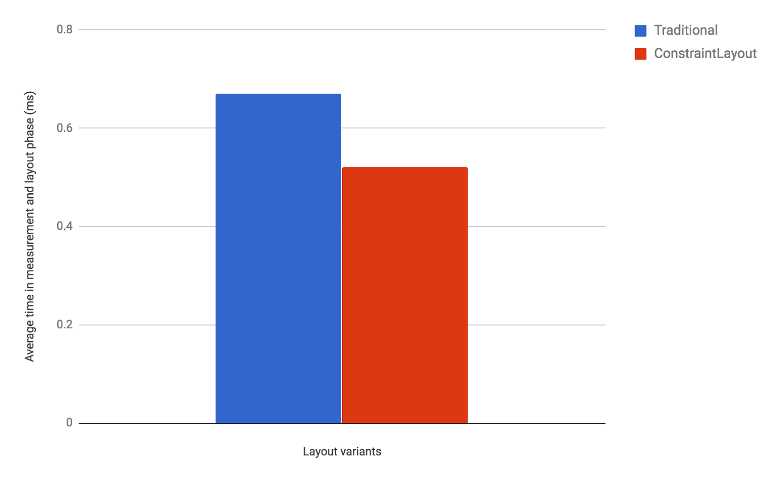
Measurement results: ConstraintLayout is faster

Our performance comparison shows that ConstraintLayout performs about 40% better in the measure/layout phase than RelativeLayout:

Figure 6. Measure / Layout (unit: ms, average of 100 frames)

As these results show, ConstraintLayout is likely to be more performant than traditional layouts. Moreover, ConstraintLayout has other features that help you build complex and performant layouts, as discussed in the benefits of a ConstraintLayout object section. For details, see the Build a Responsive UI with ConstraintLayout guide. We recommend that you use ConstraintLayout when designing your app's layouts. In almost all cases when you would have previously need a deeply-nested layout, ConstraintLayout should be your go-to layout for optimal performance and ease of use.

Appendix: Measurement environment

All the measurements above were performed in the following environment.

Device Nexus 5X
Android Version 8.0
ConstraintLayout version 1.0.2

What's next

Check out the developer guide, the API reference documentation, and the article on Medium to fully understand what ConstraintLayout can provide for you. And once again, thank you to all who submitted feedback and issues over the months since our alpha release of ConstraintLayout. We're truly grateful that we were able to release the production-ready 1.0 version of ConstraintLayout earlier this year. As we continue to improve ConstraintLayout, please continue to send us feedback using the Android issue tracker.

Explore California design, from self-driving cars to search

When you think of California, what comes to mind? An exhibition opening today at the Design Museum in London explores the state’s outsize influence and examines how California has shaped and expanded the way we think about design. Spanning from 1960s counterculture to innovative tech in Silicon Valley, California: Designing Freedom features more than 200 objects and includes everything from political posters designed by nun and activist Corita Kent in 1965 to Waymo’s self-driving car (on public display for the first time).

Through the exhibition, curators Justin McGuirk and Brendan McGetrick examine how software and hardware designers in the San Francisco Bay Area influence our daily lives in significant ways. Notably, the exhibition highlights several collaborations between designers, engineers, and researchers at Google, to create products like Google Cardboard, Search, Google Maps and Material Design. Here are a few examples of Google’s work featured in the exhibition:

As VP of Design at Google, I find this exhibition particularly exciting because it gives the public an inside look at the process of designing great software. It’s an honor to be part of California’s rich design story, and we’re thrilled to have such diverse work included alongside our peers. Justin and I recently discussed California’s defining characteristics and the evolution of our design system at Google in an interview for the show’s catalogue. An edited and condensed version of the interview is below.

Justin McGuirk: You were initially quite skeptical about the idea of California as a center of design. Can you explain why?
Matias Duarte: Software (for lack of a better term to describe the medium that Silicon Valley operates in) is very new. Software grew up in a pragmatic “can we just get things off the ground?” way.

Design, as opposed to engineering, touches the human experience. If you’re building an airplane that’s just going to haul cargo back and forth, the human experience is not prioritized. Once you have passengers, then you start to consider everything about the human experience: aesthetics, comfort, and ergonomics. Silicon Valley was a lot like that, which is why for a long time we saw this naïve expression in our software interfaces. There was almost an endearing primitivism to it. So I’d find myself hiring people from New York or Hollywood to do these things. But it’s changing.

You’re head of a department called Material Design. What does that mean?
I started working in concert with design leaders across Google to come up with a design system that we’d use across the company, which meant for Android, iOS and the web. And then I thought let’s work on a design system that makes the fundamentals of these software experiences easy and useful for everyone, so designers and developers aren’t starting from scratch. And we ended up calling that Material Design. We rallied the company around that banner, updating products across all these platforms. And when that was done, I went to Sundar [Pichai] who had just become CEO, and I said, if this is going to be an actual change at Google, we need to make this not just a mountain we climbed once and patted ourselves on the back for, we need to make this an ongoing effort. It needs to be a product—for all our developers and all the third parties that are hungry for things like this.

Why did you call it Material Design?
We were thinking about how we wanted designers to perceive it. We had a tagline for this unnamed thing—a system for rational space, form, and motion. The metaphor is: think about appropriately designing with the material of software, in the same way that if you were learning to be an architect or an industrial designer, you would learn to design with wood or steel or aluminium.

What is it that makes software design unique as a medium?
Just like wood or steel or glass, software has certain properties—one of these properties is that it’s constantly evolving. It doesn’t require someone to go back to the store to buy a better one. It evolves in reaction to your interactions, or to advances in technology. And that deeply influences the way that software is designed. It’s intrinsically iterative as you’re trying to approach a better solution.

In many ways, that is one of the defining characteristics of design from California, this impatience to get a product out into the world so that it can be updated and improved. It’s a new design methodology based on a culture of rapidly evolving tech products.
Google comes from a background in software, so there’s a willingness to be transparent about the process. We iterate in the public space because we’re not the kind of company that thinks we can do our best work by hiding it. This is how Californian companies are starting to think.


California: Designing Freedom is on view at the Design Museum in London through October 15, 2017. To learn more about design at Google, visit Google Design and sign up for our newsletter.

User experience tips to help you design your app to engage users and drive conversions

By Jenny Gove, Senior Staff UX Researcher, Google Play

We know you work hard to acquire users and grow your customer base, which can be challenging in a crowded market. That's why we've heard from many of you that you find tools like store listing experiments and universal app campaigns are valuable. It's equally important to keep customers engaged from the beginning. Great design and delightful user experiences are fundamental to doing just that.

We partnered with AnswerLab to conduct comprehensive user experience research across a variety of verticals; including e-commerce, insurance, travel, food ordering, ticket sales and services, and financial management. The resulting insights may help you increase engagement and conversion by providing guidance on useful and usable functionality.

The best app experiences seamlessly guide users through their tasks with efficient navigation, search, forms, registration and purchasing. They provide great e-commerce facilities and integrate effective ordering and payment systems. Ultimately, an engaging app begins with attention to usability in all of these areas. Learn tips on:

  • Navigation & Exploration
  • In-App Search
  • Commerce & Conversions
  • Registration
  • Form Entry
  • Usability and Comprehension

You can read the full article, design your app to drive conversions, on the Android Developers website, complete with links to developer resources. Also get the Playbook for Developers app to stay up-to-date with features and best practices that will help you grow a successful business on Google Play.

How useful did you find this blogpost?

Android Developer Story: PicMix reaches global audience on Google Play

Posted by Lily Sheringham, Google Play team

Inovidea Magna Global, is the developer of PicMix, a photo and video editing app, which has now evolved into an interest based social media platform powered by content discovery and social commerce. It has 27 million users worldwide, 65% of which are outside of its home market in Indonesia.

Hear Calvin Kizana, CEO, and Sandy Colondam, Co-founder, explain how they used Google Play tools, such as Store Listing Experiments and Material Design, to create a high quality app which appeals to a global audience.

Learn more about store listing experiments and find out how to get started with Material Design. Also, get the Playbook for Developers app and stay up-to-date with more features and best practices that will help you grow a successful business on Google Play.

Your emails, optimized for every screen with responsive design

Posted by Pierce Vollucci, Associate Product Manager, Gmail and Steve Bazyl, Developer Programs Engineer, Google Apps

When you send emails, your recipients might read them on a computer, tablet, or phone—or more likely, all three. However your message might look different on all these devices. Later this month, you’ll be able to use CSS media queries with Gmail to ensure that your message is formatted the way you intended, whether it's viewed on a computer, a phone in portrait mode, or a tablet in landscape mode. You’ll be able to change styles based on width, rotation, and resolution, allowing for more responsive formatting to optimize your email for every device.

Example of an email before and after responsive design

In discussions with email designers, these supported CSS rules were identified as the most useful media queries to support responsive design. This is just one part of an overall effort to expand CSS support in Gmail and to give email designers more control over how their messages are rendered. For example, the CSS below applies the color red when the screen width exceeds 500px.

@media screen and (min-width: 500px) {
.colored {
color:red;
}
}

You can find the full list of supported CSS rules in the developer documentation. We hope this reference helps you create more feature-rich, responsive email for users. Happy formatting!

Announcing the 2016 Android Experiments I/O Challenge!

Posted by Roman Nurik, Senior Interactive Designer, and Richard The, Google Creative Lab

Last summer we launched Android Experiments: a showcase of creative Android projects, and an open invitation for all developers to submit their own experiments to the gallery. So far we’ve seen some amazing work from the developer community - from live wallpaper, to watch faces, to interesting hacks of the IOIO board - and we want to see more.

Today we announce the Android Experiments I/O Challenge: a chance for your experiment (and you) to go to I/O 2016!

From now through April 13, you can enter by submitting your experiments to the gallery. The top three winners of the contest will receive a trip to this year’s Google I/O, and the five runner-ups will get the new Nexus 6P.

So what makes a good Android Experiment? It’s a project that utilizes the unique capabilities of the Android platform in an innovative way. Here are a few suggestions:

  • Creative uses of Android’s new or distinctive features
  • Projects that explore how we interact with our devices, in small and big ways
  • Unique visual aesthetics
  • Open source projects that inspire other developers
  • Surprise us - we want to see the amazing things you’re cooking up

All projects on Android Experiments are open source. If you’re not sure where to start take a look on the site gallery, dig in and get inspired.

We can’t wait to see how you’re combining code and creativity! Enter on androidexperiments.com/challenge today.