Tag Archives: Chrome

How we redesigned the Chrome icon

After more than eight years, we introduced a refreshed version of the Chrome icon for the 100th update for Chrome earlier this year. Today, I chatted with user experience interaction designer Elvin Hu and visual designer Thomas Messenger to go behind the scenes and learn more about how the Chrome icon was designed.

What was the Chrome icon meant to represent originally?

Thomas: When we introduced Chrome back in 2008, our goal was to build a browser that was fast and easy to use, and nothing better represented speed than a rocket ship! But our team decided to move away from a literal rocket ship in the end, and came to a design that looked approachable and clickable that still captured the spirit of Google.

Image of a rocket ship, which was the early iteration of the Chrome icon

One of the first ideas for the Chrome icon

Why are you making this change now?

Elvin: The logo hadn't been updated in eight years, and we wanted to give it a refreshed and modern look to reflect how Chrome has evolved as a product. We also noticed that the visual design of modern operating systems was becoming more stylistically diverse, so it was important that the Chrome icon felt more adaptable, native and fresh no matter what device you used.

How will the Chrome icon look different across operating systems?

Elvin: We simplified the main brand icon by removing the shadows, refining the proportions and brightening the colors, to align with Google's current brand design. We also found that placing certain shades of green and red next to each other created an unpleasant “glow” between the two colors, so we introduced a very subtle gradient to the main icon to make the icon easier to the eyes compared to using flat colors. Then we created OS-specific customizations. We want the icons to feel recognizably Chrome, but also well crafted for each operating system.

It seems like a subtle change. Did you consider a more significant departure?

Thomas: We did! In the exploratory phase, we tried all kinds of ideas; softening corners, different geometries, whether or not to separate the colors with white. We also tried options that further departed from the overall shape we’ve been using for the past 12 years. But we knew how well the four Google colors and circular composition are recognized, so we decided not to deviate too much from that.

Image of various design explorations of the Chrome icon

A few examples of proposed redesigns of the Chrome icon.

What surprised you about the design process?

Elvin: The design process was a fun and collaborative challenge for everyone involved. The team held virtual brainstorm sessions that produced a variety of concepts that strived to become the new “face” of Chrome.

After coming up with the overall direction, we stress tested many color, gradient and proportion options in different contexts. Even if the change to color is subtle, we wanted to ensure the icon would not get lost in any of the places it appears. At one point, we felt happy about a specific green gradient in the icon, but after comprehensive testing, we found that it blended in with the default Windows 11 wallpaper (and taskbar) – which is popular with lots of our users. It was tests like that which ensured our icon would work well everywhere.

Image of two Chrome icons on a Windows desktop - one icon with a brighter green and the other with a darker green - to test color palettes in different contexts and platforms.

Caption: Several rounds of stress tests were conducted to ensure the icon’s color palette would work cohesively across platforms and contexts.

How did you think about making the icon more accessible to more communities?

Thomas: We revised the proportions of the central blue ball. Working with Googlers who are low-vision, we found that the refined proportions and updated central white stroke made it more recognizable. We also made different versions of the icon for small sizes to improve legibility and avoid fuzziness by aligning to pixel boundaries.

An image of a side-by-side comparison of Chrome actions and how the updated icon improves legibility at smaller sizes and aligns to pixel boundaries.

A side-by-side comparison of Chrome actions and how the updated icon improves legibility at smaller sizes and aligns to pixel boundaries.

Would you ever bring back the original Chrome icon?

Elvin: Never say never! We’ve investigated custom app icons, and found that each platform has different levels of support for it. Maybe one day we will bring it back as an option on platforms that support it.

Source: Google Chrome


Staying safe online with our updated Google Password Manager

Strong, unique passwords are key to helping keep your personal information secure online. That's why Google Password Manager can help you create, remember and autofill passwords on your computer or phone: on the web in Chrome, and in your favorite Android and iOS apps.

Today we've started rolling out a number of updates that help make the experience easier to use, with even stronger protections built in.

A consistent look and feel, across web and apps

We're always grateful for feedback, and many of you have shared that managing passwords between Chrome and Android has been confusing at times: "It's the same info in both places, so why does it look so different?" With this release, we're rolling out a simplified and unified management experience that's the same in Chrome and Android settings. If you have multiple passwords for the same sites or apps, we’ll automatically group them. And for your convenience, you can create a shortcut on your Android home screen to access your passwords with a single tap.

GIF showing new Google Password Manager shortcut on an Android homescreen.

You can now add a shortcut to Google Password Manager to your Android homescreen.

More powerful password protections

Google Password Manager can create unique, strong passwords for you across platforms, and helps ensure your passwords aren’t compromised as you browse the web. We’re constantly working to expand these capabilities, which is why we’re giving you the ability to generate passwords for your iOS apps when you set Chrome as your autofill provider.

Image showing how Chrome can automatically generate strong passwords on iOS

You can now create strong passwords on your computer or mobile, on any operating system.

Chrome can automatically check your passwords when you enter them into a site, but you can have an added layer of confidence by checking them in bulk with Password Checkup. We’ll now flag not only compromised credentials, but also weak and re-used passwords on Android. If Google warns you about a password, you can now fix them without hassle with our automated password change feature on Android.

Image showing how the Password Checkup feature flags compromised passwords on Android

For your peace of mind, Password Checkup on Android can flag compromised, weak and reused passwords.

To help protect even more people, we’re expanding our compromised password warnings to all Chrome users on Android, Chrome OS, iOS, Windows, MacOS and Linux.

Simplified access and password management

Google built its password manager to stay out of your way — letting you save passwords when you log in, filling them when you need them and ensuring they aren’t compromised. However, you might want to add your passwords to the app directly, too. That's why, due to popular demand, we're adding this functionality to Google Password Manager on all platforms.

GIF showing how you can add your passwords directly on all platforms.

Adding your passwords directly is now possible on all platforms.

In 2020, we announced Touch-to-Fill to help you fill your passwords in a convenient and recognizable way. We’re now bringing Touch-to-Login to Chrome on Android to make logging in even quicker by allowing you to securely log in to sites directly from the overlay at the bottom of your screen.

GIF showing new touch-to-login feature

Touch-to-Login signs you in directly from a recognizable overlay.

Many of these features were developed at the Google Safety Engineering Center (GSEC), a hub of privacy and security experts based in Munich, so Guten Tag from the team! Of course, our efforts to create a safer web are a truly global effort – from our early work on 2-step verification, to our future investments in technologies like passkeys – and these updates that we are rolling out over the next months are an important part of that work.

5 new features for Chrome on iOS

When it comes to getting things done on your iPhone and iPad, there’s no place like Chrome. With the Chrome iOS app, you can securely save your passwords so there’s no need to keep guessing. Your payment and shipping info can be automatically filled when you’re ready to check out, and your favorite tabs and bookmarks can be synced across your devices, whether you're on your phone, tablet, or laptop.

With the next release on Chrome on iOS, we're bringing five new features to iPhone and iPad users.

1. Stronger protection from phishing and malware

Enhanced Safe Browsing can give you more proactive and tailored protections from phishing, malware and other web-based threats — and now we’re extending it to iOS. If you turn on Enhanced Safe Browsing on your iPhone or iPad, Chrome predicts and warns you proactively if web pages are dangerous by sending information about them to Google Safe Browsing to be checked. When you type your credentials into a website, Chrome can warn you if your username and password have been compromised in a third-party data breach. Chrome will then suggest you change them everywhere.

2. Fill in passwords on any app

Google Password Manager is built into Chrome on your computer or Android phone. On iOS, you can set it up as your Autofill provider so Chrome can help you quickly and securely create, store and fill in your passwords into any website or app on your iOS device.

3. Discover something new, or pick up where you left off

We’re making it easier for you to discover new content or start a fresh search in Chrome for iOS when you’ve been away for a while. You’ll still be able to find all your recent tabs, but we’re also making it easier to browse content, start a new Search or easily get back to your most frequently visited sites. This change will also come to Android soon.

Image of Chrome browser new tab page on an iPhone, which includes quick links to recent tabs, bookmarks, history and the Discover feed.

4. Translate websites faster into your language

We’re also using on-device machine learning to make those websites available in your preferred language. In particular, we are launching an updated language identification model to accurately figure out the language of the page you’re visiting, and whether it needs to be translated to match your preferences. As a result, we’re seeing many more successful translations every day.

5. Use Chrome Actions to quickly get things done

Coming soon, we’ll roll out Chrome Actions on iOS to help you get more things done quickly from the Chrome address bar. Soon, you’ll be able to save time by typing an action’s title into the address bar. The Chrome address bar also predicts when you could benefit from a Chrome Action based on the words that have been typed. Chrome Actions make it faster to do common activities on Chrome for iOS such as:

  • Clear Browsing Data
  • Open Incognito Tab
  • Set Chrome as Default Browser
Image of Chrome Actions on iOS, which specifically shows the Chrome address bar with the phrase “delete history” typed in.

We plan to bring even more innovation to Chrome on iOS in the coming weeks, so stay tuned. In the meantime, let us know if there are any features that you want to see by reaching out to us on Twitter @googlechrome.

Google Workspace Updates Weekly Recap – June 17, 2022

New updates

There are no new updates to share this week. Please see below for a recap of published announcements. 

Previous announcements 

The announcements below were published on the Workspace Updates blog earlier this week. Please refer to the original blog posts for complete details.

Improved email notifications for Google Calendar invites 
We’ve refreshed the layout of emails sent by Google Calendar to make key event details more accessible and useful. | Learn more

De-reverberation available for Google Meet 
Google Meet will now remove reverberations from sound recorded by your microphone. This automatically filters out echos created by spaces with hard surfaces, such as a basement or a kitchen, helping to ensure optimal audio quality. | Available to Google Workspace Business Standard, Business Plus, Enterprise Essentials, Enterprise Standard, Enterprise Plus, Education Plus, the Teaching and Learning upgrade, and Frontline customers only. | Learn more

VirusTotal integration with the security investigation tool provides deeper insight into Chrome events 
You can now use VirusTotal to view deeper insights on Chrome log events in the Security Investigation Tool. | Available to Google Workspace Enterprise Plus, Education Standard, and Education Plus customers only. | Learn more

Manage Google Voice call recording options for your organization 
Admins can set Google Voice call recording options (automatic or manual) for any organizational unit or group in their organization. | Automatic voice recording is available to all Google Voice Premier customers. On-demand voice recording is available to all Google Voice Premier and Standard customers. | Learn more

Improved experience for removing participants from Google Meet calls 
We’ve updated the user experience for removing participants from a meeting in Google Meet. When a host or co-host removes a participant from a call, they are prompted with additional actions: remove the user from the call, fill out an additional abuse report, and/or block the user from rejoining. | Learn more

Export search results to .CSV files from the security investigation tool 
Admins can now download log event data from the security investigation tool as a .CSV file. This will allow admins to further analyze data outside of the tool. | Learn more

Picture-in-Picture and multi-pinning available for Google Meet in Chrome 
We’re bringing picture-in-picture to Google Meet to Chrome browsers on the web. You’ll be able to see up to four video tiles of meeting attendees in a floating window on top of other applications. | Learn more.  


For a recap of announcements in the past six months, check out What’s new in Google Workspace (recent releases).

Building a more helpful browser with machine learning

At Google we use technologies like machine learning (ML) to build more useful products — from filtering out email spam, to keeping maps up to date, to offering more relevant search results. Chrome is no exception: We use ML to make web images more accessible to people who are blind or have low vision, and we also generate real-time captions for online videos, in service of people in noisy environments, and those who are hard of hearing.

This work in Chrome continues, so we wanted to share some recent and future ML improvements that offer a safer, more accessible and more personalized browsing experience. Importantly: these updates are powered by on-device ML models, which means your data stays private, and never leaves your device.

More peace of mind, less annoying prompts

Safe Browsing in Chrome helps protect billions of devices every day, by showing warnings when people try to navigate to dangerous sites or download dangerous files (see the big red example below). Starting in March of this year, we rolled out a new ML model that identifies 2.5 times more potentially malicious sites and phishing attacks as the previous model – resulting in a safer and more secure web.

To further improve the browsing experience, we’re also evolving how people interact with web notifications. On the one hand, page notifications help deliver updates from sites you care about; on the other hand, notification permission prompts can become a nuisance. To help people browse the web with minimal interruption, Chrome predicts when permission prompts are unlikely to be granted based on how the user previously interacted with similar permission prompts, and silences these undesired prompts. In the next release of Chrome, we’re launching an ML model that makes these predictions entirely on-device.

Two separate images side by side. The first on the left is a smartphone showing a red screen and a warning message about phishing. The image on the right shows a Chrome browser window showing a pop-up message saying “Notifications blocked”.

With the next release of Chrome, this is what you will see if a phishing attempt is detected (Left) and Chrome will show permission requests quietly when the user is unlikely to grant them (Right).

Finding what's important, always in your language

Earlier this year we launched Journeys to help people retrace their steps online. For example: You might spend weeks planning a national park visit – researching attractions, comparing flights and shopping for gear. With ML and Journeys, Chrome brings together the pages you’ve visited about a given topic, and makes it easy to pick up where you left off (vs. scr o o o l l ling through your browser history).

When you return to those hiking boots and camping guides, we’re also using ML to make those websites available in your preferred language. In particular, we’ve launched an updated language identification model to figure out the language of the page, and whether it needs to be translated to match your preferences. As a result, we’re seeing tens of millions more successful translations every day.

A Chrome browser showing Journeys related to travel. The user can see a cluster of recent searches they did related to a trip to Yosemite.

The Journeys feature of Chrome groups together your search history based on topic or intent.

A browser built just for you

Maybe you like to read news articles in the morning – phone in one hand, cereal spoon in the other – so you share lots of links from Chrome. Or maybe voice search is more your thing, as you sneak in a few questions during your transit ride to work. Either way, we want to make sure Chrome is meeting you where you’re at, so in the near future, we’ll be using ML to adjust the toolbar in real-time – highlighting the action that’s most useful in that moment (e.g., share link, voice search, etc.). Of course, you’ll be able to customize it manually as well.

A Chrome browser with a highlighted square around an icon to the right of the address bar. At the top is a share icon, and at the bottom is a microphone icon.

The toolbar in Chrome on Android will adapt based on your needs.

Our goal is to build a browser that’s genuinely and continuously helpful, and we’re excited about the possibilities that ML provides. At the end of the day, though, your experience is what really matters, so please tweet @googlechrome to send us your feedback.

Personalize Chrome with themes from LGBTQ+ artists

Back in high school, before I came out, seeing LGBTQ+ role models made me feel a sense of community. In particular, seeing LGBTQ+ people depicted in art and media who were thriving gave me confidence to be who I am. Artistic expression, from people like Keith Haring and Frida Kahlo, has been crucial for LGBTQ+ people throughout history for telling our stories and securing equal rights.

To celebrate the next generation of LGBTQ+ artists this Pride month, Chrome commissioned five LGBTQ+ artists to create themes you can select to personalize your Chrome browser and Chromebook. Available globally starting today with more options coming soon, these themes reflect the unique points of view of each individual artist. Here’s how some of the artists describe their work:

Our Chrome team crafted themes around the work of the artists to fuse them seamlessly into Chrome, coordinating the colors of your tabs and making sure the work looks great on all types of laptop and desktop screens. To get one of these themes for Chrome browser, visit the Chrome Web Store, select “Themes” and click “add to Chrome”. To set a wallpaper for your Chromebook, right click your desktop, choose “Set wallpaper”, then select “LGBTQ Artists”

This collection is a testament to the expansiveness of the LGBTQ+ community, which continues to become more vibrant and diverse. You can browse all themes in the collection on the Chrome Web Store, where you’ll also find themes from Black and Latino artists.

Implementing Dynamic Color: Lessons from the Chrome team

Posted by Rebecca Gutteridge, Developer Relations Engineer on Android

blue and green phone illustration 

Introduction

With the release of Android 12 and Material You, we provided documentation and guidance on dynamic color foundations, how to implement dynamic color in Jetpack Compose and a getting started codelab. But creating a scalable, personalized, and accessible app with dynamic color can feel like a daunting task. We talked to designers and developers on Google Chrome, and they offered to share some tips on how they approached it at scale for their Android app. Here’s what they suggest if you are considering adopting dynamic color in your app.


Where to start

Start by reviewing all your current screens in your app and identify your current colors, themes and surfaces. Chrome kicked off a design review and evaluated their color scheme. Material 3 encourages designers and developers to use color tokens which enable flexibility and consistency across an app by allowing designers to assign an element's color role in a UI, rather than a set value. This is particularly powerful when considering designing for light and dark themes and dynamic color.


An example surface for Chrome, the Tab Switcher, identifying the color token for each element

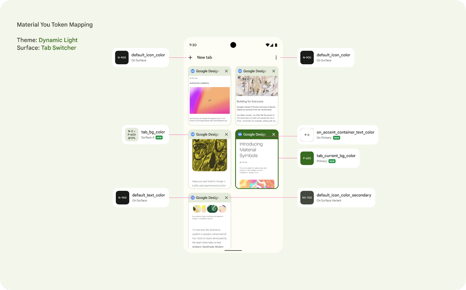
Figure 1 : An example surface for Chrome, the Tab Switcher, identifying the color token for each element


Your app may already have a color token system, so reviewing how the new Material You dynamic color enabled color scheme matches your previous naming convention is an important exercise. Engineering should align with UX to review the new color token system with your mocks. This is also a good opportunity to review your current colors.xml, themes.xml and styles.xml.In particular check that your app correctly differentiates between Styles and Themes as well as correctly extending from base themes. It is also worth reviewing if there are redundant colors in your existing scheme or an opportunity to make a more consistent color scheme throughout your app. Dynamic color implementation with Compose is also available.


Accessibility

Ensuring your app’s color system is accessible is critical for designing for everyone and creating products that are inclusive to the widest possible audience. Dynamic color is committed to guaranteeing that the color selection model has accessibility requirements built in. Material 3 color schemes are defined by tonality rather than hue or hex value, this system of tonal palettes is central to making any color system accessible by default. Using a minimum 60 luminance spread in color pairings provides enough contrast to ensure accessibility standards.


Combining color based on tonality, rather than hex value or hue, is one of the key systems that make any color output accessible.

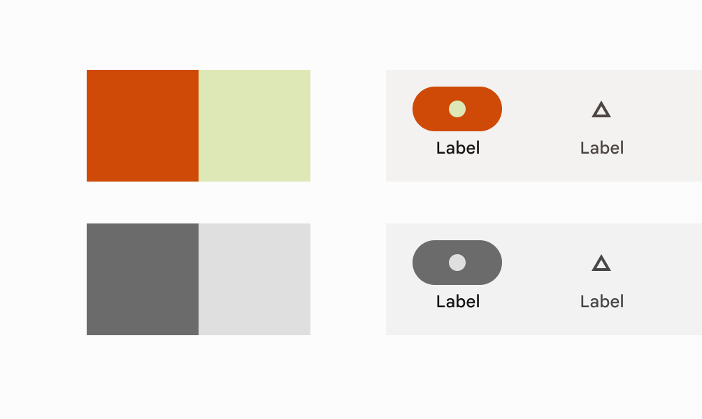
Figure 2 : Combining color based on tonality, rather than hex value or hue, is one of the key systems that make any color output accessible.


Phase approach

When looking at implementation, consider this upgrade as a phased approach if needed, targeting the primary surfaces first and leveraging that dynamic color can be applied at a per activity level. This was how Chrome was able to update their app and used it as an opportunity to migrate some of their older UI app compat components to the modern Material 3 components, such as Top app bar.


How to support custom colors

Your app may have custom colors or brand colors that you do not want to change with the user’s preference. These can simply be added additionally as you are building out your color scheme. Alternatively you can import additional colors to extend your color scheme using the Material Theme Builder to create a unified color system. The theme builder includes a color harmonization feature that shifts the tone of a custom color to ensure that visual balance and accessible contrast is achieved when combined with user-generated colors.


Understand how to harmonize custom colors with the Material guidance.

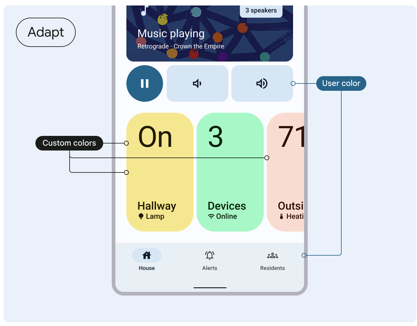
Figure 3: Understand how to harmonize custom colors with the Material guidance.


For Chrome, here is a deep dive into two examples of where protected colors are important for them and how they approached it.


Publisher colors

It is important that Chrome allows for brands to keep their known colors and not impact that functionality when adopting dynamic color.

Publishers have the ability to set a publisher color using a metadata element in their html. The top toolbar is controlled using a decision tree to programmatically determine the toolbar color and icon color based on a series of cascading rules:

  • Incognito mode has the highest priority. If Incognito is enabled, the toolbar and icon colors follow the dark baseline palette.
  • For night theme, toolbar and icon colors follow the dark dynamic theme rather than the publisher color to ensure a consistently dark UI.
  • For day theme, the toolbar color is set to the publisher color, the icon color is either white or gray based on whether the publisher color is a dark or light color via util method.
  • If the publisher color is too bright or not specified, Chrome defaults to the light dynamic theme.

Incognito

In Incognito mode, the dark gray color scheme has a semantic importance and reassurance for users. Chrome decided to preserve and leverage their existing color system and not change it dynamically.


Phone showing incognito mode

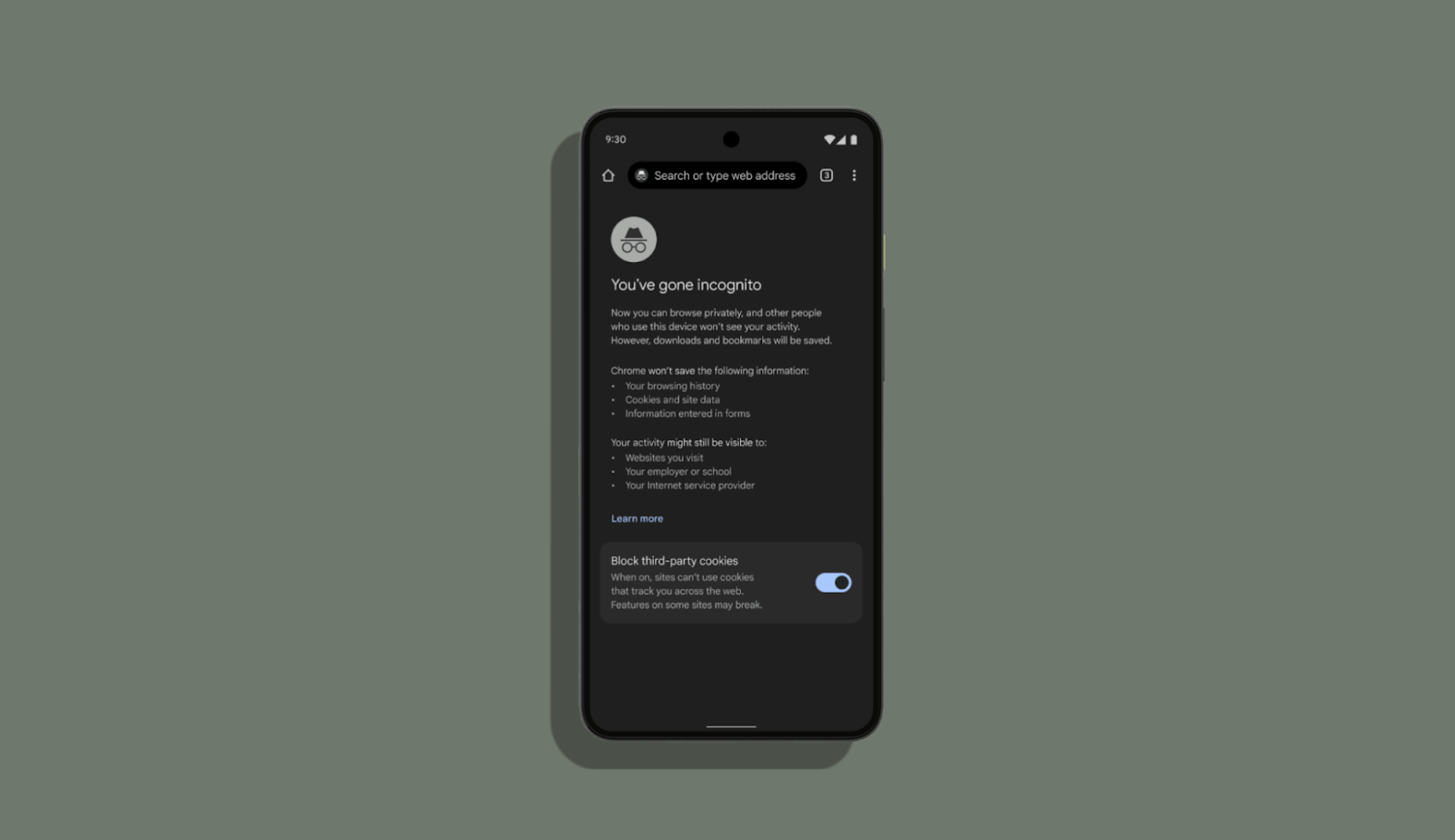
Figure 4: Incognito mode remains the same


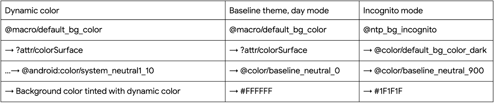
To achieve this, Chrome defined non adaptive colors that map to hex values and adaptive colors that map to different non adaptive colors for day/night mode. For incognito mode, Chrome uses the dark non adaptive colors as they are easily recognized by the users as incognito. With these adaptive colors, Chrome created a baseline theme.

The table below shows what their background colors look like after applying dynamic colors:

Table showing what background colors look like after applying dynamic colors

Themes and Theme Overlays

One thing to consider for adhering to theme best practices, is to leverage Theme Overlays properly. The Chrome team used this opportunity to refactor their themes and leveraged the power of Theme Overlays for a given activity. At times Chrome saw that full themes were being used where a ThemeOverlay would be more appropriate. Dynamic color and Material3 encourages better code hygiene.

Take a look at this example, previously the theme for full screen dialogs inherited from a full theme. This overrode all the attributes from the activity theme, undoing the dynamic colors or any overrides that are applied at the activity level. With the dynamic color work, the team became more deliberate in how they define and use their theming.

Previously:

    <style name="Base.Theme.Chromium.Fullscreen" parent="Theme.BrowserUI.DayNight">
    <item name="windowActionBar">true</item>
          <item name="colorPrimary">...</item>
          <item name="colorAccent">...</item>
    </style>

Now:

    <style name="Base.ThemeOverlay.BrowserUI.Fullscreen" parent="">
    <item name="android:windowContentTransitions">false</item>
    </style>

Recommendations from Google Chrome designers

This section shares some key lessons that Chrome’s designers applied to successfully create an intentional and unified theme

  • Create a unified design system: Material 3 and dynamic color gives the opportunity to reconcile your app’s themes. For Chrome that meant reconciling their light and dark theme and removing fragmentation based on elevation.
  • Identifying how to migrate existing color system: Understand the role of your current color system and tokens, if applicable, and how they map onto the M3 color tokens.
  • Use accent colors meaningfully: Material 3’s accented color tokens are incredibly powerful and useful, iterate on how best to use them.
  • Phased approach: Focus on a few surfaces first. Dynamic color is increasingly part of the user’s expectation of their device, so work out which surfaces make sense to adopt first and then iterate and expand to more surfaces.
  • Work closely with your engineers from the beginning: Share designs as soon as you have them with your engineers. Chrome designers asked questions to understand how Chrome was built so they could establish how color would be applied and which components might be affected. This will help you make better informed decisions on which surfaces/components are updated since there could be many dependencies in your app.
  • Create custom tokens: If you need to use dynamic colors that are not part of the out of the box color system, create a custom color token that extends your color theme.

Recommendations from Google Chrome developers

This section shares some key lessons that Chrome’s developers applied to successfully migrate

  • Have a rigorous theme code hygiene: Create a baseline set of colors without dynamic for instances where dynamic color is not applied, eg, incognito mode and then extend with theme and theme overlays.
  • Understand how to use surface colors: Surfaces are treated with “elevation” to allow differentiation from the background and layered elements like app bars, and other navigation elements; this may be a paradigm shift for some apps. Surface colors are calculated at runtime, so there is no resource/color/macro to retrieve them currently. Chrome decided to create a utility method to calculate surface colors using `ElevationOverlayProvider`. However, this is only available to use programmatically while we also needed to implement dynamic color for many layouts in bulk. For this purpose, they created a custom Drawable that can draw a surface color based on a provided elevation value. One drawback of this approach is that a legacy pre-dynamic colors version of each drawable must be maintained for compatibility with old Android versions.
  • Importance of using Activity context: It’s important to use the Activity context to inflate views as the Activity has the theme with the dynamic color overlay applied.
  • Choice of method to get colors: Usage of ‘Resources#getColor(int)’ was very common in Chrome’s codebase because they needed to support older Android versions. However, to support dynamic color, the `#getColor` method should be able to resolve the color resources against the theme. So, Chrome migrated the `Resources#getColor` calls to `Context#getColor`.
  • Macros: Chrome uses semantic color names to have a unified color system throughout the app. Before the dynamic color adoption, a semantic color would look something like this:

    @color/default_text_color_light: Color used for primary text

    → @color/default_text_color_dark/@color/default_text_color_light (adaptive to night mode)

    → @color/modern_grey_900/@color/modern_white

    → #1F1F1F / #FFFFFF

    Your app may already have a semantic color system and so migrating adds additional considerations. For Chrome they wanted to preserve their semantic colors. In collaboration with UX, they translated the existing color palette to the Material color roles/attributes. Their first idea was to point to these attributes from the existing semantic colors. For example, @color/default_text_color from the example above would look like this: <color name="default_text_color">?attr/colorOnSurface</color>. However, the @color resource cannot point to an ?attr. The next idea was to convert all semantic `@color`s to `?attr`s with the same names. This approach also caused issues as they needed to add all the attributes to their themes and there are many activities, themes and entry points to Chrome, so it would be challenging to maintain. Finally, they adopted the newly introduced <macro> tag. Macros are much like C/C++ macros but for Android resources: they are replaced with whatever they point to at build time. So semantic colors became semantic macros, for example, <macro name="default_text_color">?attr/colorOnSurface</macro>. This made it possible to implement dynamic colors at bulk. One limitation of macros is that they cannot be accessed programmatically, but Chrome added static utility methods to work around this. The macro tag is now available in Android Studio Canary.

Dynamic color is coming to more Android 12 phones globally, including devices by Samsung, OnePlus, Oppo, Vivo, realme, Xiaomi, Tecno, and more! As you work with dynamic color in your app, we’d love to get your feedback via the Material Android issue tracker. Happy coloring!

Cut, copy and paste files using keyboard shortcuts in Google Drive Web

Quick summary

You can now use familiar keyboard shortcuts Ctrl + C (or ⌘ + C on Mac), Ctrl + X and Ctrl + V to copy, cut and paste Google Drive files in your Chrome browser. This saves you time by allowing you to copy one or more files and move them to new locations in Drive, and across multiple tabs, with fewer clicks. 


Additionally, a link to the file and its title will also be captured when copying a file, which allows you to easily paste them into a document or an email. 


To help you more easily organize files in multiple locations without necessarily creating duplicate files, Ctrl + C, Ctrl + Shift + V will create shortcuts. 


Lastly, you can open files or folders in a new tab using Ctrl+Enter, so that you can easily view multiple files at once, or use different tabs to more easily organize files between two different folder locations. 


In the above screencast, you can see opening a folder in a new tab, files moved between folders, shortcuts created, and file name and URLs pasted into a Google Doc.

Rollout pace 


Availability 

  • Available to all Google Workspace customers and users with personal Google Accounts when using Google Chrome 

Resources 

Buckle up: McLaren has a new Android and Chrome F1 race car

At this weekend’s Miami Grand Prix, I’ll be cheering on two of my favorite Formula 1 drivers — Lando Norris and Daniel Ricciardo — as they race around the track in McLaren Formula 1 cars fashioned with Android-inspired engine covers and slick, Chrome-inspired wheel covers.

Earlier this year, Google became an Official Partner of the McLaren Formula 1 Team, a sport that is data-driven at heart and a natural fit for our products. We specifically teamed up with McLaren because of our shared values, especially around sustainability and inclusion. In 2011, McLaren was the first F1 team to be certified carbon neutral, and they’re currently in the process of adopting renewable energy across all their operations. They also recently announced their first woman driver for the Extreme E electric racing series as a first of many efforts to improve representation.

Through our partnership, we're pairing the engineering excellence of McLaren’s race cars with Google technology to help maximize race-day performance. McLaren’s crew is already using Android connected devices and equipment, including phones, tablets and earbuds, to help improve pit stops, and their pit team will use Fitbit devices to monitor their overall health and wellbeing, including heart rate and breathing rate. The team will also exclusively use the Chrome browser. Meanwhile, the Extreme E McLaren Team will bring Pixel 6s and Pixel Buds to their off-road racing operations for the first time this season.

A line of race car wheels with the blue, green, yellow and red Chrome-inspired logo colors around them. A person in an orange shirt is doing maintenance on one of them.

This collaboration has the potential to solve big and complex engineering challenges — from improving the team’s telemetry and design capabilities through AI, to speeding up decision making and safeguarding team communications using Android 5G. We've got an exciting road ahead with McLaren Racing, and our feet are placed firmly on the gas.

Find great extensions with new Chrome Web Store badges

Since 2009, publishers have been hard at work building extensions that make Chrome more powerful, useful and customizable for users. It has always been our mission to make it easy for users to find great extensions while recognizing the publishers who create them. Today, we’re announcing two new extension badges to help us deliver on our goal: the Featured badge and the Established Publisher badge. Both badges are live on the Chrome Web Store today.

Featured badge

Picture featuring UI of Featured badge

The Featured badge is assigned to extensions that follow our technical best practices and meet a high standard of user experience and design. Chrome team members manually evaluate each extension before it receives the badge, paying special attention to the following:

  1. Adherence to Chrome Web Store’s best practices guidelines, including providing an enjoyable and intuitive experience, using the latest platform APIs and respecting the privacy of end-users.
  2. A store listing page that is clear and helpful for users, with quality images and a detailed description.

Established Publisher badge

Picture featuring UI of Featured badge

The Established Publisher badge showcases publishers who have verified their identity and demonstrated compliance with the developer program policies. This badge is granted to publishers who meet the following two conditions:

  1. The publisher's identity has been verified.
  2. The publisher has established a consistent positive track record with Google services and compliance with the Developer Program Policy.

As our goal is to help users find great extensions, publishers cannot pay to receive either badge. They can, however, submit a request for their extension to be reviewed to receive the Featured badge in the one-stop support page (under My item → I want to nominate my extension…) .

If you’re a publisher, learn more about badging and discovery on Chrome Web Store.