Tag Archives: App quality

Design with Widget Canonical Layouts

Posted by Summers Pitman – Developer Relations Engineer, and Ivy Knight – Senior Design Advocate

Widgets can bring more productive, delightful and customized experiences to users' home screens, but they can be tricky to design to ensure a high quality focused experience. In this blog post, we’ll cover how easy Widget Canonical Layouts can make this process.

But, what is a Canonical Layout? It is a common layout pattern that works for various screen sizes. You can use them as a starting point, ready-to-use compositions that help layouts adapt for common use cases and screen sizes. Widgets also provide Canonical Layouts to get started crafting higher quality widgets.

Widget Canonical Layouts

The Widget Canonical Layouts Figma makes previewing your widget content in multiple breakpoints and layout types. Join me in our Figma design resource to explore how they can simplify designing a widget for one of our sample apps, JetNews.

Three side-by-side examples of Widget Canonical Layouts in Figma being used to design a widget for JetNews

1. Content to adapt

Jetnews is a sample news reading app, built with Jetpack Compose. With the experience in mind, the primary user journey is reading articles.

    • A widget should be glanceable, so displaying a full article would not be a good use case.
    • Since they are timely news articles, surfacing newer content could be more productive for users.
    • We’ll want to give a condensed version of each article similar to the app home feed.
    • The addition of a bookmark action would allow the user to save and read later in the full app experience.
Examples of using Widget Canonical Layouts in Figma to design a widget for JetNews

2. Choosing a Canonical Layout

With our content and user journey established, we’ll take a glance at which canonical layouts would make sense.

We want to show at least a few new articles with a headline, truncated description, and possible thumbnail. Which brings us to the Image + Text Grid layout and maybe the list layout.

Examples of using Widget Canonical Layouts in Figma to design a widget for JetNews

Within our new Figma Widget Canonical Layout preview, we can add in some mock content to check out how these layouts will look in various sizes.

Examples of using Widget Canonical Layouts in Figma to design a widget for JetNews

Moving example of using Widget Canonical Layouts in Figma to design a widget for JetNews

3. Adapting to breakpoint sizes

Now that we’ve previewed our content in both the grid and list layouts, we don’t have to choose between just one!

The grid layout better displays our content for larger sizes, where we have some more room to take advantage of multiple columns and a larger thumbnail image. While the list is working nicely for smaller sizes, giving a one column layout with a smaller thumbnail.

Examples of using Widget Canonical Layouts in Figma to design a widget for JetNews

But we can adapt even further to allow the user to have more resizing flexibility and anticipate different OEM grid sizing. For JetNews, we decided on an additional extra small layout to accommodate a smaller grid size and vertical height while still using the List layout. For this size I decided to remove the thumbnail all together to give the title and action space.

Consider these in-between design tweaks as needed (between any of the breakpoints), that can be applied as general rules in your widget designs.

Here are a few guidelines to borrow:

    • Establish a content hierarchy on what to hide as the widget shrinks.
    • Use a type scale so the type scales consistently.
    • Create some parameters for image scaling with aspect ratios and cropping techniques.
    • Use component presentation changes. For example, the title bar’s FAB can be reduced to a standard icon.
Examples of using Widget Canonical Layouts in Figma to design a widget for JetNews

Last, I’ll swap the app icon, round up all the breakpoint sizes, and provide an option with brand colors.

Examples of using Widget Canonical Layouts in Figma to design a widget for JetNews

These are ready to send over to dev! Tune in for the code along to check out how to implement the final widget.

Go try it out and explore more widgets

You can find the Widget Canonical Layouts at our new Figma Community Page: figma.com/@androiddesign. Stay tuned for more Android Figma resources.

Check out the official Android documentation for detailed information and best practices Widgets on Android and more on Widget Quality Tiers, and join us for the rest of Widget Spotlight week!

Android Banner

This blog post is part of our series: Spotlight Week on Widgets, where we provide resources—blog posts, videos, sample code, and more—all designed to help you design and create widgets. You can read more in the overview of Spotlight Week: Widgets, which will be updated throughout the week.

Introducing Widget Quality Tiers

Posted by Ivy Knight – Senior Design Advocate

Level up your app Widgets with new quality tiers

Widgets can be a powerful tool for engaging users and increasing the visibility of your app. They can also help you to improve the user experience by providing users with a more convenient way to access your app's content and features.

To build a great Android widget, it should be helpful, adaptive, and visually cohesive with the overall aesthetic of the device home screen.

In order to help you achieve a great widget, we are pleased to introduce Android Widget Quality Tiers!

The new Widget quality tiers are here to help guide you towards a best practice implementation of widgets, that will look great and bring your user’s value across the ecosystem of Android Phone, Tablets and Foldables.

What does this mean for widget makers?

Whether you are planning a new widget, or investing in an update to an existing widget, the Widget Quality Tiers will help you evaluate and plan for a high quality widget.

Just like Large Screen quality tiers help optimize app experiences, these Widget tiers guide you in creating great widgets across all Android devices. Now, similar tiers are being introduced for widgets to ensure they're not just functional, but also visually appealing and user-friendly.

Two screenshots of a phone display different views in the Google Play app. The first shows a list of running apps with the Widget filter applied in a search for 'Running apps'; the second shows the Nike Run Club app page.
Widgets that meet quality tier guidelines will be discoverable under the new Widget filter in Google Play.

Consider using our Canonical Widget layouts, which are based on Jetpack Glance components, to make it easier for you to design and build a Tier 1 widget your users will love.

Let’s take a look at the Widget Quality Tiers

There are three tiers built with required system defaults and suggested guidance to create an enhanced widget experience:

Tier 1: Differentiated

Four mockups show examples of Material Design 3 dynamic color applied to an app called 'Radio Hour'.
Differentiated widgets go further by implementing theming and adapting to resizing.

Tier 1 widgets are exemplary widgets offering hero experiences that are personalized, and create unique and productive homescreens. These widgets meet Tier 2 standards plus enhancements for layout, color, discovery, and system coherence criteria.

A stylized cartoon figure holds their chin thoughtfully while a chat bubble icon is highlighted
For example, use the system provided corner radius, and don’t set a custom corner radius on Widgets.

Add more personalization with dynamic color and generated previews while ensuring your widgets look good across devices by not overriding system defaults.

 Four mockups show examples of Material Design 3 components on Android: a contact card, a podcast player, a task list, and a news feed.
Tier 1 widgets that, from the top left, properly crop content, fill the layout bounds, have appropriately sized headers and touch targets, and make good use of colors and contrast.

Tier 2: Quality Standard

These widgets are helpful, usable, and provide a quality experience. They meet all criteria for layout, color, discovery, and content.

A simple to-do list app widget displays two tasks: 'Water plants' and 'Water more plants.' Both tasks have calendar icons next to them. The app is titled 'Plants' and has search and add buttons in the top right corner.
Make sure your widget has appropriate touch targets.

Tier 2 widgets are functional but simple, they meet the basic criteria for a usable app. But if you want to create a truly stellar experience for your users, tier 1 criteria introduce ways to make a more personal, interactive, and coherent widget.

Tier 3: Low Quality

These widgets don't meet the minimum quality bar and don't provide a great user experience, meaning they are not following or missing criteria from Tier 2.

 Examples of Material Design 3 widgets are displayed on a light pink background with stylized X shapes. Widgets include a podcast player, a contact card, to-do lists, and a music player.
Clockwise from the top left not filling the bounds, poorly cropped content, low color contrast, mis-sized header, and small touch targets.

A stylized cartoon person with orange hair, a blue shirt, holds a pencil to their cheek.  'Kacie' is written above them, with a cut off chat bubble icon.
For example, ensure content is visible and not cropped

Build and elevate your Android widgets with Widget Quality Tiers

Dive deeper into the widget quality tiers and start building widgets that not only look great but also provide an amazing user experience! Check out the official Android documentation for detailed information and best practices.


This blog post is part of our series: Spotlight Week on Widgets, where we provide resources—blog posts, videos, sample code, and more—all designed to help you design and create widgets. You can read more in the overview of Spotlight Week: Widgets, which will be updated throughout the week.

Notes from Google Play: The next phase of Play

Posted by Sam Bright – VP & GM, Google Play + Developer Ecosystem

Hello everyone,

Thank you for making this year another incredible one! Your innovative experiences continue to inspire us and bring joy to billions. We recently celebrated some of your amazing work in our Best of 2024 awards, showcasing moments of delight across phones, large-screen devices, watches, and PCs.

This year, we shared our vision for the next phase of Play where Play leans into being more than a store and becomes a dynamic platform that connects people with your content, when and where they need it most. To help people discover all you have to offer, truly engage with your experiences, and keep them coming back for more, we’re making Play:

    • A destination for discovery: Helping people find their new favorite apps and games and the content within
    • The best place for gaming: So people can play more of the games they love across more surfaces, with exclusive rewards available only through Play Points, and
    • Go beyond the store: Where people can get relevant content from installed apps directly on their home screen through our new Collections experience

Check out the video above, or keep reading for some of the key features we've launched this year to help you succeed at every stage of your app’s lifecycle.

New tools and features built in 2024

Launch with confidence

Launching a new app or update is a critical moment and we want to make this process as smooth and successful as possible.

    • The new quality panel gives you a centralized view of your app's quality so you can proactively find and address issues like crashes and ANRs, and see recommendations related to user experience.
    • And with SDK Console, we’re connecting you with SDK owners who can alert you in Android Studio and Play Console when new versions may address quality issues or help your app or game comply with Play policies.
Quality Panel in Google Play
Features like quality panel help you proactively find and address issues before you launch, helping you have a smooth and successful experience

Accelerate your growth and deepen your engagement with users

We've made Google Play even more content-forward with a visually engaging design that helps people discover the best of what you have to offer, wherever they are.

    • We integrated Gemini models to make it easier for everyone to find what they're looking for with AI-generated app review summaries, FAQs, and app highlights, providing key information at a glance.
    • Seamless app discovery helps users enjoy amazing experiences across their devices. Now, when people search for apps on their phone, they'll easily discover and install relevant apps for their TV, watch, and more.
    • Enhanced custom store listings give you even more ways to tailor your content. And now, with the ability to segment by search keyword, you can connect with users who are actively searching for the specific benefits your app offers. Play Console will even give you keyword suggestions.
    • Deep links help you create seamless web-to-app journeys to take users directly to the content they want, right inside your app. And now, we’ve made it even easier for you to manage and experiment with these deep links in Play Console, where you can make quick changes without waiting to publish a new app release.
App highlights in Google Play
App highlights is one of our latest AI-powered features making it easier for users to discover their next favorite apps.

Optimize revenue with Google Play Commerce

We're continuing to make it easier and more convenient for over 2.5 billion users in over 190 markets to have seamless and secure purchase experiences.

    • This year, we've helped over half a billion people be ready to make purchases by proactively encouraging them to set up payment and authentication methods in advance. With new secure biometric authentication options like fingerprint and facial recognition, checkout is now faster and more secure.
    • Our extensive payment method library, which includes over 300 local forms of payment in more than 65 markets, continues to grow. This year, we added CashApp (US), Blik Banking (Poland), Pix (Brazil), and MoMo (Vietnam).
    • Expanded payment options give more ways for users to pay for content. Parents with Google Family setup can now approve their child's in-app purchases from any OS, not just on Android devices.
    • And new subscription platform improvements, like flexible payment plans for long-term subscriptions, give users more options throughout the purchase experience, which helps drive higher conversions and new subscribers.
Installment subscriptions in Google Play
Flexible payment plans give users more options throughout the purchase experience, helping drive higher conversions and new subscribers for your app

Reinforcing trust, safety, and security

We continue to invest in more ways to protect users, your business, and the ecosystem. This includes actively combating bad actors who try to deceive users or spread malware, and giving you tools to combat abuse.

    • Google Play Protect scans 200 billion apps daily. When it finds a potentially harmful app, we let people know and may even disable particularly dangerous apps.
    • Easier automatic app updates help ensure users have the latest features and improved security. Users with limited Wi-Fi access have the option to get their app updates over mobile data, and within their data budgets. We also launched a new tool that empowers you to prompt users for timely updates.

These are just the highlights. To see how we're continuously improving the experience, check out our quarterly roundup of programs and launches on The Latest.

Investing in our app and game community

We’re continuing to help app and game businesses of all sizes reach their full potential.

    • This year, we’ve doubled the size of our global Indie Games Accelerator program and selected 60 game studios from around the world to participate in a 10-week program of masterclasses, workshops, and access to industry experts.
    • Ten studios from across Latin America were selected to receive a share of $2 million in equity-free funding and hands-on guidance from the Google Play team as part of our Indie Games Fund.
    • And the ChangGoo initiative in Korea has nurtured a thriving startup ecosystem, supporting over 500 startups and attracting over KRW 147.6 billion in investments.

And with another year of #WeArePlay, we shared and celebrated the stories of 300 app and game businesses from all over the world. Take a look back at just a few of the inspiring founders we’ve featured.

Looking ahead

I’m excited about the future of Google Play as a dynamic platform that connects users with your amazing content, wherever they are.

Next year, we're going to continue helping you maximize your investments on Play by:

    • Leaning into content-rich and interactive experiences for apps both within and beyond the Play store,
    • Building on our gaming destination to make it even more personalized, engaging, and part of daily routines, and,
    • Simplifying the payment and checkout experience for your apps and content.

Thanks again for your continued partnership and the innovation you’ve put into your apps and games. From our team to yours, happy holidays and best wishes for an amazing 2025!

Sam Bright 
VP & GM, Google Play + Developer Ecosystem

Build better, safer SDKs with Google Play SDK Console

Posted by Yafit Becher – Product Manager

SDKs offer a wide range of benefits for app developers, but they can also impact apps in ways that aren’t always easy to identify or control. That’s why, in 2021, we launched Google Play SDK Console and invited some of the most widely adopted SDKs to join, empowering SDK providers to improve the performance, quality, and security of their SDKs.

SDK Console allows SDK providers to access usage statistics, crash and ANR (application not responding) reporting, and tools to help them guide app developers in adopting SDK versions that fix quality issues and comply with Play policies.

Based on the success of our early access program for both SDK providers and app developers, today we’re pleased to make SDK Console available to all SDKs, as long as they're distributed from a canonical Maven repository source that we can verify.

Improve communication between SDK providers and app developers

Without clear communication between SDK providers and app developers, problems can be hard to identify and slow to resolve. SDK providers don’t always know how their SDKs are performing in the wild, so app developers often have to wait for bug fixes or use outdated SDK versions.

SDK Console bridges this gap by giving SDK providers visibility into usage and adoption stats, crash and ANR reporting, and a communication channel with app developers. With access to crash and ANR reporting across apps, SDK providers can identify and solve issues before they escalate into customer complaints.

Once resolved, SDK providers can report back to the developers with the reason for the crash and how to solve it. SDK providers can also receive a full stack trace report directly from app developers, ensuring all information is shared for a quick fix.

Screenshot of ANR reporting in SDK Console
click to enlarge

SDK providers can also encourage app developers to upgrade to newer SDK versions or provide guidance for a particular SDK version. SDK Console lets SDK providers add notes to their versions, report them as outdated, and for SDK versions that are very behind and have little usage, give app developers 90 days to update their SDK version, after which they would no longer be allowed to publish new app releases with those SDK versions.

Screenshot of prompt to report version as outdated in SDK Console
click to enlarge

Build with confidence with insights and timely updates

Many SDK providers struggle to collect usage and adoption data for their SDKs, making it difficult to make informed decisions about their future development efforts. SDK Console fills in these gaps by providing detailed usage and adoption stats by app category, country, or even SDK version.

Screenshot of market share metrics available in SDK Console
click to enlarge

As part of our commitment to a safe user experience, Google Play policies are constantly evolving. While it’s essential for maintaining a secure ecosystem, we know that keeping track of these updates can be a challenge for SDK providers. SDK Console will help simplify this process by notifying SDK providers about policy issues within the platform.

Get started with SDK Console

SDK Console is free for all SDK providers. Head over to Google Play SDK Console to get started.

Top things to know in Android Platform and Quality at Google I/O ’23

Posted by Dan Galpin, Developer Relations Engineer

Google I/O was HUGE for developers with exciting news all across the platform and more around quality. Here are the top three announcements around Android and App Quality from Google I/O 2023:

#1 Android 14 comes with new features in privacy and security, system UI, and more

Android 14 continues our effort to improve privacy and security on the platform with the CredentialManager, which has a unified API that brings support for passkeys and federated login. Health Connect is also now a core part of the platform and available on all Android mobile devices directly in Settings, helping to control how users’ health and fitness data is shared across apps.. In addition, the beta of Privacy Sandbox on Android ensures effective privacy-preserving personalized advertising experiences.

Additionally, you’ll find Foreground Service changes, with required types, new permissions, system runtime checks, and new purpose-built APIs for user initiated data transfers and VoIP telephony that behave more consistently across our entire ecosystem. Android 14 also introduces Grammatical Inflection to help your app correctly address your users, along with updated per-app language and regional preferences. Finally, check out the Updated Predictive Back APIs that support in-app animations.

Watch the sessions that will help you get your app ready:

#2 Premium devices mean premium app experiences with camera & media and on-device ML

To help devices become creative powerhouses, Media3's Transformer supports video editing and transcoding and Android 14 introduces Ultra HDR images and more premium camera extensions. To leverage that CPU and GPU power to enable new productivity experiences, ML Kit adds new, production-ready on-device machine learning models such as document scanning and face mesh, and the Acceleration service for your custom ML models is in public beta.

Check out the sessions from I/O to learn more:

#3 More around app quality: a new quality framework, quality hub, and design hub

We've introduced a quality framework and quality hub which includes insights into how Google Play views app quality. We also created a new UI design hub that gives you a centralized destination for guidance, Figma starter kits, UI samples, and inspirational galleries to help apply our best practices for phones, large screens, wearables, and TVs.

Be sure to catch the full Android Platform and Quality playlist from Google I/O for all these videos!

Mindful architecture: Headspace’s refactor to scale

Posted by Manuel Vicente Vivo, Android Developer Relations Engineer

Contributors: Mauricio Vergara, Product Marketing Manager, Developer Marketing, Marialaura Garcia, Associate Product Marketing Manager, Developer Marketing

Headspace Technical case study graphic


Executive Summary

Headspace was ready to launch new wellness and fitness features, but their app architecture wasn’t. They spent eight months refactoring to a Model-View-ViewModel architecture, rewriting in Kotlin and improving test coverage from 15 to 80%. The improved app experience increased MAU by 15% and increased review scores from 3.5 to 4.7 between Q2 and Q4 of 2020. To learn more about how Headspace’s focus on Android Excellence impacted their business, read the accompanying case study here.


Introduction

Headspace has grown into a leader in mindfulness by creating an app which helps millions of people to meditate daily. Mindfulness goes far beyond meditation, it connects to all aspects of a person’s life. That idea prompted the most recent stage in Headspace’s evolution. In 2019, they decided to expand beyond meditation and add new fitness and wellness features to their Android app. Headspace realized that they would need a cross-functional team of engineers and designers to be able to deliver on the new product vision and create an excellent app experience for users. An exciting new phase for the company: their design team started the process by creating prototypes for the new experience, with fresh new designs.

With designs in hand, the only thing stopping Headspace from expanding their app and broadening users’ horizons was their existing Android software architecture. It wasn’t well structured to support all these new features. Headspace’s development team made the case to their leadership that building on the existing code would take longer than a complete rewrite. After sharing the vision and getting everyone on board, the team set out on a collective journey to write a new Android app in pursuit of app excellence.


The Android Rewrite

Headspace’s Android development team first needed a convenient way to standardize how they built and implemented features. "Before we wrote a single line of code, our team spent a week evaluating some important implementation choices for the foundation of our app,” Aram Sheroyan, an Android developer at Headspace explains;

“This was crucial pre-work so that we were all on the same page when we actually started to build."

Immersing themselves in Google’s literature on the latest, best practices for Android development and app architecture, the team found a solution they could all confidently agree on. Google recommended refactoring their app using a new base architecture: model-view-view-model. MVVM is a widely-supported software pattern that is progressively becoming industry standard because it allows developers to create a clear separation of concerns, helping streamline an app’s architecture. “It allowed us to nicely separate our view logic," Sheroyan explained.

With MVVM as the base architecture, they identified Android’s Jetpack libraries, including Dagger and Hilt for dependency injection. The new tools made boilerplate code smaller and easier to structure, not to mention more predictable and efficient. Combined with MVVM, the libraries provided them with a more detailed understanding of how new features should be implemented. The team was also able to improve quality in passing arguments between functions. The app had previously suffered from crashes due to NullPointerException errors and incorrect arguments. Adopting the safeArgs library helped to eliminate errors when passing arguments.

In rewriting the app, the team further made sure to follow the Repository pattern to support a clearer separation of concerns. For example, instead of having one huge class that saves data in shared preferences, they decided that each repository’s local data source should handle the respective logic. This separation of data sources enables the team to test and reproduce business code outside of the live app for unit testing without having to change production code. Separating concerns in this way made the app more stable and the code more modular.

The team also took the opportunity to fully translate their app into the Kotlin programming language, which offered useful helper functions, sealed classes, and extension functions. Removing legacy code and replacing the mix of Java and Kotlin with pure Kotlin code decreased build time for the app. The new architecture also made it easier to write tests and allowed them to increase test coverage from around 15% to more than 80%. This resulted in faster deployments, higher quality code, and fewer crashes.

To capture the new user experience in the app’s reviews, Headspace implemented the Google Play In-App Review API. The new API allowed them to encourage all users to share reviews from within the app. The implementation increased review scores by 24%, and — as store listing reviews are tied to visibility on Google Play — helped draw attention to the app’s recent improvements.


Achieving App Excellence

The rewrite took eight months and with it came a new confidence in the code. Now that the codebase had 80%+ unit test coverage, they could develop and test new features with confidence rather than worries. The new architecture made this possible thanks to its improved logic separation, and a more reusable code, making it easier to plan and implement new features.

The build time for the app decreased dramatically and development velocity picked up. The team’s new clarity around best practices and architecture also reduced friction for onboarding new developers, since it was now based on Android industry standards. They could communicate more clearly with potential candidates during the interview process, as they now had a shared architectural language for discussing problem sets and potential solutions.

With velocity came faster implementation of features and an improved retention flow. They could now optimize their upsell process, which led to a 20% increase in the number of paid Android subscribers relative to other platforms where the app is published. The combination of a new app experience and the implementation of the new In-App Review API led to their review scores improving from 3.5 to 4.7 stars between Q2 and Q4 of 2020! Overall, the new focus on Android App Excellence and the improved ratings earned Headspace a 15% increase in MAU globally..

These were just a few of the payoffs from the significant investment Headspace made in app excellence. Their laser focus on quality paid off across the board, enabling them to continue to grow their community of users and lay a solid foundation for the future evolution of their app experience.


Get your own team on board

If you’re interested in getting your team on board for your own App Excellence journey, check out our condensed case study for product owners and executives linked here. To learn more about how consistent, intuitive app user experiences can grow your business, visit the App Excellence landing page.

Performance and Velocity: How Duolingo Adopted MVVM on Android

Posted by Kateryna Semenova, Android Developer Relations Engineer

illustration of hand holding up a chart with the Duolingo bird sitting on top

Executive Summary

Duolingo’s app began to experience growing pains due to scalability issues in their Android software architecture. They were able to solve these performance problems and regain developer productivity, by refactoring to a Model-View-ViewModel architecture and using Android Jetpack’s Dagger and Hilt for dependency injection. To learn more about how this impacted their business, read the accompanying article here.

Introduction

Duolingo is the world’s most popular language learning app, with over ten million daily learners, because they’ve managed to make something people found daunting feel easy and fun. This continued success relies on a constant stream of innovations and updates — and a smooth-running app that can deliver all of them. To Duolingo, a single unresponsive app in a device anywhere in the world could mean a learner potentially discouraged. This commits them to app excellence, particularly on the Android devices used by sixty percent of their learners, including their CEO, who keeps track of the app from an entry-level phone. And so, when Duolingo's Android development team registered an increase in “App not Responding” errors, dropped frames — and even received a hand-written complaint — they took action immediately.

Their situation wasn’t that uncommon. Apps that lack scalable architecture and clear best practices often perform well at the beginning but show signs of technical debt as they grow. Duolingo’s Android codebase was designed to allow them to add and release new features rapidly, but the lack of an agreed-upon architecture was manifesting in increasingly frequent performance regressions. It was starting to suffer from unreliable frame rates, visually inconsistent or broken interactions, and a growing assortment of new bugs. These regressions not only inconvenienced learners but also cost the team substantial development effort to diagnose and repair. Duolingo’s Android development team realized that if they wanted to keep shipping new features while providing the target level of user experience, a new approach to their codebase was needed.

Discovery

First, they had to get to the bottom of what exactly was going on. A deep dive into the numbers uncovered that, as they added new functionality, the app’s rendering performance was regressing 5-10% every month. In fact, one particularly unwieldy release had increased crashes by 10%, slowed frame renders by 25%, and saw lessons starting 70% slower on entry-level devices.

Further analysis of their code led them to the conclusion that most of the app’s issues could be traced back to a single bottleneck: a global state object called DuoState, which was responsible for maintaining state across different features of the app. A number of popular features (like experience points and daily streak tracking) were using it to access vital information. Centralizing their data in this way had once enabled the team to iterate rapidly. They simply added properties to DuoState whenever a new feature needed to share information across the app. But now the unoptimized and frequent access to the object was causing increasing performance regressions.

DuoState was so tightly coupled to the entire codebase that even small changes could impact the rest of the app. The team feared that a minor new feature could have the unforeseen side effect of triggering many internal updates to the app, causing the entire release to be too slow for many devices. These performance regressions became more frequent as the app grew, and the team onboarded new engineers to keep up with the accelerating product roadmap. In 2020, as they added more developers, they were starting to see significant regressions cropping up as often as every 90 days. Upon closer inspection, the likelihood of a regression in a given release was proportional to the number of changes it implemented. At this rate, these regressions would completely derail the product roadmap within a few years.

This outdated architecture had become a bottleneck for both the performance of the app and the velocity of the team. After much internal debate, they stopped development of new features, including some closely tied to their bottom line. For two full months, Duolingo’s development team went all-in on refactoring their Android app in an effort they called the “Android Reboot”.

The Android Reboot

One of the team’s first key takeaways was that their code lacked clear boundaries. The DuoState object was readily available at any point in the code, inviting developers to access it frequently in inefficient ways. They needed to create a greater separation of concerns within the codebase. They decided to tease apart each feature into its own, clearly-defined module, using the Model-View-ViewModel architectural pattern. MVVM allowed them to remove calls to the monolithic DuoState object, letting many modules work in separate threads.

Diagram showing before and after implementing the Model-View-ViewModel architectural pattern

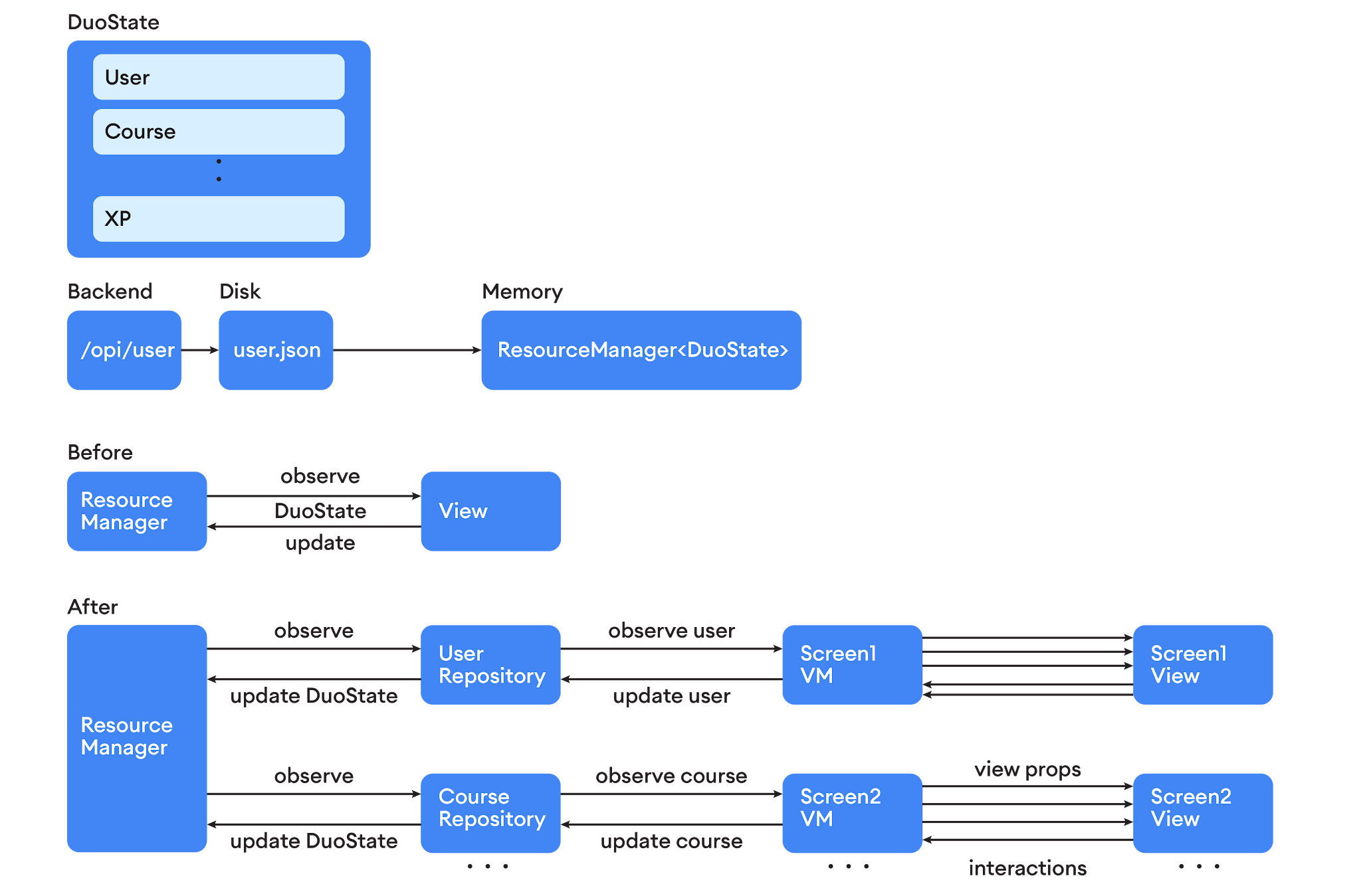
The team’s familiarity with MVVM, and Google’s support for it, made it an obvious choice. It allowed them to clearly document what logic should go into what files (including views, view models and repositories). This helped make their feature architecture more consistent. With a clear path to follow, the team quickly began refactoring their monolithic code into sets of classes with clear boundaries and responsibilities.

Along with MVVM, the team used Dagger and Hilt (also included in Android Jetpack) to implement repository patterns to replace DuoState. Dagger generates clear readable code that provides verbose error logging designed to help developers understand exactly what their code is doing, eliminating dead stack traces to reflected properties; and Hilt reduces the amount of boilerplate code needed to write for this.

This new architecture allowed the team to split DuoState into smaller objects. This immediately reduced unnecessary coupling between domains. For example, the code responsible for tracking a user’s progress could now access their experience points but not the number of times they’ve logged in during a month. These new architecture guidelines meant that while no single thing was too difficult to change, it took coordination and planning to change it across the app. Implementing the new architecture across the code base drove significant performance gains in aggregate.

MVVM architecture facilitates a separation of concerns between the domain data, the interface the learners see, and the logic for how these two realms interact. It gave Duolingo’s developers a more deliberate way to control how the app responds to internal state updates. They could now develop more complex user experiences without the risk of triggering regressions, or affecting the underlying business rules.

Developer Productivity

In the past, inconsistent application of development patterns made different parts of the codebase harder to understand and maintain. Without consensus, each developer implemented code as they saw fit.

MVVM, Dagger, and Hilt, provided the team with a more detailed understanding of how new features should be implemented. Following these best practices made the code easier and more predictable. Developers could now assist in debugging features that they hadn’t originally worked on. And new developers could be onboarded more efficiently; as long as they understood the architecture, they could contribute meaningfully right away. This new clarity significantly boosted the team’s development velocity.

Ensuring Quality

Crucially, the new architecture also revealed that certain animation features in the app were underperforming on entry-level devices. Accordingly, the other core focus of the Android Reboot was the reduction of jank, dropped frames, and "App Not Responding” (ANR) errors. The team used repository patterns to help streamline the sharing of data between threads. These patterns ensured that they could more efficiently use device resources with multiple threaded modules. Moving work off the main thread improved responsiveness, overall frame rate, and led to smoother animations on entry-level devices. Performance on flagship devices improved as well.

A Better Overall Android Experience

In the six months working with the new architecture, Duolingo’s Android team has continued to ship new features without recording significant performance regressions. The days where they had to halt feature production to hunt and fix bugs are safely behind them.

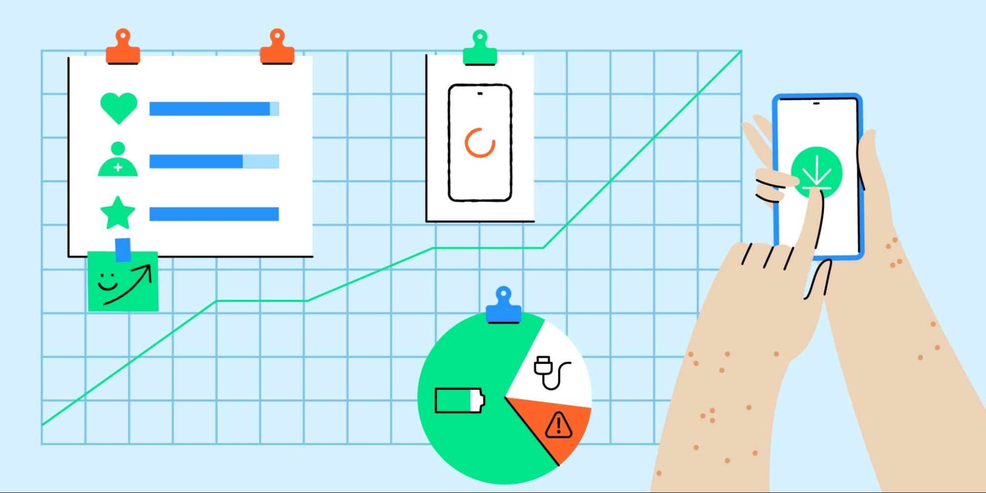
The app’s daily ANR rate dropped 41%. The percentage of time that the app’s frame rate fell below target decreased by 28%. And importantly, users experienced a 40% increase in speed when scrolling through lessons, the leaderboard, and stories in the app.

The reboot allowed Duolingo to consistently provide their trademark fun, effective, and delightful language learning experience on a much wider range of Android devices.

Conclusion

Duolingo’s dedication to their mission made them the world's top app in the language learning space. Their commitment to app excellence — creating cutting edge educational experiences without compromising accessibility — is what kept them there.

If you’re interested in getting your team on board for your own Android Reboot, check out our condensed case study for product owners and executives linked here.

Working Towards Android App Excellence

Posted by Jacob Lehrbaum Director of Developer Relations, Android

illustration of freckled hand over mobile phone with graphs

Great app experiences are great for business. In fact, nearly three-quarters of Android app users who leave a 5 star review on Google Play mention the quality of their experience with the app1; its speed, design, and usability. At Google, we want to help all developers achieve app excellence, and in turn help you drive user acquisition, retention, and monetization.

So what is “app excellence”? This may sound aspirational, but it is within reach for many apps. It starts with a laser focus on the user, and more specifically, with intuitive user experiences that get people to the main functionality of your app as quickly as possible — but that is just the beginning. Excellent apps are consistent across all of their screens and experiences. They perform well, no matter the device used. App excellence is achievable when all of the stakeholders who influence your app are invested in the experience of using your app.

One of the blockers that gets in the way of app excellence is shared or unclear accountability. Some of the primary measures of app quality, such as crashes and load times, are often seen as the responsibility of one group in the company, such as the engineering team. However, when we talk to best-in-class organizations2 about how they achieve app quality, it is clear that taking a cross-functional approach is key, with engineering, design, product, and business teams working toward a common goal.

So what are some internal best practices behind app excellence?

Make app quality a cross-organizational focus — not just an engineering concern

It’s a way easier conversation for me at the business end because I can say “these competitors’ apps are faster than ours; we need to reduce our load time down from 5 seconds to 4 seconds”.
Software engineer, x-platform app

App excellence helps drive business performance. New features are great, but if they slow down app start-up times or take up too much device space, people will eventually use your app less often or even delete it. Engineers who have built a company-wide focus on quality have often done so by quantifying the impact of quality issues on business performance, through:

  • Case studies showing the impact of responsiveness, APK size, start-up time, and memory usage on business KPIs. Here you can find practical case studies showcasing how developers such as Headspace and Duolingo achieved app excellence.
  • Benchmarking against competitor apps. Check out peer benchmarks and other metrics on the Google Play Console.

Organize teams around features and/or app user journey stages

Companies that organize teams around features — or stages in the user journey — are more likely to deliver consistent experiences across each operating system they support, bring new apps or features to market faster, and deliver a better app experience for all their customers. These teams are often cross-functional groups that span engineering, marketing, ux, and product — and are responsible for the success of a feature or user journey stage3 across all devices and platforms. In addition to better experiences and feature parity, this structure enables alignment of goals across functional areas while reducing silos, and it also helps teams hyper-focus on addressing specific objectives.

Feature organized team graph

Squads focused on business objectives heighten focus on the user.

Use the same devices your customers use

If a majority of your users are on a specific type of device, you can build empathy for their experience if you use the same phone, tablet or smart watch as your primary device. This is especially relevant for senior leadership in your organization who make decisions that impact the day-to-day experience of millions of users. For example, Duolingo has built this into their company DNA. Every Duolingo employee — including their CEO — either uses exclusively or has access to an entry level Android device to reflect a significant portion of their user base.

A user-centric approach to quality and app excellence is essential to business growth. If you are interested in learning how to achieve app excellence, read our case studies with practical tips, and sign up to attend our App Excellence Summit by visiting the Android app excellence webpage.

In subsequent blog posts, we will dig deep into two drivers of excellent app experiences: app performance and how it is linked to user behavior, and creating seamless user experiences across devices. Sign up to the Android developer newsletter here to be notified of the next installment, and get news and insights from the Android team.

Notes


  1. Internal Google Play data, 2021. 

  2. Google App Quality Research, 2021 

  3. The series of steps each user takes as they interact with your app is referred to as the “user journey.” Examples of user journey stages include installs, onboarding, engagement, and retention 

Quality to match with your user’s expectations

Posted by Hoi Lam, Android App Quality

Since the launch of Android more than 10 years ago, the platform and the user’s expectations have grown. There are improvements from user experience through material design to the importance and advancement in privacy. We know you want your apps to offer a great user experience. At the same time, we also know that it’s not always straightforward to know which area to tackle first. That’s why we are launching a new App Quality section in our developer site to help you keep up-to-date with key aspects of app quality and provide related resources.

In the first release, we have updated the Core App Quality checklist to take into account recent Android releases as well as the current trends of the app ecosystem. Here are some highlights in this update:

  • Visual Experience - We highlight the best practice of using Material Design Components in place of platform components such as buttons. This will give your app a modern look as well as making features such as dark theme easy to implement. In addition to advice on back stack, we have expanded it to preserving the state of the app. This is becoming more important as edge-to-edge screens and gesture navigation are becoming commonplace, even in entry level phones.
  • Functionality - There are three areas where we have updated our guidance. For media applications, we have updated our recommendations around the playback experience as well as support for HEVC video compression for video encoding. For sharing between apps, we highlight the importance of using the Android Sharesheet. This will be critical going forward as apps will have limited visibility to other installed apps in API level 30 by default. Lastly, we expanded our recommendations around background services. Helping users to conserve battery is a priority for Android, and we will continue to share updates on this topic.
  • Performance & Stability - We have added tooling now available such as Android vitals in the Google Play Console. One important point to highlight here is Application Not Responding (ANR). ANRs are caused by threading issues and are something developers can fixed. The ANR troubleshooting guide can help you diagnose and resolve any ANRs that exist in the app.
  • Privacy & Security - We have summarized our latest recommendations to take into account the latest safeguards from runtime permission to securely using WebView. We have also expanded to include privacy norms that users come to expect from protecting private data to not using any non-resettable hardware Ids.
  • Google Play - In this section, we highlight some of the most important policies for developers and link you to more information on the guidelines.

Going forward, we aim to update this list on a quarterly basis to make sure this is up-to-date. In addition, we will be updating the quality checklists for other form factors.

We are working on additional tools and best practices to make it easier for you to build quality applications on Android. We can’t wait to introduce these new improvements to you. Stay tuned!

Android Developer Story: Music app developer DJIT builds higher quality experiences and a successful businesses on Android

Posted by Lily Sheringham, Google Play team

Paris-based DJiT is the creator of edjing, one of the most downloaded DJ apps in the world, it now has more than 60 million downloads and a presence in 182 countries. Following their launch on Android, the platform became the largest contributor of business growth, with 50 percent of total revenue and more than 70 percent of new downloads coming from their Android users.

Hear from Jean-Baptiste Hironde, CEO & Co-founder, Séverine Payet, Marketing Manager, and Damien Delépine, Android Software Engineer, to learn how DJit improved latency on new Android Marshmallow, as well as leveraged other Android and Google Play features to create higher quality apps.


Find out more about building great audio apps and how to find success on Google Play.