Category Archives: Google LatLong Blog

News and notes by the Google Earth and Maps team

Google for Brazil: Building a more inclusive internet for everyone, everywhere

Google for Brazil: Building a more inclusive internet for everyone, everywhere

Brazilians love the internet. With more than 139 million people online, Brazil ranks among the top five internet populations in the world. Brazilians are also heavy users of Google products, from Search and Android to YouTube and Maps to Photos and Waze. And Brazil is an innovation hub for Google. Our engineering team in Belo Horizonte has made remarkable contributions to our products globally, such as improving health-related searches.

But we know there is still a lot of work to do in Brazil and elsewhere to make technology work better for more people. So today at our Google for Brazil event in São Paulo, we made several announcements about how we're working to make the internet more inclusive and to make our products work better for people in Brazil—and around the world.

Google Duo audio calling

Last year we created Google Duo to bring simple, high-quality video calling to users on Android and iOS. Now we’re adding audio-only calling in Duo. So in those moments when video calling isn't an option—like when you’re about to hop on a crowded bus or have a poor network connection—you can stay connected with family and friends through audio calling. Duo audio calls work well on all connection speeds and won't eat up your data. This feature will be available starting today first in Brazil, and we'll be rolling it out to users around the world in the coming days.

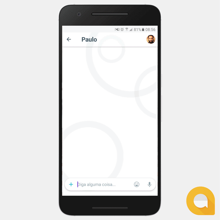
Google Allo file sharing and Smart Smiley in Brazilian Portuguese

Since launching Google Allo last September, users in countries like Brazil have requested the ability to share documents in group chats. Starting today, Android users everywhere will be able to share documents and other files (.pdf, .docs, .apk, .zip, and mp3) with friends on Allo. And for users in Brazil, we're also rolling out Smart Smiley in Portuguese, which uses machine learning to help you find the right emoji faster. Tap the Smart Smiley icon on the compose bar, and the app will suggest relevant emojis and stickers to help you finish your thought.

ALLO-GIF-FEIJOADA_750px.gif

Google Photos: Faster backup and sharing, no matter the connection

We built Google Photos to help people store, organize and share photos and videos in a hassle-free way. But it can sometimes be difficult to back up and share photos and videos, especially when you're on the go and don't have an internet connection. So today we're rolling out two new features to make backup and sharing easier on low connectivity. Now on Android your photos will back up automatically in a lightweight preview quality if you aren't able to back up in high quality, and still look great on a smartphone. And when a good Wi-Fi connection becomes available, your backed up photos will be replaced with high-quality versions. We’re also making it easier to share many photos at once even on low connectivity. Never mind if you're at the beach or hiking in the mountains, with Google Photos on Android and iOS you can now share pictures quickly even with a spotty connection by sending first in low resolution so friends and family can view them right away. They'll later update in higher resolution when connectivity permits.

It can be hard to find time to organize your pictures, so Google Photos automatically creates animations, movies, collages, and albums. For movies, Google Photos will select the best moments, put them together with professional-style transitions, and set it all to music. With Brazil in mind, we recently rolled out a great example of these kinds of movies—your best photos from Carnival, set to a soundtrack of samba.

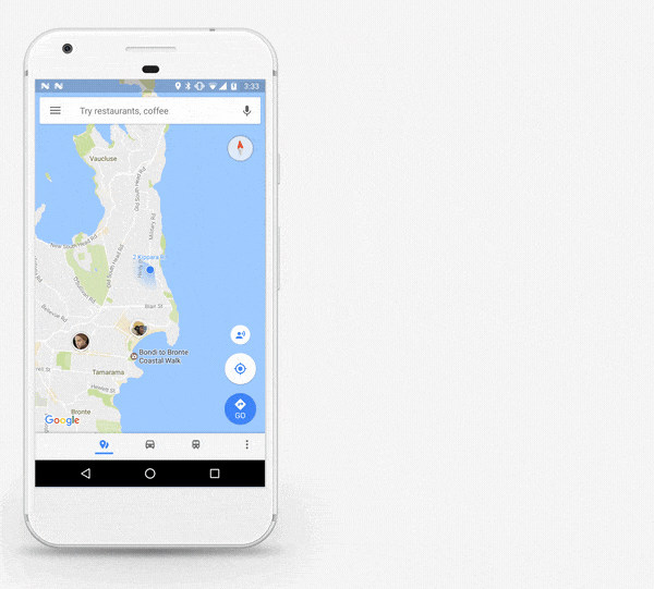
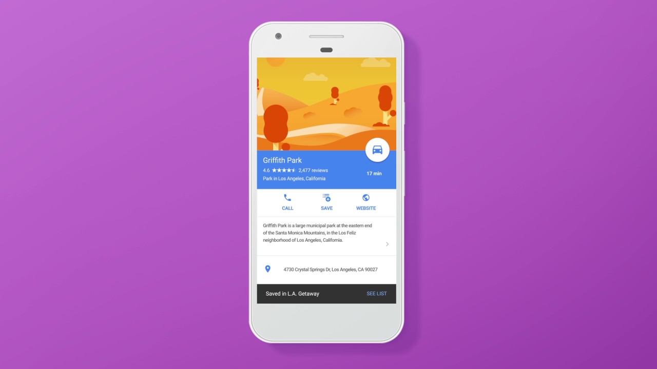
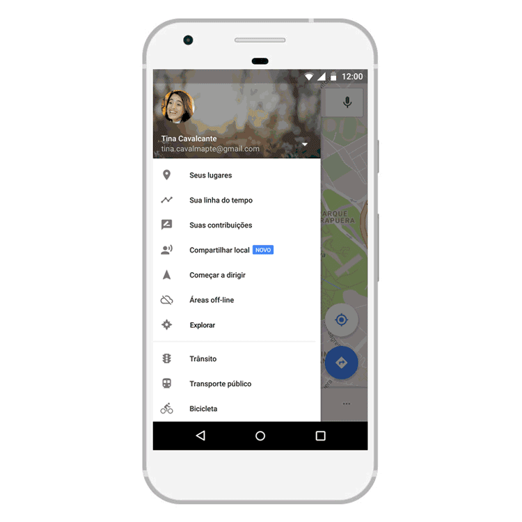
Maps location sharing

We're adding a new location sharing feature in Google Maps that lets you tell your friends and family where you are and when you’ll arrive at your destination. You have complete control over whether you share your location, who you share it with, and how long you share it. You can stop sharing at any time. No more "where are you now?" messages back and forth. To manage your location sharing settings across Google products go to the "Your personal info" section of My Account and select Location Sharing.

Compartilhamento-de-local_750px.gif

Posts on Google

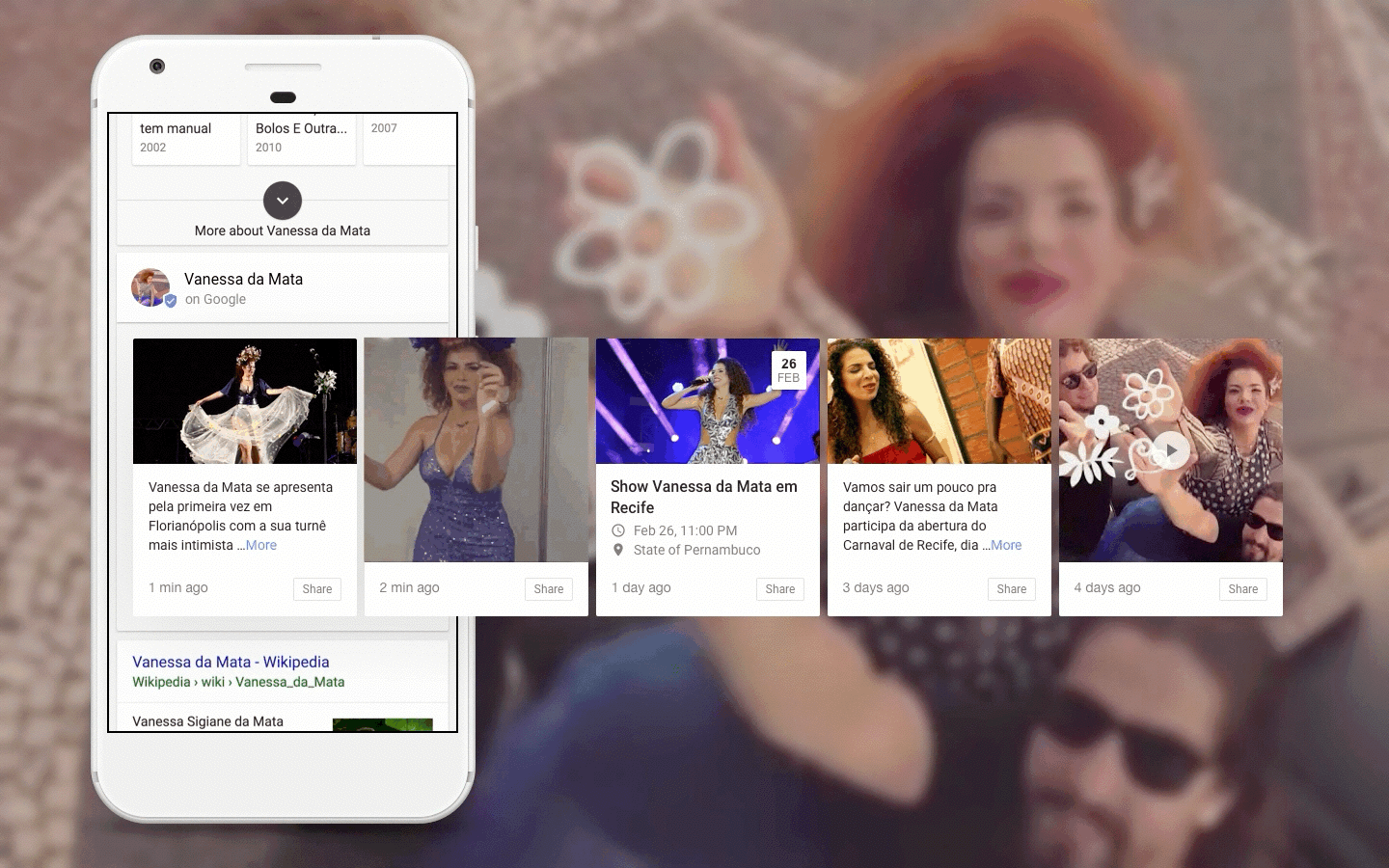
Last year we started experimenting with allowing people and places to post directly on Google Search. We started out with the U.S. election and have completed dozens of other experiments around the world. Starting today, in the U.S. and Brazil, we’re taking it to the next step and opening up the application process so that organizations and people within specific categories can post directly on Google.

Now, when you search for museums, sports teams, sports leagues, movies and, in Brazil for now, musicians, you can find content from that participating organization or person, right on Google. So if you’re searching for the Henry Ford Museum in the U.S. or for Vanessa da Mata in Brazil, you'll see updates directly from the source with relevant information, like new exhibits, timely updates and interesting facts. Beyond these categories in the U.S. and Brazil, we’ll continue to experiment globally and look forward to making Search even more useful and timely.

Vanessa Animated Post.gif

We made some Brazil-specific announcements at our event in São Paulo today as well, including plans to roll out the Google Assistant in Brazilian Portuguese on Android phones running Marshmallow or Nougat. We also extended a $5 million Google.org grant to the Lemann Foundation for an exciting tech-based education project in Brazil, launched the iconic São Paulo Museum of Art on Google Arts & Culture, and announced plans to roll out Waze Carpool in Brazil later this year.

All of today's announcements were inspired by your feedback. We do extensive research in places like Brazil, and we use those insights to make new product features tailored to people's needs in mobile-first countries. The great thing about building products for the most difficult, limited internet conditions is that you end up creating great products for everyone, everywhere.

Source: Google LatLong


Share your trips and real-time location from Google Maps

“Where are you now?” and “What's your ETA?” Whether you’re heading to a party or meeting up for dinner, you probably hear questions like this pretty often from family and friends. Soon Google Maps users worldwide will be able to answer those questions in just a few taps, without ever leaving the app. On both Android and iOS, you’ll be able to share your real-time location with anyone. And the people you share with will be able to see your location on Android, iPhone, mobile web, and even desktop. Here’s how it works in a real-world scenario:

Location Sharing in Google Maps

Whenever you want to let someone know where you are, just open the side menu or tap the blue dot that represents where you are. Tap “Share location” and then select who to share with and how long to share—and you're done! You can share your real-time location with your Google contacts, or even share with friends and family by sending a link on your favorite messenger apps. When you’re sharing your location, the people you’ve chosen to share with will see you on their map. And you’ll see an icon above the compass on your own map reminding you that you’re actively sharing your location. You can change your mind and stop sharing at any time—it’s entirely up to you.

Sharing Your Location

Next time you’re on your way or running late, you can share your real-time location and trip progress from navigation as well. During your next trip, tap the “More” button on the bottom on the navigation screen, and then tap “Share trip.” When you share your trip with people, they’ll see your expected arrival time and can follow your journey as you head toward your destination. Sharing automatically ends when you arrive.

Sharing a Trip

Location sharing on Google Maps is rolling out soon worldwide, and you’ll be able to quickly let your friends and family know where you are and when you’ll get where you’re going. The answer to “where are you?” is only a tap away.

Source: Google LatLong


Shedding light on solar potential in all 50 U.S. States

Solar power is an abundant, low carbon source of electricity, but historically it has been more expensive than traditional electricity. With solar costs dropping dramatically, many people are starting to ask: does solar power make sense on my rooftop? In my town or state?  Since its initial launch in 2015, Project Sunroof has used imagery from Google Maps and Google Earth, 3D modeling and machine learning to help answer those questions accurately and at scale. For every building included in the data, Project Sunroof calculates the amount of sunlight received by each portion of the roof over the course of a year, taking into account weather patterns, position of the sun in the sky at different times of year, and shade from nearby obstructions like trees and tall buildings. Finally, the estimated sunlight is translated into energy production using industry standard models for solar installation performance.

sunroof image 1
Project Sunroof county-level coverage from 2015 - 2017

Today, Project Sunroof is helping answer those questions for more places than ever, with an expansion that brings Project Sunroof’s data coverage to every state in the U.S, with a total of approximately 60 million buildings analyzed. The expanded data reveals some fascinating insights about the solar energy opportunity nationwide:


  • Seventy-nine percent of all rooftops analyzed are technically viable for solar, meaning those rooftops have enough unshaded area for solar panels.

  • Over 90 percent of homes in Hawaii, Arizona, Nevada and New Mexico are technically viable, while states like Pennsylvania, Maine and Minnesota reach just above 60 percent viability.

  • Houston, TX has the most solar potential of any U.S. city in the Project Sunroof data, with an estimated 18,940 gigawatt-hours (GWh) of rooftop solar generation potential per year. Los Angeles, Phoenix, San Antonio, and New York follow Houston for the top 5 solar potential cities -- see the full top 10 list in the chart below.
Sunroof image 2

To put the rooftop solar potential into perspective, the average U.S. home consumes 10,812 kilowatt-hours (kWh) a year according to EIA. There are one million kWh in one gigawatt-hour (GWh). One GWh of energy is enough to supply power to 90 homes for an entire year.

If the top ten cities above reached their full rooftop solar potential, they'd produce enough energy to power 8 million homes across the US.
Sunroof image 3
Sample of Project Sunroof solar energy potential map

This also means that if you've been thinking about going solar, there's a much better chance there's Project Sunroof data for your area. The Project Sunroof data explorer tool allows anyone to explore rooftop solar potential across U.S. zip codes, cities, counties and states. If you’re looking to learn about the solar and financial savings potential for your homes, the Project Sunroof savings estimator tool now covers 40x more buildings in the U.S. than when we launched it in 2015.

Sunroof Image 4
Visualization of solar potential at the Googleplex in Mountain View, CA.

Almost 10 years ago, Google became an early adopter of rooftop solar, installing a 1.6 megawatt (MW) solar array at our headquarters in Mountain View, CA—the largest corporate solar installation of its kind at the time. Today, Project Sunroof combines Google’s longstanding interest in sustainability and renewable energy with unique, high-quality information about the potential of rooftop solar power. We’re proud to be expanding coverage of this project to help more people decide if solar makes sense for you.  

Source: Google LatLong


Shedding light on solar potential in all 50 U.S. States

Solar power is an abundant, low carbon source of electricity, but historically it has been more expensive than traditional electricity. With solar costs dropping dramatically, many people are starting to ask: does solar power make sense on my rooftop? In my town or state?  Since its initial launch in 2015, Project Sunroofhas used imagery from Google Maps and Google Earth, 3D modeling and machine learning to help answer those questions accurately and at scale. For every building included in the data, Project Sunroof calculates the amount of sunlight received by each portion of the roof over the course of a year, taking into account weather patterns, position of the sun in the sky at different times of year, and shade from nearby obstructions like trees and tall buildings. Finally, the estimated sunlight is translated into energy production using industry standard models for solar installation performance.

sunroof image 1
Project Sunroof county-level coverage from 2015 - 2017

Today, Project Sunroof is helping answer those questions for more places than ever, with an expansion that brings Project Sunroof’s data coverage to every state in the U.S, with a total of approximately 60 million buildings analyzed. The expanded data reveals some fascinating insights about the solar energy opportunity nationwide:


  • Seventy-nine percent of all rooftops analyzed are technically viable for solar, meaning those rooftops have enough unshaded area for solar panels.

  • Over 90 percent of homes in Hawaii, Arizona, Nevada and New Mexico are technically viable, while states like Pennsylvania, Maine and Minnesota reach just above 60 percent viability.

  • Houston, TX has the most solar potential of any U.S. city in the Project Sunroof data, with an estimated 18,940 gigawatt-hours (GWh) of rooftop solar generation potential per year. Los Angeles, Phoenix, San Antonio, and New York follow Houston for the top 5 solar potential cities -- see the full top 10 list in the chart below.
Sunroof image 2

To put the rooftop solar potential into perspective, the average U.S. home consumes 10,812 kilowatt-hours (kWh) a year according to EIA. There are one million kWh in one gigawatt-hour (GWh). One GWh of energy is enough to supply power to 90 homes for an entire year.

If the top ten cities above reached their full rooftop solar potential, they'd produce enough energy to power 8 million homes across the US.
Sunroof image 3
Sample of Project Sunroof solar energy potential map

This also means that if you've been thinking about going solar, there's a much better chance there's Project Sunroof data for your area. The Project Sunroof data explorer tool allows anyone to explore rooftop solar potential across U.S. zip codes, cities, counties and states. If you’re looking to learn about the solar and financial savings potential for your homes, the Project Sunroof savings estimator tool now covers 40x more buildings in the U.S. than when we launched it in 2015.

Sunroof Image 4
Visualization of solar potential at the Googleplex in Mountain View, CA.

Almost 10 years ago, Google became an early adopter of rooftop solar, installing a 1.6 megawatt (MW) solar array at our headquarters in Mountain View, CA—the largest corporate solar installation of its kind at the time. Today, Project Sunroof combines Google’s longstanding interest in sustainability and renewable energy with unique, high-quality information about the potential of rooftop solar power. We’re proud to be expanding coverage of this project to help more people decide if solar makes sense for you.  

Source: Google LatLong


Special delivery with Google Maps APIs

Customers care about convenience and expect fast responses, so a company’s ability to provide “last mile delivery”—quick, on-demand delivery service—can make or break its relationship with a customer. Asia-Pacific companies that rely on last-mile service are tapping into the cloud’s ability to amass and analyze data–specifically, using Google Maps to route drivers to the fastest path to a customer’s front door.

Committing to delivery windows

Swiggy, a local food delivery service based in India, delivers meals from restaurants in major cities like Bangalore and Delhi within a 40-minute delivery window. To make sure drivers can meet this commitment, Swiggy worked with Google partner Media Agility to integrate Google Maps APIs. Their application uses the Google Maps Distance Matrix API and Google Maps Places API to find and display only those restaurants that are within four to five kilometers of the customer. Once the customer places an order from one of the local restaurants, Swiggy uses the Google Maps Directions API to help drivers find directions to restaurants and customers.

special-delivery-1

Business is booming for Swiggy as a result of leveraging location data and the cloud to meet its delivery time commitment. Business has grown 25 percent per month, and nearly 80 percent of orders come from repeat customers.

Providing online estimates for delivery times

Bigbasket, India’s largest online food and grocery store, relies on mapping data too, but allows customers to choose a time window for delivery. For those who need their deliveries pronto, the company also offers an express service that delivers orders within 90 minutes.

When customers place orders on Bigbasket’s mobile app, they set their location on a Google map. The location determines the menu of products they are shown, as well as prices. Bigbasket used the Google Maps Javascript API and worked with Google partner Media Agility to build a web-based app for the company’s backend that tracks all orders and delivery progress. Dispatchers use the Google Maps Directions API to match drivers with orders and customers, and the Google Distance Matrix API to estimate the time of arrival for deliveries.  The delivery recipe is working: Bigbasket has grown to four million customers, with more than one million orders every month.

Improving driver productivity and efficiency

For honestbee, an online concierge and delivery service based in Singapore, the last-mile goal was to improve driver and dispatcher efficiency. Using Google Maps, honestbee created a web-based map that shows the locations of drivers and their pickup and dropoff destinations.

The company uses the Google Distance Matrix API to build a batching engine, which automates dispatching drivers, and optimizes pickup and dropoff points. In instances where deliveries are too complex to be automatically handled by the batching engine, dispatchers match drivers with customers using a web-based map built with the Google Maps Javascript API.

special-delivery-2

Timely and speedy delivery plays a key role in customer satisfaction in today’s on-demand world. With accurate cloud-based mapping resources, merchants are finding ways to shave off precious minutes from last-mile delivery routes so customers keep coming back.

Source: Google LatLong


How Google Maps APIs are fighting HIV in Kenya

In 2015, the Joint United Nations Programme on HIV/AIDS (UNAIDS) and mobile analytics solutions provider iVEDiX  came together to create the HIV Situation Room, a mobile app designed to help fight the HIV epidemic in Kenya. The app uses Google Maps APIs to create a comprehensive picture of HIV prevention efforts, testing and treatment — and make this programmatic data accessible both to local staff in clinics and others on the front lines, as well as to policy makers.

We sat down with Taavi Erkkola, senior advisor on monitoring and evaluation for UNAIDS, and Brian Annechino, director of government and public sector solutions for iVEDiX, to hear more about the project and why they chose Google Maps APIs to help them in the fight against HIV.

How did the idea for the UNAIDS HIV Situation Room app come about?

Taavi Erkkola: As of 2015, UNAIDS estimates a total of 36.7 million people living with HIV globally. Of those, 2.1 million are newly infected, with approximately 5,700 new HIV infections a day. Sixty-six percent of all infected by HIV reside in sub-Saharan Africa, and approximately 400 people infected per day there are children under age 15. To effectively combat HIV, we need access to up-to-date information on everything from recent outbreaks and locations of clinics, to in-country educational efforts and inventory levels within healthcare facilities. UNAIDS has a Situation Room at our headquarters in Geneva that gives us access to this kind of worldwide HIV data. But we wanted to build a mobile app that provided global access to the Situation Room data, with more detail at a national, county and facility-level.

We tested out the app in Kenya because the country has a strong appetite for the use of technology to better its citizens’ health. Kenyan government agencies, including the National AIDS Council, encouraged organizations like Kenya Medical Supplies Authority (KEMSA) and the Ministry of Health to contribute their disease control expertise and data to the Situation Room solution. Kenya's President Uhuru Kenyatta was an early advocate, and has demonstrated his government’s commitment to making data-driven decisions, especially in the fight against HIV and AIDS.

UNAIDS-1

Why did UNAIDS and iVEDiX choose Google Maps, and how did you use Google Maps APIs to build the HIV Situation Room app?

Brian Annechino: In Kenya, more than 80 percent of adults own a cell phone, and Android is by far the most popular operating system. Google Maps APIs are available across all platforms, including native APIs for Android, and Google Maps also offers the kind of fine-grained detail we needed — for example, the locations of more than 7,500 Kenyan healthcare facilities servicing the HIV and AIDS epidemic. Using data from multiple sources along with Google Maps, we can map things like a clinic’s risk of running out of antiretroviral medicine.

Onix, a Google Premier Partner, identified the right Google Maps components to build the app and helped us procure the licensing we needed. We used the Google Maps Android API to build the main interface. Since it was important to have the most accurate and up-to-date map data for Kenya to support the effort, we used the Street View feature of the Google Maps Android API to let people zoom into the street level and see clinics that offer HIV services in locations where Street View imagery is available.

TE: These mapping capabilities are critical because we need to give our county-level users as much insight as possible on service delivery at health facilities. Decision-makers in HIV response are at national and county-level. In this app, we’re able to combine multiple data sources to get a more comprehensive picture of HIV prevention efforts, testing and treatment across these levels.

What kind of data does the HIV Situation Room app display?

TE: The app taps into three data sources. The first is UNAIDS data set about country-by-country HIV estimates. The second is Kenya’s District Health Information System, which has detailed information from all 47 Kenyan counties — everything from the number of people treated at a specific hospital for HIV, to the number of HIV+ pregnant women attending clinics for visits, to the number of condoms distributed by each facility. The third data set will include community level data, which can also contain survey responses from clients about the quality of service they receive.

UNAIDS-2

How does the HIV Situation Room use the data?

TE: By overlaying our inventory data and field notes on a map, we can see patterns and identify trends that help us respond quickly and plan efficiently. For example, if we see breakouts occurring in a particular area, we can monitor HIV test kits in that area or increase educational efforts for target communities.

Have you seen signs that your efforts are making a difference in Kenya?

TE: One of our biggest successes in Kenya is that the app is used by the highest-level decision-makers in the country — President Kenyatta uses the app — as well as people on the front lines fighting HIV, such as program managers. Using the app, policy makers have more information than ever before, and as a result, are able to devise more effective solutions by combining insights at the local and program coordination levels. We see it as an extremely powerful tool for fighting HIV — and we’re looking to bring this tool to other countries in Africa soon.

Source: Google LatLong


How Google Maps APIs are fighting HIV in Kenya

In 2015, the Joint United Nations Programme on HIV/AIDS (UNAIDS) and mobile analytics solutions provider iVEDiX  came together to create the HIV Situation Room, a mobile app designed to help fight the HIV epidemic in Kenya. The app uses Google Maps APIs to create a comprehensive picture of HIV prevention efforts, testing and treatment — and make this programmatic data accessible both to local staff in clinics and others on the front lines, as well as to policy makers.

We sat down with Taavi Erkkola, senior advisor on monitoring and evaluation for UNAIDS, and Brian Annechino, director of government and public sector solutions for iVEDiX, to hear more about the project and why they chose Google Maps APIs to help them in the fight against HIV.

How did the idea for the UNAIDS HIV Situation Room app come about?

Taavi Erkkola: As of 2015, UNAIDS estimates a total of 36.7 million people living with HIV globally. Of those, 2.1 million are newly infected, with approximately 5,700 new HIV infections a day. Sixty-six percent of all infected by HIV reside in sub-Saharan Africa, and approximately 400 people infected per day there are children under age 15. To effectively combat HIV, we need access to up-to-date information on everything from recent outbreaks and locations of clinics, to in-country educational efforts and inventory levels within healthcare facilities. UNAIDS has a Situation Room at our headquarters in Geneva that gives us access to this kind of worldwide HIV data. But we wanted to build a mobile app that provided global access to the Situation Room data, with more detail at a national, county and facility-level.

We tested out the app in Kenya because the country has a strong appetite for the use of technology to better its citizens’ health. Kenyan government agencies, including the National AIDS Council, encouraged organizations like Kenya Medical Supplies Authority (KEMSA) and the Ministry of Health to contribute their disease control expertise and data to the Situation Room solution. Kenya's President Uhuru Kenyatta was an early advocate, and has demonstrated his government’s commitment to making data-driven decisions, especially in the fight against HIV and AIDS.

UNAIDS-1

Why did UNAIDS and iVEDiX choose Google Maps, and how did you use Google Maps APIs to build the HIV Situation Room app?

Brian Annechino: In Kenya, more than 80 percent of adults own a cell phone, and Android is by far the most popular operating system. Google Maps APIs are available across all platforms, including native APIs for Android, and Google Maps also offers the kind of fine-grained detail we needed — for example, the locations of more than 7,500 Kenyan healthcare facilities servicing the HIV and AIDS epidemic. Using data from multiple sources along with Google Maps, we can map things like a clinic’s risk of running out of antiretroviral medicine.

Onix,aGoogle Premier Partner, identified the right Google Maps components to build the app and helped us procure the licensing we needed. We used the Google Maps Android API to build the main interface. Since it was important to have the most accurate and up-to-date map data for Kenya to support the effort, we used the Street View feature of the Google Maps Android API to let people zoom into the street level and see clinics that offer HIV services in locations where Street View imagery is available.

TE: These mapping capabilities are critical because we need to give our county-level users as much insight as possible on service delivery at health facilities. Decision-makers in HIV response are at national and county-level. In this app, we’re able to combine multiple data sources to get a more comprehensive picture of HIV prevention efforts, testing and treatment across these levels.

What kind of data does the HIV Situation Room app display?

TE: The app taps into three data sources. The first is UNAIDS data set about country-by-country HIV estimates. The second is Kenya’s District Health Information System, which has detailed information from all 47 Kenyan counties — everything from the number of people treated at a specific hospital for HIV, to the number of HIV+ pregnant women attending clinics for visits, to the number of condoms distributed by each facility. The third data set will include community level data, which can also contain survey responses from clients about the quality of service they receive.

UNAIDS-2

How does the HIV Situation Room use the data?

TE: By overlaying our inventory data and field notes on a map, we can see patterns and identify trends that help us respond quickly and plan efficiently. For example, if we see breakouts occurring in a particular area, we can monitor HIV test kits in that area or increase educational efforts for target communities.

Have you seen signs that your efforts are making a difference in Kenya?

TE: One of our biggest successes in Kenya is that the app is used by the highest-level decision-makers in the country — President Kenyatta uses the app — as well as people on the front lines fighting HIV, such as program managers. Using the app, policy makers have more information than ever before, and as a result, are able to devise more effective solutions by combining insights at the local and program coordination levels. We see it as an extremely powerful tool for fighting HIV — and we’re looking to bring this tool to other countries in Africa soon.

Source: Google LatLong


Keep track of your favorite places and share them with friends

Is your bucket list etched in your memory, or scribbled on a dozen post-it notes scattered around your home? Have you ever promised out-of-town guests an email full of your favorite spots, only to never get around to clicking send? Starting today, you can create lists of places, share your lists with others, and follow the lists your friends and family share with you—without ever leaving the Google Maps app (Android, iOS).


Getting started is easy. Simply open the Google Maps app and find that BBQ spot you’ve been wanting to try. Tapping on the place name and then the “Save” icon adds the place to one of several pre-set lists like “Want to Go” or “Favorites.” You can also add the restaurant to a new list that you name yourself, like “Finger Lickin’ BBQ.” To recall the lists you’ve created, go to Your Places (in the side menu) and then open the saved tab. Icons for the places you’ve saved to lists will appear on the map itself, so you’ll always know whether one of your must-try BBQ spots is nearby.


Because sharing is caring, we made it easy to share lists like “Best Views in SF” via text, email, social networks and popular messaging apps. Whenever friends and family come to town, tap the share button to get a link and start flexing your local knowledge muscles. Once you send a link to your out-of-towners, they can tap “Follow” to pull up the list from Your Places whenever they need it. Here’s how it all works in real life:

Lists on Google Maps

The lists you follow are with you wherever you take Google Maps and are viewable on mobile and desktop—and even offline. Next time you're on a trip, download offline maps of the area in advance and you'll be able to see all the places you’ve added to lists on the map itself.


With the millions of landmarks, businesses and other points of interest in Google Maps, there’s no shortage of places to try. Now that we’ve got the world mapped, it’s your turn to map your world with Lists—from local hotspots to bucket list destinations worlds away.


Source: Google LatLong