Author Archives: Susanna Zaraysky

Partnering to change how the world reads: Expanding Lexend to different weights

Lexend has 9 styles and is a variable font. Lowercase and uppercase letters i, j, o, and q


Google Fonts partnered with CosmosDirekt, a German insurance company, to expand Lexend, a typeface designed by Dr. Bonnie Shaver-Troup for readers with dyslexia and other reading challenges. 

When Philipp Muhlebach, Executive Creative Director of Superunion in Germany, learned about Lexend, he made it the default font in his browser. The new typeface promised to help struggling readers with various spacing options that improved readability. He noticed that Lexend did help him read more quickly and fluently than other fonts. (Reading fluency consists of three components: accuracy, speed, and expression.) 

“I was impressed with Lexend’s mission. It improves reading performance by enhancing the legibility of the words with distinctive letters and numbers. It also combats the challenges faced by millions of people with dyslexia,” said Mühlebach. 

When CosmosDirekt hired Superunion, for a rebranding project, Mühlebach suggested CosmosDirekt use Lexend to reflect the company’s new modern look. He found that the typeface could aptly work for the various types of text the insurance company used: bold and confident banners and display text, and more subtle and serious content. “As Lexend was available through Google Fonts, we knew that it could generate the best performance across multiple digital devices,” said Mühlebach.


Mobile screen with images of a car and home, prices in Euros for car and home insurance

CosmosDirekt mobile applications for car and home insurance

CosmosDirekt wanted to make it easier for customers with reading difficulties to read and understand their materials. “We loved the font and the story behind it all. Insurance language is hard enough to understand. We’re trying to make it all as simple and accessible as possible,” said Jeromy Lohmann, Head of Marketing and Sales at CosmosDirekt.  


However, there was a problem. Lexend was only available as a single weight, Regular 400. CosmosDirekt needed more font weights for its documents, websites, and marketing materials. 


CosmosDirekt partnered with Google Fonts to commission Font Bureau and Superunion to expand Lexend from one to nine weights for the insurer to use in its products and for Google Fonts to offer for anyone to use without charge. The new weights (Thin, Extra Light, Light, Medium, SemiBold, Bold, ExtraBold, and Black) were published on Google Fonts in April 2021.


Since January 2022, CosmosDirekt has been using Lexend online in their website, app, forms, and advertising. The company is going to roll out Lexend in all future communication materials. “Overall our customers are extremely impressed with our new rebranding,” said Lohmann. 


Desktop page with an man in cap taking a picture with his phone while a dog licks his face CosmosDirekt desktop homepage page for animal insurance

For CosmosDirekt, increasing the amount of Lexend offerings wasn’t just about the company’s new look, it was also about social responsibility. “We quickly understood the added value we could offer many people who are faced with reading issues. What is better than using design to improve the lives of many?” stated Lohmann. 

Shaver-Troup sees the Lexend extension as a business model for solving major problems: “What this exceptional collaboration has done to eradicate reading issues will resonate far into the future. Reading problems are often described as a global crisis. However, we need to think about how reading impacts people on an individual level. Having Lexend available in nine font weights gives many individuals the choices they need to find the right font for them.” 

Lexend fonts are available on Google Fonts, in Google Docs and in Google Workspace. Watch this video to see how to add Lexend in Google Docs. To learn more about the creation of Lexend, visit Clean and clear: making reading easier with Lexend.
Posted by Susanna Zaraysky, Google Fonts Content Strategist

Eine Partnerschaft mit dem Ziel, das Leseerlebnis weltweit zu verändern: Erweiterung von Lexend um verschiedene Schriftstärken

Lexend hat 9 verschiedene Stile und ist eine variable Schriftart. Hier zu sehen: Die Klein- und Großbuchstaben i, j, o und q.


Google Fonts arbeitet mit CosmosDirekt, einer deutschen Versicherungsgesellschaft zusammen, um Lexend, eine Schriftart, die von Dr. Bonnie Shaver-Troup für Leser mit Dyslexie und anderen Leseschwächen entwickelt wurde, weiter auszubauen. 

Als Philipp Mühlebach, Executive Creative Director bei Superunion in Deutschland, von Lexend erfuhr, legte er sie als standard Schriftart in seinem Browser fest. Die neue Schriftart versprach Nutzern mit eingeschränkten Lesefähigkeiten mithilfe von verschiedenen Abstandsoptionen eine bessere Lesbarkeit. Mühlebach stellte fest, dass Lexend ihm tatsächlich dabei half, schneller und flüssiger zu lesen als mit anderen Schriftarten. Die Leseflüssigkeit setzt sich aus drei Komponenten zusammen: Genauigkeit, Geschwindigkeit und Ausdruck. 


„Ich war von dem Anliegen von Lexend beeindruckt. Die Schriftart verbessert die Leseleistung, indem die Lesbarkeit der Wörter durch deutlich zu erkennende Buchstaben und Zahlen erhöht wird. Das Unternehmen kämpft auch gegen die Herausforderungen, denen sich Millionen von Menschen mit Dyslexie stellen müssen“, so Mühlebach. 


Als CosmosDirekt Superunion für ein Rebrandingprojekt engagierte, schlug Mühlebach CosmosDirekt vor, Lexend zu nutzen, um das neue moderne Design des Unternehmens widerzuspiegeln. Er stellte fest, dass die Schriftart gut für die verschiedenen Textarten geeignet wäre, die bei der Versicherungsgesellschaft verwendet werden: Banner und Displaytexte, die fett gedruckt sind und Vertrauen ausstrahlen, sowie dezentere und ernstere Inhalte. „Als Lexend über Google Fonts verfügbar war, wussten wir, dass diese Schriftart auf verschiedenen digitalen Geräten die beste Leistung generieren könnte“, sagte Mühlebach.


Display eines Mobilgeräts mit Bildern eines Autos und eines Hauses, Preise in Euro für Auto- und Wohngebäudeversicherungen

Mobile Anwendungen von CosmosDirekt für Auto- und Wohngebäudeversicherungen


CosmosDirekt wollte es Kunden mit Leseschwächen einfacher machen, ihre Informationen zu lesen und zu verstehen. „Uns hat die Schriftart und auch die Geschichte dahinter sehr gut gefallen. Versicherungssprache ist so schon schwer genug verständlich. Wir versuchen daher, alle Informationen so einfach und barrierefrei wie möglich zu gestalten“, sagte Jeromy Lohmann, Head of Marketing and Sales bei CosmosDirekt.


Es gab jedoch ein Problem. Lexend war nur mit einer Schriftstärke, nämlich „Regular 400“, verfügbar. CosmosDirekt brauchte jedoch mehr Schriftstärken für seine Dokumente, Websites und Marketingmaterialien. 


CosmosDirekt hat daher zusammen mit Google Fonts die Unternehmen Font Bureau und Superunion damit beauftragt, Lexend von einer auf neun Schriftstärken zu erweitern, sodass die Versicherungsgesellschaft diese in ihren Produkten nutzen und Google Fonts sie für alle Nutzer kostenlos anbieten kann. Die neuen Schriftstärken (Thin, Extra Light, Light, Medium, SemiBold, Bold, ExtraBold und Black) wurden im April 2021 bei Google Fonts veröffentlicht.


Seit Januar 2022 verwendet CosmosDirekt Lexend online auf der Website, in der App, in Formularen und in Werbung für das Unternehmen. Die Versicherungsgesellschaft möchte Lexend zukünftig in all ihren Kommunikationsmaterialien nutzen. „Insgesamt waren unsere Kunden äußerst beeindruckt von unserem neuen Rebranding“, sagte Lohmann. 


Seite auf einem Computer mit einem Mann mit einer Mütze, der ein Foto mit seinem Smartphone macht, während ein Hund sein Gesicht ableckt
CosmosDirekt-Startseite auf einem Computer für eine Haustierversicherung


Für CosmosDirekt ging es bei der Erweiterung der Anzahl an Lexend-Angeboten nicht nur um das neue Erscheinungsbild des Unternehmens, sondern auch um soziale Verantwortung. „Wir haben schnell den Mehrwert erkannt, den wir vielen Menschen mit Leseproblemen bieten können. Was ist besser, als mithilfe von Design das Leben vieler Menschen zu verbessern?“, sagte Lohmann. 


Shaver-Troup sieht die Lexend-Erweiterung als Geschäftsmodell, das große Probleme löst: „Was diese außergewöhnliche Zusammenarbeit geschaffen hat, um Leseprobleme zu beseitigen, wird noch in Zukunft nachhallen. Leseprobleme werden oft als globale Krise beschrieben. Wir müssen uns jedoch darüber Gedanken machen, wie Lesen sich auf den einzelnen Menschen auswirkt. Dadurch, dass Lexend in neun Schriftstärken verfügbar ist, können Nutzer nun genau die Schrift finden, die zu ihren Bedürfnissen passt.“ 


Lexend-Schriftarten sind bei Google Fonts, in Google Docs und in Google Workspace verfügbar. In diesem Video erfährst du, wie du Lexend in Google Docs hinzufügst. Weitere Informationen zur Erstellung von Lexend findest du unter Clean and clear: making reading easier with Lexend.

Emmy award for web fonts: faster online streaming


6 men in suits on red carpet, Blue Emmy awards background

From left to right: Googlers Roderick Sheeter, Garret Rieger, David Kuettel, Tobias Kunisch, Jimmy Mooney, Raph Levien at the Emmy® awards 
Photo credit: National Academy of Television Arts & Sciences (NATAS)


Perhaps you watch the yearly Emmy® awards to see if your favorite television shows and actors will win. (The Emmy® awards are for television shows in the United States.)


Did you know that software engineers and font teams also win Emmys®?


Google Fonts is part of the The World Wide Web Consortium (W3C)’s Web Fonts Working Group that won an Emmy this year for Standardization of Font Technology for Custom Downloadable Fonts and Typography for Web and TV Devices at the Technology & Engineering Emmy® Awards. The award ceremony took place at the National Association of Broadcasters (NAB) show in Las Vegas on April 25, 2022.


The award was for the Web Open Font Format 2 (WOFF2) that became a standard in 2018. WOFF2 is installed on all major web browsers and powers a vast majority of sites. Google Fonts collaborated on creating both WOFF 2 and its predecessor, WOFF. The team created and maintains the WOFF2 encoder and decoder that convert a font to WOFF2 and from WOFF2 back to a font. The encoder and decoder are used in most browsers.


Two men in tuxedos, one man holding Emmy statue

Google Software Engineers Jyrki Alakuijala and David Kuettel (left to right), Photo credit: NATAS


What are web fonts? How do they impact your online entertainment streaming?


Web fonts enable people to use fonts on demand without requiring installation in their operating systems. They make it easier for your movie or television series to load faster and they take up less Internet bandwidth. WOFF2 fonts are smaller and load faster than previous formats, such as TrueType Font (TTF) and Embedded OpenType File Format (EOT).


Before the invention of web fonts such as WOFF2, some fonts were embedded in images and would slow down the time it took for the pages to load. When text is embedded in images, such as in film or television posters, and not included as alt text or in adjacent text near the poster, it can cause accessibility issues for screen reader users because screen reader programs usually can’t read embedded text in images. With WOFF2, it’s more convenient for website designers to use fonts to display text. As a result, screen reader users can hear the text read to them.


Man holding Emmy statue with National Academy of Television Arts and Sciences backdrop


Garret Rieger, Google Fonts Software Engineer and Co-chair of the Web Fonts Working Group, Photo credit: NATAS


“Prior to the WOFF, if online media streaming services wanted to use web fonts, they would have to provide the web fonts in several different formats, depending on the browser. Since all major browsers support WOFF2, online streaming services only need the font in the WOFF2 format. Google Chrome was the first browser to support WOFF2,” explained Garret Rieger, Google Fonts Software Engineer and Co-chair of the Web Fonts Working Group.


The Web Fonts Working Group is currently collaborating on a standard for incremental font transfer to speed up font loading. With this technology, clients, such as a streaming company, will load only the portions of the font they actually need.

Posted by Susanna Zaraysky, Google Fonts Content Strategist

You can now use Radio-Canada’s brand typeface: The award-winning variable font comes to Google Fonts

Radio Canada character set, 2 variable axes, 317 languages supported


A typeface made to give a specific identity and distinction to the Canadian Broadcasting Corporation (CBC) and Radio-Canada’s public broadcasting platforms is now available on Google Fonts in many languages using the Latin writing system, including many indigenous languages spoken in Canada. 

CBC/Radio-Canada is Canada's national public broadcaster. Its mandate is to inform, enlighten, entertain, and strengthen Canadian culture and diversity on radio, television, and digital platforms. As part of this mandate, CBC/Radio-Canada is proud to release its original typeface publicly and make it available through Google Fonts.

The Radio-Canada typeface was created in 2017 by Montreal-based designer and typographer Charles Daoud, in collaboration with Coppers and Brasses and Alexandre Saumier Demers

The humanist style stands out with distinctive angles and subtle curves. In compliance with digital accessibility standards, the font’s x-height is intended to increase legibility, making it very effective when used in continuous text.


In 2018, the Radio-Canada typeface won three awards, in the Font Design category at Communication Arts Typography, Applied Arts Design Annual and at Grand Prix Grafika.

Several optimizations were made in 2021 thanks to Eli Heuer’s contributions. He expanded the static font into a variable font and increased the character set (490 to 679) and the number of supported Latin languages (106 to 317).  

In 2022, Jacques Le Bailly (Baron von Fonthausen), with the expertise of Aaron Bell, expanded the font to include support of indigenous languages used in Canada, such as Sechelt, Algonquin, Ojibway, Carrier, and Chipewyan (more languages to be released).

The Radio-Canada typeface is offered in two styles (Roman and Italic), two widths (Regular and Condensed), and five weights (Light to Bold); and as a variable font.

Posted by Susanna Zaraysky, Google Fonts Content Strategist

Voici Radio-Canada, la police de caractères du diffuseur public canadien, plusieurs fois primée et maintenant disponible sur Google Fonts

caractères typographiques de la police Radio-Canada, supportant deux axes variables et 317 langues.


Une police de caractères créée pour renforcer l’identité distinctive de CBC/Radio-Canada sur toutes les plateformes du diffuseur public est maintenant disponible sur Google Fonts dans plusieurs langues (dont les langues autochtones parlées au Canada) utilisant les caractères latins.

CBC/Radio-Canada est le diffuseur public du Canada. Son mandat est de renseigner, d'éclairer et de divertir, afin de renforcer la culture et la diversité canadienne à la radio, la télé et sur les plateformes numériques. À titre de diffuseur public, CBC/Radio-Canada est fier d’offrir publiquement sa police de caractères par le biais des polices de caractères Google.

De style humaniste, elle se démarque par ses angles et ses empattements distinctifs. Sa hauteur d’x assure une excellente lisibilité conformément aux normes d’accessibilité numérique, ce qui la rend très performante lorsqu’utilisée en texte continu.

La police Radio-Canada a été créée en 2017 par le designer et typographe montréalais Charles Daoud, en collaboration avec Coppers and Brasses et Alexandre Saumier Demers. Elle a été conçue spécifiquement pour CBC/Radio-Canada afin de répondre à ses besoins de diffusion de contenus, tant sur le numérique qu'à la télévision ou qu'en imprimé. 

En 2018, la police Radio-Canada a raflé trois distinctions, dans la catégorie Design de police de caractères aux Communication Arts Typography, Applied Arts Design Annual et Grand Prix Grafika.

Plusieurs optimisations ont vu le jour en 2021 grâce à la collaboration d’Eli Heuer. Il a développé la fonction variable de la police de caractères basée sur les deux familles statiques, augmentant au passage les glyphes originaux (de 490 à 679) et les langues latines (de 106 à 317). 

En 2022, Jacques Le Bailly (Baron von Fonthausen), avec l’expertise d’Aaron Bell, a optimisé la police afin de supporter les langues autochtones du Canada (dont Sechelt, Algonquin, Ojibwé, Carrier, Chipewyan et d’autres langues ajoutées en continu).

La police Radio-Canada est offerte en deux styles (Romain et Italique), deux largeurs (Regulier et Condensé), et cinq graisses (Léger à Gras) ainsi qu’en fonte variable.

Publié par Susanna Zaraysky, Google Fonts Content Strategist


Preserving endangered languages with Noto fonts

Minority or endangered languages are facing a crisis. According to UNESCO, at least 43% of the estimated 6000 languages spoken in the world are endangered. Even though my grandparents spoke an endangered language and language preservation has been my passion for many years, I only recently understood that fonts—the symbols that appear when you type on a keyboard—play a key role in enabling minority language speakers to digitize and preserve their languages on the internet and in print. Until now, many minority languages lacked fonts.

From billions of readers to very small language communities, the freely available, open source Noto font family from Google Fonts supports literacy for hundreds of languages. The Cherokee Nation, with an estimated 20,000 speakers, uses Noto on phones for texting, email and teaching their language in the USA. Noto is used every day for Tibetan, millions of African users, and hundreds of languages of Asia. The government of British Columbia in Canada, with a population of 5 million people, wanted to cover all their languages, including indigenous ones, in a single font and merged Noto Sans + Noto Sans Canadian Aboriginal into a single font, BC Sans font.

The Noto name comes from the mission, “NO TOfu”—eliminating the tofu-like boxes (???) that appear when no font is available for a user’s text. Noto offers fonts for 146 scripts (writing systems) and over 800 languages, and is opening the door to reading and writing for minority language speakers. Noto is the largest source of fonts for endangered languages. Aligned with Google.org’s support of the Endangered Languages Project and Google’s private sponsorship of UNESCO’s International Conference Language Technologies for All, the Noto project is Google’s ambitious Unicode font project, aiming to continually support 100% of all Unicode characters each year with fully functional fonts. Noto won the Beazley Design Museum Designs of the Year award in 2017.

Noto, which has been in development since 2012, recently updated its page on GitHub. The new home at github.com/notofonts has one git project per script, with all sources either available in the widely supported Unified Font Object (UFO) font source or using the .glyphs format. We also have a new on-demand build system triggered as soon as someone updates a font source that uses the Google Fonts open source ‘fontmake’ compiler. This means Noto fonts are now more truly open source, will be better documented and available for contributions by many more people.

Digitizing endangered languages

A font and a keyboard to type it are critical needs for languages in the digital era, but the most important thing is Unicode support.

Type design is the discipline of creating physical or digital typefaces, the coherent collections of letterforms that today are more commonly referred to as fonts, which are the digital representations of type. With fonts, communities can digitize written documents, publish cultural and religious texts online, or teach their children with digital media. This digitization process saves knowledge, and enables connections and communication across generations. It allows people to keep connected with their villages and family, even if they are physically far away. People in an urban diaspora can keep in touch with other urbanites in the same language community, by using the font to produce printed material for posters, educational material, books, newsletters, and so on. Younger generations of language learners can use Noto fonts to learn to read and write in endangered tongues, text and write emails to each other and communicate via social media.

Ultimately, typefaces are a kind of "critical infrastructure" for each culture, a medium to store and transmit emotional tone.

Accessibility

The ability to read minority languages digitally via text magnification improves the accessibility of both historical and modern content in these languages. Languages and their scripts are important to me because I am multilingual and an endangered language activist. While I was preparing the documentary film, Saved by Language, about a boy who saved his life in the Holocaust by speaking the endangered language of Ladino/Judeo-Spanish and my TedX talk on preserving endangered languages with music, I had to read through many old printed materials from a century ago. Since I am partially blind, it was difficult to read the small text with dense typography on discolored paper. If these documents had been digitized and users could easily use zoom mode to read on a computer or device, they would be more accessible and useful to everyone. Unicode fonts, such as Noto, resolve the problems that previously existed when minority language communities had to publish images of text without Unicode encodings. These images were not readable by screen readers and would often be hard to read when enlarged.

For some communities, the Noto font for their writing system may be the only way to use their language digitally because there are no other fonts available for their scripts. I encourage you to learn about which Noto fonts are available for the languages you care about.

How accessible design helps everyone

I was born cross-eyed, and after two corrective surgeries, I thought I could see like everyone else. But I still had trouble driving, navigating stairs, and playing sports. In my late twenties, I learned that I mostly saw with one eye, and I couldn’t see in 3D. This is considered a hidden disability (similar to dyslexia or color blindness), and people with hidden disabilities could go years without knowing why some basic daily activities and interactions with technology are challenging. 

There are millions of people with hidden disabilities and over 2.2 billion people who have a vision impairment around the world, but more than 70 percent of all websites are inaccessible to them. Often, there is a lack of awareness among developers and designers about both the challenges as well as how best to design and code for accessibility.

To bridge this gap, our Material Design team updated the accessibility guidelines on how to  make images more accessible for websites and applications. The new guidelines explain how to write HTML code in the correct order for images to be read aloud by a screen reader, how to write alt text and captions for  sighted and non-sighted people to understand images, and which types of images have to follow accessibility requirements. By following these guidelines, designers and developers can prevent common mistakes that may leave beautifully designed websites and apps difficult to use for people with visual impairments. We’ve started applying these rules to images in the Material Design guidelines, but there's more to do to make the web more inclusive. Here are a few of the key lessons we learned:

Designing and coding should start with inclusivity in mind 

Imagine how someone with a visual impairment experiences your website or app.When text is embedded in images, it may not be read aloud by screen reader software used by people with visual impairments. By implementing captions that describe how the images relate to the topic and alt text to explain the contents of the images, screen reader users will hear what the images are about. 

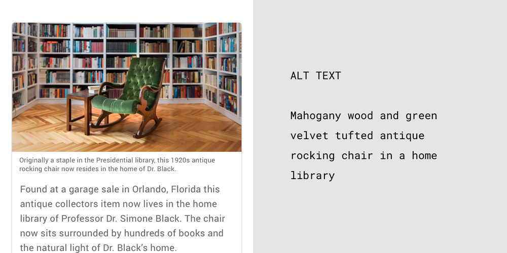
1920s antique rocking chair in Presidential library

The captions appear below the photo and explain the who, what, when, and where about the image. The alt text describes the colors, sizes, and location of the objects in the image.


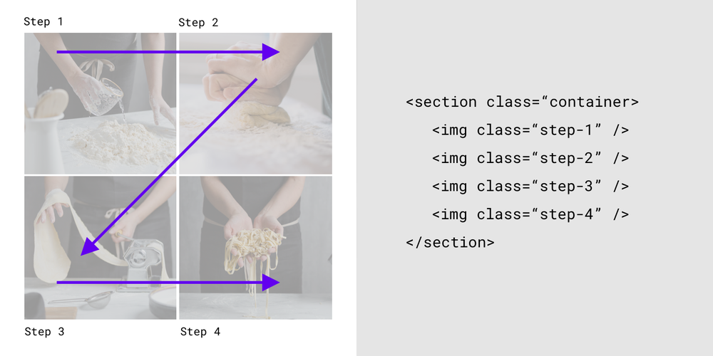
Designers put images in a specific order on a website, such as a four-step recipe with photos showing what to do for each step. However, if the HTML is not in the correct order, the screen reader will read out the alt text for each image in the wrong order, and the screen reader user may follow the recipe incorrectly.  To prevent such (untasty) problems, we provided visual and text examples of the correct HTML code order.

HTML code showing the order of a four-step recipe

The HTML reflects the visual hierarchy by reading the content from the top left (Step 1) to the top right (Step 2), bottom left (Step 3) to bottom right (Step 4).

Not all images are alike

Decorative images such as illustrations of fruit on a recipe website may not have to follow accessibility guidelines because they don’t contain critical information. However, informative images such as the foods in a recipe, should follow the guidelines because they convey information that is relevant to the adjacent text. The updated accessibility guidelines contain information about color contrast, text size, captions, and alt text. Images such as logos, icons, images within a button, and images that are links, benefit from alt text that describes their function and not what they look like.  

Inclusivity helps everyone

Making products accessible means that even people beyond your target users may benefit. Captions help sighted people understand images. Alt text appears when images don’t load, helping sighted users understand what they are missing. People reading an online menu in poor lighting, such as during an electricity outage, might experience a temporary disability. They are more likely to be able to read the menu if it has good color contrast and large text. 

Disabilities have too often stayed hidden and taboo. I believe we are entering a new age where disabilities can serve as a precursor to improving the world for others. The first time somebody at Google saw me looking at a document that was enlarged to 125 percent, I was absolutely mortified because I wasn’t keen on sharing my visual impairment. But then I realized that, in fact, being open and vocal could help make products more useful and accessible for everyone. I hope that these guidelines can help ensure that developers and designers implement accessibility so that those of us with visual impairments can fully access the content of their websites and apps.