Author Archives: Simon Rogers

A new machine learning app for reporting on hate in America

Hate crimes in America have historically been difficult to track since there is very little official data collected. What data does exist is incomplete and not very useful for reporters keen to learn more. This led ProPublica — with the support of the Google News Lab — to form Documenting Hate earlier this year, a collaborative reporting project that aims to create a national database for hate crimes by collecting and categorizing news stories related to hate crime attacks and abuses from across the country.

Now, with ProPublica, we are launching a new machine learning tool to help journalists covering hate news leverage this data in their reporting.

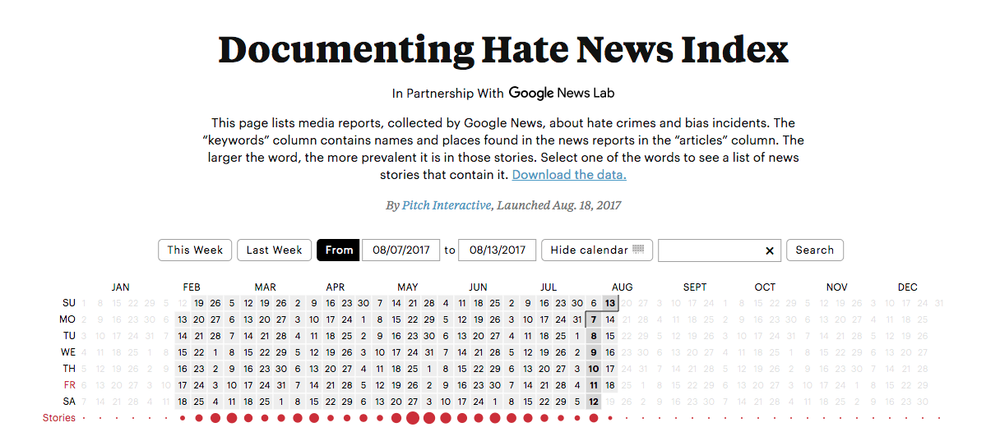
The Documenting Hate News Index — built by the Google News Lab, data visualization studio Pitch Interactive and ProPublica — takes a raw feed of Google News articles from the past six months and uses the Google Cloud Natural Language API to create a visual tool to help reporters find news happening across the country. It’s a constantly-updating snapshot of data from this year, one which is valuable as a starting point to reporting on this area of news.

The Documenting Hate project launched in response to the lack of national data on hate crimes. While the FBI is required by law to collect data about hate crimes, the data is incomplete because local jurisdictions aren't required to report incidents up to the federal government.

All of which underlines the value of the Documenting Hate Project, which is powered by a number of different news organisations and journalists who collect and verify reports of hate crimes and events. Documenting Hate is informed by both reports from members of the public and raw Google News data of stories from across the nation.

The new Index will help make this data easier to understand and visualize.  It is one of the first visualisations to use machine learning to generate its content using the Google Natural Language API, which analyses text and extracts information about people, places, and events. In this case, it helps reporters by digging out locations, names and other useful data from the 3,000-plus news reports. The feed is updated every day, and goes back to February 2017.

The feed is generated from news articles that cover events suggestive of hate crime, bias or abuse — such as anti-semitic graffiti or local court reports about incidents. We’re also monitoring the feed to ensure that errant stories don’t slip in; i.e., searches for phrases that just include the word ‘hate’. (This hasn’t happened yet but we will continue to pay close attention.)

The Documenting Hate coalition of reporters has already covered a number of stories on this area, including an examination of white supremacy in Charlottesville, racist graffiti, aggression at a concert in Columbus, Ohio and the disturbing rise of hate incidents in schools.

Users of the app can filter the reports by searching for a keyword in the search box or by clicking on algorithmically-generated keywords. They can also see reports by date by clicking ‘calendar’.

Screen Shot 2017-08-18 at 10.48.29 AM.png

The Hate News Index is available now and we will be developing it further over the next few months as we see how journalists use it day to day to unearth these stories of hate and help collate a national database to monitor.

The ProPublica-led coalition includes The Google News Lab, Univision News, the New York Times, WNYC, BuzzFeed News, First Draft, Meedan, New America Media, The Root, Latino USA, The Advocate, 100 Days in Appalachia and Ushahidi. The coalition is also working with civil-rights groups such as the Southern Poverty Law Center, and schools such as the University of Miami School of Communications.

As part of our mission to create new resources for the journalism community, we are also open-sourcing the data on our GitHub page — let us know what you do with it by emailing [email protected].

Helping journalists tell stories with data

The Data Journalism Handbook, published in 2011, is considered the guidebook for telling stories with data. To ensure that journalists are up to speed on the latest data journalism practices, the Google News Lab is partnering with the the European Journalism Centre to launch a new version of the Data Journalism Handbook, which will be published in four languages next year.

The original handbook was born at a 48-hour workshop at MozFest 2011 in London, and became an international, collaborative effort involving dozens of data journalism's leading advocates and best practitioners.

Over the past three years, the handbook has been digitally downloaded 150,000 times, and almost a million people have accessed the online version. But the world is changing, and so are the ways we use data to tell news stories. So this project is one of a series of initiatives by the data team at the Google News Lab to support data journalists and help them understand how to best incorporate technology into their work—you can find out more on our site. We’re also proud to partner with the European Journalism Centre on their mission to connect journalists with new ideas through initiatives like the News Impact Summits and the News Impact Academy.

On July 31, we will open a call for contributions. Later this year, around 50 authors and experts will join a Handbook Hack to create and edit content for the new edition. And you won’t have to wait long to start reading the new chapters: we’ll make them available online as they are completed. Check out the official site for the latest updates.

Make your own data gifs with our new tool

Data visualizations are an essential storytelling tool in journalism, and though they are often intricate, they don’t have to be complex. In fact, with the growth of mobile devices as a primary method of consuming news, data visualizations can be simple images formatted for the device they appear on.

Enter data gifs.

trends_BatmanSuperman.gif

These animations can be used for a variety of sophisticated storytelling approaches among data journalists: one example is Lena Groeger, who has become *the* expert in working with data gifs.

Today we are releasing Data Gif Maker, a tool to help journalists make these visuals, which show share of search interest for two competing topics.

trends_PBJ.gif

Data Gif Maker works like this:

1. Enter two data points

Trend_Step4.png

We typically use the tool to represent competing search interest, but it can show whatever you want it to—polling numbers, sales figures, movie ratings, etc. If you want to show search interest, you can compare two terms in the Google Trends explore tool, which will give you an average number (of search interest over time) for each term. Then input those two numbers in Data Gif Maker.

2. Add your text

Trend_Step3.png

3. Choose your colors

Trend_Step2.png

4. Choose your explanatory text

Trend_Step1.png

5. Hit “Launch Comparisons” and “Download as Gif”

And there you go—you’ve made your first animated data gif. Pro-tip #1: the high resolution download takes longer but it’s better quality for social sharing. Pro-tip #2: Leave the window open on your desktop while it’s creating the gifs as it will do so quicker.

If you want the visual, but not the gif, hit “Launch Comparisons” and it will open in your browser window. Just hit space to advance through the views (it’s set up to show five pieces of data, one after the other).

Find the tool useful? We’d love to see what you do with it. Email us at [email protected].

Make your own data gifs with our new tool

Data visualizations are an essential storytelling tool in journalism, and though they are often intricate, they don’t have to be complex. In fact, with the growth of mobile devices as a primary method of consuming news, data visualizations can be simple images formatted for the device they appear on.

Enter data gifs.

trends_BatmanSuperman.gif

These animations can be used for a variety of sophisticated storytelling approaches among data journalists: one example is Lena Groeger, who has become *the* expert in working with data gifs.

Today we are releasing Data Gif Maker, a tool to help journalists make these visuals, which show share of search interest for two competing topics.

trends_PBJ.gif

Data Gif Maker works like this:

1. Enter two data points

Trend_Step4.png

We typically use the tool to represent competing search interest, but it can show whatever you want it to—polling numbers, sales figures, movie ratings, etc. If you want to show search interest, you can compare two terms in the Google Trends explore tool, which will give you an average number (of search interest over time) for each term. Then input those two numbers in Data Gif Maker.

2. Add your text

Trend_Step3.png

3. Choose your colors

Trend_Step2.png

4. Choose your explanatory text

Trend_Step1.png

5. Hit “Launch Comparisons” and “Download as Gif”

Trend_Step5.png

And there you go—you’ve made your first animated data gif. Pro-tip #1: the high resolution download takes longer but it’s better quality for social sharing. Pro-tip #2: Leave the window open on your desktop while it’s creating the gifs as it will do so quicker.

If you want the visual, but not the gif, hit “Launch Comparisons” and it will open in your browser window. Just hit space to advance through the views (it’s set up to show five pieces of data, one after the other).

Find the tool useful? We’d love to see what you do with it. Email us at [email protected].

Make your own data gifs with our new too

Data visualizations are an essential storytelling tool in journalism, and though they are often intricate, they don’t have to be complex. In fact, with the growth of mobile devices as a primary method of consuming news, data visualizations can be simple images formatted for the device they appear on.

Enter data gifs.

trends_BatmanSuperman.gif

These animations can be used for a variety of sophisticated storytelling approaches among data journalists: one example is Lena Groeger, who has become *the* expert in working with data gifs.

Today we are releasing Data Gif Maker, a tool to help journalists make these visuals, which show share of search interest for two competing topics.

trends_PBJ.gif

Data Gif Maker works like this:

1. Enter two data points

Trend_Step4.png

We typically use the tool to represent competing search interest, but it can show whatever you want it to—polling numbers, sales figures, movie ratings, etc. If you want to show search interest, you can compare two terms in the Google Trends explore tool, which will give you an average number (of search interest over time) for each term. Then input those two numbers in Data Gif Maker.

2. Add your text

Trend_Step3.png

3. Choose your colors

Trend_Step2.png

4. Choose your explanatory text

Trend_Step1.png

5. Hit “Launch Comparisons” and “Download as Gif”

Trend_Step5.png

And there you go—you’ve made your first animated data gif. Pro-tip #1: the high resolution download takes longer but it’s better quality for social sharing. Pro-tip #2: Leave the window open on your desktop while it’s creating the gifs as it will do so quicker.

If you want the visual, but not the gif, hit “Launch Comparisons” and it will open in your browser window. Just hit space to advance through the views (it’s set up to show five pieces of data, one after the other).

Find the tool useful? We’d love to see what you do with it. Email us at [email protected].

Data Journalism Awards 2017: Call for submissions

With trust in journalism under attack, data journalism has never been more vital. And this year, for the sixth consecutive year, we’re proud to support the 2017 Data Journalism Awards.

But you need to get your skates on: The deadline is fast approaching for the only global awards recognizing work that brings together data, visualization and storytelling to produce some of the most innovative journalism out in the world today.

It’s a part of our commitment to supporting innovative journalism both in Europe and around the world.
Data Journalism Awards SS

Past winners of the $1,801 prizes include the New York Times, Buzzfeed, FiveThirtyEight, Quartz and IndiaSpend. 2017 hopefuls don’t have long: the deadline for this year’s awards is April 7, 2017 at midnight GMT.

And if you’re wondering why the prize is $1,801? That’s because in 1801 William Playfair invented the pie chart.

Aimed at newsrooms and journalists in organizations of all sizes—big and small—the #DJA2016 awards will recognize the best work in key categories, including:

  • Data visualisation of the year

  • Investigation of the year

  • News data app of the year

  • Data journalism website of the year

  • The Chartbeat award for the best use of data in a breaking news story, within first 36 hours

  • Open data award

  • Small newsrooms (one or more winners)

  • Student and young data journalist of the year

  • Best individual portfolio

The competition is organized by the Global Editors Network: a cross-platform community of editors-in-chief and media innovators committed to high-quality journalism, with the support of Google and the Knight Foundation. For Google, the Data Journalism Awards offer another way for foster innovation through partnership with the news industry, in addition to our efforts through the Digital News Initiative and the work of the Google News Lab teams around the world.

Data journalists, editors and publishers are encouraged to submit their work for consideration by joining the GEN community via this form by April 7 at midnight GMT. A jury of peers from the publishing community, including new jury members Esra Doğramacı from Deutsche Welle and Data Journalism China’s Yolanda Ma will choose the winners, which will be announced during a gala dinner at the Global Editors Network Summit in Vienna on June 22.

Good luck!

Simon Rogers is Data Editor at Google’s News Lab and Director of the Data Journalism Awards